
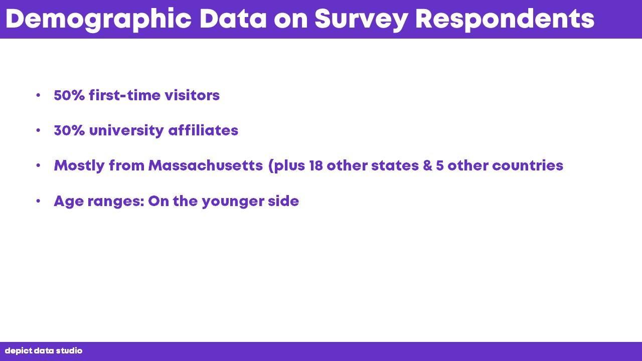
There’s nothing more boring than a slide full of bullet points. Here’s the “before” version from a slideshow. A lot of my own projects used to look like this. I wasn’t trying to put my audience to sleep. I just didn’t realize how easy it was to design engaging visuals.
The Project: Need to Display Demographic Data about Survey Respondents
A little context: I recently spoke to graduate students about visualizing their survey data. A group of students had surveyed an art museum’s visitors to gather feedback about their experiences at the museum.
I’m pretending that I’m going to meet with the museum’s higher-ups and share data in a slideshow.
I’d begin with a single slide about the survey respondents. Same thing for a report: Limit your background information to just a page.
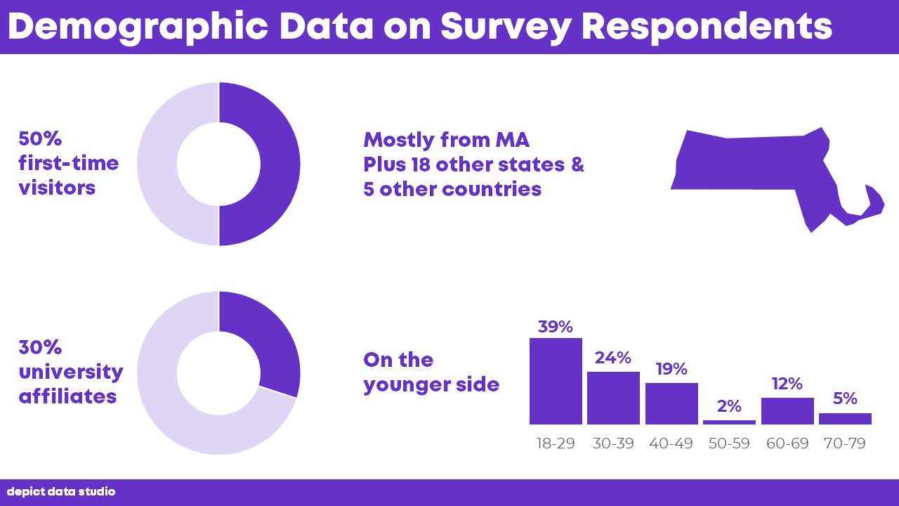
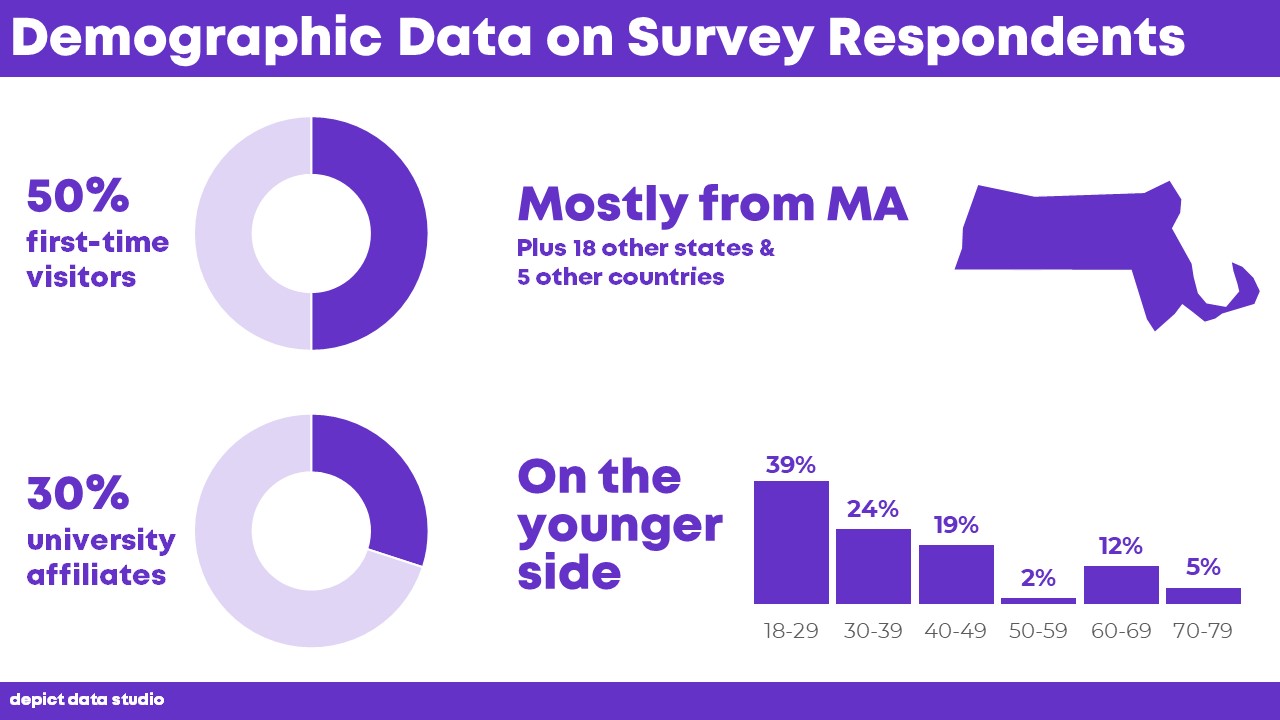
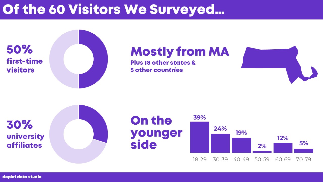
In the vast majority of cases, I suggest that you only present one graph per slide. Otherwise, the slide gets cramped and the audience is reading Graphs B, C, and D while you’re still droning on about Graph A. But, nobody really cares about demographic data. I mean, they want to know how many people responded. And they want to know whether the small sample was generally a good representation of everyone else as a whole. Reassure your audience that you gathered a nice big number of surveys and that you had a balanced mix of people, and then move on. Don’t drone on for four separate slides.
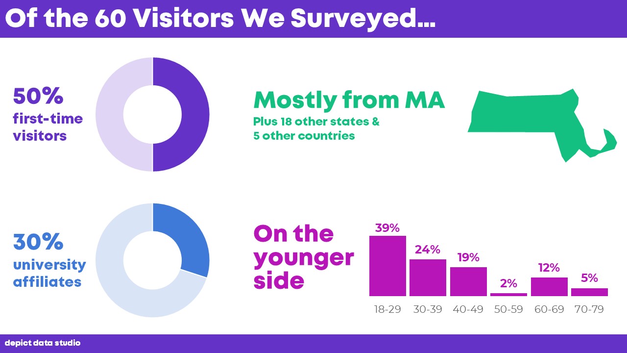
Your speaking points would be brief, too: “We surveyed 60 people. 50 percent were first-time visitors and 30% were Harvard affiliates. Most of the visitors were from Massachusetts, but we did have a bunch of other states and countries represented, like Canada and even China! And the people were surveyed tended to be on the younger side; 39 percent were in that 18 to 29 year old bracket.”
The content is fine as-is. We just need to tweak the visuals.
Step 1. Instead of a List, Experiment with a Two-Column or Three-Column Layout
First, break out of the regular ol’ one-column layout and experiment with two-column layouts. As you’re rearranging your key phrases on the slide, don’t forget to delete the bullet points altogether. Those little circles are chartjunk.

Step 2. Add One Visual Per Key Point
Then, add one visual per key point. I used two-slice donut charts to show that 50 percent of survey respondents were first-time visitors to a museum and 30 percent were connected with the nearby university. I used a map to emphasize how most of the survey respondents were from Massachusetts. I used a histogram to show the distribution of age ranges of survey respondents. All of the visuals have been decluttered. In other words, there aren’t any unnecessary lines, borders, tick marks, or legends on the graphs.
Step 3. Apply a Text Hierarchy
Size your text intentionally to guide viewers through the content. The most important information should be large, bold, and dark. The least important information should be small, but not too small. I suggest using at least size 18 for the less-important info on slides, like the “18-29” age bracket labels.
You’ll use your audience’s font to enhance their branding (not my font).
Step 4. Re-Write Your Slide’s Title
Do something, anything, I’m begging you, to translate that jargony slide title for non-technical audiences.
Step 5. Apply Intentional Color-Coding
Finally, color-code by category. Intentional color-coding breaks up your dense visuals and text into a few simple categories.
You’ll use your audience’s color palette to enhance their branding (not my colors).
Bonus! Watch a Video Tutorial
And better yet, watch a sample lesson from my online course, Great Graphs: Transform Spreadsheets into Stories with Better Data Visualization so that you can see the entire step-by-step transformation. Most lessons, like this one, are just a few minutes long. I know you’ve got other things going on. Learn a new technique while you eat lunch, and build your new skills steadily. Enjoy!
Leave a Reply