In this article, guest author Molly Hanlon shares how she uses data to create visualizations and stories that help school staff make decisions to better serve their students. Please comment below with your own tips! Let’s learn with each other. –Ann
We use stories to affirm our beliefs. This is especially true in conversations about equity.
Over many years, I’ve observed countless situations in which school administrators were presented data that showed unjust equity in their system. Most often, administrators told themselves stories to justify that result. A common story was, “That data is confusing, and it can’t be right.”
Many school systems are not using data to make informed decisions. Too often, they are making decisions on what feels right to them, based on a story that isn’t consistent with the evidence. My goal is to use data to create visualizations and stories that are consistent with the evidence, and to help staff focus on how to make schools more equitable and just for all students.
It has felt so gratifying to me to create and share data visualizations that help people accept stories consistent with the evidence. Those stories empower them to identify and accept the challenges faced by their systems, and to inform possible solutions.
Producing Data Visualizations for the Seattle Public Schools
In 2019, I was tasked with presenting data to an Advanced Learning taskforce within the Seattle Public Schools. Advanced Learning programs are designed for students who demonstrate an exceptional ability or potential to learn and reason beyond their same-age classmates.
The taskforce examined disparities among students of color who participated in the program, how students were selected for the program, the program’s delivery, and institutional best practices.
The following two examples are a small sample of the visualizations I provided the taskforce, to help them understand the demographic student populations in the advanced learning programs.
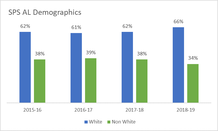
Visualizing White vs. Non-White Students
This first visualization illustrates the percentage of white versus non-white students in the Seattle Public Schools Advanced Learning program over time.
These graphs were presented in-person to the taskforce, and then included into a “fact pack” for later reference.
Before: A Clustered Column Chart with Default Software Settings
Here’s what our graphs used to look like: a clustered column chart with default software settings.
After: A Stacked Column Chart with a Takeaway Title
Here’s what our graphs look like now.
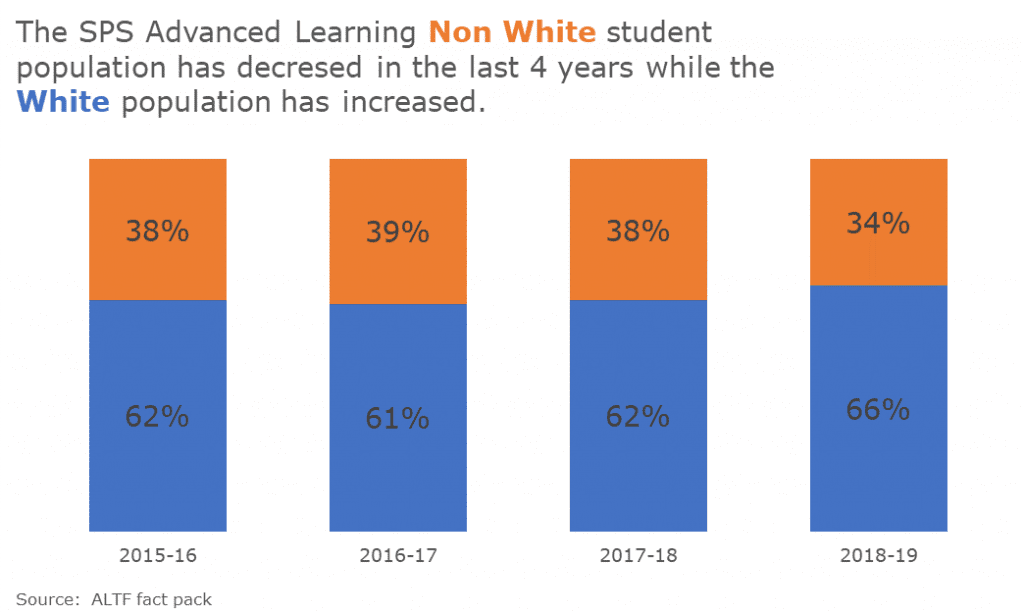
Here are the improvements we made. We:
- changed the font and color schemes to match the Seattle Public Schools style guide;
- wrote a more descriptive title;
- eliminated the superfluous legend, which distracts the viewer’s attention;
- changed the chart type from a clustered column to a 100% stacked column for easier reading;
- increased the font size of percentages for easier reading; and
- eliminated the border and x-axis line, which introduced unhelpful visual distractions.
Visualizing Disparities of Students of Color
The second example shows the disparities of students of color compared to their overall representation in the district.
Before: A Clustered Column Chart with Default Software Settings
Here’s what our graphs used to look like:
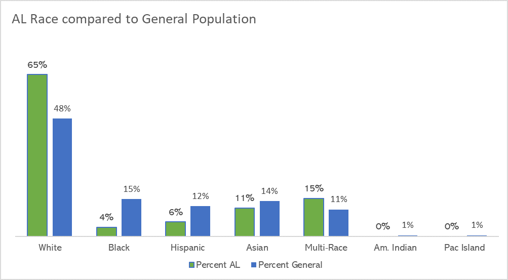
After: Adding Color-Coded Annotations
Here’s what our graphs look like now:
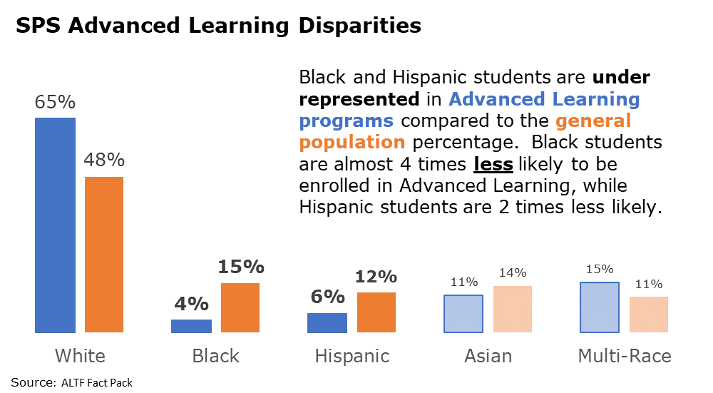
Here are the improvements we made. We:
- changed font and color schemes to match the Seattle Public Schools style guide;
- wrote a descriptive title and inserted a text box to further explain the significance of the data;
- eliminated or used a lighter shade for the data that wasn’t as significant;
- increased the font of the percentages that were more significant;
- eliminated the legend by coloring the font in the descriptive text box; and
- eliminated the border and x-axis line.
The Impact of Intentional Data Visualization
These graphs challenged the task force to think about the inequities in Advanced Learning programs given the change in district demographics.
Collect with Molly
Connect with Molly Hanlon on LinkedIn: https://www.linkedin.com/in/molly-hanlon-b701305a/
6 Comments
Thanks for this post. In my organization, we have thought a lot about how we present race data. We have moved away from the category label “non-white” and instead use “youth of color.” I really like how you break out racial categories in your second example.
As someone who works primarily with Alaska Native / American Indian-led non profits, I’m confused about why the erasure of American Indian and Pacific Islander students from this data is considered a move toward equity.
Yes, the second chart is simpler to read and more visually appealing. Unfortunately, it renders invisible the fact that, despite their existence within the general population of [whatever community this is], Indigenous students have **0%** representation in Advanced Learning. An equity focus would highlight this data and challenge the idea that the statistical size of a population compared to others doesn’t render its disproportional exclusion “insignificant.”
Thanks for these free resources, and for sharing information about making data more visually accessible and powerful.
Would love to learn from you! Do you have any public-facing data visualization examples you can share?
I don’t at all! I’m learning from you all about data visualization (looking forward to the course opening up), because I’ve been very reliant on written words and tables in the work I do – which obviously are the opposite of accessible, easily digested information.
In my experience, if we have the freedom to build in an equity lens throughout data collection, we can do things that support that in the eventual report, including presumably visualization. For instance, some school districts are open to using racial demographic data that counts all students who identify with a race “alone or in combination”, which often can build a more complete count and help make visible the differences in smaller subpopulations.
If you don’t get to build the data collection approach from the ground up though, pulling out elements of data revealing inequity that might otherwise be obscured by relative population size could maybe be accomplished through highlighting in pop-out frames and talking about them directly? I know this is just a snippet of a much larger project in Seattle – maybe Molly did that in the original work. The deletion was just notable to me because of the title of the post.
Thanks again to both of you for providing these public resources. Appreciate the opportunity to learn.
It may just be that her district has a very low number of Alaska Native/ American Indian students. In my county, this population comprises 0.2% of the total population, which rounds to 0%. Our department of education demographics list 0% of AN/AI pop.
Thank you, Ione! Yes, agree about the likely reasons. I commented because from the standpoint of equity, the absence of even a small population (particularly one known to experience broad inequities in outcomes) from an advanced learning program seems like something to address. There are almost no districts in the country where AN/AI students comprise a statistically significant proportion, but an equity lens would say their experiences are still significant despite their comparative presence. Seattle has one of the more significant urban AN/AI populations in the country, but even there a single-race data count would hover around 1%.
I just want to say that after taking Ann’s free Dusty Shelf Report course, I feel like I understand better why Molly chose to highlight the striking statistical disparity she did in this example. I don’t want my initial comment to imply that I think these kind of storytelling graphs mean the elimination of key data. I think data on outcome disparities from populations with extreme size differences is actually far better served by this highlighting approach. A separate storytelling graph pulling AN/AI and Pacific Islander student outcomes out would do much more to make inequity visible than the original technical graph did – and given this is a small piece of a longer project, very possible that happened.