
A couple years ago, I was invited to be the keynote speaker for the Continuous Quality Improvement Conference in Illinois. (And a couple weeks ago, I keynoted their conference in California, too. What a great group!)
While planning for the session, I asked conference attendees to submit examples from their reports, dashboards, and slideshows that I could makeover as part of the talk.
Later, during the live keynote, I shared a few data visualization principles. Then, as a group, we practiced applying those principles to their real projects.
Here’s one of my favorite submissions:
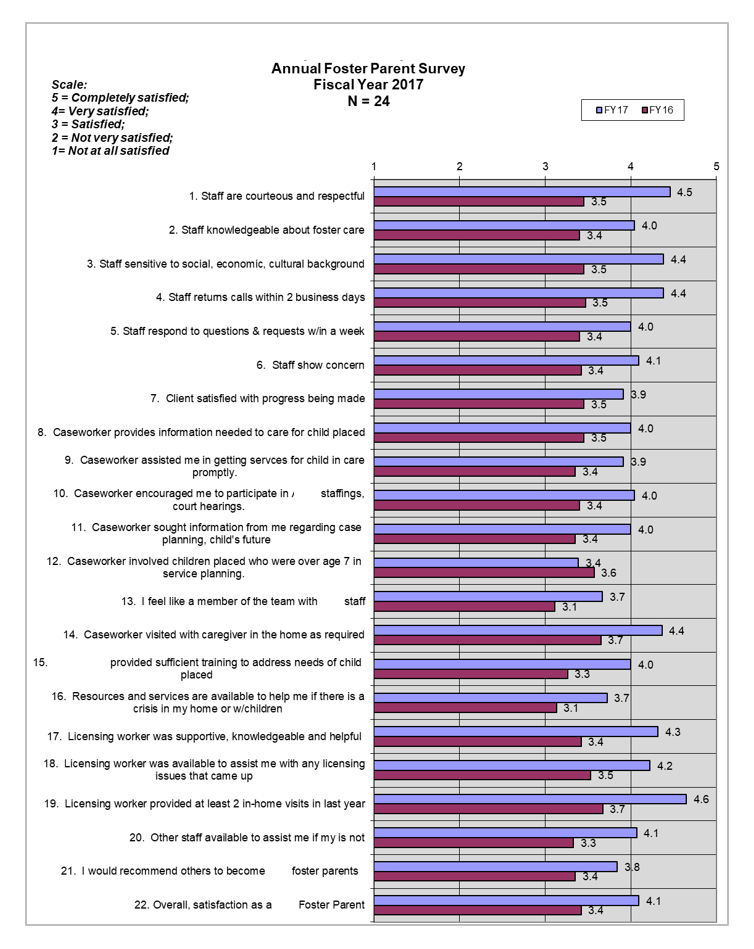
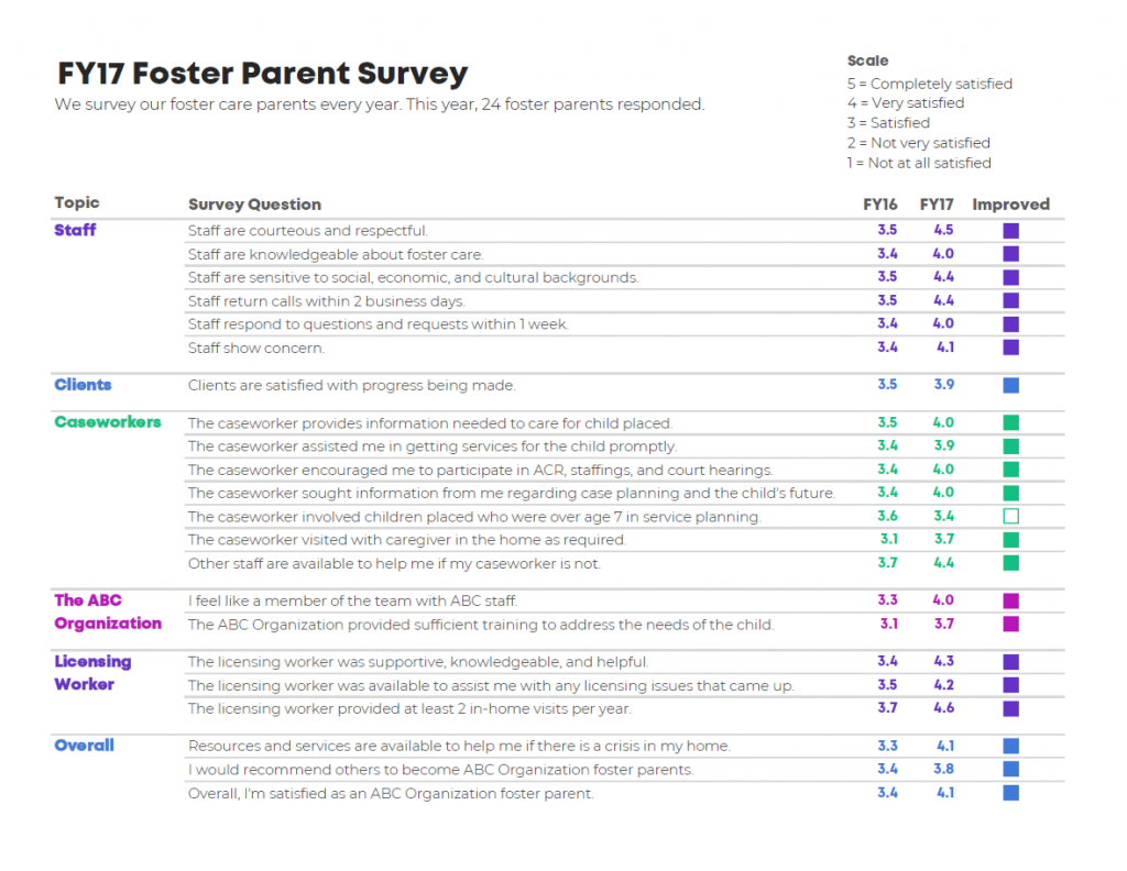
This conference attendee worked at an organization that placed children into foster care homes. Each year, the organization surveyed their foster care parents to gather their feedback about the experience.
Virtually every organization conducts satisfaction surveys of one kind or another, so even if you don’t work for a foster agency, keep reading!
I’m going to show you the before version followed by five makeovers.
The first makeover didn’t work. The second makeover didn’t work. The third makeover didn’t work. The fourth makeover didn’t work. Just as I was about to give up, I found a winning design with my fifth attempt!
Let’s make fun of my first few attempts together. Then, we can celebrate the fifth attempt together.
I’m going to provide a behind-the-scenes peek into my thought process so that you can apply my thinking to your own projects.
What’s Already Working Well: Length and Context
A couple things were already working well in the before version.
First, I was pleasantly surprised to see that they fit all 22 survey questions and the responses on a single page. They wanted an at-a-glance handout, not a full report. All too often, I witness organizations drone on and on about simple survey results. It’s just a survey. Keep simple things simple, please.
Second, I was pleasantly surprised to see two years’ worth of data included: fiscal year 2016 and fiscal year 2017. All too often, I see annual survey results that only provide the current year’s data. Without historical context, we don’t know whether the current year’s data is any better or worse than previous years. Providing patterns over time is always a good thing.
What’s Not Working: Clutter, Order, Clustered Bars, and Analysis Approach
We’ll declutter the one-pager, obviously. We need to remove the gray background shading. How are the foster agency’s leaders supposed to make decisions based on this data if they can’t even see it?
We’ll also re-order the survey questions. Right now, questions are listed in the order they were asked on the survey: 1, 2, 3, and so on. Presenting survey results in the same order as the survey is rarely the best approach. Instead, we’ll group the individual questions into categories.
Next, I wanted to find an alternative to the clustered bars. Clustered bars are my least favorite chart of all time—even more so than 3D exploding pie charts! Clustered bars aren’t inherently evil. They’re just overused.
Finally, the analysis approach was a bit off. The agency asked foster parents whether they were completely satisfied, very satisfied, satisfied, not very satisfied, or not at all satisfied. They coded a completely satisfied as a 5, a very satisfied as a 4, and so on. Then, they calculated the average score. For example, Staff are courteous and respectful got an average score of 4.5 in 2017.
Although this numeric coding approach is common, it’s not correct. Variables can be nominal (favorite ice cream flavors), ordinal (this satisfaction scale), interval (the scale’s points are equidistant), or ratio (the scale has a true zero, e.g., a height of 0 feet means zero height). If this is the first time you’re learning about nominal, ordinal, interval, and ratio scales, check out this article to learn more.
You can only calculate averages on interval or ratio scales, but the survey has an ordinal scale. In other words, the agency should’ve displayed how many foster parents selected completely satisfied, very satisfied, and so on for each of the questions instead of calculating an average score.
I didn’t have access to the raw dataset while designing this makeover, so I’m going to have to display the average scores here. It’s not the end of the world. But I did cringe during the makeover process. And I’m definitely cringing again during the blogging process.
Makeover 1: Slope Graphs Didn’t Slope…
I experimented with a few makeovers before I settled on a winning design. Here’s the first makeover. Wait! Before you start frowning and rolling your eyes, hear me out. Let’s look at what’s working, and then I’ll be honest with you about what’s not working.
I kept all of the makeovers to a single page, which was a fun challenge. I kept two years’ worth of data. I dramatically decluttered the page, removing the background shading, vertical lines, and horizontal lines from the original. And I grouped the survey questions into categories and then color-coded by category (Staff in turquoise, Clients in purple, Caseworkers in red, and so on). You can learn more about color-coding by category here.
I love most aspects of this redesign.
The major shortcoming of this data visualization makeover is the visualization itself—darn!
We have a few options for comparing two points in time, like these two fiscal years. The most obvious choice is a line chart, which was born with the sole purpose of displaying patterns over time. A slope chart is just the line chart’s cousin; it displays exactly two points in time.
The problem is that the slopes didn’t slope. The visuals were too short to show much of a difference.
Most designs require compromise. I decided that it was more important to limit the makeover to a single page than to increase the height of each slope chart (and, therefore, spill the survey results onto a second page).
Makeover 2: Columns Were Too Short…
Here’s my second attempt.
In this iteration, I visualized the data with column charts.
You can already see the problem, right? The columns were too short to see any differences.
If I didn’t tell you that these were supposed to be column charts, then you might’ve assumed they were just funny-looking squares.
I’m not upset that this makeover didn’t work. I wasn’t rooting for the clustered column approach anyway!
Onwards. I’ve still got a few more ideas up my sleeve…
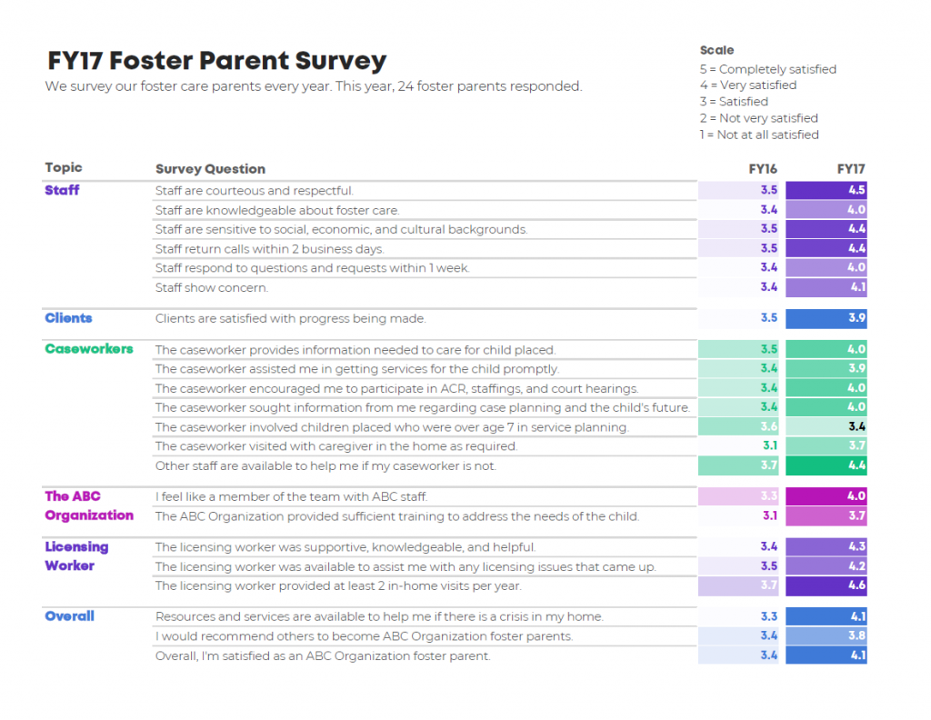
Makeover 3: The Heat Table Was Too Colorful…
Heat tables are helpful when you’re working with limited space, like my self-imposed rule of limiting myself to a single page, just for fun, ha! The colors live on top of the numbers, not beside them, so they take up less space.
I can generally see that the FY17 column is darker than the FY16 column (ratings were higher in FY17 than in FY16). But I have to work to see the darker colors because I’m distracted by the rainbow in front of me.
If I wasn’t stubbornly devoted to a one-page design, then I
could’ve added an empty row between the categories. For example, you’d see the
turquoise section for staff. Then, there would be a centimeter of white space.
Then, you’d see the purple section for clients. But again, every design is a
compromise. I was committed to a one-page design. I couldn’t turn back now!
Makeover 4: Check Boxes Provided Overly Positive News…
As I was critiquing the heat tables, I finally realized that the FY17 results were better than the FY16 results. I hadn’t actually noticed that pattern while looking at the original, at my slopes, or at my columns! Spotting this pattern was a game-changing aha moment.
In this redesign, I opted to focus on big-picture results: that foster parents scored the agency higher in FY17 than in FY16 on every survey item except one. The filled-in squares and empty-squares are easy to scan at a glance. I’ve used square icons in dozens of real-life projects, and I’ve talked about them a few times on the blog before, too. You can read this post to learn how I created them. The filled-in square is a lowercase g in the Webdings font and the empty square is a lowercase c in the Webdings font.
The downside was that the check boxes provided overly positive news.
Can you have too much good news? I think so. Pretend that you’re a leader at the foster care agency. You see this handout at a meeting. You’ve improved from one year to the next on nearly everything! This is great news! There’s nothing to fix! Everything’s working! Except for that one survey question, but that’s just one thing, so who cares! No need to try any harder next year! You’re already doing everything perfectly… or are you?
I didn’t want to encourage complacency. I wanted to provide actionable ideas for improvement.
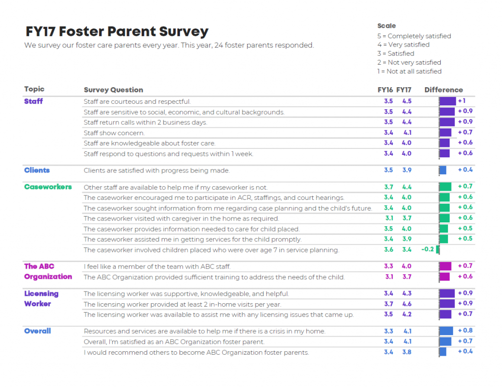
Makeover 5, the Winning Makeover: Deviation Bars
Finally! The winning makeover! It only took four failed attempts to get this one right…
I loved the simplicity of the check boxes. But I was afraid that they only provided good news. I needed to strike a balance: Keep the makeover simple while providing details about where the agency could do even better.
I created deviation bars to show the size of the difference from one fiscal year to the next. I intentionally re-ordered the survey questions yet again. Within each category, the survey questions are ordered by the magnitude of their improvements.
At a glance, you can still see that all but one survey question improved. But now, you can also see how much or little improvement took place.
It’s good to provide leaders with good news, but it’s better to provide leaders with balanced news.
Now, they can still celebrate all the areas where they improved. Then, it’s time to roll up their sleeves and get to work on improving even more.W
Bonus: Download the Materials
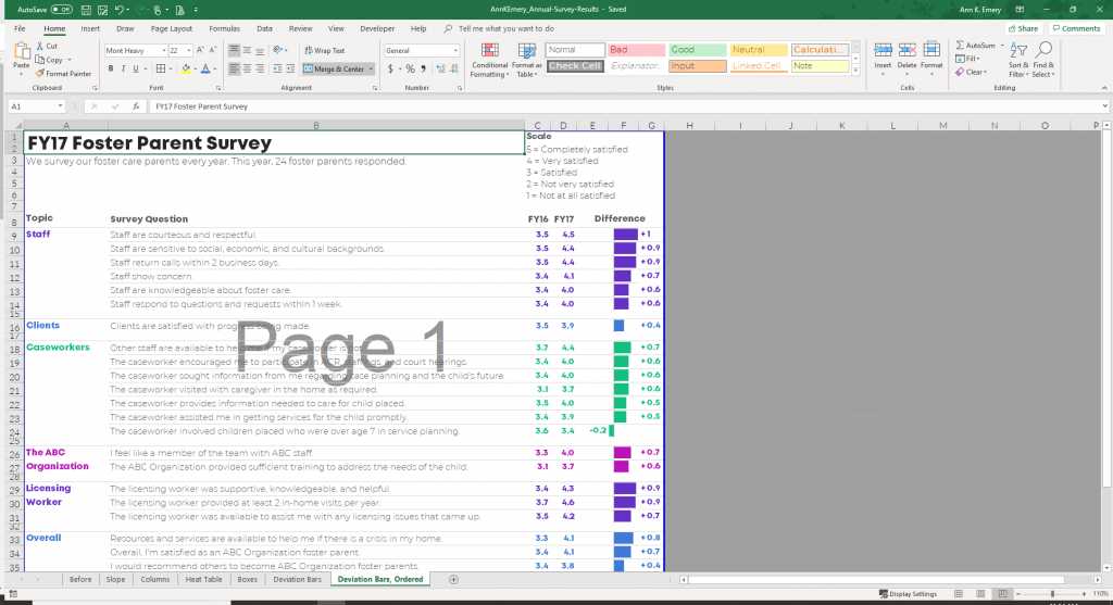
Want to see how I created these five makeovers? They all live inside Excel!
That’s right, I typed the survey questions into Excel, created all of the visuals within Excel, and then PDF’d my screen so that I could share the handouts with leaders.
Purchase the files to learn more and to adapt the templates for your own work.
Learn More
You’ll learn all the step-by-step skills inside Dashboard Design.
3 Comments
This was great!!! I downloaded it and will use it with my team.
This was really useful – thank you but I would be interested to know how you would manage the data presentation if you did want to include the full ordinal scale rather than the average score which is less appropriate.
Great question!
Here’s a blog post about ordinal survey scales (well, this one’s technically a diverging scale): https://depictdatastudio.com/agree-disagree-scales/
And here’s one about ordinal scales over time (pre-post): https://depictdatastudio.com/visualize-pre-post-survey-results-microsoft-excel/