Today’s article comes from Amelia Kohm, the founder of Data Viz for Nonprofits. Thanks for these practical dataviz tips, Amelia! — Ann
What’s missing? Charts, maps, graphs and other data visualizations. When I peruse posts from organizations and businesses, I mostly see:
- Grainy, low-resolution photos,
- Oddly-cropped photos that accidentally cut off important parts of the images once they’re transferred to social media posts,
- Headshots,
- Stock images (only some of which clearly relate to the text), or
- No image at all.
Twitter, Facebook, and LinkedIn are like crowded highways packed with billboards. If we add charts, maps, and graphs to our billboards, we can both grab attention and say something meaningful. But the image and message should be simple and clear to travelers zooming by.
What types of vizes work best? Here are four to consider.
1. Maps

If the map shows a geography we know like our own city or country, we have a lot of prior knowledge that we can apply. This knowledge makes maps easy to digest on the fly.
We look for our own location. We compare east to west or cities to rural areas.
Consider showing the distribution of the need you are addressing, the location of your clientele, or where you are providing services using a map.
The objective is to communicate one primary message but allow for one or two secondary messages.
For example, the primary message of the map above is that almost every county in the U.S. has residents who can’t afford food. Both the map itself and the title convey this message.
However, the map allows for a secondary message. The problem is particularly severe in the south. It also allows you to compare your area of the country to that of others.
When using maps in social media posts, make sure they are readable! Shrinking down a map to fit a post often means that the labels are too small for most of us to read. Consider increasing the font size, reducing the number of labels, and/or zooming in on a particular portion of the map.
More great examples of maps in social media posts:
- A prison data map to shape reform by CommonHealth ACTION
- Heat map of human trafficking cases by AWS Nonprofits
- Two active storms threaten the Gulf Coast early this week by Bloomberg Graphics on Twitter
- The six political states of Florida by the Washington Post on Twitter
- In 21 U.S. states, minimum wage workers earn the federal rate by Pew Research Center on Twitter
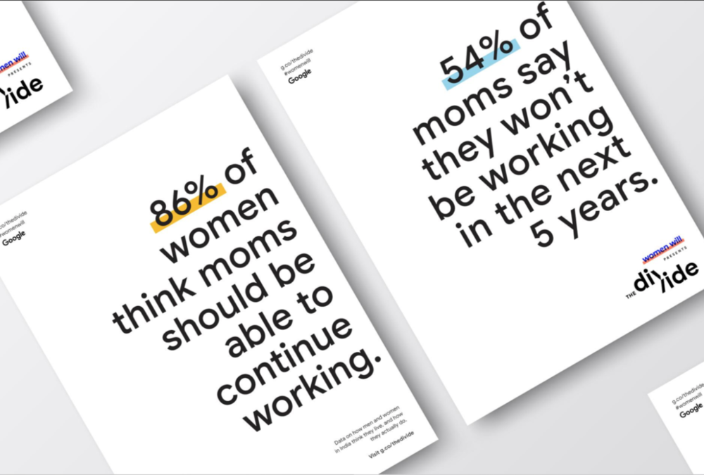
2. BANs (Big A** Numbers)

Just one large number can capture attention.
The BANs shown here are from Women Will, a Google initiative focused on economic empowerment for women. They won a Shorty Award, which honors the best content creators on social media.
Think about what single number you might share that could spark interest in your work. Numbers that are larger or smaller than most would expect work well.
If the number you want to share is a percentage, consider converting it to a “natural frequency.” Say, for example, 1 in 10 people rather than 10% of people. We humans often struggle with percentages. Natural frequencies are more intuitive. We can imagine ten people we know. One hundred is more difficult, and percentages are based on 100.
Add a link from your BAN post to a chart that provides more context and detail for that number.
More great examples of big numbers in social media posts:
- 62% of Americans can identify the name of Islam’s holiest city. Can you? by Pew Research Center on Twitter
- Our Census response rate is at 50% by the Maryland Census on Twitter
3. Line Graphs Showing Clear Trends

Line graphs are familiar. Many show change over time.
So if we make it clear what is changing (here it’s the number of deaths) and over what period of time, we can tell a quick and powerful story without much more than an angled line.
But keep it simple with only one line.
Or, if you want to compare multiple trends using multiple lines, then highlight only one in color.
For example, rather than show the overall world trend in tuberculosis deaths, you might want to have several lines each showing the trend within one country. Color one trend in a bright color and gray out the others. This will allow viewers to compare the selected country to the others.
Consider using line graphs to show how the need for your services or your impact has changed over time.
Another great example of a line graph in social media posts:
- Historic, current, and future population by continents by Visme on Twitter
4. Bar Charts Showing Clear Comparisons

Bar charts also are trusted friends. We get them.
When deploying bar charts, use color strategically to encourage particular comparisons.
This bar chart by Agata Ketterick works well for a social media post. It’s simple use of color and limited number of bars make it pretty digestible. And the caption directs your attention to the key takeaway: that over half of the tech companies are located in just two of the twelve regions.
More great examples of bar charts in social media posts:
- Coronavirus’ toll has hit minority communities the hardest by Bloomberg Graphics on Twitter
- California’s five largest wildfires by the Washington Post on Twitter
A Parting Warning…
When using charts in your social media posts, strip them down to the essentials.
Use only one chart and eliminate any visual elements that detract from the main message.
This post, for example, is too much to process for a busy, distracted social media reader.

Connect with Amelia Kohm of Data Viz for Nonprofits
Amelia Kohm, PhD, is the founder of Data Viz for Nonprofits (DVN). DVN delivers high-quality visualizations that help organizations to quickly grasp their data, improve their work, and show their impact. Sign up for DVN’s weekly 60-Second Data Tips.
Leave a Reply