2011 called.
It wants its 100-page reports back.
My wish: Limit yourself to just 30 pages (or less!).
It wants its portrait reports back.
Are people printing your doc… or reading it from their (landscape) computer?
It wants its text-heavy reports back.
We need visuals on every single page.
Ready to revamp your technical reports?
10 Tips for Redesigning Reports
Here are 10 quick wins to improve your next text-heavy document.
You don’t need to apply all 10.
Even one of these techniques will make dense reports more readable for our non-technical and busy audiences.
Design a One-Pager
The 30-3-1 Approach is the bare minimum for designing reports that actually inform decisions. You can read more about 30-3-1 here.
When you’re creating one-pagers, don’t forget to add at least ½ inch of white space between each graph so the page doesn’t feel smushed.
It’s tempting to try and fit everything into a one-pager. A one-pager is just the highlights; the full report can go into more detail.
Use Brand Colors and Fonts
Never, ever, ever use your software program’s defaults.
I’m looking at you, Calibri.
If you’re using Microsoft Office programs, like Excel, Word, or PowerPoint, then Theme Colors and Theme Fonts can save you hours of time.
Start with the “So What?”
The Key Findings and Next Steps deserve to be shared earlier (not buried in the last few pages of our docs).
Use Landscape Orientation
Will you pay to print your reports and mail them to your recipients?
If not, they’ll probably read in on their (landscape) computer screen.
Add a Cover
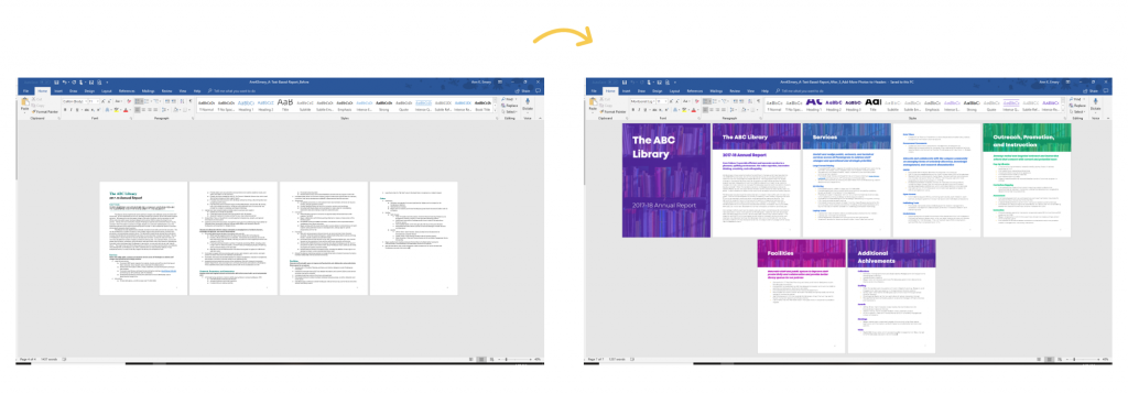
We can make beautiful, engaging report covers in 20 minutes or less— inside software we already have.
Here’s one of my favorite before/after transformations from Sara DeLong:

Chunk with Dividers
Begin each chapter with a dark, visually-striking divider page to help break up the content into small bites.

Add 1+ Visual Per Page
Think of a recent report: how many pages had visuals?
The Text Wall takes too long to read.
Add a Variety of Visuals
Not just tables.
Humanize reports with photos, too.
You can grab my Checklist of 15 Types of Visuals from this podcast with Alli Torban.
Go Beyond the Bar Chart
My old reports: bars, clustered bars, stacked bars and columns charts.
Zzzzzzzzzzzzz…
Lower the Reading Level
I suggest writing two levels below (e.g., a Master’s degree audience would get Grade 9-12 writing).
Your Turn
Which tip will you apply to your next technical report? Comment anytime and let me know.


Leave a Reply