A million years ago, I was invited to be the keynote speaker for the Southeastern Library Assessment Conference in Atlanta, Georgia. As part of that process, we redesigned several of their existing reports and dashboards.
Before
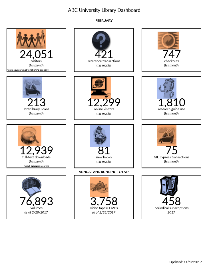
When asked to submit their existing visualizations to be redesigned, one of the conference attendees sent me this dashboard (shown below).

The attendee was responsible for monitoring key statistics about the university’s library.
The dashboard included information about the number of visitors, transactions, checkouts, and interlibrary loans.
These twelve metrics and their associated icons were intended to provide an at-a-glance overview about the library during a given month.
What’s Working Well: Length, Icons, and Text Size Hierarchy
A few things were already working well for this dashboard:
- The most notable accomplishment was that it already fit on one page! I typically see “dashboards” that drone on for way too many pages. I’m not an old school dashboard designer. I don’t believe that dashboards have to fit on a single page or screen. But sometimes the multi-page dashboards also contain so much narrative text that they’re more of a report than a dashboard.
- The icons were also working well. Michelle Borkin and her team found that icons make graphs more memorable, so I add or keep icons whenever I can.
- Finally, the dashboard already incorporated a text size hierarchy of sorts. A hierarchy means that the most important information should be large, dark, and bold so that it grabs our attention. The twelve big numbers are already stood out, which was a plus.
What Needs Editing: Clutter, Alignment, and Context
There are a couple easy edits:
- We’re going to do the usual decluttering for
this dashboard. That’s a given, right? We’ll simply remove the borders that
outline each of the twelve data points. - We also need to adjust the alignment. The numbers and words are centered within their boxes. Yet
the icons aren’t quite centered over them. Intentional alignment makes our visualizations
look polished. - The biggest edit needed is context. The dashboard
currently shows February’s numbers. For example, 24,051 people visited the
university’s library during February alone. I have no idea if that’s a huge
number or a tiny number. A single number on its own doesn’t tell us much. We
need more context. We need to be able to compare that number to something. There are a few comparisons
we could make. For example, we could compare that number to the prior month
(January vs. February). Or, we could compare that number to our goal
(February’s actual number compared to February’s goal).
After: Monitor Patterns Over Time
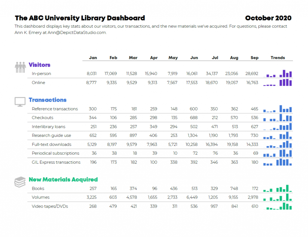
Here’s the first idea for this university’s monthly dashboard.
These are made-up numbers, but hopefully you still understand the gist of the makeover.
I:
- gave viewers the opportunity to monitor patterns over time. Each month has its own column. Now, we can compare the current month to past months, which adds much-needed context.
- added graphs, which I created with Microsoft Excel’s spark columns.
- decluttered the dashboard by removing unnecessary outlines. I chose to keep the single horizontal line beneath the months, but that line is gray, not black.
- color-coded by category. I grouped the twelve data points into categories: Visitors (blue), Transactions (purple), and New Materials Acquired (turquoise).
- applied a text hierarchy. The title is large, dark, and bold. The headings (Visitors, Transactions, and New Materials Acquired) are a medium size because they’re of medium importance.
- adjusted the alignment. The words are left-aligned and the numbers are right-aligned. The icons are center-aligned with one another, and they’re top-aligned beside each of their categories.

After: Track Progress Towards Goals
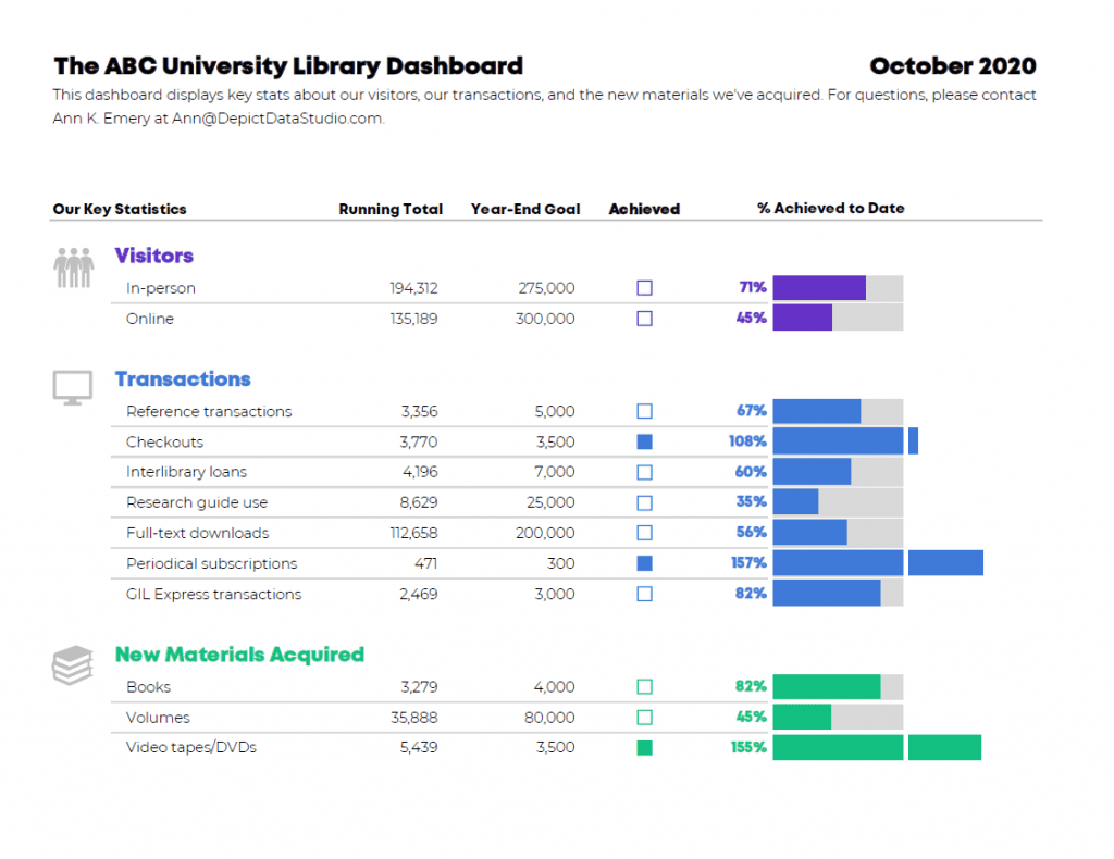
Here’s the second idea.
It’s also clutter-free; includes graphs and a text hierarchy; and groups the twelve data points into categories (which are color-coded, of course).
The difference is the dashboard’s purpose. The before version only looked at one month at a time. To provide more contextual details, the first makeover allowed viewers to compare patterns over time. This second makeover allows viewers to track progress towards goals.
I included columns for Running Totals and Year-End Goals. Then, I indicated whether the goal was achieved with filled-in squares and empty squares. I taught you how to create these square icons in an earlier post. They’re just lowercase g’s and c’s in the Webdings font!
Finally, I visualized the percentage of the goal that had been achieved so far. I call these progress bars. In some areas, the library has already exceeded their goal, so the bars spill past the 100% mark—a cause for celebration!

The Winning Idea
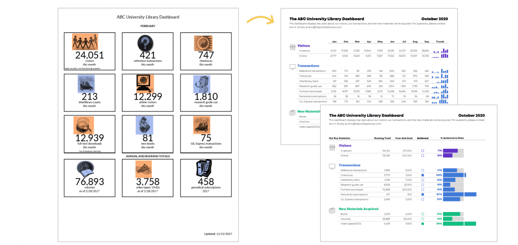
Which dashboard is correct?! Both of them!
Two dashboards, two different purposes.
I recommend designing several options for your viewers. Ask which one they prefer. Gathering feedback is one of the most important steps of the design process.

Bonus! Download the Spreadsheets
These are Microsoft Excel files, which are then distributed to viewers as static PDFs.
(I rarely make interactive dashboards with drop-down menus or checkboxes anymore. Leaders are busy and simply don’t have the time to explore interactive dashboards. I’ve found that the busier the audience, the more they prefer receiving a PDF’d one-pager.)
You can download my file and adapt the templates however you’d like for your own metrics and numbers.
Download the Excel File

Leave a Reply