How do we make our graphs more accessible?
There’s a misconception that accessibility takes all day, that’s it’s costly, or that it’s complicated. Those are all false.
Accessibility is woven into all my trainings, but since this is a topic I get asked about a lot, I decided to make a new talk that’s focused just on accessibility for dataviz.
In Spring 2021 I gave a talk at the Good Tech Fest conference about dataviz accessibility quick wins.
The talk was a “Choose Your Own Adventure” style where the audience chose what we discussed from a list of options. They chose:
- direct labels,
- lower the reading level, and
- lower the numeracy level.
You can watch the recording or read the highlights. Enjoy!
—–
Watch the Conversation
Here’s the main takeaway message: remove legends and directly label instead.
You probably know what a legend is, but direct labeling? What is that?
Let’s look at an example of a regular (inaccessible) graph.
Why Traditional Legends Don’t Work
When I saw this graph a few years ago, I actually liked most aspects of it.
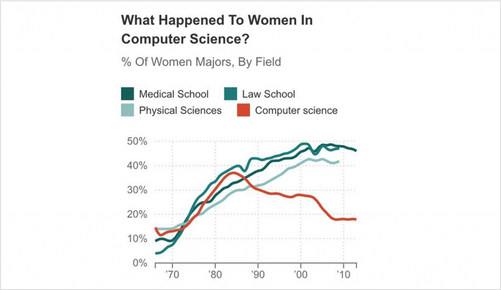
I really liked the title in particular, and how it was phrased as a question, which gets the audience to engage. Two thumbs up to the title, “What happened to women in computer science?”
Legends Take Too Long to Read
But then I kept reading a little bit and I was like, “Wait a second… Time out.”
In full color I could mostly tell which section of the legend corresponded with which line. The turquoise lines were tricky because it’s hard figure out which is dark, which is medium, and which is lightest. Your eyes zig–zag back and forth trying to differentiate between the three. It’s really time-consuming.
Legends Don’t Work for Grayscale Printing
So it works in color, kind of, but what about grayscale printing?
Some people will view our graphs on-screen. Others will print them.
And if they’re printing the graphs, we should plan for grayscale printing. Colored ink is so expensive.
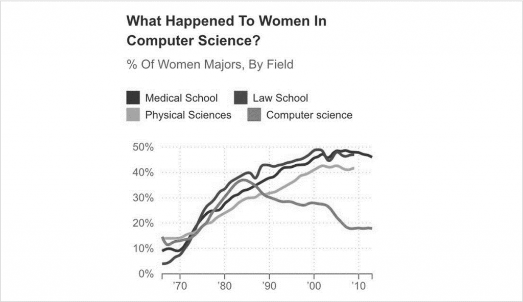
It doesn’t work at all.
Legends Don’t Work for People with Color Vision Deficiencies
What about color blindness?
If somebody has a color vision deficiency and can’t differentiate between red and green, the lines would all look yellow.
Traditional legends don’t work; they’re a thing of the past.
So what to do instead?
Directly Label the Graphs
We’re going to directly label our graphs.
What does that mean?
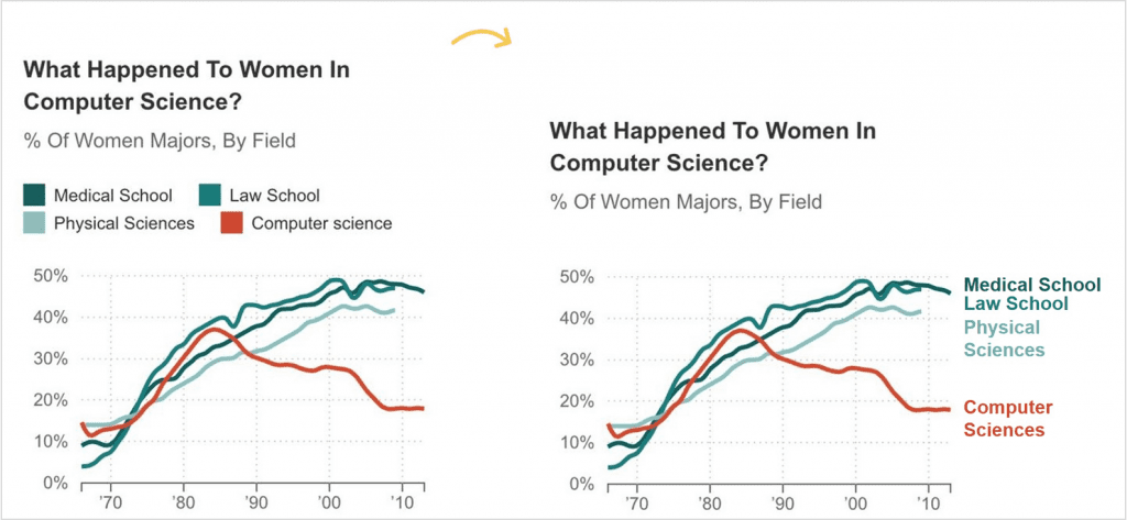
Direct labeling means you put the labels as close as physically possible to the data.
In this line chart, you’d just add the labels off to the side of the line.
Direct labels are:
- Faster for everyone to read (less eye zig-zagging)
- Grayscale-friendly
- Colorblind-friendly
A win-win-win!
Bonus points if you color-code the text to match the line it is labeling. (Red text for a red line, turquoise text for a turquoise line, and so on.)
How to Label Pie Charts
We’ve looked at line charts.
So, how do we label a pie chart?
Friendly reminder: Pie charts aren’t evil. They can be used as long as you follow the rule of two: you’re only allowed two slices in your pie. Maaaaybe three. The dark slice will be what you want the viewers to really look at, versus everything else in gray. Simple, right?
But we still need to directly label them, and it’s as easy as putting the labels as close as physically possible to their slices.
For example, if you have short labels, you can place the labels on top of the pie slices.
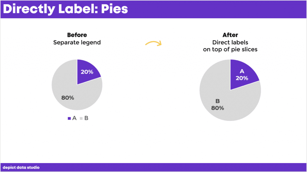
Now it’s speedier for people to read, it’s legible in grayscale, and it’s even legible for people with color vision deficiencies.
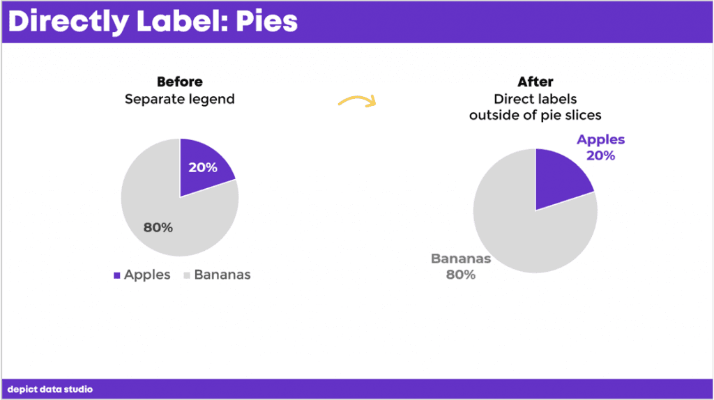
A question I get a lot is, “But if I have really long labels?” I know most of us aren’t comparing A to B.
If you have long labels, you can put your labels outside of the pie charts.
Bonus points again if you color-code the labels to the corresponding slices.
How to Label Donut Charts
Here’s another scenario for you with donuts. You’ve seen these, right? They’re just a pie chart with a hole punched in the middle.
They have the same rules as pie charts: two slices (max), with one dark slice versus everything else.
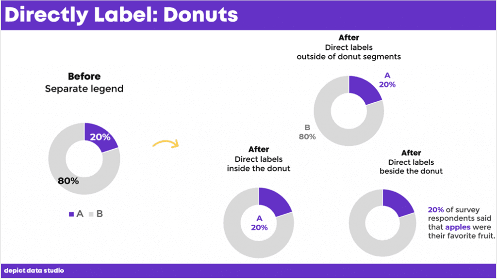
But, it’s really hard to fit any labels on top of donut segments. So how do you label these?
You have three options:
- Outside of the donut segments
- Inside the donut itself
- Beside the donut
How to Label Bar Charts
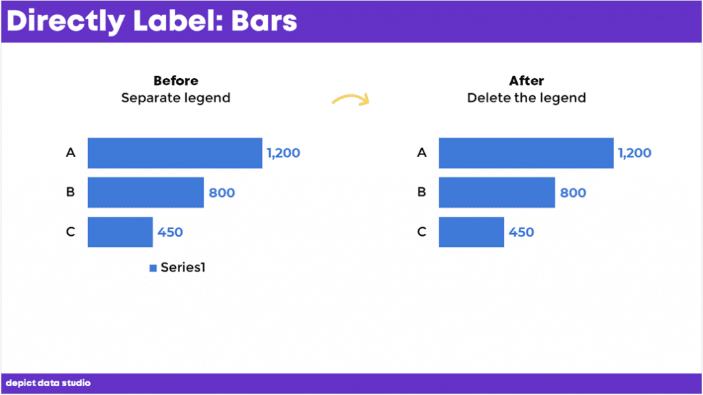
Have you ever seen this, where Excel gives a legend that reads something like ‘Series1’?
This is confusing for viewers. To fix it, all you need to do is delete the legend.
How to Label Clustered Bar Charts
If your bars are long enough, you can place the labels on top of the bars, like this.
No need to label every single bar. Teach the viewers how to read the chart by labeling the top bars. Then, let them read the rest on their own.
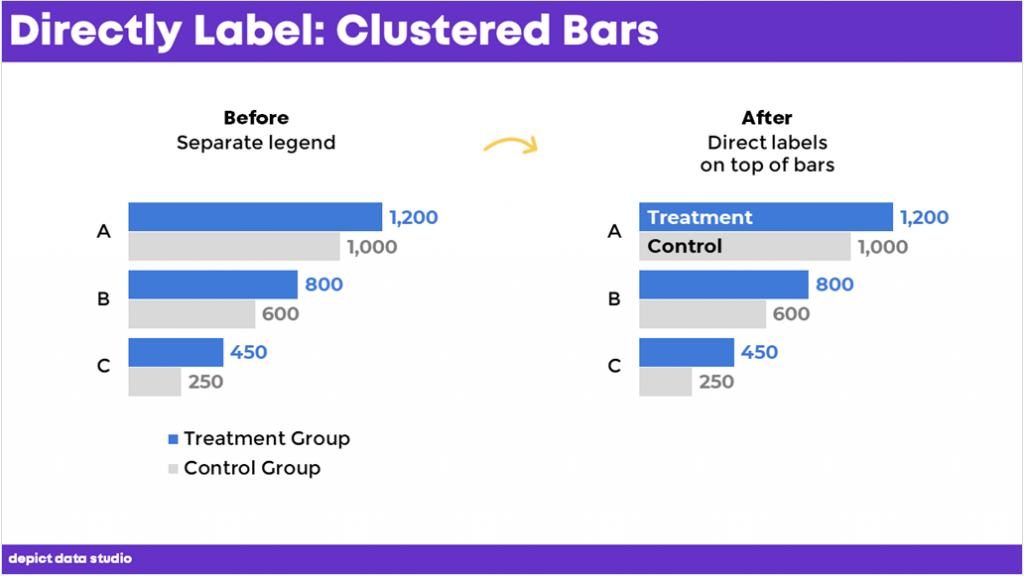
During the Good Test Fest talk, an audience member asked how I added those labels.
You can:
- Add text boxes on top of the bars (beware: clunky and time-consuming)
- Use fancier automation techniques (e.g., concatenating the words and numbers together, a technique from this course)
How to Label Clustered Column Charts
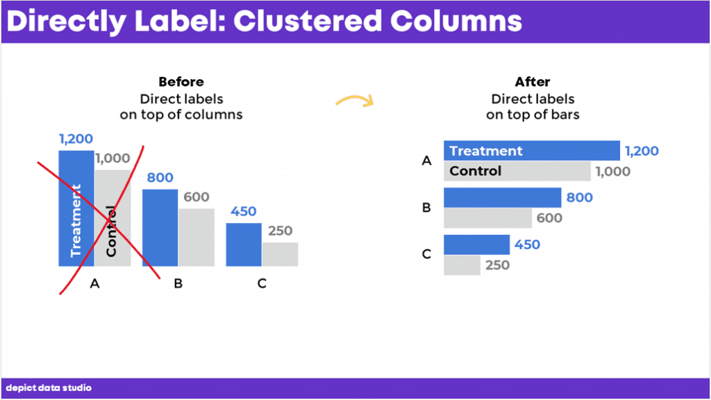
I’m not a fan of putting the labels on the columns. The labels would need to be rotated vertically, which takes longer to read than horizontal labels.
I typically use horizontal clustered bar charts to allow for horizontal labels, which are the fastest to read.
Download the eBook
Want to learn more about accessible data visualization?
In this ebook, you’ll learn 10 quick wins for designing accessible data visualizations. These small edits can have a big impact for our coworkers, board members, and funders who have color vision deficiencies, hearing loss, or learning disabilities–and for all of us who are pressed for time.
Download the EbookFor your complimentary copy, use code: goodtechfest


Leave a Reply