Leave a Reply

Your email address will not be published. Required fields are marked *

Optimist vs. Pessimist Maps

Last updated

Mar 31st, 2026

Related resources:

,

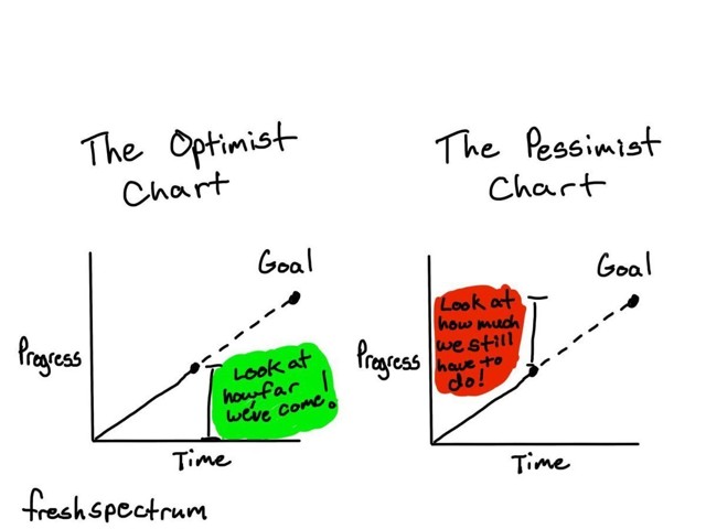
Years ago, my friend Chris Lysy made this cartoon about optimist and pessimist charts:

Last week, I applied the optimist vs. pessimist style to a map during Office Hours.

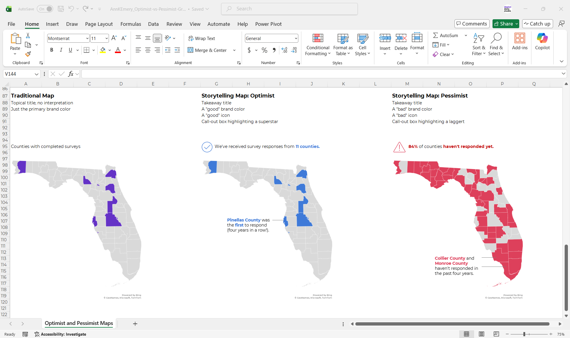
(The real version of the map was about a different topic in a different state, but you get the idea.)
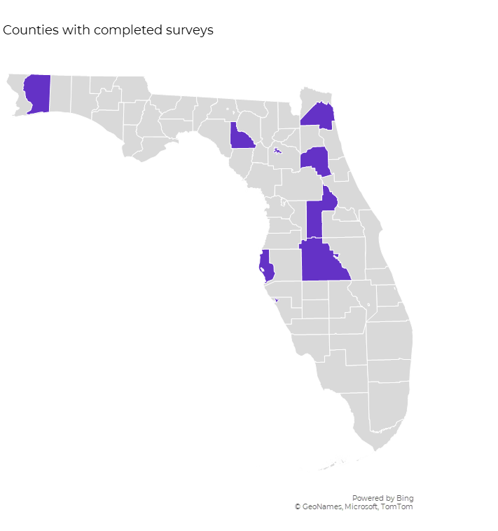
The Traditional Map

I’ve written about traditional and storytelling approaches before. You’re probably familiar with this terminology already?

The traditional version would have a topical title and regular ol’ brand colors.

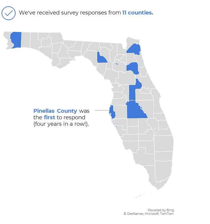
The Storytelling Map: Optimist Version

In this optimist version, we’ve got a:

  • “good” takeaway title;
  • “good” brand color;
  • “good” icon; and a
  • call-out box highlighting a superstar.

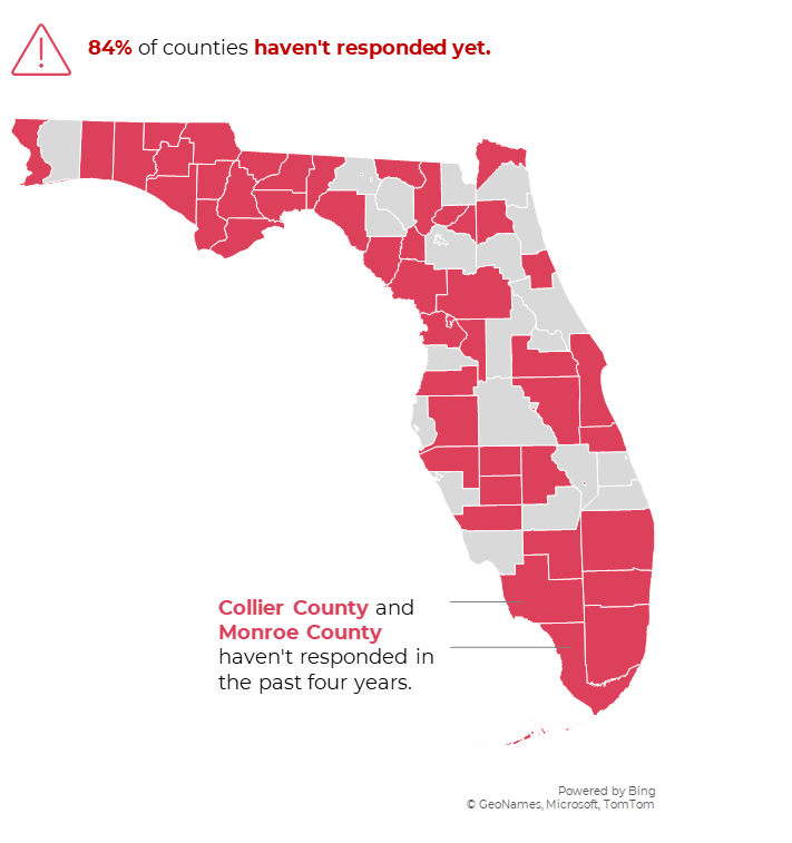
The Storytelling Map: Pessimist Version

In this pessimist version, we’ve got a:

  • “bad” takeaway title;
  • “bad” brand color;
  • “bad” icon; and a
  • call-out box highlighting a laggard.

Which Version Should You Use?

That obviously depends on your audience and context.

You’re welcome to comment here with your own insights. I read every response.

Download These Maps

Want the Excel file that I used to create these maps? You can download it here.

More about Ann K. Emery
Ann K. Emery is a sought-after speaker who is determined to get your data out of spreadsheets and into stakeholders’ hands. Each year, she leads more than 100 workshops, webinars, and keynotes for thousands of people around the globe. Her design consultancy also overhauls graphs, publications, and slideshows with the goal of making technical information easier to understand for non-technical audiences.

Leave a Reply

Your email address will not be published. Required fields are marked *

You Might Like

Our complimentary mini course for beginners to dataviz. Takes 45 minutes to complete.

Enroll

2 Common Dashboard Layouts: Filters at Top & Filters on Left Side

When I’m teaching Dashboard Design workshops, sometimes participants ask where they should place the filters. Here are two common layouts that I’ve used over and over: (1) the filters along the top and (2) the filters on the left side.

More »

Inside our flagship dataviz course, you’ll learn software-agnostic skills that can (and should!) be applied to every software program. You’ll customize graphs for your audience, go beyond bar charts, and use accessible colors and text.

Enroll

Spreadsheets to Stories
Weekly Newsletter

You’ll receive:
  • how-to tutorials about data management, analysis, visualization, and storytelling;
  • spreadsheets to download so you can try it yourself; and
  • the latest info about our online courses.

    Our weekly newsletter is shared with a community of 8,000 professionals.