


Earlier this year, I was invited back to speak at CreativePro’s Presentation Design Conference for a second time.
First, in this “Chart Smart” session, we learned about alternatives to overused charts like pies, bars, and spaghetti lines.
Then, we looked at before-after makeovers together.
Here’s one of the “before” graphs we looked at:
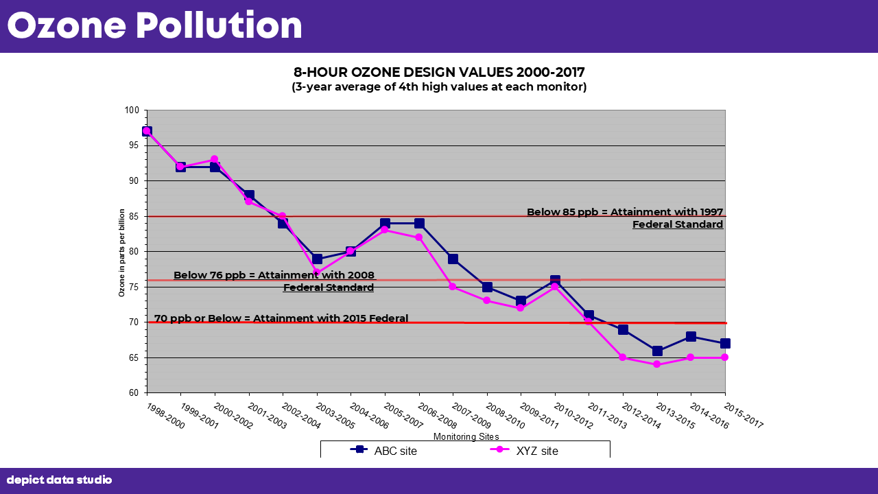
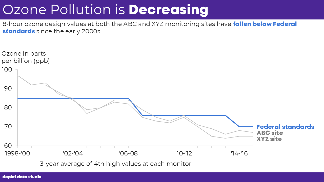
And here’s how we transformed it into the “after” graph, which is easier to read (thanks to the decluttering) and states the takeaway message (to remove guesswork).
Want the full copy of the slides?
You can purchase them here: https://depictdatastudio.kit.com/products/chartsmart
Leave a Reply