
Leave a Reply

Your email address will not be published. Required fields are marked *

Lonely Line Chart? Try Shading Under the Line

Last updated

Aug 24th, 2026

Related resources:

, , ,

On a recent consulting project, I was redesigning some graphs for an upcoming report.

We were showing patterns over time.

Pretty easy, right?

Let’s pretend your line chart has tons of lines. I’ve got plenty of resources about fixing spaghetti line charts.

But what if your line chart only shows a single variable??

A single line is so… lonely.

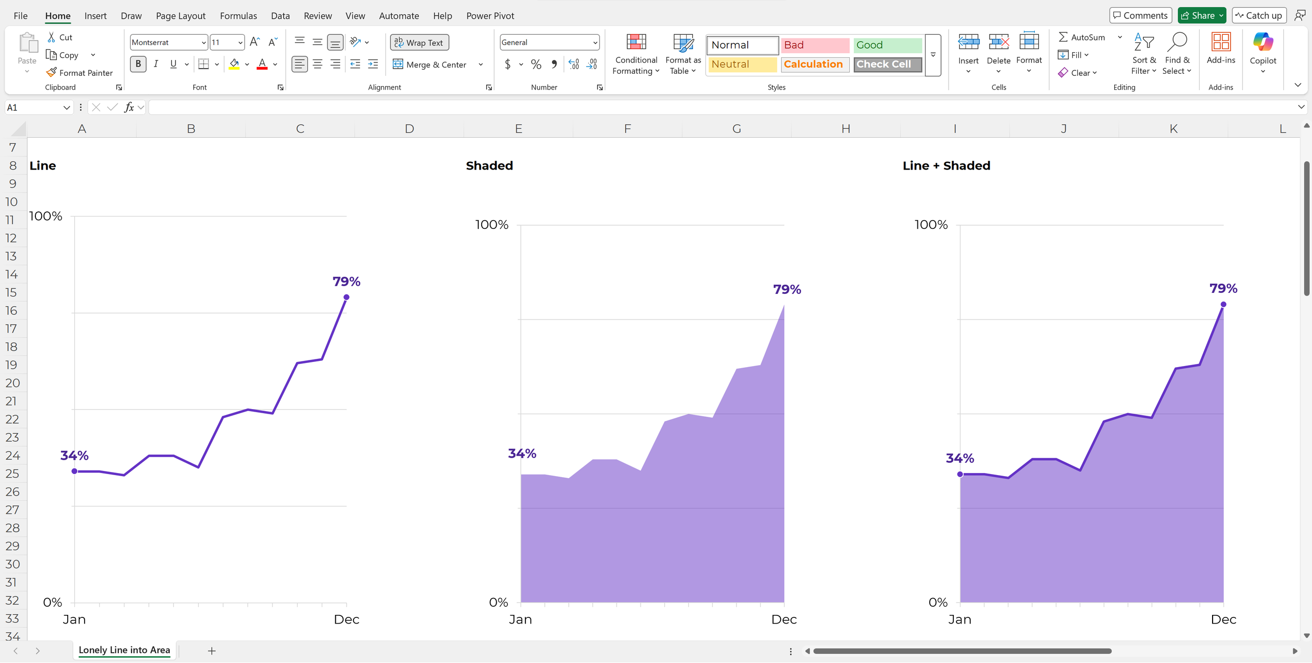
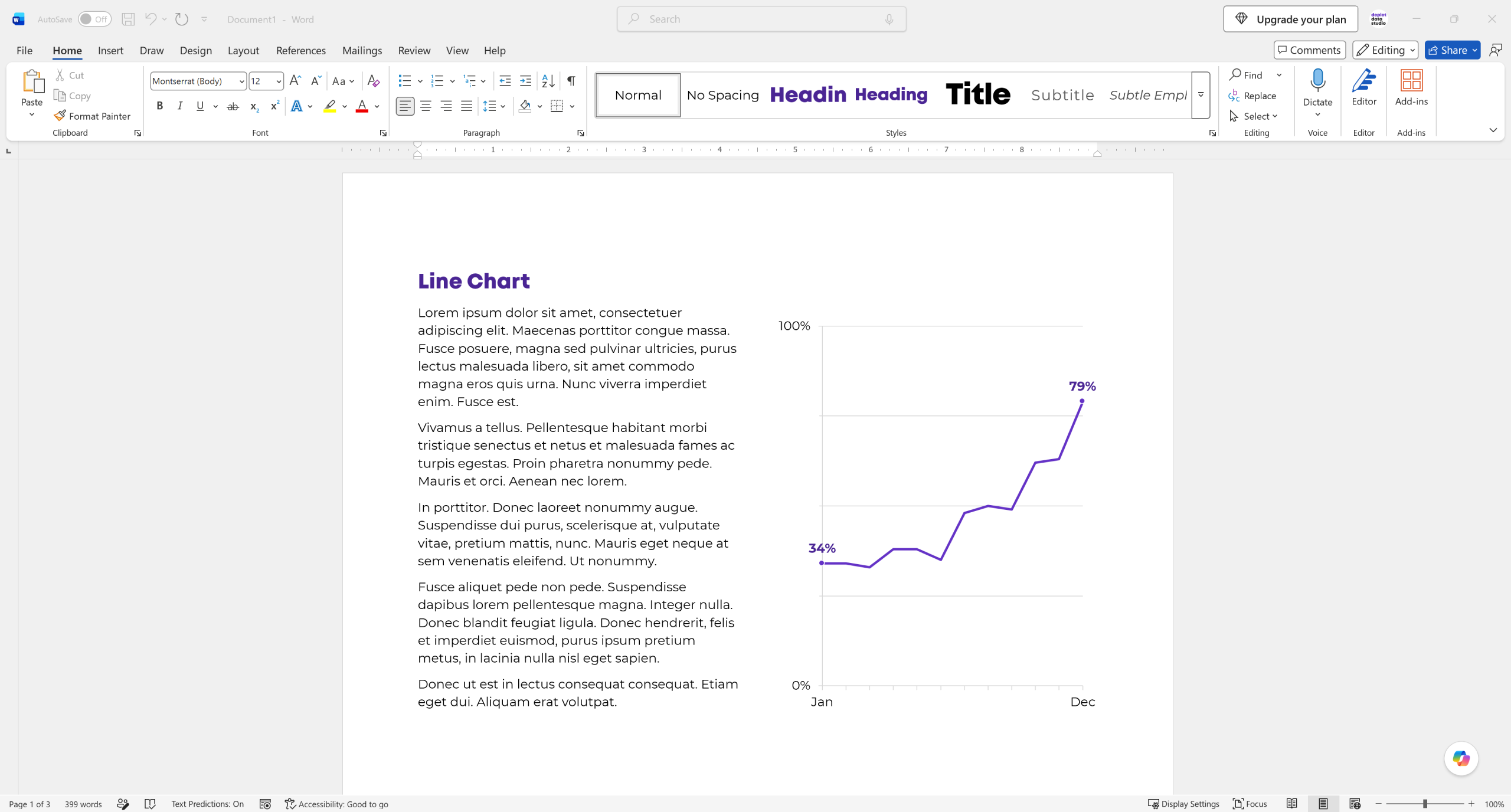
Before: Lonely Line Chart

There’s not much to look at.

It’s just a line.

Competing for attention with the gray grid lines.

Not terrible. But not great either.

(This report was for a lay audience, so we didn’t need to label all the percentages along the line. Those details belong in tables in the appendix. We purposefully labeled the first and last point – plenty of info for this audience – and kept the light gray grid lines so our readers could estimate the other values if they wanted to.)
Ann K. Emery, data storytelling instructor, shows you how to transform data visualizations.

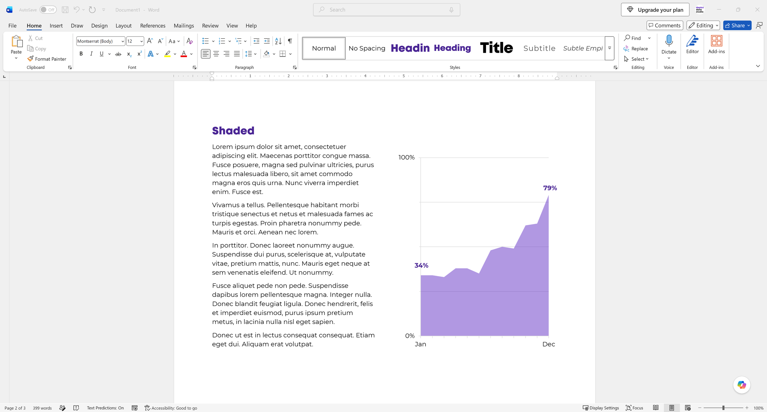
After: Shading Under the Line

Whenever I have a single line, I add shading underneath it.

(Behind the scenes in Excel, this is called an “area chart.”)

Now, there’s more to look at.

(In technical terms, the shading gives us more preattentive attributes. The line isn’t competing with the grid lines for attention anymore; there’s more color to see.)

I used a 50% transparency, not a solid fill, so that readers can still see the grid lines peeking through.
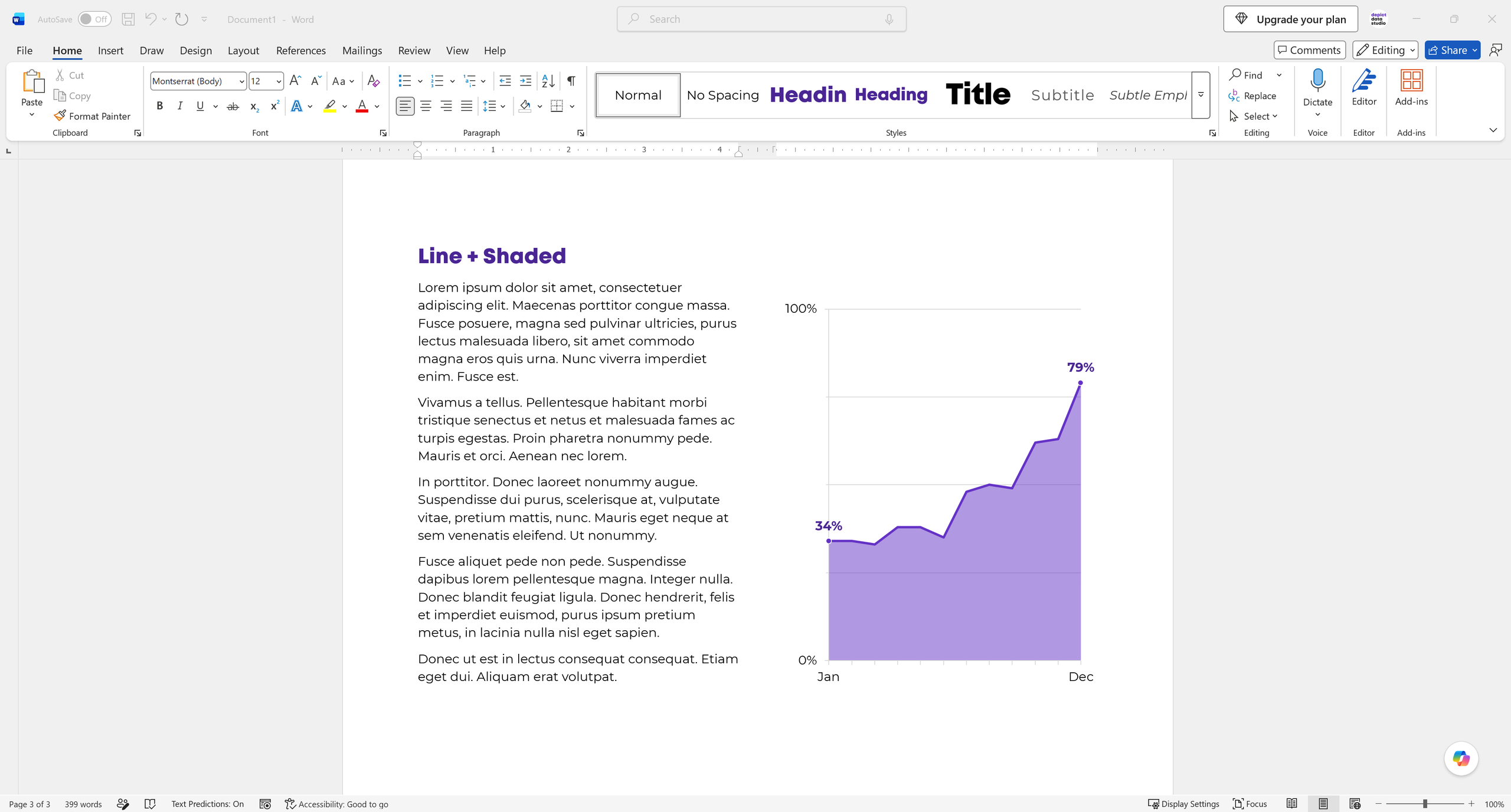
Ann’s Favorite: Line + Shading Together

My personal fav is combining the line and shading together.

(Behind the scenes in Excel, this is called a “combo chart.”)
All 3 Options Together

What do you think?? Comment and let me know.
Download My Excel File

Want to explore how I made these charts?

It’s available for free here.

More about Ann K. Emery
Ann K. Emery is a sought-after speaker who is determined to get your data out of spreadsheets and into stakeholders’ hands. Each year, she leads more than 100 workshops, webinars, and keynotes for thousands of people around the globe. Her design consultancy also overhauls graphs, publications, and slideshows with the goal of making technical information easier to understand for non-technical audiences.

Leave a Reply

Your email address will not be published. Required fields are marked *

You Might Like

Our complimentary mini course for beginners to dataviz. Takes 45 minutes to complete.

Enroll

“Higher is Better” vs. “Lower is Better” Clarifications on Graphs

Sometimes, higher numbers are better. And other times, lower numbers are better. Here’s how you can add icons and text boxes to graphs to remove that guesswork for your colleagues.

More »

Inside our flagship dataviz course, you’ll learn software-agnostic skills that can (and should!) be applied to every software program. You’ll customize graphs for your audience, go beyond bar charts, and use accessible colors and text.

Enroll

Spreadsheets to Stories
Weekly Newsletter

You’ll receive:
  • how-to tutorials about data management, analysis, visualization, and storytelling;
  • spreadsheets to download so you can try it yourself; and
  • the latest info about our online courses.

    Our weekly newsletter is shared with a community of 8,000 professionals.