I was recently working with an organization to improve their graphs for an upcoming conference presentation.
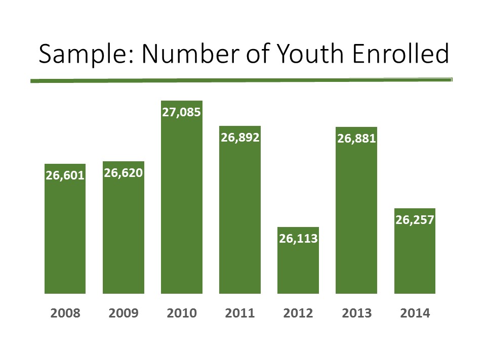
Notice anything funny about the height of these bars?
The shortest bar, for 2012, represents 26,000 youth. But the tallest bar, for 2010, represents 27,000 youth. 26,000 and 27,000 are pretty similar numbers, yet they look reeaaaallllly different. The 26,000 seemed way too short compared to the 27,000.
This graph’s vertical y-axis doesn’t start at zero, so the differences between bar heights are exaggerated.

It’s okay to have a non-zero y-axis. But, it must be labeled.
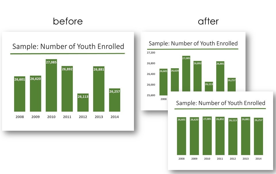
In the after version, I added labels for 25,600, 26,000, 26,400, and so on.
We don’t want to mislead our viewers. We have to be clear that we’ve intentionally truncated that y-axis so that we could zoom in on that segment between 26,000 and 27,000.
Or, another option is to adjust your vertical y-axis so that it starts at zero.
Then, you wouldn’t need to have any axis labels off to the left of your graph.
The tradeoff is that, now, the bars are all roughly the same height… which might be okay, depending on what you want to emphasize. Maybe you’re trying to show that a consistent number of youth were enrolled in the study sample each year. In that case, starting the y-axis at zero would help you out.

Let’s look at those two “after” versions once more.
Option A, on the top right: If you’re going to start your y-axis at something other than zero, then you need to add axis labels.
Option B, on the bottom right: You can start your axis at zero and forego having any labels.
How have you handled truncated y-axes in your projects?
3 Comments
I would say that your options are great rules, but would disagree with your visual metaphor of a bar chart.
Bar charts inherently use length to visualize the measure of the data. If you truncate the length at all, the visual metaphor disappears all together, regardless of whether or not the axis is labeled.
A better visual metaphor in this case (and I would say of any case in which the axis is truncated) would be a trend line chart. The data in the case are already over time, making it the more appropriate choice from the start. Then, if you need to truncate the axis to make the change in the data more clear, you don’t lose the meaning of the visual metaphor, like in the case with the bar chart.
In line charts that are truncated, I like to not only indicate the scale with labels, but also distinguish the baseline with weight. For example, if I normally make the baseline a solid, 1pt line and the grid lines 0.5pt dotted line, I would also code the “baseline” in a truncated chart the in the same way as I would the rest of the grid lines. I’ve found this has helped people more readily notice that the baseline is not really a baseline, but a truncated y-axis.
I totally agree with Jessica here. Please don’t truncate the y-axis when using bar charts. Plot a line chart instead.
Wouldn’t this be a case for possibly not even using a bar chart and just stating the there was virtually no variation in youth enrollment from 2008-2014? (the coefficient of variation for this data set is ~1.3%). Unless there is some threshold # (i.e. 26,500) that the data “needs” to be at (which you could then draw a line at as a performance indicator regardless of the y-axis), this may be a talking point sentence vs a chart.