Leave a Reply

Your email address will not be published. Required fields are marked *

Bubble Charts (An Alternative to Bars)

Last updated

Mar 18th, 2026

Related resources:

,
Ann K. Emery, data visualization and data storytelling

Instead of boring bar charts…

…why not try bubble charts?

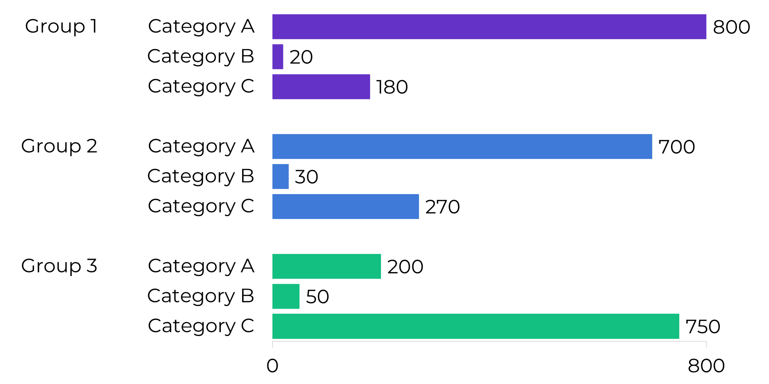
Bar charts depict data with length.

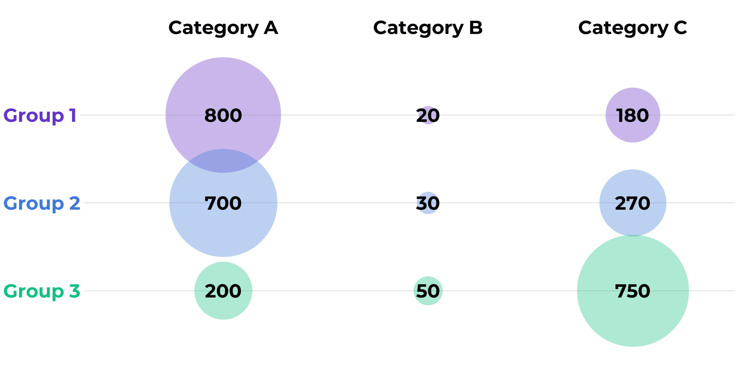
Bubble charts depict data with area.

If you want to try bubble charts, you can make them in good ol’ Excel with this tutorial.

More about Ann K. Emery
Ann K. Emery is a sought-after speaker who is determined to get your data out of spreadsheets and into stakeholders’ hands. Each year, she leads more than 100 workshops, webinars, and keynotes for thousands of people around the globe. Her design consultancy also overhauls graphs, publications, and slideshows with the goal of making technical information easier to understand for non-technical audiences.

Leave a Reply

Your email address will not be published. Required fields are marked *

You Might Like

Our complimentary mini course for beginners to dataviz. Takes 45 minutes to complete.

Enroll

How to Make a Bubble Chart in Microsoft Excel

Here’s a step-by-step guide to making circle charts (or “bubble” charts) in Microsoft Excel. You’ll learn how to use x, y, and z values to control the location and size of your circles.

More »

Inside our flagship dataviz course, you’ll learn software-agnostic skills that can (and should!) be applied to every software program. You’ll customize graphs for your audience, go beyond bar charts, and use accessible colors and text.

Enroll

Spreadsheets to Stories
Weekly Newsletter

You’ll receive:
  • how-to tutorials about data management, analysis, visualization, and storytelling;
  • spreadsheets to download so you can try it yourself; and
  • the latest info about our online courses.

    Our weekly newsletter is shared with a community of 8,000 professionals.