Colors can make or break a chart.
Colors direct our eye movements, and therefore our brains and attention.
It’s up to you: will you help or hinder your reader’s understanding?
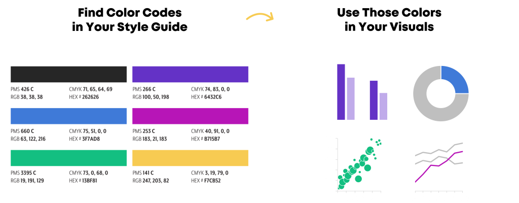
Step 1: Start with Your Brand Colors
Otherwise, your graphs, slides, and dashboards will be Frankensteined.
I’ve written about brand colors and brand presents in other posts.
Some of those resources include:
Step 2: Do Your Accessibility Testing
I’ve written about colorblindness, color contrast, grayscale printing in other posts.
Some of those resources include:
Then, your accessibility testing “results” should go inside your organization’s Dataviz Style Guide.
Step 3: Apply Those Brand Colors According to the Data & Variables
Now, it’s time to apply those branding colors to ensure that your graph is intuitive.
Look at your graph: Is your variable binary, sequential, diverging, or categorical?
Or, do you want to tell a story with a dark-light contrast?
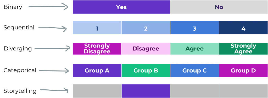
Binary Variables Get Binary Color Schemes
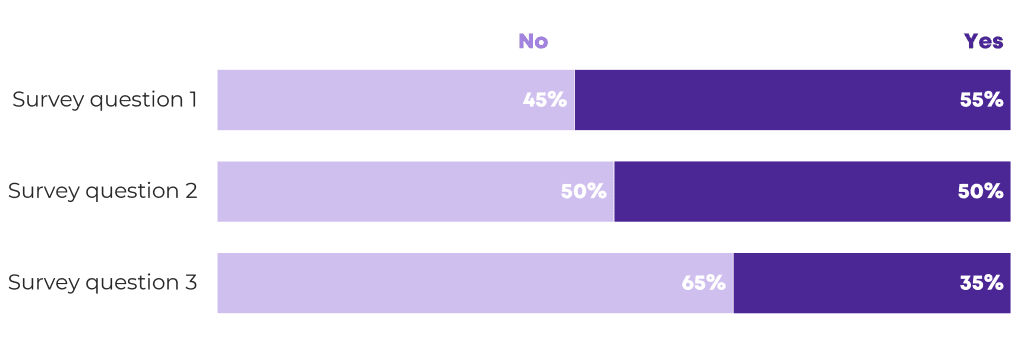
Binary variables include yes/no data, such as:
- yes/no survey questions
- people who speak Portuguese as their primary language vs. people who don’t
- people who own a home vs. people who don’t
- people who graduated from program on time vs. people who didn’t
- people diagnosed with an illness vs. people who don’t have it
For binary variables, choose one brand color. The “presence” of the attribute gets the darker color, and the “absence” of the attribute gets the lighter color.
Here’s an example:
Sequential Variables Get Sequential Color Schemes
a.k.a. ordinal
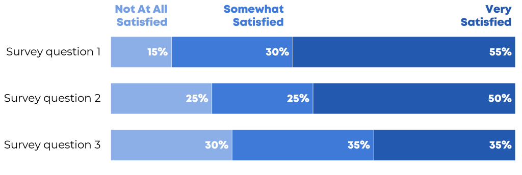
Sequential variables have a natural order.
Examples include:
- age ranges (5-9 year olds, 10-14 year olds, and 15-19 year olds)
- income levels
- highest educational level completed (some high school, high school diploma, some college, etc.)
- years (Year 1, Year 2, and Year 3 of a project)
- semesters (fall, spring, fall, spring…)
- cohorts (first cohort of participants, second cohort, etc.)
For sequential variables, choose one brand color, and use a light-dark gradation of that color.
Here’s an example:
Categorical Variables Get Categorical Color Schemes
a.k.a. nominal
Categorical variables include:
- race/ethnicity (African American, Asian, Hispanic/Latin@, White, etc.)
- gender (male, female, nonbinary, genderfluid, etc.)
- chapters of a report
- sections of a presentation
- categories of a dashboard
For categorical variables, use a different brand color for each category.
Here’s an example:

Diverging Variables Get Diverging Color Schemes
Diverging variables are opposites.
Examples include:
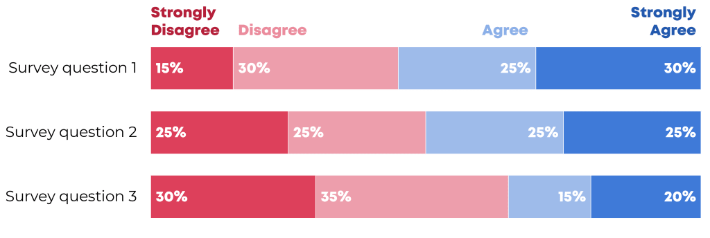
- agree/disagree scales on surveys
- changes over time (e.g., “50 percent decrease” or “70 percent increase”)
For diverging variables, choose two brand colors, and place the darkest shades on the poles.
Here’s an example:
Combining these Techniques
In most real-life projects, we need to combine these color techniques.
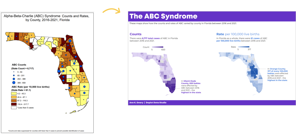
In this map makeover, for example, we needed to:
- use brand colors, not software defaults;
- use two brand colors, one for each category; and
- apply a dark-light gradation to each map, because these are ordinal variables.
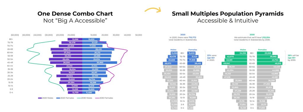
In this population pyramid makeover, we needed to:
- use two brand colors, one for each timeframe, and
- apply a dark-light storytelling emphasis to each pyramid.
Your Turn
What types of color questions do you have? Comment below..


21 Comments
I wish I was a little more daring when it comes to color.
I recently tried the color difference for emphasis for categorical data, and I’ve tried highlighting the outside of the bars a different color for emphasis.
Thanks so much for all the tips!
Karen
Karen,
I’d love to see examples of some of your charts. Do you have any anonymized charts that you can share?
Ann
Really good post. What I really like is the simplicity. This is easy to implement and the result is huge.
Thanks Oz! There are dozens, perhaps hundreds, of more comprehensive resources about color theory as it applies to data visualization. I tried to select a few of the easiest-to-implement tips that get us the biggest bang for our buck. Let me know if you apply any of the strategies and how they work out.
[…] Nominal, Sequential, or Diverging? Simple Strategies for Improving Any Chart’s Colors […]
Awesome post, Ann! This is very relevant to our work right now. We are publishing a series of briefs (starting in Word or Excel and then finalizing in InDesign). Do you know of any good tutorials on how to create a custom color template – and save it – in Microsoft products or InDesign?
Went right over to graphic design and got our company’s color palette. Any ideas for how to incorporate in “line graphs”?
Fernando,
Great! I’d love to see some of your makeover charts — maybe you could tweet me an image when you’re done?
For examples of using color effectively in line charts, check out Cole Nussbaumer’s blog: http://www.storytellingwithdata.com/ She often uses 1 or 2 colors (gray and blue) and adds just the right amount of contextual details (and in the right places, physically, on each graph) to give the reader the perfect amount of information about each pattern.
Ann
Excellent post Ann! I’m thrilled to have just discovered my DigitalColor Meter on my Macbook Pro and have been having a wonderful time matching fonts and slide backgrounds to pictures I’ve chosen. You just mouse over anywhere and it give you RGB codes for each pixel! Who knew? Why ever didn’t I realize it was there before???
Sheila, What a useful built-in feature! My PC’s Microsoft Office 2013 products (like Excel, Word, & PowerPoint) also have a built-in color matching tool. These small features sure can save a lot of clicks (and therefore time and sanity!) I only have Office 2013 on one of the three computers I use, so in the meantime the Instant Eyedropper download continues to be my primary go-to color matching resource.
Hey Ann! I often default to Stephen Few’s color palettes from his book Show Me the Numbers. Another tool similar to Eye Dropper is Color Cop – so handy!
Love your example of divergent colors – good reminder to use color to my advantage when I’m working with this type of data!
[…] week I shared strategies for improving any chart’s colors. One of the examples was a diverging stacked bar […]
Hi Ann,
I’ve been using company logo colors (and the eyedropper tools) for years as inspiration for my dashboard reports. I like how you’ve taken it a step further and found similar colors using design-seed.com.
Cheers,
Mynda.
[…] bold tone them down to pastel shades. Ann Emery has some great tips on the use of colour in her ‘Simple Strategies for Improving Any Chart’s Colors’ […]
[…] week I shared strategies for improving any chart’s colors. One of the examples was a diverging stacked bar […]
[…] For additional color resources, check out Nominal, Sequential, or Diverging: Simple Strategies for Improving Any Chart’s Colors. […]
This is exactly what I need! I often see graphs in our reports that have some very strange/distracting/meaningless colour palettes, but just have no idea how I should fix it. Thank you 🙂
[…] Whether your viewers will really understand that diverging stacked bar chart, or whether you should just stick to a regular old stacked bar […]
[…] very knowledgeable to not at all knowledgeable scale is ordinal so I selected one hue (blue, or green, or orange) and used darker and lighter versions of each hue to correspond to the […]
[…] you’ll need to determine whether you want to add a categorical, sequential, or diverging palette. I’ll show you categorical. You can add the others as needed using the same […]
[…] Agree/disagree survey scales are diverging variables so we need a diverging color palette. I selected two hues (blue and red). The most saturated version of each color goes on the outer poles. The only problem with this traditional approach is that the graph is a bit crowded. Where are the viewers supposed to look? What’s most important? When everything all at once is competing for attention, it’s easy to lose viewers. […]