9 Comments

  • Kathleen Lynch says:

    I LOVE your idea of using a table to line up your text and your graphs. So simple and yet so brilliant!

  • […] et consultantes en visualisation de données basées aux Etats-Unis. (Blog de Ann K. Emery: annkemery.com Site de Stéphanie Evergreen : […]

  • Hi there! Super interested in this checklist!
    Has this been published anywhere?
    How did you develop it?

  • Leave a Reply

    Your email address will not be published. Required fields are marked *

    Back in 2014, we launched the Data Visualization Checklist. Today, we bring you the updated version!

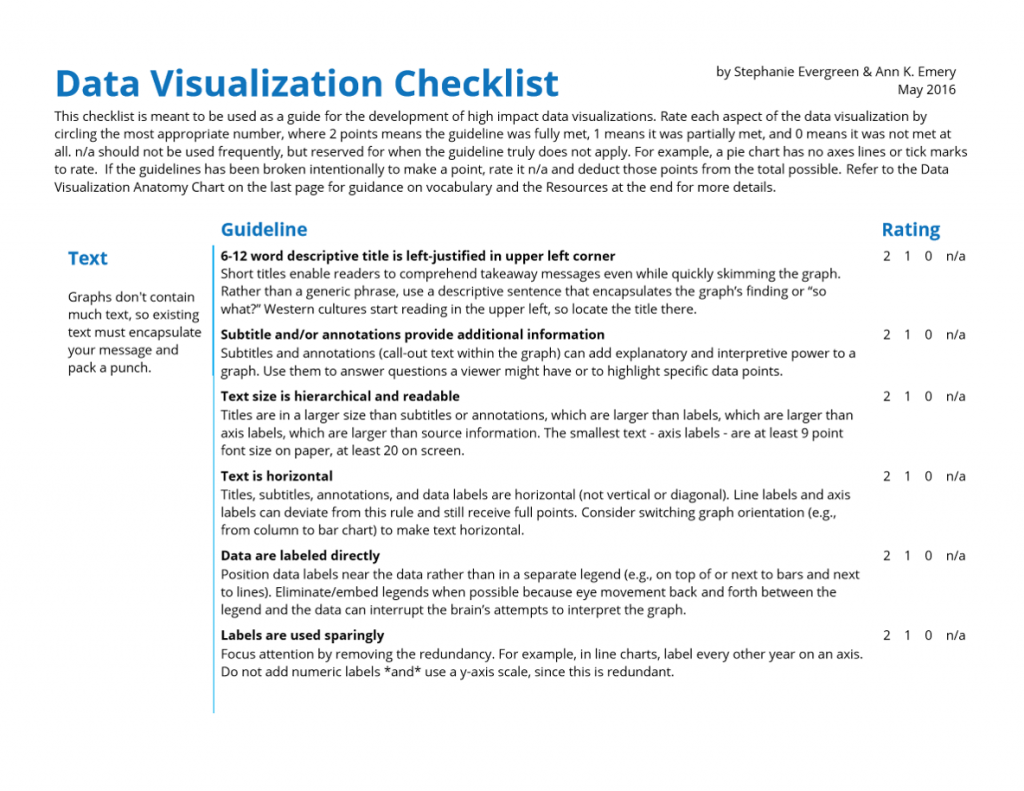
    Stephanie Evergreen and I designed the Data Visualization Checklist in 2014 and updated it in 2016. You can use the checklist to help you assess your drafts.


    Download the Data Visualization Checklist (Free)

    What’s Included in the Updated Data Visualization Checklist?

    Stephanie and I tweaked five items:

    • Text size is hierarchical and readable
    • Labels are used sparingly
    • Proportions are accurate
    • Axes do not have unnecessary tick marks or axis lines
    • Graph has appropriate level of precision

    And I’m sure we’ll tweak more in the future. The field’s evolving and we’re learning more about the building blocks of good graphs all the time.

    What’s Not Included?

    The Data Visualization Checklist contains the foundational techniques needed for clear, effective graphs. But it can’t cover every single nuance under the sun. That’s what workshops, webinars, custom consulting projects, and blogs posts are for–to explain the strategies that’ll reallllly take your graphs from good to great, to explain when it’s okay to break these “rules,” and to explain how to customize these guidelines for your viewers.

    Here’s a technique that is so insanely useful but so nuanced that it just can’t fit into a three-page checklist: adapting your graphs for your dissemination format. 

    Are you giving a formal presentation with slides and a projector? Are you giving an informal presentation with a handout to accompany your talking points? Is your graph going into a report?

    You’ll need to adjust your graph’s font sizes, layout, and amount and type of explanatory text to fit each of your dissemination formats.

    In my previous post, I demonstrated how to remove double y axes, in which we’ve got total grants awarded (dollars) on the left and the number of projects that were funded (a tally of projects) on the right.

    Here’s the original, which I’ve always found onerous to interpret because two lines with two different units are overlaid on top of each other. This layout doesn’t give the viewer any clues as to which section of the graph should be read first.
    Line chart with double y axis.
    In my remake, I arranged the graphs in the order in which I want my viewers to read them: the total grant dollars given out, followed by the number of projects that were supported, with space for a third variable, the average grant size.
    Three line charts side by side that give viewers all the information they need and answers any questions they may have.
    What would the final final version of this graph look like? It depends on my dissemination format.

    A handout to accompany an informal presentation

    The handout would probably look exactly like my remake above.

    I tend to include lots of subtitles and explanatory text in handouts so that meeting attendees can use the handout as a reference later on, even when I’m not in the room to talk through it with them.

    I usually design my handouts in PowerPoint so that I have a nice, large screen to use. Then, I print full-page “slides” to bring to the meeting, and might even save the slide as a PDF so it can be emailed to folks later on.

    A series of slides to accompany a formal presentation

    When I present slides on a projector screen, I use storyboarding to make my slides look like they’re animated. I plan how I’m going to explain the graphs, and then make each section appear to coincide with my speaking points.

    For the first slide, I might say: “And next on the agenda, we’re going to talk about the grants we gave out between 2008 and 2016.”

    For the second slide: “First, I looked at the amount of grant funding we gave out.”

    For the third slide: “Look at the graph. There are little ups and downs, but we generally awarded the same ballpark figure each year.”

    For the fourth slide: “The next item I looked at was the number of different projects that we supported. That number has actually been going down over the past eight years. This is on purpose–remember our plan to build stronger ties with a smaller number of grantees and a smaller number of projects?”

    For the fifth slide: “And finally, I looked at the average project size. Since we’ve given out roughly the same amount of money, but for a smaller pool of projects, this means our average project size is going up.”

    Storyboarding is easy. I design my final (fifth) slide first. Then, I copy and paste the fifth slide to create the fourth slide, and delete something (or cover up a portion of the slide with a big white rectangle). Then, I copy and paste the fourth slide to create the third slide, and delete something. And so on. It tends to be easier to work backwards than forwards.Example of storyboarding for a presentation.
     

    For a report

    Slides are short and fat, but reports are tall and skinny. (Or, landscape vs. portrait.) Slides have large font size, but reports have small font size.lides have less text, but reports have more text. (Are you getting the picture? You can’t use the exact same graph in both a slide and in a report. Well, sometimes. But rarely.)

    For a report, I would rearrange the graphs so that go from top-to-bottom rather than left-to-right. I take advantage of my tall, skinny document and use my real estate accordingly. I often place the titles and subtitles off to the left of each graph.

    Example of formatting charts for a report.

    Have you noticed how it’s SO HARD to get text and images to align correctly in a document?? What a waste of time to spend hours dragging text boxes, paragraphs, and images around. Here’s my secret: I paste my graphs into a table. I type the titles and subtitles in the cells on the left, and then paste the accompanying graphs in the cells on the right. When I’m finished, I swap the black table borders for white/transparent borders. Your viewer gets a crisp, organized page layout and has no idea that your sentences and images are actually hiding within a table.

    Example of pasting charts into a table to ensure correct formatting.

    Bonus: Download the Data Visualization Checklist

    The revised Data Visualization Checklist is your framework for best practices. Stephanie and I included the core techniques in a single document so that you’ll have all the strategies in one central place. It’s your job to customize these techniques for your viewer and your dissemination format. Add, delete, reformat, and recycle for your handouts, slideshows, and reports.

    Download the Data Visualization Checklist (Free)

    More about Ann K. Emery
    Ann K. Emery is a sought-after speaker who is determined to get your data out of spreadsheets and into stakeholders’ hands. Each year, she leads more than 100 workshops, webinars, and keynotes for thousands of people around the globe. Her design consultancy also overhauls graphs, publications, and slideshows with the goal of making technical information easier to understand for non-technical audiences.

    9 Comments

  • Kathleen Lynch says:

    I LOVE your idea of using a table to line up your text and your graphs. So simple and yet so brilliant!

  • […] et consultantes en visualisation de données basées aux Etats-Unis. (Blog de Ann K. Emery: annkemery.com Site de Stéphanie Evergreen : […]

  • Hi there! Super interested in this checklist!
    Has this been published anywhere?
    How did you develop it?

  • Leave a Reply

    Your email address will not be published. Required fields are marked *

    You Might Like

    Our complimentary mini course for beginners to dataviz. Takes 45 minutes to complete.

    Enroll

    Your Dataviz Icons: Too Big and Too Dark?

    If your boss doesn’t like your icons… they’re probably too big and too dark. Just like all your graphs, maps, and diagrams, your icons deserve some TLC, too. Icons can get cartoonish or steal the show if they’re not formatted well.

    More »

    Inside our flagship dataviz course, you’ll learn software-agnostic skills that can (and should!) be applied to every software program. You’ll customize graphs for your audience, go beyond bar charts, and use accessible colors and text.

    Enroll

    Subscribe

    Not another fluffy newsletter. Get actionable tips, videos and strategies from Ann in your inbox.