13 Comments

  • I think the challenge is beyond my skill set, but what a great, innovative post! Are you able to say what program was used to create the original charts? I would love to see more of what Excel can do that most of us might not be aware of.

    • Ann K. Emery says:

      Sheila, Your skillset might be closer than you think… I’m confident that you’ll be able to create these charts in the near future!
      To create the original chart, our team sketched out what we wanted the chart to look like on paper first. Then we sent our designs to the graphic designer, and I believe she used an Adobe program (?) to turn our sketches into an electronic report. However, now that we’ve figured out how to create a variety of charts in Excel, it’s likely that we’d send her the sketches in Excel the next time around. Stay tuned!

  • Elena H says:

    That is very cool, but how did you do it?? I am so often told that you “can” do these things in Excel, but I certainly don’t know how. Can you post a key at the end of this challenge? I would love to learn.

    • Ann K. Emery says:

      Elena, Thanks for your interest! I’m glad that you’re excited to learn. I’ll post the solution in two weeks, on March 12, 2013. I plan to share the actual Excel file so you can see how I arranged the data and how I fooled Excel into creating this chart.
      If you’d like to try it yourself, here’s a hint: I made a bubble chart in Excel. Try googling “how to make a bubble chart in Excel” to learn the basic structure of what I made.

  • What a fun idea! Just to clarify: you are asking us to re-create the same visualization that you re-created? Or another one from the report? Thanks!

    • Ann K. Emery says:

      Anna, Good question. Yep, I’m challenging you to re-create the same visualization from page 7 of the State of Evaluation report. I’m not super picky about the formatting. You’ll notice the colors I used didn’t match the report exactly. The goal is simply to challenge your brain to use Excel is new ways (and, hopefully, have some fun in the meantime!)

  • Karen says:

    I’m going to give it a shot Ann! Thanks for giving us a push to try it on our own 🙂
    -Karen Anderson

  • […] Two weeks ago, I challenged readers to reproduce a bubble chart from Innovation Network’s State of Evaluation 2012 report — using only Microsoft Excel or R. You can read the full blog post here. […]

  • […] More data visualization challenges […]

  • […] first dataviz challenge was a hit! A few of you wanted to participate but weren’t ready to jump into a challenge that […]

  • […] to everyone who participated in the first and second dataviz challenges! I hope these challenges give you a chance to practice and build upon […]

  • […] Two weeks ago, I challenged readers to reproduce a circle chart from Innovation Network’s State of Evaluation 2012 report — using only Microsoft Excel or R. You can read the full blog post here. […]

  • […] first dataviz challenge was a hit! A few of you wanted to participate but weren’t ready to jump into a challenge that […]

  • Leave a Reply to Blog-o-versary! | Emery Evaluation Cancel reply

    Your email address will not be published. Required fields are marked *

    Dataviz Challenge #1: Can You Make a Bubble Chart in Excel?

    Updated on: Feb 26th, 2013
    Data Visualization in Excel
    , ,
    Two circle charts made in Excel.

    In case you haven’t noticed, I’m a huge fan of Microsoft Excel (click here if you don’t believe me). I love Excel because it’s nearly free and can accomplish 99% of my data analysis tasks.

    Sometimes evaluators are hesitant to use Excel. One misconception is that Excel is only good for 3-D exploding pie charts, boring bar charts, and random radar charts. But Excel can do more than you think!
    Innovation Network recently published State of Evaluation 2012: Evaluation Practice and Capacity in the Nonprofit Sector. Click here to download the report. I loved the visualizations in the report and wondered if I could re-create them in Excel.

    Here’s a screenshot from page 7 of State of Evaluation 2012. The visualization shows the percentage of small, medium, and large nonprofit organizations that used quantitative and qualitative evaluation practices. Quantitative practices were more common than qualitative practices, and medium and large organizations were more likely to use these practices than smaller organizations.

    Side by side circle charts.

    And here’s what I made with a little Excel elbow grease:

    Side by side circle charts.

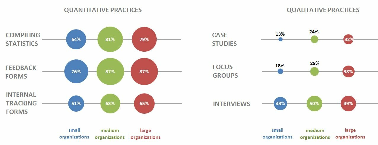
    The formatting’s not identical, but that’s not the point. Did you realize that you can manipulate Excel to produce almost anything you want?

    I challenge you to re-create this State of Evaluation chart in Excel or R — no expensive software allowed. Email me your submission or tweet an image to @annkemery. I’ll post the solution on March 12, 2013.

    What do you get for playing? A coffee or beer together, my treat, the next time you’re in DC; a workout for your brain; and bragging rights. Game on!

    More about Ann K. Emery
    Ann K. Emery is a sought-after speaker who is determined to get your data out of spreadsheets and into stakeholders’ hands. Each year, she leads more than 100 workshops, webinars, and keynotes for thousands of people around the globe. Her design consultancy also overhauls graphs, publications, and slideshows with the goal of making technical information easier to understand for non-technical audiences.

    13 Comments

  • I think the challenge is beyond my skill set, but what a great, innovative post! Are you able to say what program was used to create the original charts? I would love to see more of what Excel can do that most of us might not be aware of.

    • Ann K. Emery says:

      Sheila, Your skillset might be closer than you think… I’m confident that you’ll be able to create these charts in the near future!
      To create the original chart, our team sketched out what we wanted the chart to look like on paper first. Then we sent our designs to the graphic designer, and I believe she used an Adobe program (?) to turn our sketches into an electronic report. However, now that we’ve figured out how to create a variety of charts in Excel, it’s likely that we’d send her the sketches in Excel the next time around. Stay tuned!

  • Elena H says:

    That is very cool, but how did you do it?? I am so often told that you “can” do these things in Excel, but I certainly don’t know how. Can you post a key at the end of this challenge? I would love to learn.

    • Ann K. Emery says:

      Elena, Thanks for your interest! I’m glad that you’re excited to learn. I’ll post the solution in two weeks, on March 12, 2013. I plan to share the actual Excel file so you can see how I arranged the data and how I fooled Excel into creating this chart.
      If you’d like to try it yourself, here’s a hint: I made a bubble chart in Excel. Try googling “how to make a bubble chart in Excel” to learn the basic structure of what I made.

  • What a fun idea! Just to clarify: you are asking us to re-create the same visualization that you re-created? Or another one from the report? Thanks!

    • Ann K. Emery says:

      Anna, Good question. Yep, I’m challenging you to re-create the same visualization from page 7 of the State of Evaluation report. I’m not super picky about the formatting. You’ll notice the colors I used didn’t match the report exactly. The goal is simply to challenge your brain to use Excel is new ways (and, hopefully, have some fun in the meantime!)

  • Karen says:

    I’m going to give it a shot Ann! Thanks for giving us a push to try it on our own 🙂
    -Karen Anderson

  • […] Two weeks ago, I challenged readers to reproduce a bubble chart from Innovation Network’s State of Evaluation 2012 report — using only Microsoft Excel or R. You can read the full blog post here. […]

  • […] More data visualization challenges […]

  • […] first dataviz challenge was a hit! A few of you wanted to participate but weren’t ready to jump into a challenge that […]

  • […] to everyone who participated in the first and second dataviz challenges! I hope these challenges give you a chance to practice and build upon […]

  • […] Two weeks ago, I challenged readers to reproduce a circle chart from Innovation Network’s State of Evaluation 2012 report — using only Microsoft Excel or R. You can read the full blog post here. […]

  • […] first dataviz challenge was a hit! A few of you wanted to participate but weren’t ready to jump into a challenge that […]

  • Leave a Reply to Blog-o-versary! | Emery Evaluation Cancel reply

    Your email address will not be published. Required fields are marked *

    You Might Like

    Our complimentary mini course for beginners to dataviz. Takes 45 minutes to complete.

    Enroll

    3 Tips for Visualizing Social Change Data

    I recently had the chance to be on the Community Possibilities® podcast with Ann Price. Ann owns Community Evaluation Solutions and she started the podcast as a way to connect with community leaders to talk about root causes, dig deeper into understanding social and health inequities and to connect by talking with each other instead of at each other. We connected through our mutual speaking coach and have since followed each other’s careers and were excited to talk together.

    More »

    Need practical how-to tips? In this course, you’ll learn how to make great graphs inside software you already have. Includes beginner, intermediate, and advanced tutorials for making charts from start to finish.

    Enroll

    Subscribe

    Not another fluffy newsletter. Get actionable tips, videos and strategies from Ann in your inbox.