We can all agree that 3-d exploding pie charts are pretty rotten.
My vote for worst chart? The clustered bar chart.
I see clustered bar charts everywhere. E-V-E-R-Y-W-H-E-R-E. On pages 1, 2, 3, 4, 5, 6, 7, 8, 9, and 10 of reports. In slides 1, 2, 3, 4, 5, 6, 7, 8, 9, and 10 of presentations. In every handout, dashboard, and infographic.
Clustered bar charts aren’t inherently bad, but their overuse is killing me. What’s worse than a text-heavy report with zero graphics? A report that only contains the same chart type over and over and over, regardless of whether that chart is really the best tool for the job.
When a colleague was looking to overhaul her clustered bar chart, I jumped at the opportunity.
Let’s explore alternatives to this overused chart. Don’t forget to vote for your favorite alternative at the end of the post.
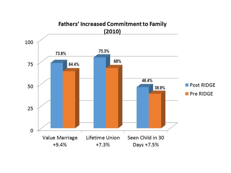
Before: An Unformatted Clustered Bar Chart
Here’s the chart style I see most often among researchers, analysts, and communications specialists: the unformatted clustered bar chart.
This particular graph is courtesy of Saint Wall Street.

Remake #1: A Formatted Clustered Bar Chart
At the very least, let’s format this chart. Regardless of which software program you’re using, make sure to question every single default setting. Default settings are fine for the privacy of your own computer – when you’re just exploring datasets or drafting several different options. But before charts get shared with coworkers or clients, you’ll need to adjust nearly every setting to ensure that your chart is easy to understand.
Crucial edits include:
- I removed the 3d, bringing the graph into the 21st century and making it easier to read.
- I flipped the order of the bars. Now, pre-intervention data is listed first and post-intervention data is listed second.
- I reduced chart clutter. I removed the border, the grid lines, and the tick marks, none of which served a purpose in our before chart. This streamlined design shocks folks at first, but trust me, sleep on it and you’ll awaken a completely new analyst. Once you get into the habit of reducing chart clutter you’ll never go back to your old ways.
- I used the color highlighting strategy. Previously, viewers’ eyes were equally drawn to the orange and the blue. Now, pre-intervention data is a light color and post-intervention data (what we want viewers to focus on) is a deeper, saturated color. I want viewers to know exactly which set of bars is most important.
- I swapped the generic title (“Fathers’ Increased Commitment to Family”) for a descriptive title (“Fathers showed an increased commitment to families”). Notice how the title is the largest font in the chart, a technique called hierarchical font sizing.

Remake #2: A Side-by-Side Bar Chart
In theory, this small multiples layout should be easy to read. I purposefully added light gray shading to indicate part-to-whole relationships.
In practice, viewers’ eyes have to zig-zag back and forth between the pre and post data. For instance, they’d have to read the 68%, and then the 75%, and then try to compare the lengths of those bars to each other. Since the bars are beside each other – not on top of each other – comparing the two lengths takes too much precious mental energy. For that reason, the side-by-side bar chart isn’t my favorite option.

Remake #3: A Slope Chart
Slope charts are line charts that only display two points in time. They’re an excellent option for pre-intervention and post-intervention datasets like this. The upward-sloping trend jumps off the screen and into our brains.

Remake #4: A Panel Chart
A small multiples version of the slope chart, this remake allows viewers to examine each of the metrics separately.

Remake #5: A Panel Chart with Contextual Shading
I use this style when I really want viewers to compare the lines to each other. I highlight one line at a time and gray-out the others.

Remake #6: A Dot Plot
Dot plots are another stellar choice for displaying two points in time. I use dot plots for pre/post data, for Grant Year 1/Grant Year 2 data, for Fall/Spring data, and many other timeframes. View additional examples here.

Share your perspective in the comments section: Which option do you prefer? Which option(s) do you already use in your own work, and which ones will you try now that you’ve seen them in action?
34 Comments
Indeed, clustered bar charts are overused. I prefer remake #6, which could possibly be further enhanced by deleting the value axis (it’s redundant) and showing the category axis (just the line). Maybe also making circles smaller (use dots) and then place the labels outside (especially in the case of more data categories).
However, there are at least 2 major “messages” that users try to convey with clustered bar charts: (1) comparison of two category classes (or KPIs) or (2) variance. In this case it’s the variance (growth from “Pre” to “Post”), so using “integrated variance” bar chart is another option (I cannot upload the remake in this comment, but you can take a look at the 4th chart here: https://zebra.bi/features/).
Love the panel slope charts! Is there a secret to to the grid line labels pre and post there or are they text boxes?
Nick, Those are regular old axis labels, just placed at the top of the vertical axes instead of the bottom to make them more visible. Stay tuned for an upcoming slope chart how-to tutorial.
Another option is to use a Multiple width overlapping column chart. I created one using your data here: http://paradi.link/MWOCCExample1. It can be created in Excel or PowerPoint (I used PowerPoint). I find audiences see the comparison easily because the columns are in front of one another.
You do such great work, and describe things so clearly. I’m constantly referring data-based communicators to your website. So thanks! You convinced me with Remake #1, but I really responded to Remake #3, as it clarifies that there was one intervention that had a positive effect on three different indicators. A sort of all-in -one-glance understanding is conveyed. All of the other remakes could possibly be interpreted as results of 3 different interventions. So I vote for Remake #3. Great work.
Thanks Lynn!
Great post – thank you! Out of all of the remakes, I prefer #1 and #6. Plus, the name “Dot Plot” is pretty cute.
I like all the alternatives but the dot plot is my favorite. To me, the slope charts are nice, but not quite as clean (especially #5) and I envision my users being a little puzzled with them at first. I’m looking forward to attempting a dot plot the next time I get the opportunity! Thanks Ann for this post — super helpful!!
i like the before and after – i have been in market research for 40 years and that Before i must have seen 10,000 times
ist available on a vieo or youtube, how to make these nice charts?
Sultan, I teach how-to charting skills in my online webinars and in-person workshops. Here’s a full listing of upcoming events: http://annkemery.com/events/
These are great options when you only have two series, but what do you recommend when you have 3 or 4 series?
Glenna, People use the term ‘series’ in a few different ways. Are you referring to datasets with more than two points in time? Explore my Essentials chart chooser for some inspiration: http://annkemery.com/essentials/ Thanks.
[…] If you're tired of seeing clustered column charts, especially the 3-D kind, you'll get 6 new ideas from Ann K. Emery. She helped a colleague overhaul a chart, and wants to know which alternative you like the best. […]
I really like #3 It’s better for overall comparisons than the clustered column charts
[…] If you're tired of seeing clustered column charts, especially the 3-D kind, you'll get 6 new ideas from Ann K. Emery. She helped a colleague overhaul a chart, and wants to know which alternative you like the best. […]
I really like #6 A Dot Plot version. Thanks to share 🙂
I’ve just subscribed to your blog 🙂
You might want to try a variant where the bars overlap, i.e. you take remake #1 and slide the darker bar about 40-60% below the light blue bar (leave a transparent line between them). Then you can get rid of ~80% of the space between each set. Numbers will be easy to compare, between sets and between points in time. That’s probably closer to an update of the source chart for the 21st century 😉
Also, it makes sense to mention that removing the gridlines only works when you present values on a linear scale. Some people use other scales, or even cut the bars to make the difference look bigger (not a good idea most of the time), and this info will be lost on the viewer without gridlines.
That being said, you should not your waste time reading the comments on your blogposts 😉
I would go with option 1 or 6, for the sake of providing a familiar visualization for people. I found that unfamiliar charts require more energy for interpreting, thus are abandoned faster.
[…] If you'd like a change from clustered column charts, you'll be inspired by 6 new ideas from Ann K. Emery. She helped a colleague overhaul a chart, and wants to know which alternative you like the best. […]
I like remakes #1, #4 and #6. Remake #2 is to hard to compare as you’ve described, in remake #3 the ‘Lifetime Union’ line’s slope somehow makes it appear that the increase was negative (don’t know why!) and remake #5 adds to much detail IMHO. But they are all a vast improvement over the original, that’s for sure!
I definitely prefer #4, the Panel chart. I’m able to effectively comprehend the improvements in each category without intrusion from the other categories.
Although I like the idea of the dot plot, I can’t as easily understand the value of the improvement other than mentally calculating the difference between the text values.
Fantastic ideas for this kind of data! Great for pre/post benchmark analytics data from website redesigns. Thank you!
This dataset lends itself to #4. Three categories fit nicely in the canvas, I can compare one slope to another easily and they aren’t crowding each other by sharing the same axises.
I am so glad I found you. Today’s puttering on your site has made my American Evaluation Association membership pay for itself.
[…] write about chart-choosing and sketching a lot and wanted to share these ideas with you, […]
Great post! I really like remake #3. Although, all have their own separate advantages.
I think the slope chart allows for the quickest understanding and least eye zig zagging. May I ask why the pre and post lines are so far apart? I think the slope chart offers a unique opportunity to save space and reduce eye movement even further. Also, I personally could have benefited from the labels reading pre ridge / post ridge or adding post ridge (or something similar) to the title. Maybe that want necessary in the context of the report though.
Thanks for taking the time to cover this. Unformatted 3d clustered bar charts are definitely cringe-worthy
[…] bar charts I had designed. Clustered bar charts are my least favorite chart of all time because 1) there’s (almost) always a more effective alternative but 2) despite these alternatives they’re used over and over and over and over and […]
[…] Both legends and sideways text take longer to read, a drawback we can’t ignore… Yet another reason I despise clustered charts. […]
The first chart that the article opened with was absolutely atrocious. However, I love the author’s spin on it with the different graph types. My favorite graph was the dot plot. I think that this one is the best, because it is extremely clear. There is a lot of openness in the graph, and this provides a lot of clarity to the graph’s purpose. I also thought the color scheme was creative, because it kept both groups as the focal point. I also like how even though the percents are included within the dots, the author still included the “0-100%” at the bottom. Little details in the graph like this are so important. I also enjoyed her title change as well, because the first title’s grammar was weird. Overall, the author’s message was easy to understand and her execution of the graph itself was perfect.
Coming from a person who has no knowledge regarding data visualization it is interesting to know how much one can make their data pop! I really enjoyed the formatted bar cluster chart. The difference in the title and the different shades of color make the information stand out a lot more than the original blue and orange. the different fonts as well make a difference in the chart as well. These are little key elements in making the charts more visual that will be crucial to know when displaying data.
I found this blog very interesting. It was very easy to understand the purpose of the blog as well as to understand how to make better graphs. I liked learning more ways to make my data sets pop in a presentation. The color and tiles help make everything stand out better. These are definitely things that I will be using in my next presentation.
This is a very helpful article which helps a person to improve their bar graph and not have any unnecessary things in the graph. The author removes the grid lines, borders and flips the order of the bars which makes it a lot easier to understand. These little things addressed in the article makes your work standout more, very helpful.
[…] least favorite charts of all time include clustered bar charts, 3D exploding pie charts, and line charts with two y axes. By now, hopefully you know my style. […]