Depict Data Studio full courses always end with a graduation ceremony where students share the progress they’ve made. I’m always amazed by the transformations that take place and I can’t help but want to share their wonderful work!
Today you’ll learn from JC De Jesus, Vice-President of Service Delivery for an internet-provider based in Canada. Thanks for sharing, JC! –Ann
—–
“The world rewards people who are best at communicating ideas, not the people with the best ideas”
@david_perell
The ability to communicate effectively is a key skill in any venture, business or personal. Depending on your specific situation, effective communication skills can vary, and cover a wide range of topics.
A student presenting in class with a set agenda topic and visual aids will communicate very differently from, say, a company CEO or a manager leading a team through a complex project over several weeks or months.
Communicating via Salesforce Chatter
In our company, Salesforce Chatter is one tool for effective communication.
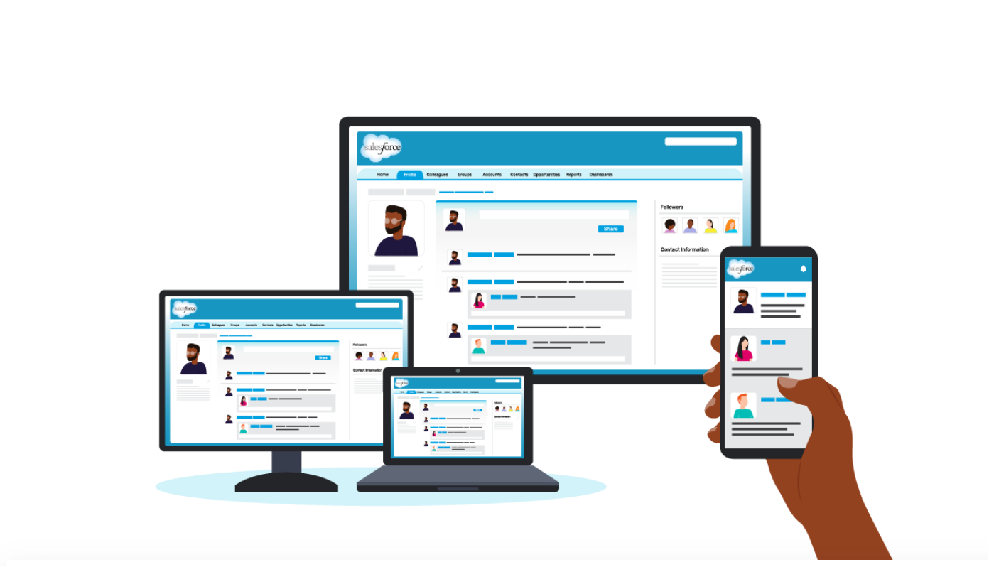
Chatter is like a social-media platform but for business. You follow co-workers to see their posts (like Twitter or LinkedIn), you can join groups and see group updates (like Facebook). It also has a top-notch mobile app.
And as you can imagine, just like any social-media app, your newsfeed can get really, really busy!
For a leader sharing an update to the team or the entire company, it’s important for your update to be as concise and engaging as possible for it to be effective.
Using a 1-Pager to Effectively Communicate Internally
I run a large team and share updates in Chatter. One of the things I find to be effective is using 1-pagers.
Instead of dense and text-heavy presentations, I minimize the text to include only the main points and actions I need from my team. This way, the 1-pager can be read in 2 minutes or less.
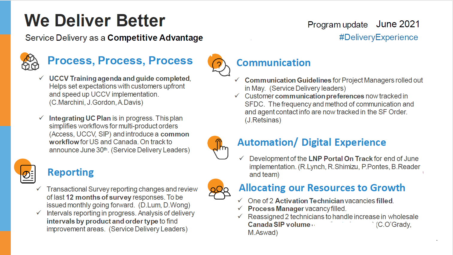
Here’s a 1-pager I’ve posted recently. This is for an ongoing project with many stakeholders.

Notice some of the key elements:
- Headers. The header “We Deliver Better” is in large, bolded font.
- Page Layout. The layout is a 2-column format, which makes the sentences appear shorter and easier to read.
- Outline. Notice the five-topic outline with icons. Those 5 topics stand out because of the larger font size and font color (blue) that’s different from the rest of the text.
- Visual Framework. The icons emphasize each of the 5 topics. These are also used in slidedeck presentations for consistency.
- Branding. It uses our corporate brand colours and logo.
- Divider Lines. There are no divider lines between rows and columns. Those are not needed if we give the page a lot of white space, which I’ve attempted to do here by cutting down on text. Cutting down on text while getting the full message is the hardest part in putting this together!
- Skimmability. Key phrases are in bold to make it more scannable.
- Hashtag. And, of course, the hashtag #DeliveryExperience on the top right.
My goal was to write something that can be read in 2 minutes or less by a wide audience (100+ people), and the 1-pager format helps me achieve exactly that.
And for anyone who wants to get into more detail, we also have a 30-minute slidedeck. It uses many of the same elements as the 1-pager.
By having a variety of approaches in communicating, I’m able to appeal to and share information with my audiences much more effectively.
Connect with JC
LinkedIn: http://www.linkedin.com/in/jc-dejesusus
Twitter: @technophone
1 Comment
Easy on the eyes and simple to read. The icons emphasizing each topic was the icing on the cake for me! I plan to copy this idea. Thank you so much for sharing!