We’ve all encountered redundant tables and graphs: You see a table. And then you see a graph nearby. You scan the table, and then you scan the graph, and then you scan the table again, zig-zagging your eyes around the screen and trying to figure out whether the table and graph are telling you the same information or whether they’re about two different topics entirely.
Redundancies steal precious time from our days. Redundancies force us to read two visuals instead of one—the table and the graph—when all we need is a single well-designed graph.
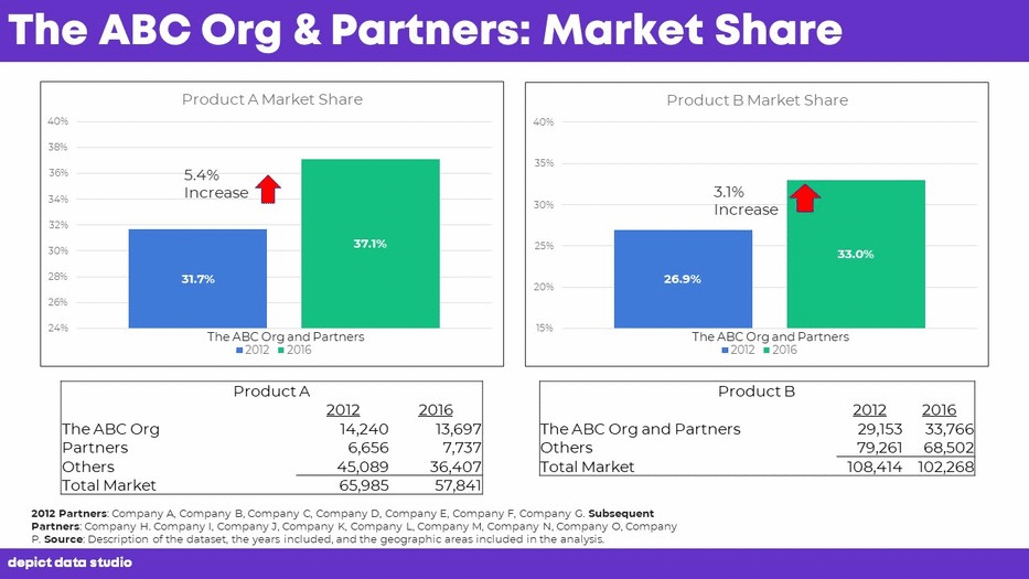
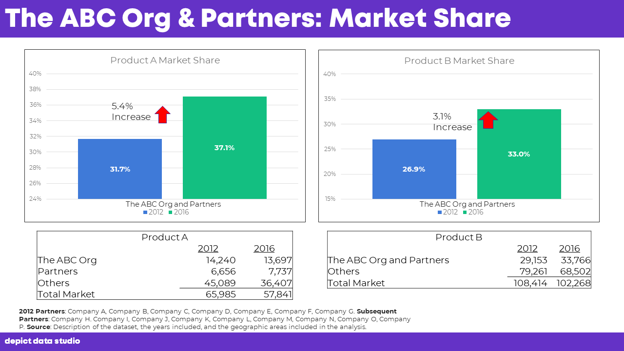
Before
Here’s a before slide that I encountered in a client workshop. I tried to figure out how the two graphs and two tables were related, if at all. I started to crunch some numbers in a calculator and couldn’t find any clear connections. Eventually, it clicked! They wanted to display both the numbers and percentages, but they couldn’t figure out how to do that in a single visual, so they created both a graph and a table. Aha! That’s an easy fix!
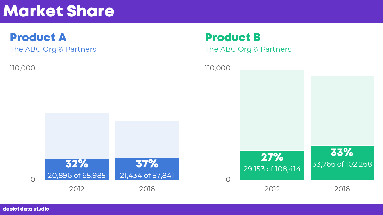
After
We needed to combine the percentages from the graph with the raw numbers from the table. We:
- Decided to focus on the percentages, so those are bold and large. The numbers are there, too, but they’re smaller.
- Transformed the column charts into stacked columns to further emphasize the percentages (how the darker 32% is part of the whole blue section).
- Decluttered the entire slide by removing the redundant table (duh) and by removing the borders, grid lines, and footnotes. We also removed the arrows that had shown 5.4% and 3.1% increases. We considered adding the arrows again but decided that the after version was so easy to follow that viewers could do the simple mental math for themselves.
- Edited the colors. Before, the visuals were color-coded by year (blue for 2012 and green for 2016). After, the visuals are color-coded by product (blue for Product A and green for Product C). Immediately, you know that the slide is comparing two things, the blue thing and the green thing.
- Applied a text hierarchy. A text hierarchy tells your viewer where to look. The important text should be large, dark, and bold. Before, there were too many different font sizes, so our viewers didn’t know what was important. After, product names and percentages stand out because they’re significantly larger, darker, and bolder than everything else.
Here’s what our finished slide looked like:
Do your slides have redundant tables and graphs? Examine each one. Decide what to focus on. We opted to focus on the percentages. Then, design a single graph or table to highlight that single piece of information.

Bonus! Download the Materials
Want to peek behind the scenes and see how I made the graphs? Download the spreadsheet and slides.
Download the Materials
Leave a Reply