In July 2018, I spent a couple days teaching data visualization workshops in Wisconsin. I remember one attendee in particular: Sara DeLong.
Sara was serious about taking her skills to the next level. Over the past six months, Sara started her own data visualization blog, and Sara and her team transformed their lengthy technical reports into visual summaries that local health departments and community-based organizations crave.
I talk about the 30:3:1 approach to reporting in Soar Beyond the Dusty Shelf Report. The gist is that you write a technical report plus shorter summaries, like a three-pager or a one-pager.
Sara and her team of public health researchers took the 30:3:1 approach to the next level–they even developed a media campaign to get HIV data out of dusty spreadsheets and into the community. You’ll love the photos of the bus and the bus stop in her article.
I hope you enjoy learning these practical tips about effective data communication from Sara DeLong. –Ann
Do you have a long report that took a lot of time and effort, but you’re not really sure how anyone is going to use it? Annual progress reports, data publications, strategic planning documents… many of us spend a lot of time writing these documents, and they’re necessary to capture a lot of detailed information.
Here is an example of how I turned a long report into accessible, graphic summaries, and eventually into a media campaign.
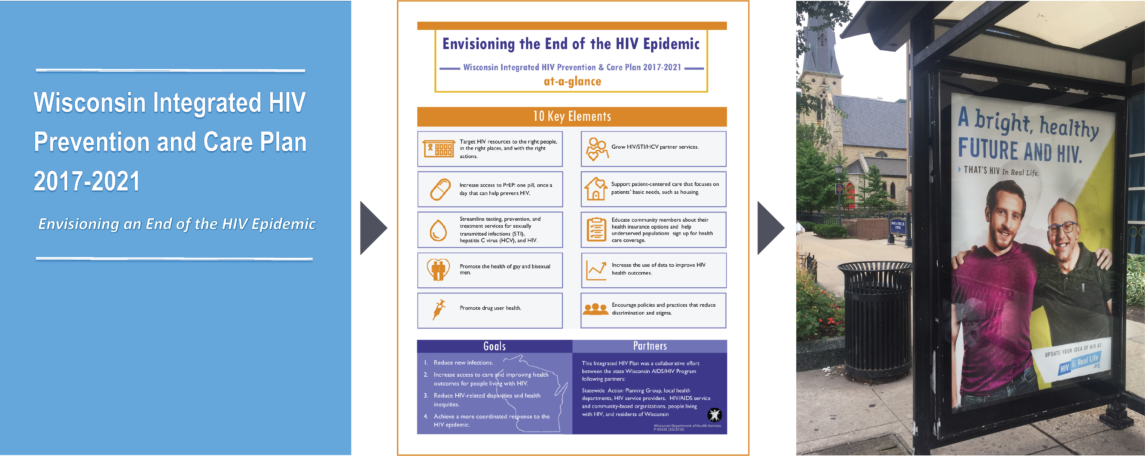
The 130-Page Report
The Wisconsin Integrated HIV Prevention & Care Plan 2017-2021 is 130 pages long.
I took this 130-page plan and paired it down to a 10-page overview document and a one-page snapshot.

10-Page Overview
The 10-page overview is primarily used by local health departments and community-based organizations to identify strategies and data that will support their grant writing.
Readers can pull out the key points of the report more quickly with enough detail to support their own strategic plans and align their proposed activities with statewide plans.

Here is a page out of the 10-page overview:

1-Page Snapshot
The one-page snapshot is intended for the general public, specifically anyone who would like a quick overview of how Wisconsin plans to address the HIV epidemic in our state.
These one-page summaries are helpful for media releases and make great handouts for public presentations on the HIV Integrated Plan.

5 Steps for Transforming a Report into Digestible Summaries
Shedding over 100 pages of content isn’t as simple as hitting the delete key, but with a little planning, you can create tailored one-page and ten-page summaries for your target audiences. Here’s how.
Step 1. Identify the Main Points with Input from Colleagues
My colleagues worked really hard to put together the 130-page strategic plan. One of the biggest challenges of creating the one-page snapshot and the ten-page overview was getting the team to agree on the most important information to highlight for various audiences. Start by identifying your audience and the content that is most important to them. This can take several meetings and revisions, but this step is crucial before you start designing.
Step 2. Create a Style Guide that Specifies the Document’s Fonts and Colors
I created the snapshot and overview documents above, and a colleague created an accompanying slide deck. Designing a brief style guide made it easier to collaborate with my colleagues. Style guides can vary in detail, but creating one with just fonts and a color scheme can make a big difference in the consistency and efficient production of your final deliverables.
I intentionally chose colors that would pop off the page to make the materials as visually appealing and engaging as possible. I also used icons throughout the summary documents. This content can be dense, but icons help break it up for the viewer. Ann Emery demonstrates the power of icons in her blog post, How to Visualize Qualitative Data.
Step 3. Design, Edit, Seek Feedback, Repeat
Since a large group worked on the 130-page document, my team members had different ideas about how the most important information should be represented. Asking for feedback throughout the development of these materials was central to the success and usefulness of the final documents. These feedback sessions included in-person meetings and edits passed via email. By the end, everyone on the team had provided their input and felt a greater sense of ownership of the final products.
Step 4. Pick a Realistic Timeline
These materials were created and approved over the course of two months. The Wisconsin Integrated HIV Care & Prevention Plan has been in use for about two years now, and the summary documents are used regularly when presenting to the public or working with community partners. Even internal staff tend to refer back to these overview documents instead of the 130-page report.
Keep in mind that it’s never too late to put a summary document in play! Ideally, all the final products would be released as a package at the same time, but in our case that wasn’t feasible. These summary materials were created two months after the full report was published. In future iterations, we plan to create supplemental materials like these when a large report is in the final stages of production.
Step 5. Pick the Right Tools
I created these materials using Microsoft Publisher, which functions a lot like Adobe InDesign but is something all of our staff have on their computers. You can use whatever software you prefer, even Microsoft Word.

The Impact of the 10-Page and 1-Page Overview Documents
We shared the 10-page overview and one-page snapshot with our community advisory group.
They provided great feedback and then requested even more accessible materials covering these HIV-related topics.
So our team went back to the drawing board.
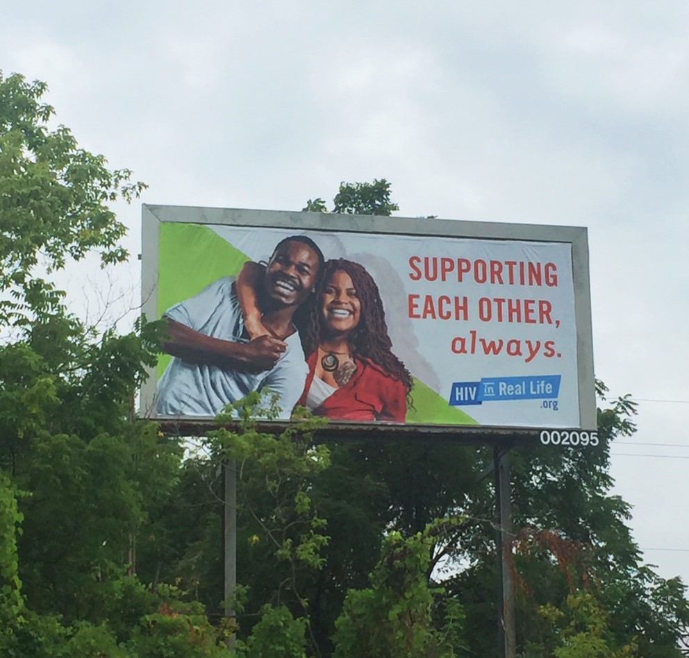
As a result of the community advisory group’s feedback, we contracted with a media firm to develop the HIV in Real Life media campaign based in Milwaukee, Wisconsin.
This media campaign features residents of Milwaukee who have been impacted by HIV and addresses HIV-related stigma through stories, images, and video.

This was a different kind of information design that looks nothing like the 130-page plan.
There is no mention of the large plan on the HIV in Real Life website, even though its overarching principles are present throughout the campaign.
In the end, the overview documents were a critical stepping stone from the large report to the final media campaign.
The overview documents enabled conversations about how to make the key messages from Wisconsin’s HIV Integrated Plan more accessible to the general public.

Media Campaign as Information Design
In this media campaign we focused on the stories of people impacted by HIV to highlight data and facts about HIV.
Ronnie tells the story about how the unconditional love of his family is a big reason he is living with HIV and thriving.
Jaymes shares that he learned the hard way how to be a friend and an advocate for the people in his life living with HIV.
Tianna talks movingly about her unwavering support for her best friend, Corey.
These stories counter the fear and stigma commonly associated with HIV. They begin to change the narrative that has been around since the 1980s.
When my team started exploring the possibility of a media campaign, we posed the same questions we ask when approaching any data visualization project.
- Who is our audience?
- What are the main points?
- What is the best method to convey those main points?
We knew we didn’t have all the answers. So we took the general concept of a media campaign to our partners. We attended community events, board meetings, coffee dates, and had many phone conversations.
We got feedback on those three questions, but we also talked to experts who had run previous, local media campaigns to learn from their past successes and challenges.
All those conversations taught us one thing: we couldn’t create this HIV media campaign in a bubble. So we formed an advisory board of community stakeholders to guide its development.

Color
In data visualization, we try to title our graphs using the main findings from the data to do the work for the viewer.
We also focus on using action colors to highlight specific information in our charts. Those same data visualization principles were applied in this media campaign.
Color was the easy part.
We knew we wanted to use bright, vibrant colors to challenge the fear and stigma commonly associated with HIV.
When the campaign launched, someone came up to me and said, “If someone drives by a billboard and just sees the word HIV and those colors this will be a success, because it is so different than people’s misconceptions of HIV.”
Headlines
Creating the headlines was the hard part.
This project started with a 130-page strategic plan, and we had to narrow down the message of our campaign to just a couple of words that would fit on a bus, billboard, or online banner ad. This took a lot of trial and error and actually ended up pushing back our launch date because it was so important to get the headlines just right.
The community advisory board that provided feedback throughout campaign development was instrumental in identifying the final headlines for the campaign. In the end, this campaign was particularly meaningful because it was collaborative and community driven from day one.
Learn More
Take a look at the complete one-page snapshot and ten-page overview documents to see how I transformed my long report into graphic summaries to create an impact.
Not everyone has time or resources to develop a city-wide media campaign, but as data visualization practitioners, advocates and experts we should continue to look for ways to transform long documents into more accessible products that maximize their value for a variety of audiences.
Leave a Reply