Maddison Staszkiewicz is a Depict Data Studio student and evaluator. She was part of the 2020 Great Graphs: Excel How-To’s cohort and is sharing her experiences with us. Thanks Maddison! –Ann
—–
I was ecstatic to register for the Great Graphs: Excel How-To’s course and transform my graphs using Excel instead of online data visualization software. I already had Excel, my data was there, and it did not make sense to use another platform to make the graphs I needed.
I had tried other options before, and it was always clunky because instead of focusing on the data and the message I was trying to show, I was inevitably focusing on the different software programs and how they would interact.
Tips, Tricks and Community
Through the Great Graphs: Excel How-To’s course, I learned more tips and tricks than I ever expected. But the most impactful, yet unexpected, outcome was joining a community and making connections with others that were also along their own journey of improving their graphs as a way of sharing messages and insights through data.
Throughout the course, I was exposed to new ways of thinking about graphs, Excel, and how data visualization can be used in the workplace to guide more data-informed decisions.
Now, I look at data visualization differently.
When I see data visualization in the newspaper or on social media, I think about what it was trying to show and whether it was successful. This critical eye helped me be a better peer and colleague when seeking to get the message across from my own data and in collaborating with others.
As we started the course, I got to know my peers also in the course.
When I was working on producing graphs for a blog based on my graduate work in evaluation surrounding the perceived effects of medication access from COVID-19, we reviewed and workshopped them together with live feedback in an office hour session.
Because of the varied backgrounds of those in the course, I was thinking about my work in a completely new and improved way. I started experimenting with graph types I had not used before, with some having greater success than others.
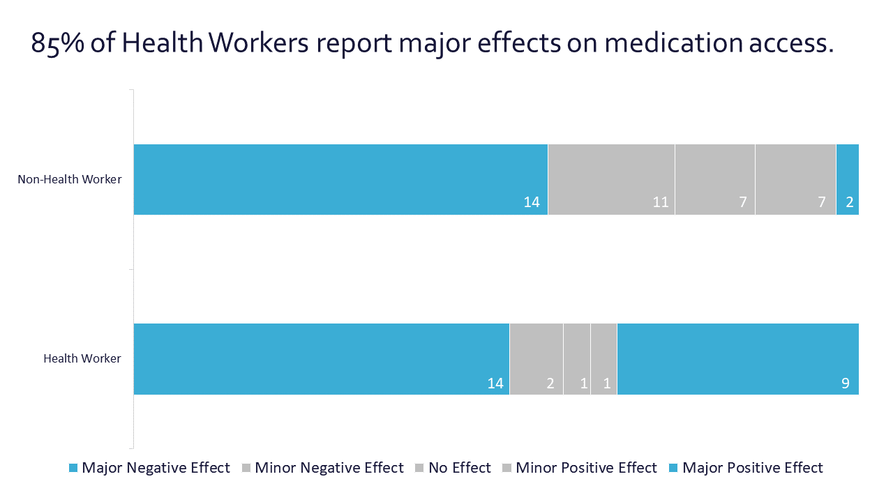
Before: Audience Left with Questions
My original graph applied many of the lessons we had covered – I used my color palette, I had storytelling titles, but there was room for improvement.
There was much left up for the audience to discern when reviewing the graph – was the 85% or 70% most important? Why were different values mentioned in the heading?
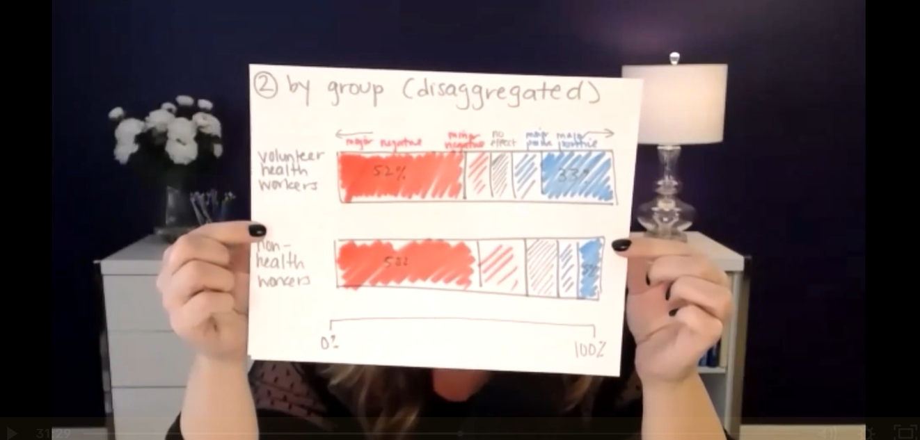
Live Editing During Office Hours
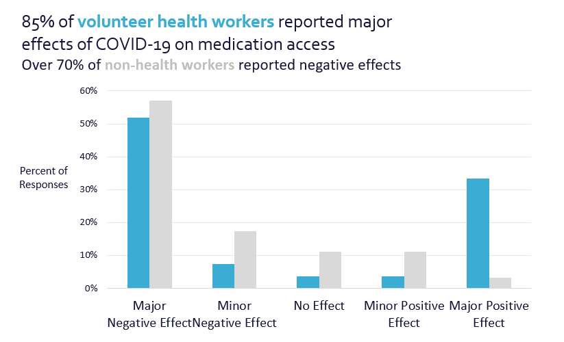
During the office hours, we mocked up what the graphs could look like and ultimately edited them to produce higher quality, easier to understand visuals. We took the original column charts and turned them into 100% stacked bar charts.
After: Clear Focus
Focusing on the major effects (both positive and negative) also provided a stronger narrative instead of hoping the audience would understand the message.
Highlighting the ends of the bars gave not only visual focus, but a clear visual.

The final product was influenced by the feedback I received throughout the course. Getting feedback from the group changed the style of the graphs, colors, way I utilized text, and I was even encouraged to turn the graphs into a GIF for better online engagement.
Shared Learning is the Best Learning
As much as I looked forward to continuing the lessons, I was excited for the live office hour sessions when I would get to hear from someone else in the field and learn how they might use a graph style as well as how they did it.
Questions and discussions sparked thinking and problem solving about my data visualization in new ways, past the technical work in Excel.
As the course continued, my skills improved, and so did my connections with my peers. We connected on LinkedIn and offline to get to know more about each other’s work – similarities and differences abounded.
I found a great benefit in this as there was so much knowledge to be shared, wherever we were along our data visualization or professional journey. As a new evaluator, learning what others found to be successful also helped me in thinking about what I could apply to my own work.
The supportive community that was built goes beyond the technical skills we learned throughout the course, as I know I have a wider network to connect with for questions, feedback, and advice long after the course ended.
Connect with Maddison
LinkedIn: @maddison-staszkiewicz
Website: www.maddisonstasz.com
Leave a Reply