
When social scientists like me have lots of data, we tend to put it in tables. There’s nothing wrong with tables. They contain infinite details within a finite and teeny space, and they give the reader freedom to draw his or her own conclusions about which details are worth paying attention to.
In today’s post I’m teaching you:
- how to explore your data tables with Excel’s conditional formatting;
- how clustered bar charts are the worst charts ever;
- how a small multiples chart can save the day by quickly visualizing an entire table’s worth of details in the same amount of space as the original table; and
- how to create that small multiples chart in Excel (and it takes less than 5 minutes, I promise).
The Original: A Data Table
This example comes from a short and sweet Child Trends brief: www.childtrends.org/wp-content/uploads/2013/07/125_Flourishing_Measures.pdf. This is a pretty typical situation in research and evaluation projects in which we’ve got some interesting variables across the top and multiple demographic breakdowns along the side.

Option A: Conditional Formatting
I wanted to see the patterns and understand what was going on. For starters, I used conditional formatting to color-code any cells that were greater than the overall percentage. For example, in Column B, 93% of children “always” or “usually” were affectionate and tender with their parent. Girls were slightly more likely than boys to be affectionate and tender (95% of girls compared to 93% of children overall) so the 95% is highlighted.
Now what can I see? Something cool is going on with the kids above poverty and whose parents have higher levels of education.
This conditional formatting technique is a good start, but it didn’t seem to show me enough patterns, so I kept going.

Option B: Data Bars
Data bars–within-cell bar charts–are another underused conditional formatting technique for exploring preliminary patterns from the comfort of your spreadsheet. I teach you how to make them here.
What’s happening with column C? Why are those bars so short? Why are the kids less likely to bounce back? Now that I can see what’s going on, my brain’s full of questions.

Option C: Clustered Bar Chart
I made one of these bad boys just for fun, and the result was even more incomprehensible than I could have imagined. The not-so-fun part is that I still see charts like these in research and evaluation reports. If you’re still using these, please, contact me and I’ll help you out. 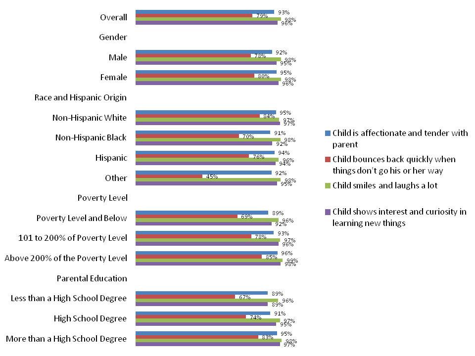
Option D: Small Multiples Bar Chart
I could’ve visualized this data through a million different individual bar charts: a bar chart showing the overall percentages for each of the four indicators (the option selected by the authors in their original report), a dot plot showing the gender differences for one or two or three or four of the indicators, a bar chart focusing on parental education, etc.
Instead of highlighting one or two patterns, I wanted to see the entire landscape of what was going on. Same real estate as the original data table. The chart could fit on just one page within the body of a report or in an appendix. But now, my brain receives the information through both images and text, rather than just text alone like in the original data table.
And since my primary goal was to see the big picture, I opted for a generic title, generic subtitle, and emphasis-free color scheme. In other words, my title just states the graph’s content rather than putting forth a “so what?” (it’s modeled after a data table from an appendix, after all). My subtitle describes the data source but doesn’t give my interpretation of what’s going on. My colors are matched to Child Trends’ logo rather than Excel’s default color scheme, but the colors don’t emphasize one category or series of data over another. I’ll describe these distinctions in more detail in a future post.

(You can also view the high resolution image here.)
15 Comments
Great post! It seems like conditional formatting would have been able to get *really* close to the same small multiples result — just four separate conditional formatting rules (one for each column) to vary the color, and each rule setting the max to 100%. The one thing it couldn’t do is up the percentage at the top (right) of the bar — it would be stuck at the bottom (left).
Am I missing something, or would that be a good alternative if looking to keep the data as data in cells rather than creating an actual chart?
Hi Tim,
You’re right, the data bars and the small multiples chart are essentially identical in their proportions and patterns.
The only difference is that data bars live within a spreadsheet and the small multiples chart can be pasted into a Word document or PowerPoint presentation.
So, data bars for exploring, brainstorming, idea-generation, and then small multiples if something seems promising enough to warrant a chart.
Thanks, Ann
Thanks for the super-helpful post! I really dislike data tables and think this is a great solution. I practiced it using some data I had on hand but couldn’t get the horizontal axis labels right. How did you get the item descriptions at the top of the columns?
Thanks!
Hi Anne,
Great question. I used a very very complicated strategy: I added text boxes, and then matched the font color to the corresponding bars (which are matched to the organization’s RGB codes).
The vertical labels are the same thing — to get the Overall, Gender, Race and Hispanic Origin, etc. labels to pop out, I simply overlayed the regular size 11 font with text boxes. For those, I had to make sure to “fill” the text boxes with white so that the original size 11 text didn’t show.
Hope this helps! Ann
Thanks, Ann!
Nice post Ann. I really like the stacked bar small multiples approach. I literally used it for a project immediately after reading this post 😉
I knew you’d be an early adopter. 🙂 I hope it was useful for the project!
P.S. Thanks to Tim Wilson (@tgwilson) for sharing his related post with me – http://tim.webanalyticsdemystified.com/?p=2515. Tim outlines additional strategies for visualizing patterns from data tables, like heat maps, and discusses how he sometimes visualizes data from tables just to get a feel for the data, like my Option A and Option B here.
Hi Ann! just saw your tutorial in youtube and I am quite interested on How to automate dashboards using Excel and Word. Actually this is my first time to know your blog. I hope you have a tutorial on this one so that I could learn from you more. God bless!
[…] From Data Table to Small Multiples In Under 5 Minutes | Ann K. Emery […]
[…] From Data Table to Small Multiples in Under 5 Minutes […]
[…] for learning new Excel visualization tips and tricks is by Ann Emery. She recently wrote a post highlighting how bar charts can be used to effectively present “small multiples” (i.e., a visualization that uses the same basic chart to display difference slides of a data […]
P.S. Here’s a recent blog post from Carrie Tanasichuk showing how she adapted this technique for her own project: http://ctanasichuk.wordpress.com/2014/09/05/data-visualization-principles-for-combining-several-charts/ Go check it out!
Great Post, clear instructions and visualization. Bravo. I will this on one o
f the projects.
[…] Ann K. Emery & her post on conditional formatting for bar charts […]