
Cole McMahon enrolled in my online course, Great Graphs, a year ago. Here’s what he learned. –Ann
I work differently now.
Here at the McMahon Consulting Group, we’re very lucky. We get to invent ways for people to help each other. I call myself a “National Service Engineer,” because we work with AmeriCorps programs to build systems. We create local solutions to local problems. Every day is interesting.
But I’ve long struggled with the challenge of presenting evidence more clearly. Many of us have data, but we don’t know what it tells us, how to make decisions, how to promote our programs.
For the past four years, I’ve been an acolyte of Ann K. Emery. There’s nothing cooler than sharing your talents the way she does. I’ve taken the journey from her webinars to her great resources on chart choosing to the Great Graphs class.
Ann’s work has led me to Stephanie Evergreen’s, and to Do Good Data, and into a new comfort zone, where data makes my work more human, and not less. While I’ll never reach her level of data visualization wizardry, I’ve learned a few things.
Dance with Your Data
(Disclaimer: someone clever came up with that phrase, but not me.)
Ann taught me to sketch graphs, and to keep trying different charts to get to what the reader will understand most clearly.
For instance, we’ve conducted two evaluations for Rebuilding Together, a phenomenal organization that repairs homes for seniors so they may age in place. We wanted to know whether a home repair helped seniors to live in their homes longer. Data visualization and chart selection was a huge challenge.
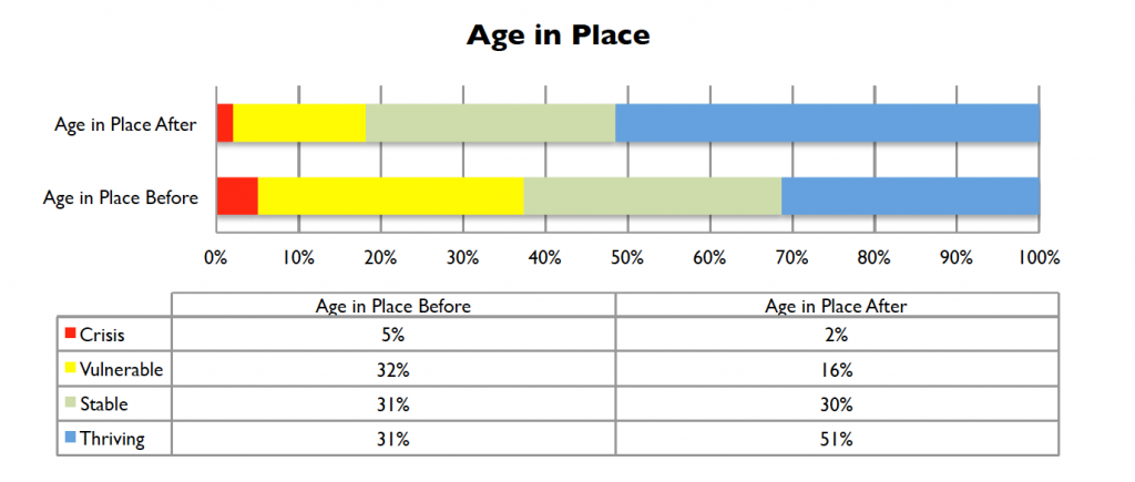
Then: The 2014 Results
Here’s what our work used to look like: a stacked bar chart with a table underneath.
Now: The 2017 Results
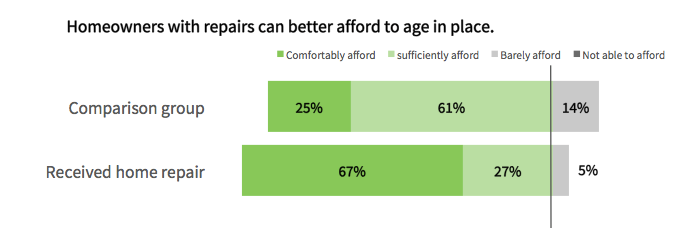
I hope you can see that I tried to channel Ann (and Stephanie).
The second chart is an inventory of their admonitions to respect your reader:
- The diverged bar chart gives the reader a fixed point of reference for comparison.
- Be gone, chart clutter!
- Placing the labels on the bars (which are also adjusted) makes a clearer case.
- The title explains the findings.
- The fonts and colors reflect the client’s branding.
Data are People
In my business, we are constantly making the case that federal dollars and personal volunteer hours create transformational results.
Used poorly, data can be off-putting, and can depersonalize the work.
The best thing about this client, Rebuilding Together, is the “homeowner hug,” the wonderful moment when a senior sees that her home is now a safe and healthy place to live.
At our best, our use of data helps people see that each of these data points are lives lived and changed.
Use Data for Decisions
Many of my clients experience their output data only during reporting season, and mainly as a check-the-box funding requirement.
I’ve found that data visualization helps me focus on what will drive results.
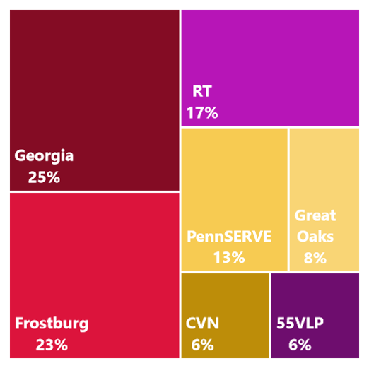
One client was astonished to learn exactly where their resources were going. A heat map of the where they placed their people across the U.S. helped them scale and reach underserved communities. I’m a geek, but I even keep an (Evergreen!) Tree Map on my to-do list to remind me to better allocate my work time.
Great Graphs: From Spreadsheets to Stories has helped me bring some flash to reports, for sure. Being able to create better data visualization tools gives me a secret thrill. Having these tools feels like having special powers, like being able to review federal regulations or write complicated budgets. But that is not the main thing I’ve taken from Ann’s work. In fact, Great Graphs is too basic a title. The value proposition for Ann’s work is that she helps you do yours. Ann K. Emery makes you better.
Leave a Reply