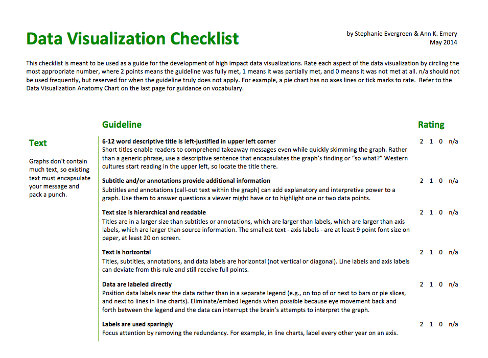
This post has been a long time coming. Stephanie Evergreen and I knew some time ago that evaluators and social scientists had a thirst for better graphs, a clear understanding of why better graphs were necessary, but they lacked efficient guidance on how, exactly, to make a graph better.
Introducing the Data Visualization Checklist.

Download this checklist and refer to it when you are constructing your next data visualization so that what you produce rocks worlds. Use the checklist to gauge the effectiveness of graphs you’ve already made and adjust places where you don’t score full points. Make copies and slip them into your staff mailboxes.
What’s in the Data Visualization Checklist?
We compiled a set of best practices based on extensive research, tested against the practical day-to-day realities of evaluation practice and the pragmatic needs of our stakeholders. This guidance may not apply to other fields. In fact, we pilot-tested the checklist with a dozen data visualists and found that those who were not in a social science field found more areas of disagreement. That’s ok. Their dissemination purposes are different from ours. Their audiences are not our audiences. You will find clear guidelines on how to make the best use of a graph’s text, color, arrangement, and overall design. We also included a data visualization anatomy chart on the last page of the checklist to illustrate key concepts and point out terminology.
What’s Next?
Stephanie and I know that the best practices need more graphic examples. Over the next couple of months we will publish blog posts that depict each of these best practices and show the transition of a data visualization that scores no points to one that scores full points (so subscribe to both blogs!).
We will present the final checklist and our collection of visual examples at the American Evaluation Association’s annual conference in October 2014. Let’s high five there!
Our presentation will be so much cooler if we can get a bit of your help. Please please please can you take a picture of your existing data visualization, apply the checklist, and then take another picture? We’d LOVE to include your before and after example in our blog posts and in our conference session. Email your redesign to me. Show people how awesome you are!
Big thanks to our pilot reviewers: James Coyle, Amy Germuth, Chris Lysy, Johanna Morariu, Jon Schwabish, David Shellard, Rob Simmon, Kate Tinworth, Jeff Wasbes, and Trina Willard.


13 Comments
[…] post has been a long time coming. Ann Emery and I knew some time ago that evaluators and social scientists had a thirst for better graphs, a […]
[…] Latest post: Introducing the Data Visualization Checklist […]
[…] Introducing the Data Visualization Checklist […]
[…] We’ve got a great week of posts lined up for you! First, Ann Emery (my colleague at Innovation Network and DVRTIG Co-Chair) will wow you with some stats and visualizations about the DVRTIG. Up next will be Rakesh Mohan and his colleagues from Idaho State’s Office of Performance Evaluations to explain Sankey diagrams. Then we’ll hear from Tony Fujs of the Latin American Youth Center about using R and ggplot2 for data visualization. From there we’ll turn it over to Gretchen Biesecker, Vice President of Evaluation at City Year, to explore storytelling as an effective communication method. And we’ll wrap up the DVR week with Ann Emery and Stephanie Evergreen with a test drive of their Data Visualization Checklist. […]
[…] Introducing the Data Visualization Checklist […]
[…] on the “grid lines, if present, are muted” item in our Data Visualization Checklist: 0 of 2 […]
[…] and made sure I covered all the big-picture aspects of the chart. Then, I went through the Data Visualization Checklist that Stephanie Evergreen and I developed to make sure I crossed my t’s and dotted my […]
[…] This revised graph would score well on the graph has appropriate level of precision section of the Data Visualization Checklist. […]
[…] Die versprochenen Kurztipps für die Abbildungen entnehme ich großteils Evergreen & Emery (2014): Weil Abbildungen nicht viel Text enthalten, solltest Du den dort vorhandenen Text präzise formulieren und genau mitteilen, worum es in der Abbildung geht. Die einzelnen Elemente der Abbildungen sollten überlegt angeordnet werden (z.B. welche Daten-Säulen ergeben Sinn, und zwar in welcher Richtung?), denn damit wird die Abbildung leichter verständlich. Vermeide möglichst (viele) Farben, denke an die Kopierfähigkeit und mögliche Farbenblindheit. Denke auch daran, dass Farben oft Botschaften transportieren (Bonbonfarben = „Mädchenfarben“). Zu viele Linien wie Rahmen, Häkchen oder zusätzliche Achsen können das Bild durch ihr „Rauschen“ stören – wenn Du sie nicht brauchst, um Deine Daten interpretierbar zu machen: raus damit (Evergreen, St. & Emery A.K. (2014): Data Visualization Checklist. Abzurufen auf: www.http://annkemery.com/dataviz-checklist/) […]
[…] This chart would score poorly on the Labels Are Used Sparingly section of the Data Visualization Checklist. […]
[…] These data labels and separate legend score a big fat zero on the Data Are Labeled Directly section of the Data Visualization Checklist. […]
[…] more tips to help you create successful visualizations, download the Data Visualization Checklist I created with Stephanie […]
[…] Evergreen y Ann K. Emery knew crearon en 2014 un artículo llamado Introducing The Data Visualization Checklist, en el que proponen un método para medir la calidad de una visualización. En su método se […]