Here’s a counterintuitive dataviz principle:
Sometimes, it’s easier to understand several small graphs than a single graph.
I was recently working with an organization to visualize which states were using their software programs.
States might use:
- Software A
- Software B
- Or, both software A and B
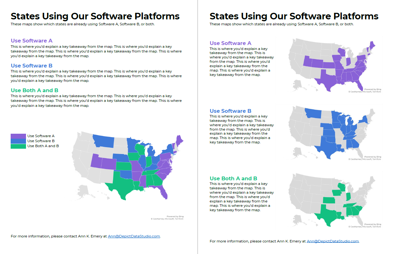
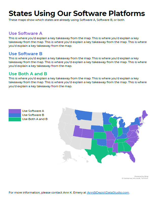
Before: A Single Multicolor Map
Here’s what their visualization looked like.
They had a single U.S. map with one color for each scenario:
- one color for states using Software A
- another color for states using Software B, and
- another color for states using A and B.
Fairly straightforward, right?
It took us a while to spot patterns, though. Three colors is a lot to understand at once. It’s not impossible, but we had to think about it for a moment.
Multicolor (well, multi-hue) maps take a while to interpret.
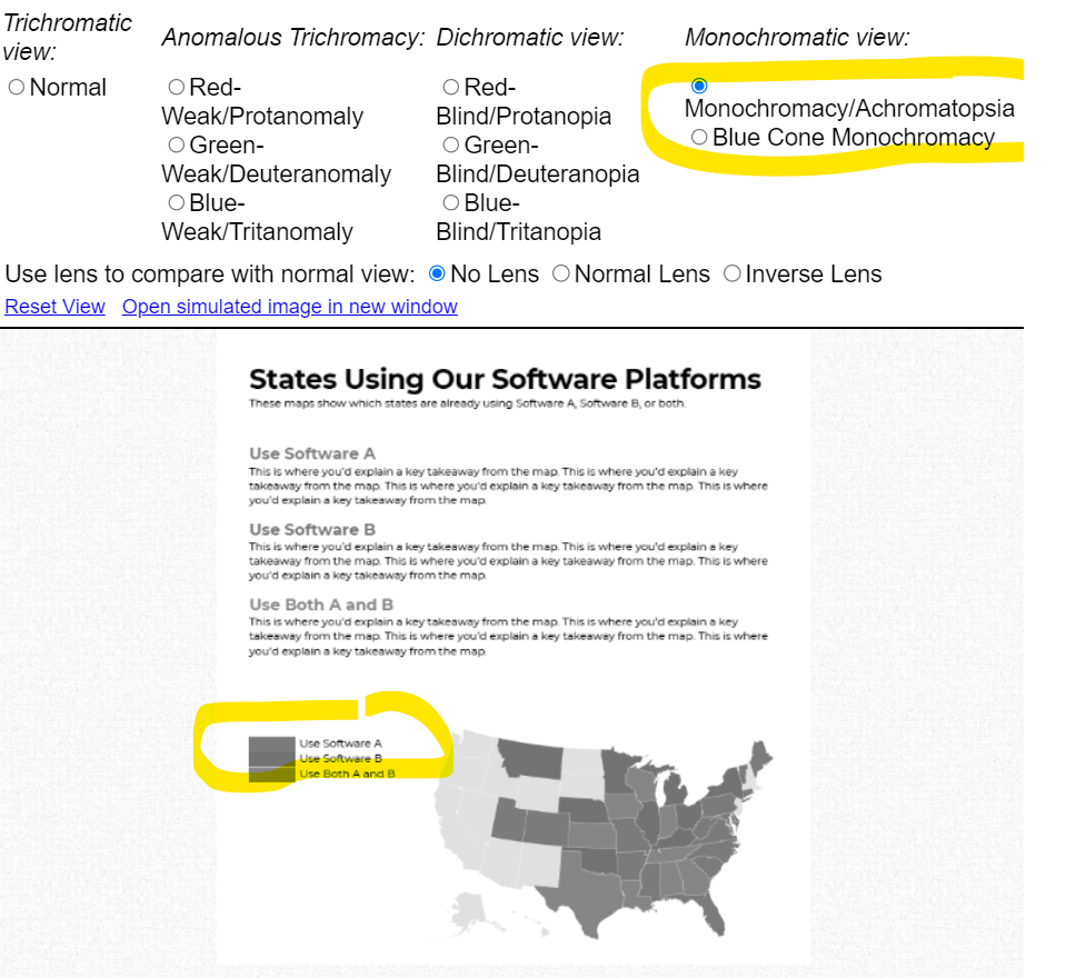
Multi-hue maps aren’t colorblind-friendly. Here’s a simulation of what the map would look thanks to https://www.color-blindness.com/coblis-color-blindness-simulator/.

Multicolor maps aren’t grayscale-friendly, either.
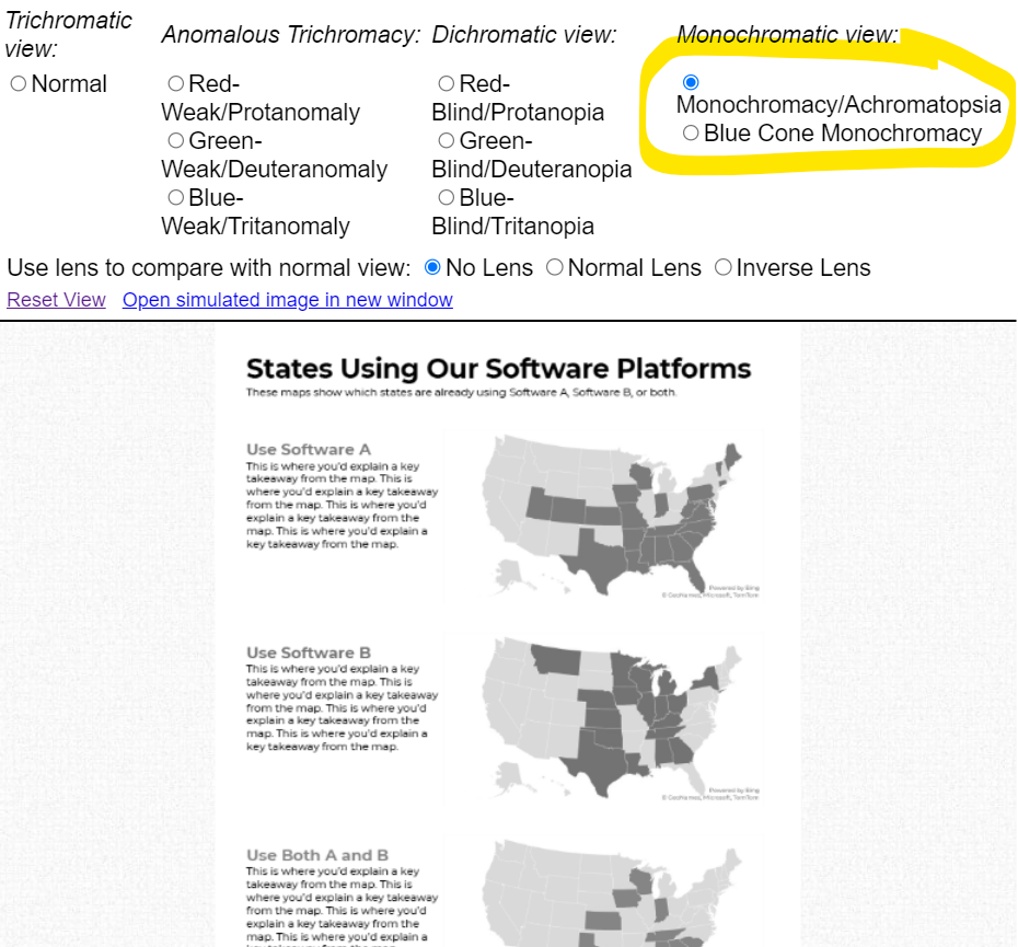
After: Small Multiples Maps with One Color Each
In lieu of a multicolor map, try small multiples!
In the redesign, we created three maps instead of one.
Now, we’re showing a single variable on each map, so the audience can understand it at a glance.
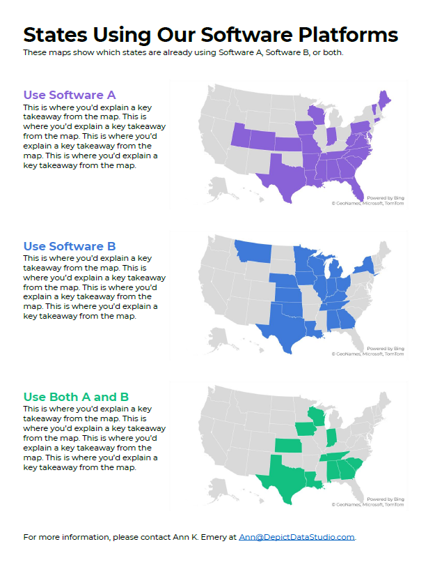
Small multiples binary maps (your dark brand color + light gray) are often faster to read than multi-hue maps. It’s counterintuitive, I know. We’re asking people to read three maps instead of one. But, three fast maps will beat one slow map any day of the week.
Small multiples binary maps are colorblind-friendly. Everyone can spot the dark brand color vs. the light gray.

Finally, small multiples binary maps are grayscale-friendly. Everyone can distinguish the dark gray vs. light gray.
Side-by-Side Comparison
Both styles fit on a single page (a goal in their project).
Both styles have room for explanatory sentences (something I recommend in all one-pagers).
Only the small multiples version is colorblind-friendly and grayscale-friendly.
I’d argue that the small multiples version is faster to read, too.

Download the Files
Want to explore my Excel file and Word doc?
You’ll see:
- How I formatted the Excel table that feeds into the maps
- How I arranged everything inside good ol’ Word
Download them here: https://depictdatastudio.gumroad.com/l/SmallMultiplesMapsInExcel
Your Turn
Have you split your multicolor map into small multiples?! Get in touch when you apply this technique to your own projects.
1 Comment
Love this! So clear and helpful. Also is anti-ableist!