
My least favorite charts of all time include clustered bar charts, 3D exploding pie charts, and line charts with two y axes. By now, hopefully you know my style. I’m not just going to complain about a graph without offering an alternative.
Sometimes we need to compare two different variables with two different units, like the total grants awarded by an agency (dollars) compared to the number of different projects that they supported (number of projects).
Your poor viewer would read the regular axis on the left. They’d probably understand that just fine–Total Grants Awarded. But then they’d have to figure out which line corresponds to that axis. And the separate legend below the graph isn’t helping much because it requires zig-zagging eye movements (no worries–solution here). Their eyes would eventually shift over to the right side of the graph. They’d they’d encounter another y axis.
Another one? Wait, what? With different units? But I thought this graph was talking about grant dollars? Or is it about the number of projects? This is getting confusing. Okay, it’s not just the viewer confused here. It’s me. Every single time. I used to think these graphs were some kind of sick joke, or at the very least, had some type of virus that accidentally arranged two separate graphs right on top of each other.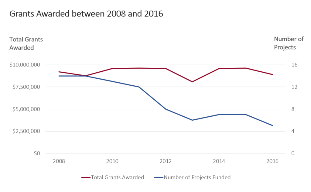
Unless your viewer looks at graphs with double y axes every day (unlikely–be honest), this is the wrong graph type.
First things first. Present the first variable, Total Grants Awarded. You viewer can skim the shape of the line and think about the implications of the graph.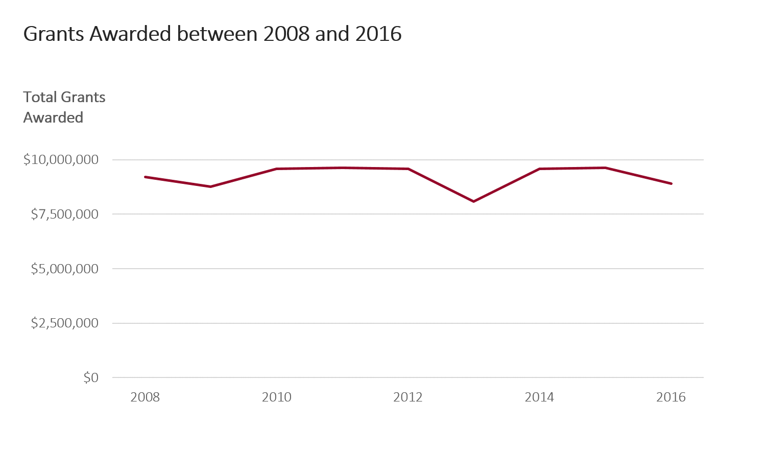
Nudge that graph over to the side: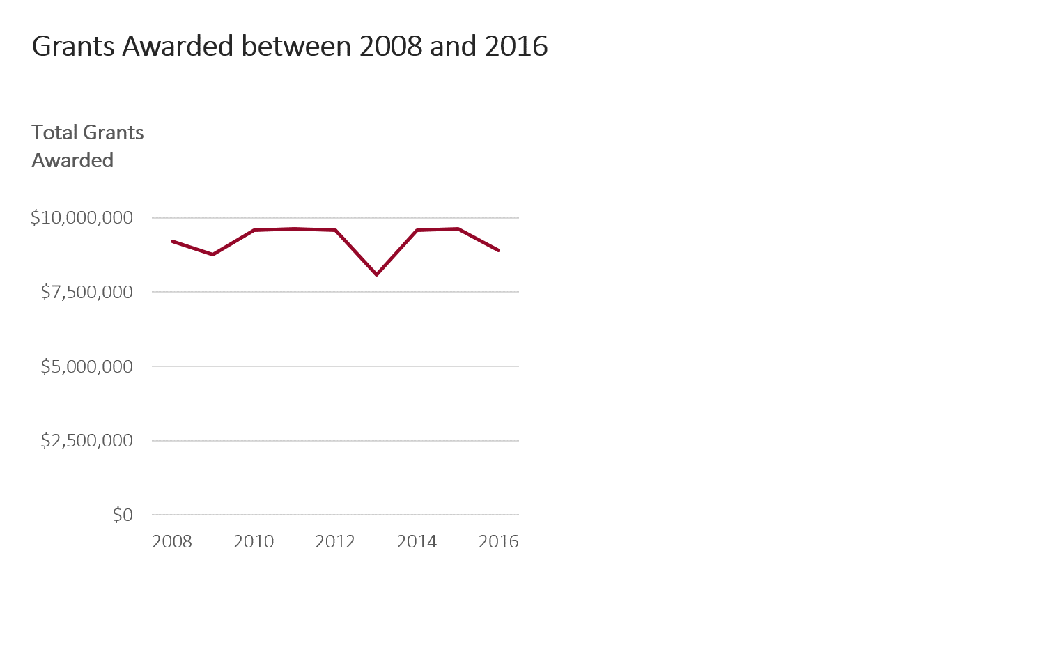
And add the second variable beside it.
In my remake, I’m presenting the data piecemeal. Think about the order in which you want viewers to make sense of your graph. First, I want viewers to see the variable on the left. Second, I want them to see the variable on the right. 
The beauty of this revision is that I’ve got plenty of space for subtitles. I find interesting nuggets, like the minimum values, maximum values, averages, and totals, and add that background information in the form of a subtitle. I don’t hide the cool stuff in the paragraph above my graph or below my graph. I put the cool stuff in plain sight, right above the graph.
With my remake, I’ve got plenty of space to add a third variable if needed. First, my graph talks about the dollar amount given out. Then, my graph talks about how many projects were funded. The logical next step is to consider how the average project size has shifted over the years. That’s probably what my viewers would start wondering: If the agency’s total funding has remained pretty constant over the years… but the agency is funding fewer grantees… then, the average project size must be increasing, right? I try to anticipate what my viewers will be curious about and then I place the answers to their questions right alongside the other graphs. Not on the the next page. Not on the next slide. On the same page as the other related information.
The original graph with the double y axis didn’t let me show the graph in the correct order. I couldn’t show the graph in any order, actually. Both the variables were smushed on top of each other on the same graph. Now, my story has a beginning, middle, and end.
Bonus
Download my Excel file and practice adjusting my template with your own numbers.
Download the Excel File
10 Comments
I love this simple and effective solution to the dreaded Double Y axis. Hoping to see more posts! Warm regards.
[…] In my previous post, I demonstrated how to remove double y axes, in which we’ve got total grants awarded (dollars) on the left and the number of projects that were funded (a tally of projects) on the right. […]
This is very smart. Too often we try to get it all on one graph, but that’s not the way our minds work. You are so right to point out that we need a beginning, middle, and end.
You could also consider a scatter plot with the line connection ordered by year…
No scatter plot looks weird. I think that doing the math to show Dollars per project is the best…
OK. Never mind. You got that at the end. ADD is a terrible thing to waste. LOL
Really lovely example of clear thought and delivery. The way the solution is presented step by step is subtle but brilliant. Particularly the way additional content is introduced, thereby surpassing the value proposition of the original double axis chart. Nicely done!
[…] The double y-axis graph is a shortcut that does not present data in a logical way that can elucidate its meaning. This graph shows project funding staying stable, but the number of projects funded decreasing. You can begin to see the trend the data are showing, but it is not made explicit. (Image source: annkemery.com) […]
I’d do a bar chart on the number of projects (or vice versa) which would make it easier to understand which data went with which axis. My 2 cents. But good point on how not everything belongs on the same chart.
Great tip! This is a good solution i’ll try to implement.
Even I get confused when creating these double y-axis charts sometimes .