
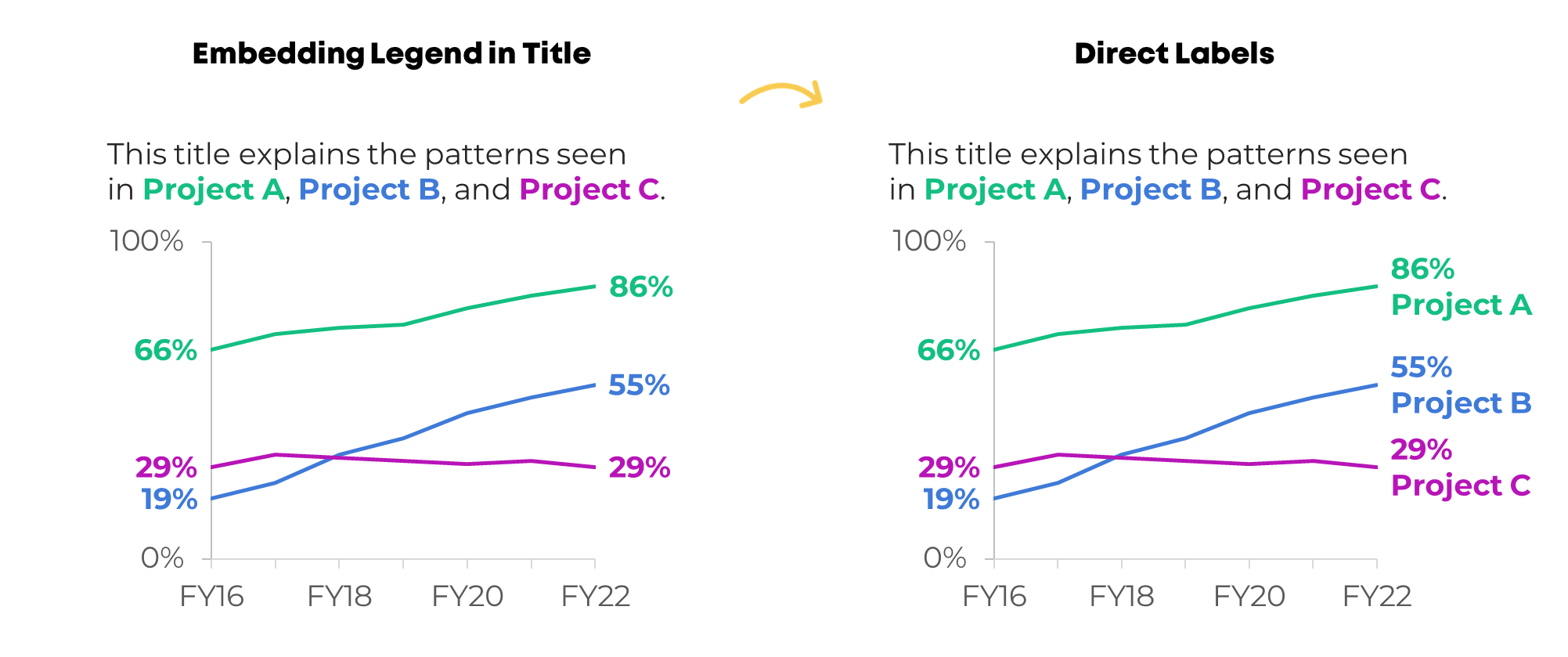
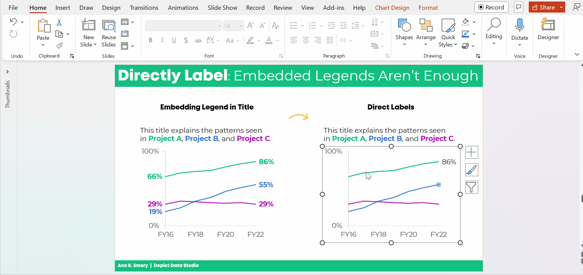
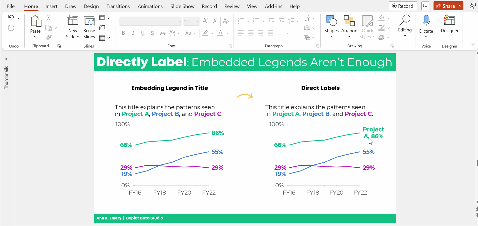
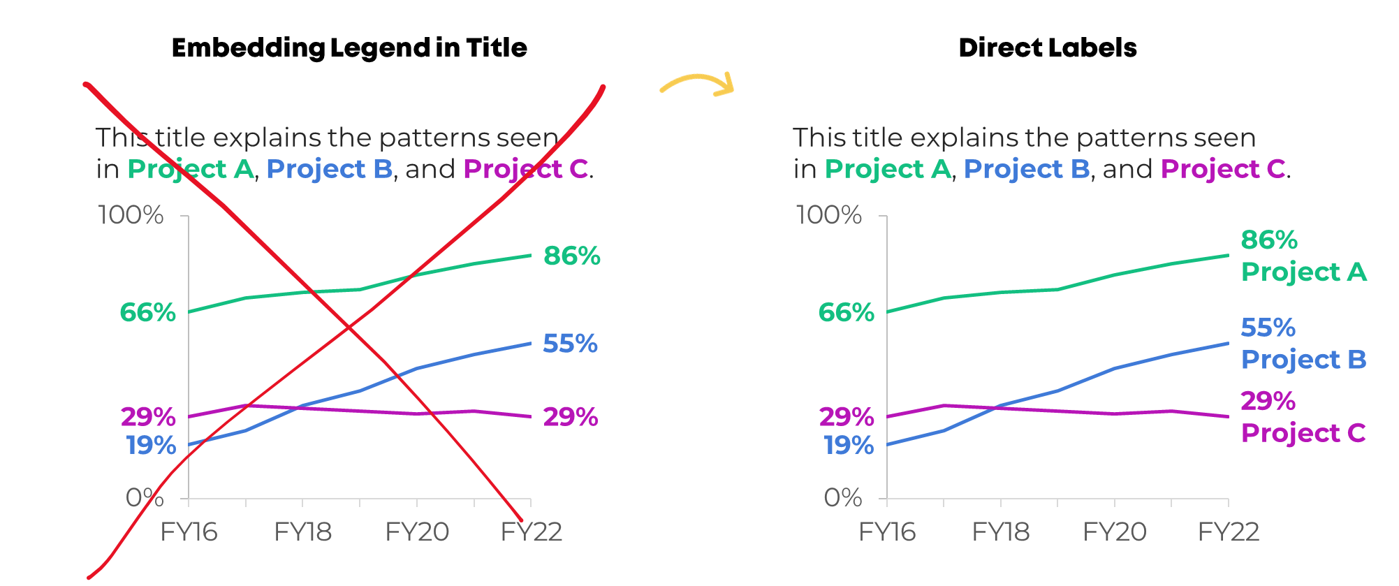
I see these graphs a lot:
The graph title tells us which line is which.
In dataviz lingo, we call it “embedding the legend” in the graph title.
What a clever style!
But it’s not colorblind-friendly or grayscale-friendly.
Let’s compare embedded legends (on the left, YUCK) with direct labels (on the right, YAY).
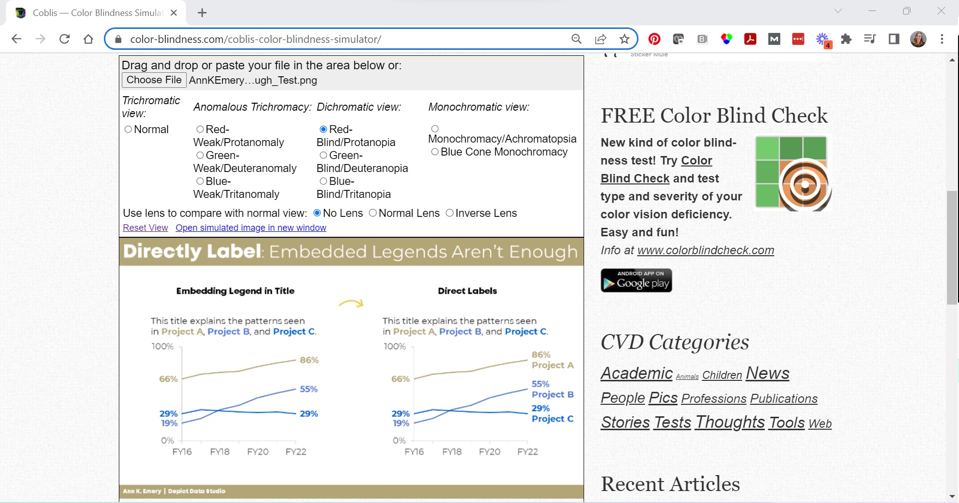
Not Legible for Colorblind People
Although embedding the legend in the graph title is popular, it’s not colorblind-friendly.
Here’s a preview of what the two styles would look like for someone with red-green colorblindness. (I uploaded a screenshot to https://www.color-blindness.com/coblis-color-blindness-simulator/.)
If you’re required to follow 508 compliance in your workplace (if your project is funded by the U.S. Federal government), then embedding the legend in the graph title isn’t 508 compliant, either.
One of the 508 guidelines goes something like this: Viewers shouldn’t have to rely on color alone to understand the graphic.
In the embedded legend version, we are asking our audience to rely on color alone. Oops! That’s where the direct labels save the day.
“But Ann, just choose colors that are colorblind-friendly!”
No no no no. I don’t think we should be choosing random colors for our graphs.
I want you to use your organization’s brand colors in your graphs. Brand colors remove guesswork. No more sitting down to think about which colors look like. Brand colors also help us avoid Frankensteined graphs. No more pages 1-5 of your document in colors that Bob likes, followed by pages 6-10 in colors that Joe likes.
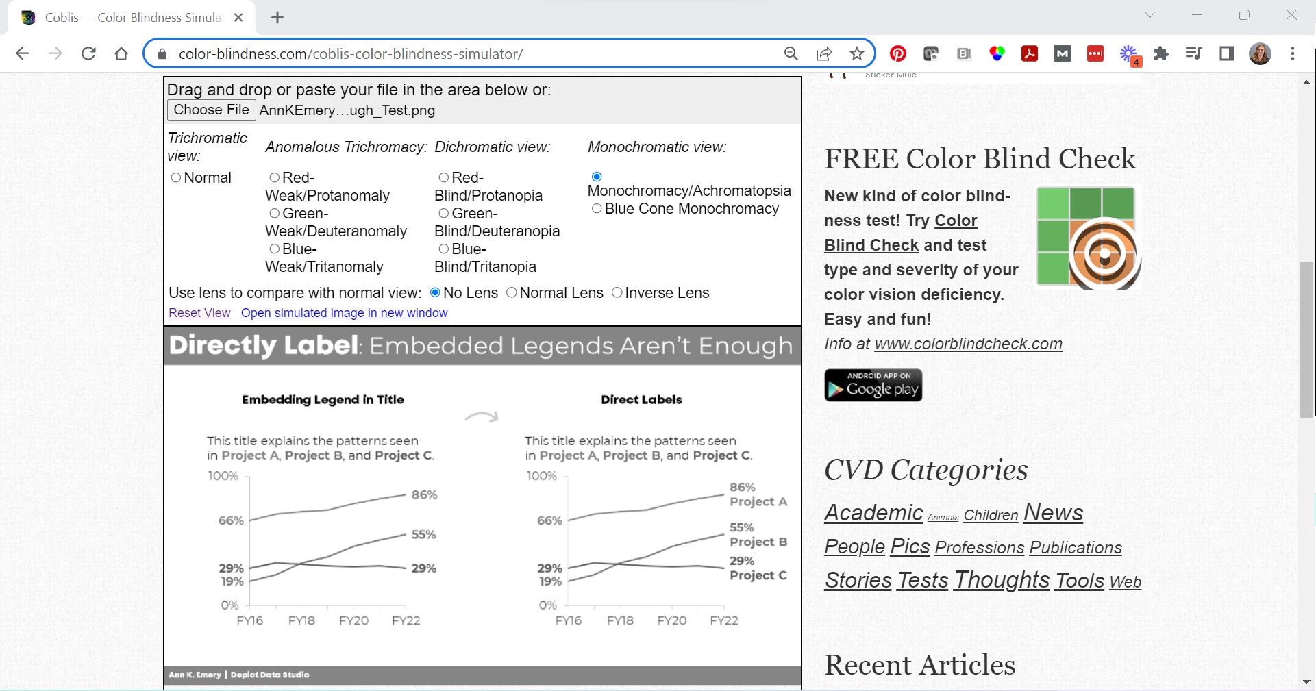
Not Legible in Grayscale
Embedding the legend isn’t grayscale-printing friendly, either. We wouldn’t want our audience to guess which shade of gray is which.
(Again, I uploaded a screenshot to https://www.color-blindness.com/coblis-color-blindness-simulator/.)
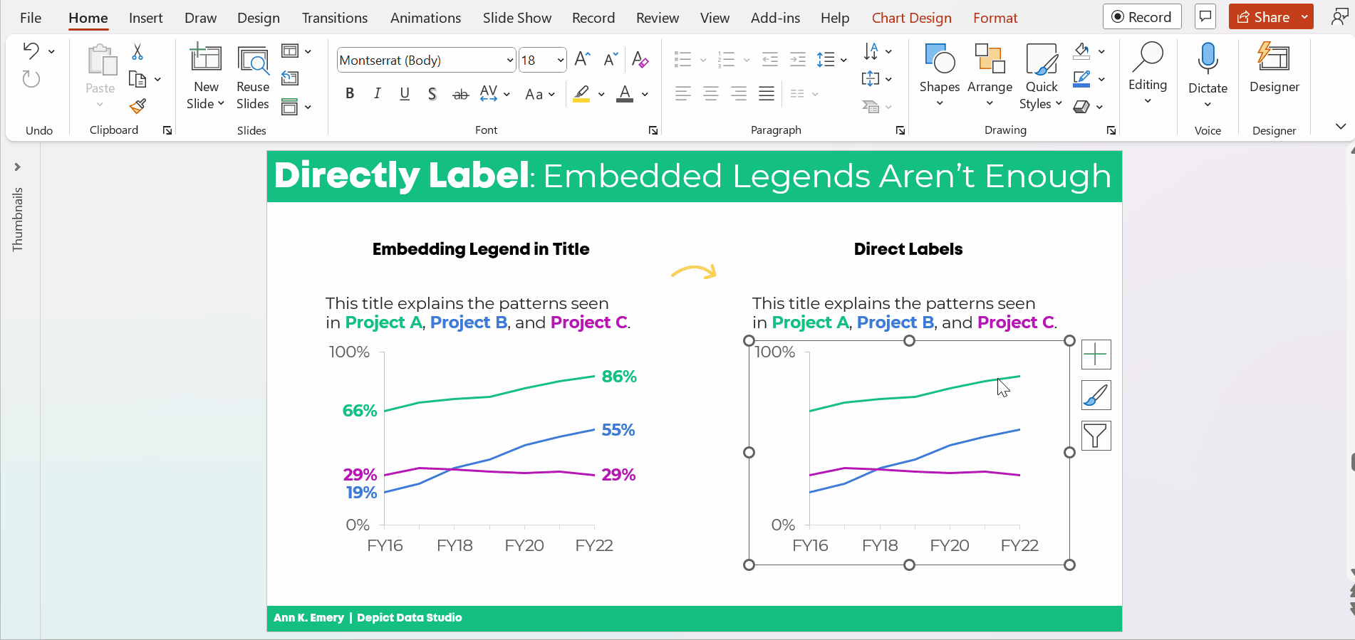
How to Directly Label Graphs in Excel, PowerPoint, or Word
“Ann, how do I directly label the graph in Excel??”
I don’t recommend using text boxes. They’re such a pain! It takes forever to add the text boxes, align them, and group them. When we re-size the graph—making it taller or smaller, for example—the text boxes have to be re-aligned. Ugh.
There’s a better way.
Add the Numeric Labels
In today’s example, I’m using PowerPoint. You can do this through Excel and Word, too.
And in today’s example, I’m labeling the endpoints. Sometimes labeling every. single. point. pulls our audience into the weeds when we need them to be thinking at a higher, strategic level.
Here’s how to add percentages to the endpoints.
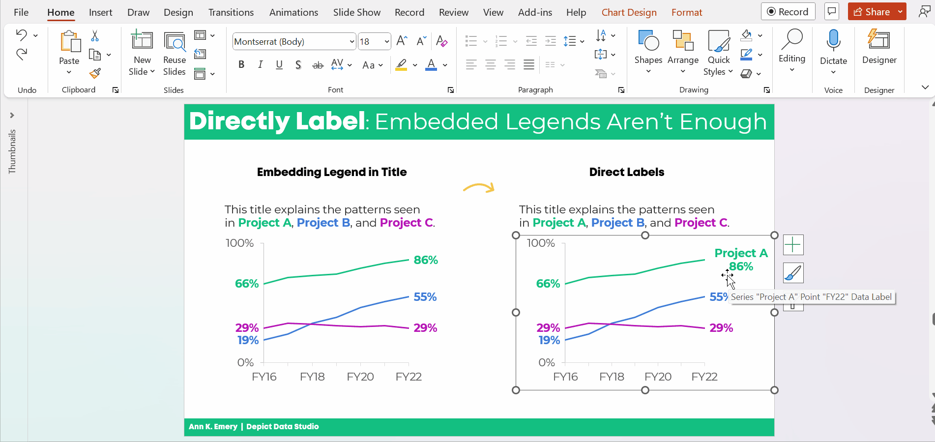
Click on the line once. All the dots will be selected.
Click on the right-most point again. Only the right-most point will be selected.
Right-click on that right-most point. On the pop-up window, choose Add Data Label. It should be singular (Add Data Label) and not plural (Add Data Labels). If you see the plural version, it means you’ve still got all the points selected.
Then, do the same thing to the left-most point.
Don’t forget to move the label to the left of the point.
Here’s how: Once you’ve got the percentage label, click on it again, twice. Right-click and choose Format Data Label. In the sidebar, go to Label Position and choose Left.
Repeat the steps to add percentages to the other lines.
Color-Code the Labels to Match the Lines
This is an extra visual cue for our audience. We want them to know which label belongs with which line.
Click on the labels to activate them.
Go to the Home tab and change the font color just as you normally would.
Make sure that colored fonts are bold, not regular. A good rule of thumb for color contrast accessibility is that colored fonts should be bold.
(It’s harder to read colored font than black font, so the way we make the colored font easier to read is to make the letters thicker. You can learn more about color contrast rules at https://webaim.org/resources/contrastchecker/.)
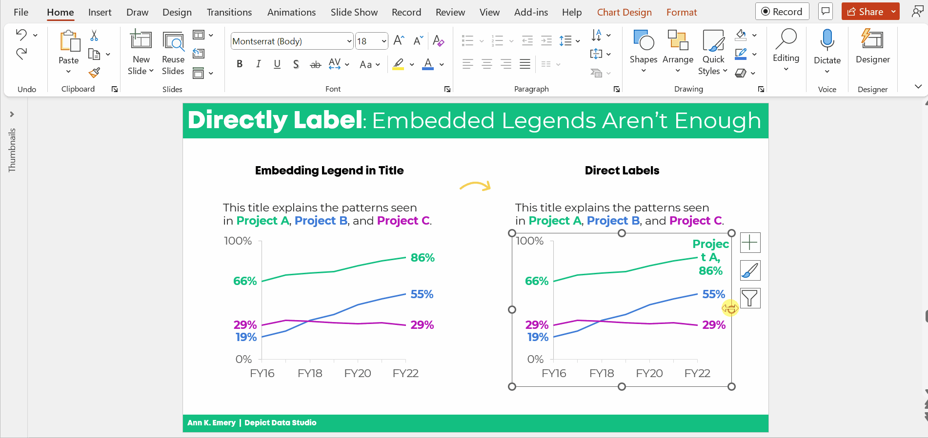
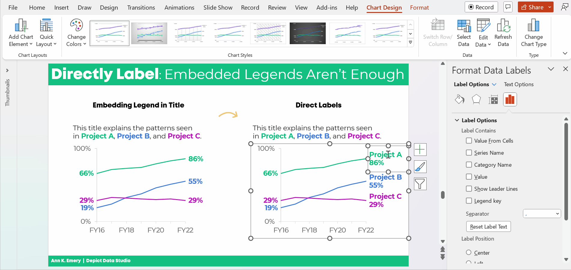
Add the Category Label
Click on that right-most percentage, twice.
Right-click and choose Format Data Label.
Check the box for either Series Name or Category Name. (Series Name vs. Category Name depends on how your data table is organized. Just check and uncheck the boxes until you get the right label.)
Make sure to un-check the Leader Lines box, too. Otherwise you’ll get cluttered connecting lines later on.
Make Sure the Labels Fit
The wrapped text is awkward and hard to read.
We need to make the graph wider.
Sometimes I need to expand the interior of the chart, too. In Excel lingo, this inner border is called the Plot Area.
It looks like this:
Adjust the Separator
This step is optional.
The “separator” is the comma, period, space, or new line that separates the percentage from the words.
In this example, I’m going to use New Line. The percentage will be on one line, and the words will be on a second line. (I’m controlling the text wrapping.)
To adjust the separator: Click on the right-most label, twice. Right-click and choose Format Label. Go to the Separator drop-down menu.
You’ll see me widening the label, too.
Left-Align the Label
Left-aligned text is faster to read than centered text.
And, left alignment ensures that the label is right beside the line.
Simply select the label, go to the Home tab, and use the alignment button.
Change Which Comes First: The Percentage or the Words
This step is optional.
We can change which comes first (well, which one’s on top): the percentage or the words.
Kudos to Nick Visscher for teaching me this tip!
Here’s how: You double-click within the label until you see the gray fill around the percentages/words. Then, on the drop-down menu, select which element should come first or second.
That was a lot of steps, sheesh!
I covered them as thoroughly and slowly as possible. In real life, once you get the hang of it, this would take 60 seconds from start to finish.
The Bottom Line
Embedding the legend is fine.
But it’s not enough on its own.
We also need to directly label the data.
Download the Spreadsheet
Want to explore the graph a bit more? You can download my Excel spreadsheet here: https://depictdatastudio.gumroad.com/l/EmbeddedLegendsArentEnough
Leave a Reply