1 Comment

  • jlbisgard says:

    Hi Ann, I am a bit confused — when I read this graph, 100 people were invited to submit survey responses, yet the graph implies that at different points in time around 70 people responded? What is the total number of responses received?

  • Leave a Reply

    Your email address will not be published. Required fields are marked *

    This is What Equidistant Axis Labels Look Like

    Updated on: Oct 14th, 2014
    Data Visualization
    , , , ,
    Line chart where axis labels are equidistant and data is represented in solid and dashed lines.

    Let’s pretend you’re tracking whether friendly reminder messages bring in more responses to your survey.

    Can you spot the fatal flaw?
    Line chart with axis labels that are equidistant.
    See it?

    Go check out the x-axis.

    Where the heck are Days 5, 6, 7, 12, 13, 14, and 20?

    (This is where you gasp.)

    Yep, the analyst accidentally skipped a few labels along the x-axis. This is an innocent enough mistake. Most likely, there weren’t any responses to the survey on Days 5, 6, 7, 12, 13, 14, and 20. So the analyst was busy and forgot to manually insert “0’s” for those days in the data table.

    This is what Stephanie Evergreen and I described in our Data Visualization Checklist: Axis labels are equidistant means that the spaces between axis intervals should be the same unit, even if every axis interval isn’t labeled.

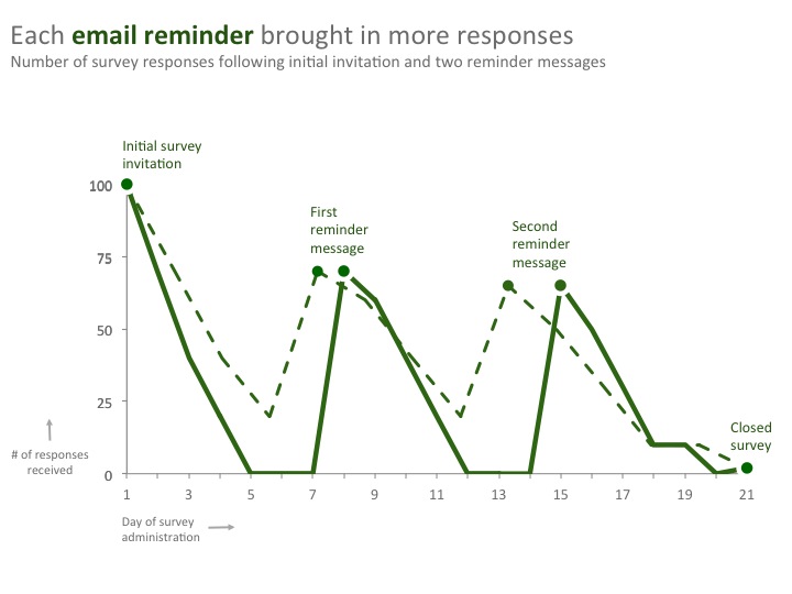
    Here’s what that graph should’ve looked like.
    Line chart with axis labels that are equidistant.
    Can you spot the differences now?

    The dotted line is the incorrect graph and the solid line is the correct graph.
    Our analyst’s error means the readers saw an incorrectly shaped graph.

    I can’t tell you how many times I’ve seen this same mistake in published research and evaluation reports. The analysts have accidentally skipped days, years, cohorts, and so on. Whoops!
    Line chart where axis labels are equidistant and data is represented in solid and dashed lines.
    The good news: What an easy fix. Just add new rows or columns to your data table, insert some 0’s, and voila! your graph will have equidistant axis labels.

    Coming to Denver for the American Evaluation Association’s annual conference?

    Or, contact me and we’ll grab coffee. 

    More about Ann K. Emery
    Ann K. Emery is a sought-after speaker who is determined to get your data out of spreadsheets and into stakeholders’ hands. Each year, she leads more than 100 workshops, webinars, and keynotes for thousands of people around the globe. Her design consultancy also overhauls graphs, publications, and slideshows with the goal of making technical information easier to understand for non-technical audiences.

    1 Comment

  • jlbisgard says:

    Hi Ann, I am a bit confused — when I read this graph, 100 people were invited to submit survey responses, yet the graph implies that at different points in time around 70 people responded? What is the total number of responses received?

  • Leave a Reply

    Your email address will not be published. Required fields are marked *

    You Might Like

    Our complimentary mini course for beginners to dataviz. Takes 45 minutes to complete.

    Enroll

    The Data Visualization Design Process: A Step-by-Step Guide for Beginners

    Visualizing numbers in charts, graphs, dashboards, and infographics is one of the most powerful strategies for getting your numbers out of your spreadsheets and into real-world conversations. But it can be overwhelming to get started with data visualization. In this step-by-step data visualization guide for beginners, I’ll walk you through the data visualization design process so that you can transform your spreadsheets into stories.

    More »

    Inside our flagship dataviz course, you’ll learn software-agnostic skills that can (and should!) be applied to every software program. You’ll customize graphs for your audience, go beyond bar charts, and use accessible colors and text.

    Enroll

    Subscribe

    Not another fluffy newsletter. Get actionable tips, videos and strategies from Ann in your inbox.