Yesterday, a woman brought a graph to Office Hours that looked something like this:
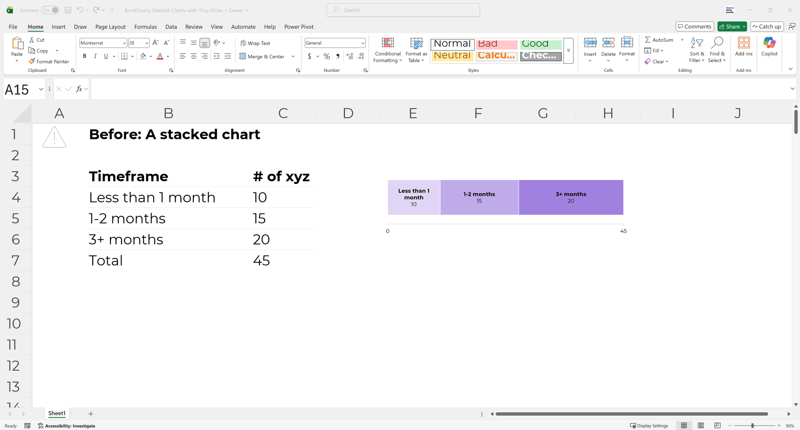
The stacked chart wasn’t terrible.
She already formatted it, following all the usual dataviz and accessibility principles. (White outlines, brand colors, direct labels instead of legends, sequential colors for a sequential variable, only labeling the min and max on the scale, using sufficient color contrast, etc.)
The challenge was that her chart was going into a dynamic dashboard, so depending on which filters were selected, the numbers might be really big, really small, or even zero.
We needed to think forward and plan for all those different scenarios.
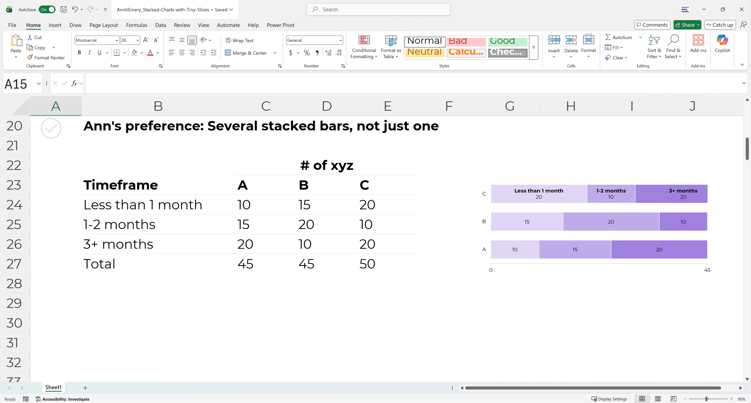
Challenge: A Single Stack is Lonely
Another challenge was that her chart looked lonely.
I don’t love stacked charts for a single stack.
I don’t have peer-reviewed articles to back this up; it’s a personal preference.
Stacks are extroverts. They thrive with their friends, like this:
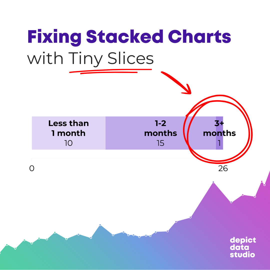
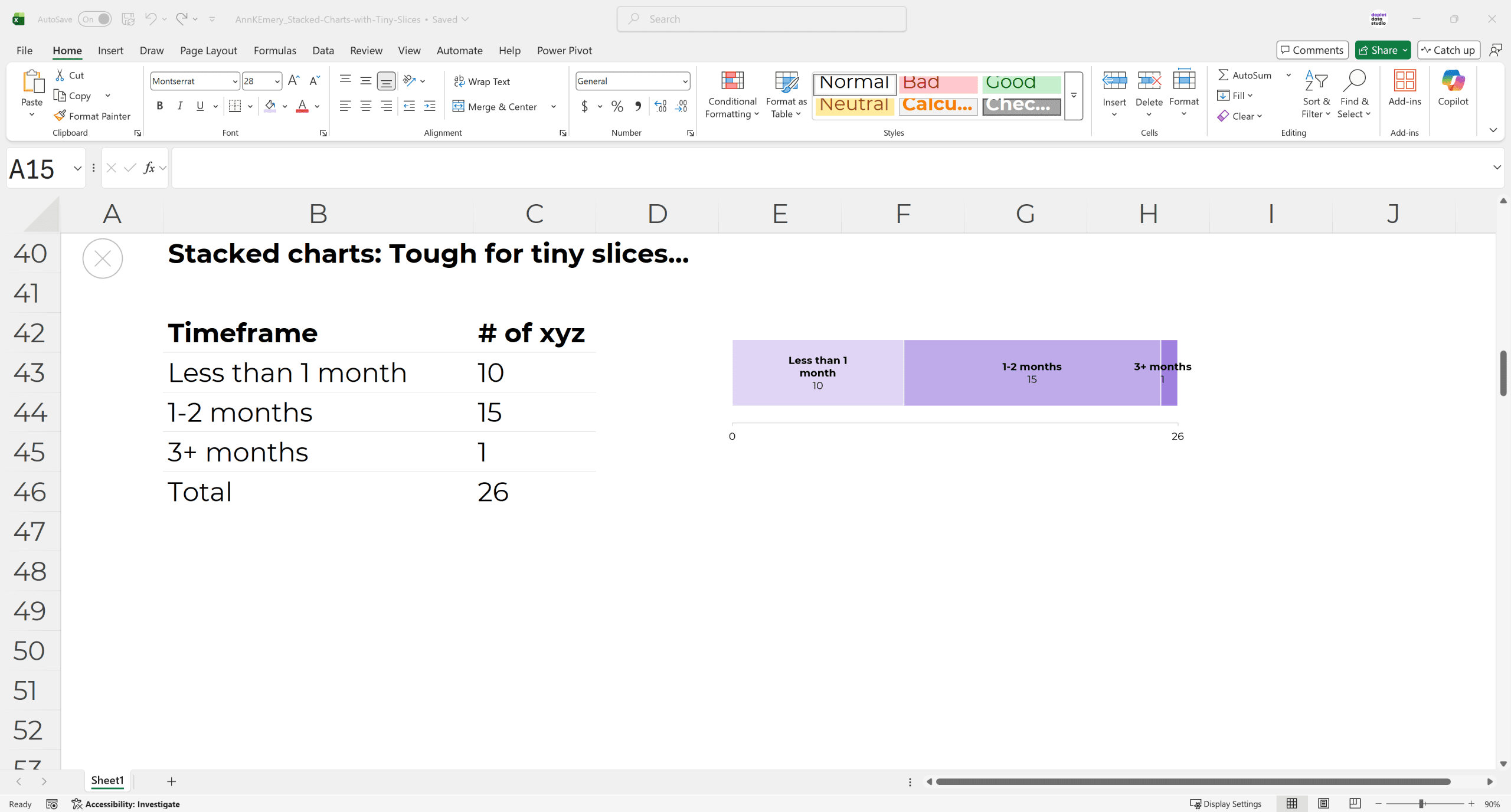
Challenge: Stacked Charts are Tough for Tiny Slices
Remember how her chart was going into a dynamic dashboard?
So depending on which filter(s) were selected, the numbers might be really small.
Stacked charts are terrible for small slices. They’re hard to label, and even harder to see.
You’ve run into this, haven’t you? It’s a common dataviz headache.
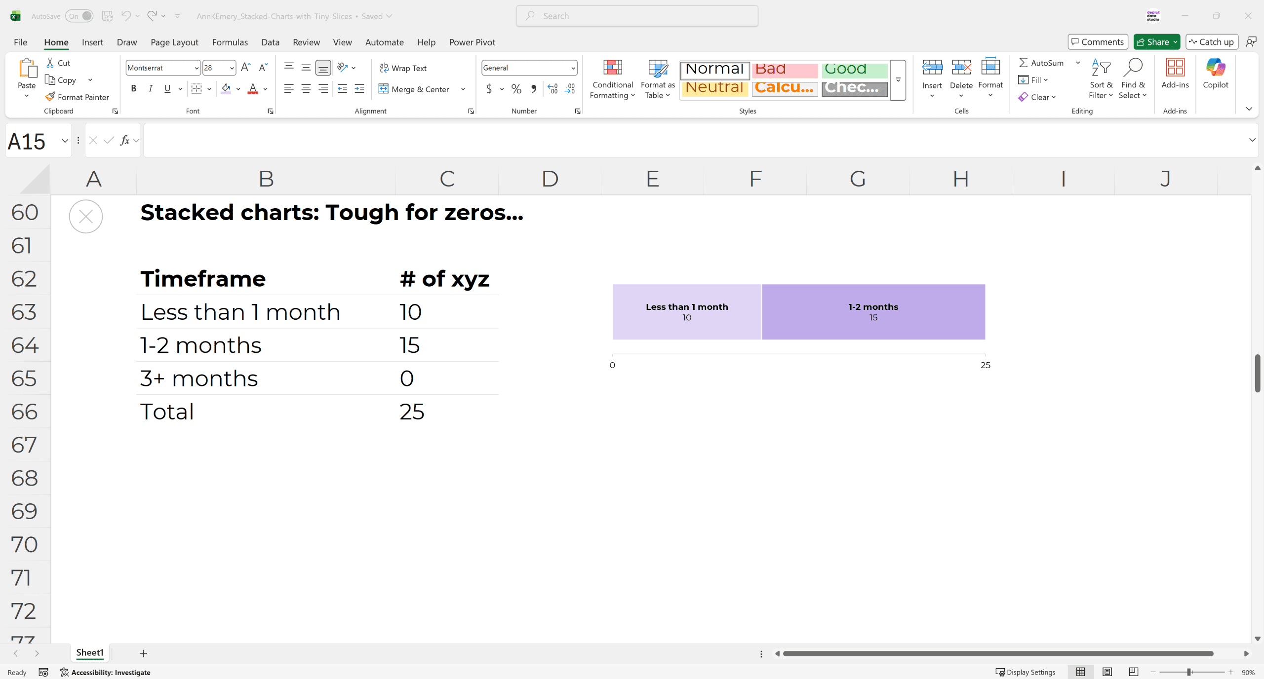
Challenge: Stacked Charts are Tough for Zeros
Another common dataviz headache is that stacked charts are terrible for zeros.
Because they literally can’t show zeros. There’s nothing to visualize.
Sure, I’ve seen people try all sorts of workarounds, like adding text boxes off to the side that explain that a category isn’t shown because the number was a zero. But that’s messy and time-consuming.
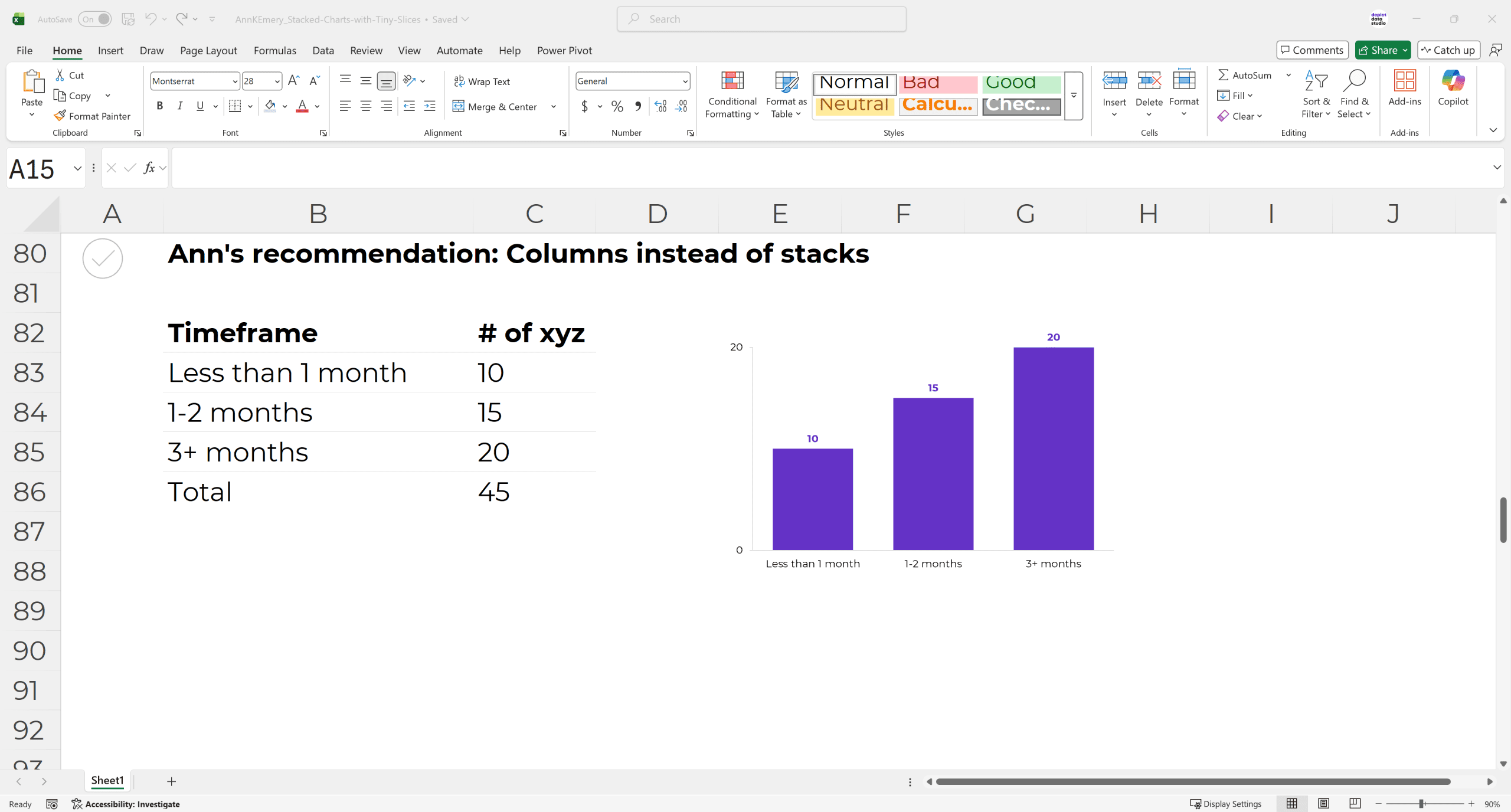
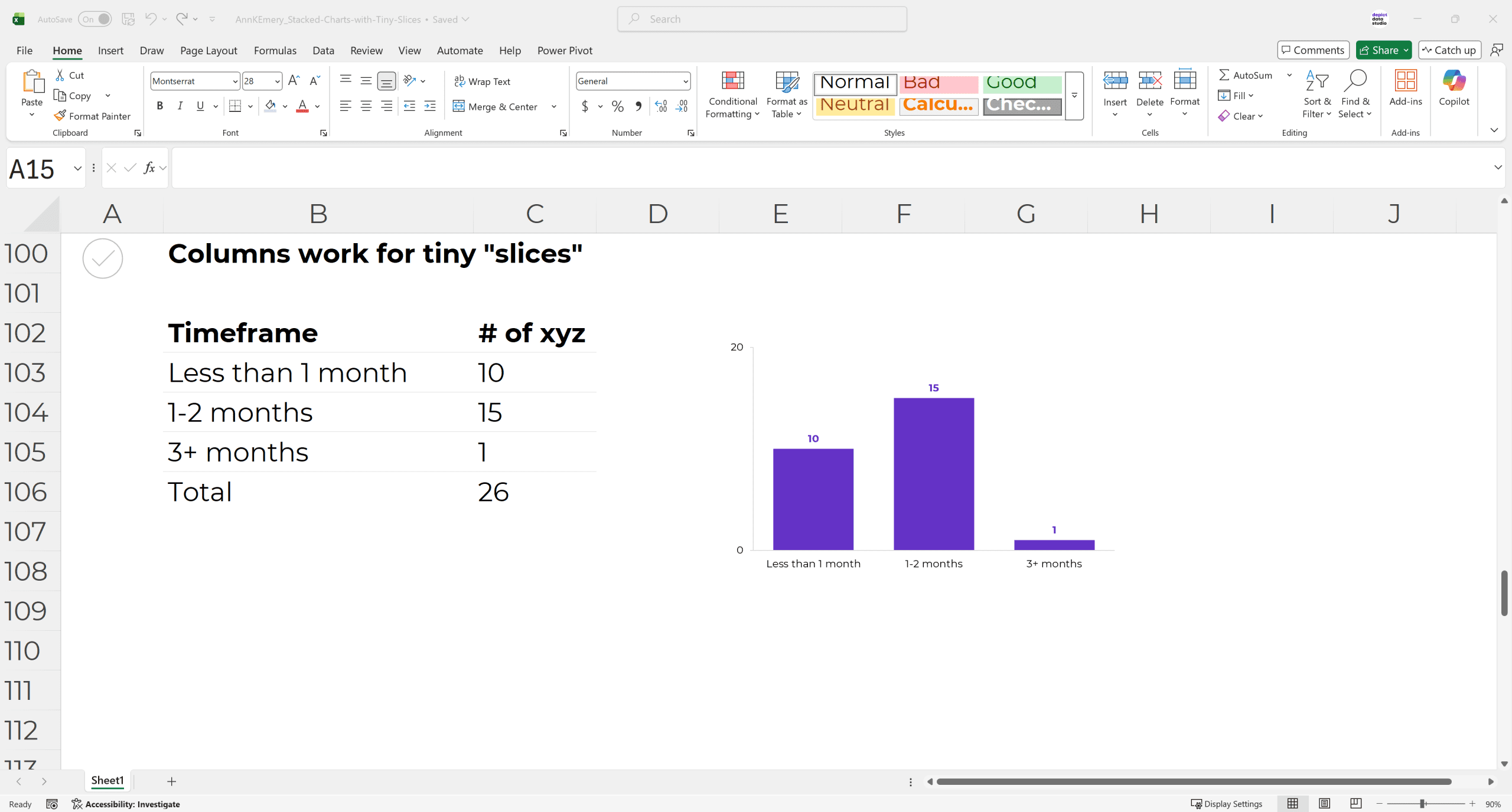
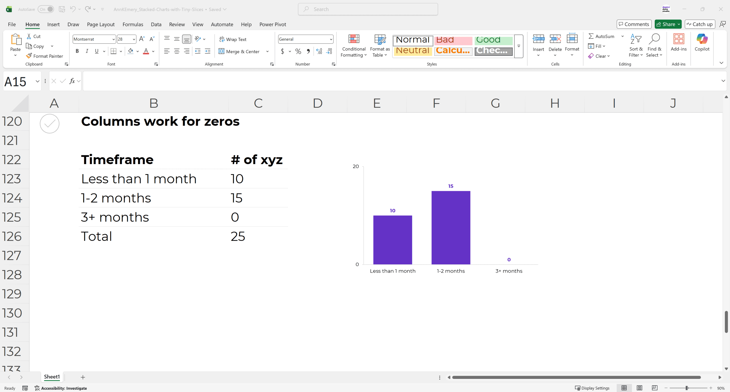
Solution: Use Columns/Bars Instead of Stacks
I often recommend changing the stacked bar/column into a regular bar/column, like this.
(Should you use vertical columns or horizontal bars? I’m using vertical columns here because this particular graph is sequential.)
(Worried you’ll have to delete the chart and start from scratch? No way! It’s faster than that. You can change the chart type with just a few clicks.)
Can you see how regular bar/column charts work better for tiny numbers?
Can you see how regular bar/column charts work better for zeros?
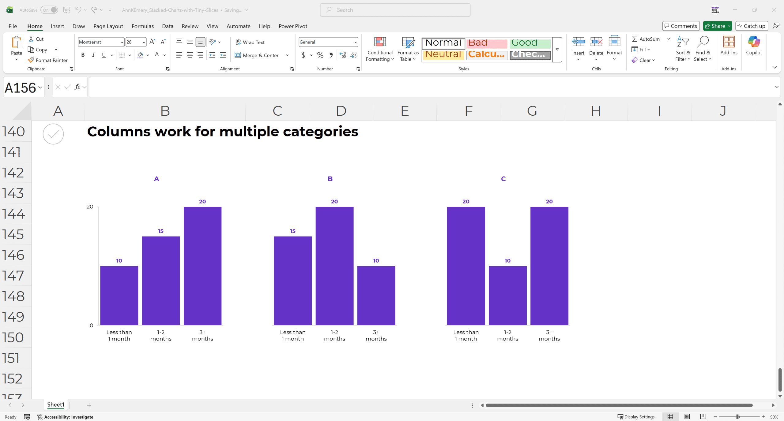
And don’t worry — regular bar/column charts still work when comparing multiple categories, too. We’d simply make a small multiples layout, like this.
Your Turn
These principles can and should be applied to every software program.
As you can see, I’m using everyday software (Excel) in these examples.
Have any how-to Excel questions? Comment here and let me know. I’ll post a link to an existing tutorial, or I’ll make a brand new tutorial for you.
5 Comments
Agree that changing the chart type up can be a good alternative. However, that’s not always an option. Do you have a tip on what to do when you have a stacked chart with tiny slices and you need to keep it as a stacked chart? Thanks!
Tell me more – why might we need to keep it as a stacked chart?
I agree with April, I use a stack chart for results of a patient satisfaction survey. There are 5 items on a likert scale I like showing together, not sure that bar chart would be easy to show on one page with 5 items. It would be too cluttered.
I get the comment about single stacks, but what would you suggest for data that adds up to 100% (but you need variety from pie charts)?
I’ve still used bar/column charts for these.