The only thing I love more than analyzing research data is analyzing personal finance data. In both cases, simple descriptive statistics and basic charts can shine a spotlight on interesting patterns and help people choose their course of action.
Not too long ago, a friend was trying to decide whether to continue renting his current apartment or to purchase a similarly-sized condominium.
- Option A: Continue renting current apartment. Approximately $2,000/month, which includes utilities and amenities. Walkable neighborhood with grocery stores, restaurants, and biking trails. Near public transportation options like a metro stop and multiple bus stops.
- Option B: Purchase a condominium. Approximately $1,700/month, thanks to those darn homeowners association dues. Farther from public transportation, which means extra commuting time and potentially extra commuting costs. Comes with the thrill of purchasing a home and the potential for making money when selling it later on.
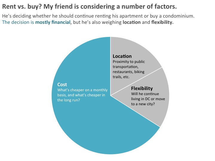
During our initial conversations, his decision seemed to be mostly financial—will he save money on a monthly basis by buying a condo? Will he save money over the next 5, 10, or 15 years by buying a condo?
Location is also part of the decision. Rush hour’s no joke in DC, so he wants to stay near public transportation to keep his commuting time and commuting costs low.
Finally, flexibility is part of the decision. He’s a computer programmer and his start-up environment can be unstable. Last year, when one of his company’s apps didn’t sell as well as they expected, the company downsized and he was laid off. He found another job almost overnight but knows it’s possible that his new company could downsize at some point. He’s pretty sure he wants to stay in DC, but has also considered moving to San Francisco.

I couldn’t make the decision for him, but I could help him crunch the numbers.
We made this spreadsheet together over a beer. He wanted to compare costs of renting vs. buying over a 10-year period. A few of our acquaintances have had trouble selling their condos so he knew that, if he chose to buy a condo, it would be a long-term living situation. And of course, we factored in rental costs like gym fees and parking fees and homeownership costs like association dues and home repairs.
My friend stares at computer programming languages all day long but he was in hell with this spreadsheet. Data visualization to the rescue! We mapped out his options in this simple line chart…

…and then formatted the chart.

Notable edits:
- We removed the grid lines;
- We removed the legend and directly labeled the end points of each line (i.e., we inserted a text box so that “Continue renting apartment” was right next to its corresponding line);
- We used the muted color + action color strategy to draw attention to Option B (how buying a condo is the cheaper option);
- We added a so what? title;
- We added a 2-line description underneath the title; and
- We drew attention to that magical 4-year milestone where my friend would break even financially—where the cost of buying a condo becomes a cheaper option than renting.
And which option did my friend choose? After our conversation, he designed Option C: moving to a slightly smaller and slightly cheaper apartment in his same great neighborhood. He was unpleasantly surprised to see how expensive his apartment really was, but he was also hesitant to buy a condo, and hadn’t previously considered swapping one rental for another. The money he’s now saving on rent will go towards his eventual move to San Francisco. Once he compared the costs, he realized that the flexibility slice of his decision making pie was pretty important.
How are you using data visualization for personal or professional decisions? Share your tips below!
3 Comments
I love reading your blog posts, Ann! I also really appreciate the example used in this post – it is something we can all relate to and understand, and it kept me interested during the entire piece. Great job! I am going to add these data viz pointers to my current list. Thank you.
I have so many spreadsheets and visualizations of my running data! I’m marathon training right now, and during my long runs I like to think about new ways to chart my progress (I run with a GPS watch, so I have a lot of data!)
[…] simple line graph is a powerful example of how data visualization can be used to make decisions. Ann K. Emery created this graph to help a friend decide whether to continue renting his current apartment or to […]