
Here’s a common data visualization challenge: Slides with some, but not all, of the chronological data included.
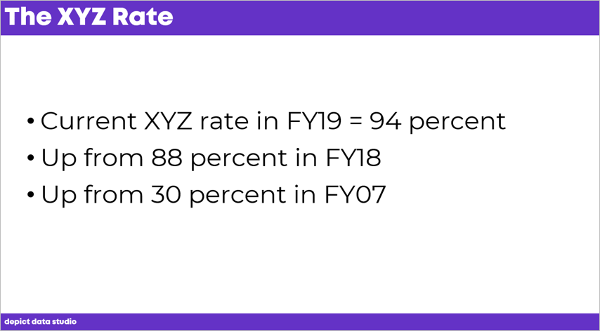
The Challenge
The challenge is twofold:
- First, how do you take your bullet points and transform them into a graph? What type of graph should it be? How should it be formatted? How do you make the graph easy to understand?
- Second, what if your dates don’t go in order? What if you’ve got data for one point in time… and then you skip a big chunk in the middle?
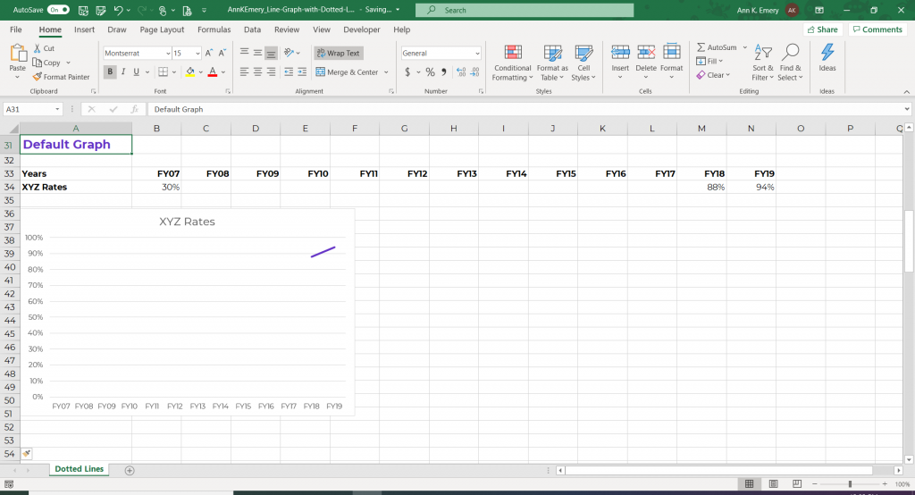
The Excel Solution that Doesn’t Work
First, I tried filling in my table with the few data points that were available.
Excel doesn’t quite know what to do with that.
Excel didn’t show anything at all for FY07. No dot. Nothing.
And, there’s all this white space between FY07 and FY17, which is obviously not going to work.
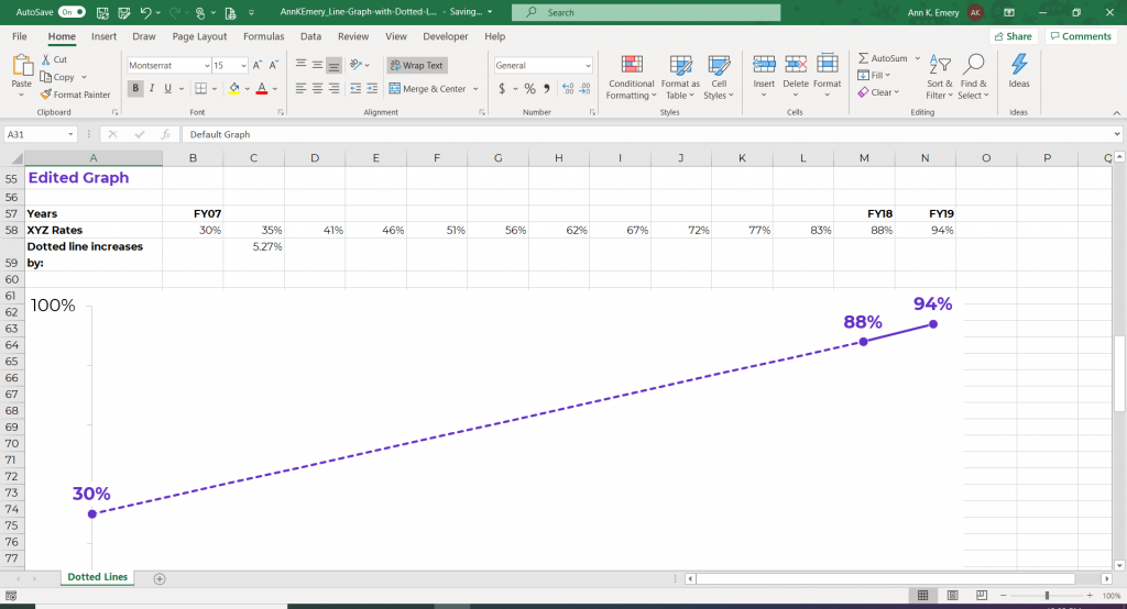
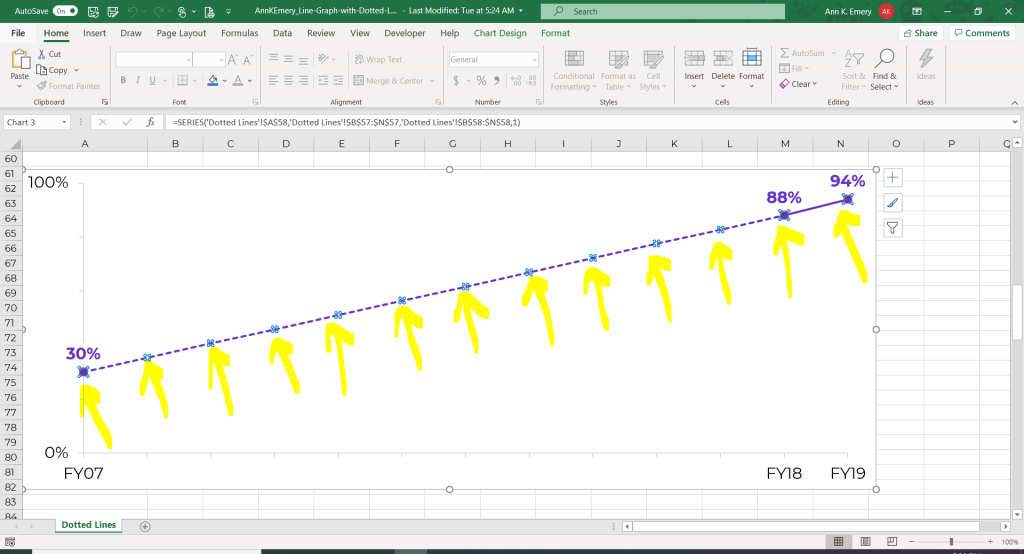
Using Dotted Lines to Show Uncertainty
Here’s the edited version.
We used a dotted line to connect two points on the graph. Dotted lines are great for visualizing estimates or uncertainty.
So how did I do this?
How to Add Placeholder Data to Your Table
You need to fill in some placeholder numbers with estimated values.
In this example, we’ll make our line increase by 5.27% each year.
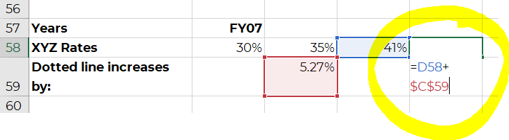
How to Calculate a Placeholder Value
To find the placeholder value, I took the FY18 number minus the FY07 number and divided that by 11. Why 11? Because there’s an 11-year gap between FY07 and FY18.

Increase Each Year by the Placeholder Value
Each year increases by 5.27%.
In the first box, it’s 30% plus 5.27%.
The next box is 35% plus 5.27%. And so on.
Selective Labeling Will Focus Your Audience on Your Years of Choice
In the table, you’ll notice that these placeholder values don’t have fiscal years above them.
I don’t want every single year’s label to show up in the graph. I want to focus on the numbers that we do have data for.

How to Change Solid Lines to Dotted Lines in Excel
After setting up your table, you’re going to insert a line graph just like you’ve done a million times before. By default, Excel gives you a solid line.
How do you get the dotted line appearance? This part is really easy!
Click Once to Edit the Entire Line
If you click once on the line, you’ll notice that all of the dots are selected.
You can edit the entire line at once, just as you normally do. For example, you can change the line’s color, width, etc.
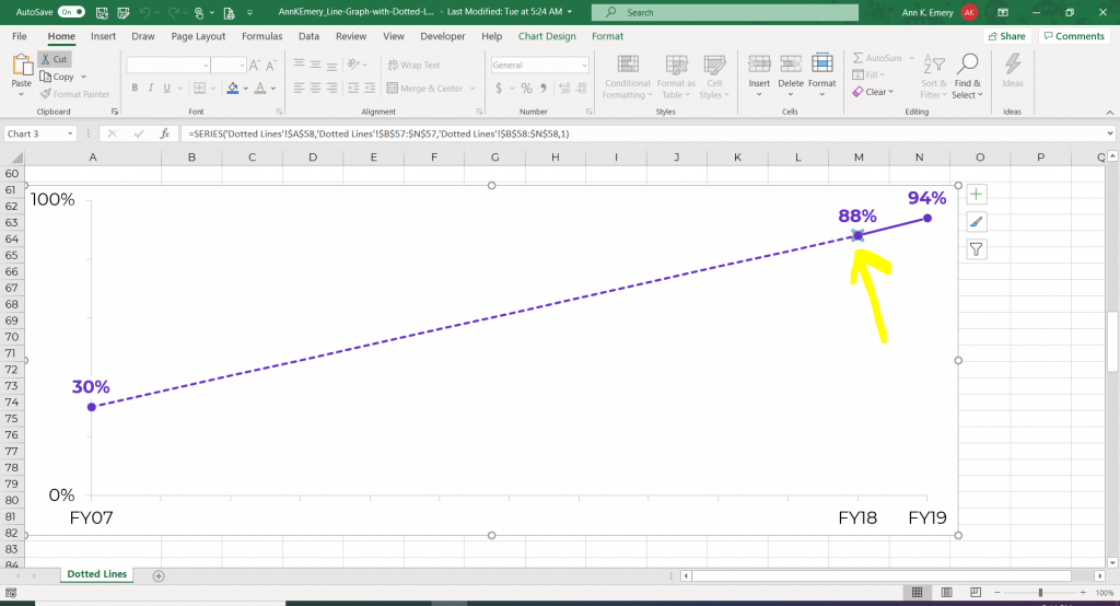
Click Twice to Edit Pieces of the Line
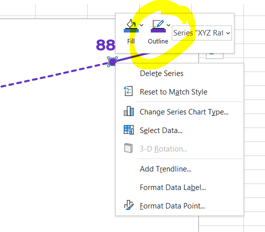
If you click on one of the dots a second time, then you can edit one smaller segment of the line at a time.
The dot controls the piece of the line just before it. You would click on the dot in this screenshot, for example, to edit just the section of line to the left of it.
Right-click on that dot and select Outline.
Then, click on Dashes.
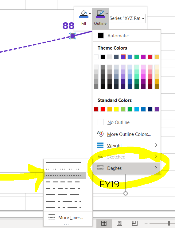
Experiment with a Few Different Dashed Styles
You’ll need to try a few different dashed styles.
Some styles work better for smaller graphs, and some styles work better for larger graphs. It depends on whether your graph is going into a tiny space in a Word report, or into a large slide in a PowerPoint presentation.
For this particular graph, I didn’t change the segments to dashed lines one at a time. That would be way too much work! Since all but one segment would be dashed, I set the entire line to be dashed, and then set one segment to be solid.
Avoid Using Text Boxes and Shapes Whenever Possible
Sometimes people think I’m going to Insert –> Shape and adding some type of dashed line.
While you’d get the same end result… that would be a lot of work.
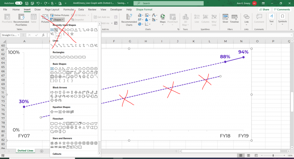
I don’t want to add text boxes or shapes on my graphs if I can avoid it.
I work on a lot of automation projects, so the more built-in features you can have, the better. Manually creating shapes is clunky and time-consuming.
Bonus! Watch a Tutorial
I’ve always found that watching someone’s mouse click on the screen makes learning a million times easier than following screenshots.
Here’s the video version of this blog post, where you’ll learn exactly which buttons to click on.
Bonus! Download the Excel File
Download the Excel file used in this tutorial and use it however you’d like.
Download the FileYour Turn
Comment below and let me see examples of dotted lines in your projects. I look forward to hearing from you.
6 Comments
Great insight
Very useful, better than the other solutions that came up.
Very useful, but the Legend cannot reflect both.
Whereas adding two fake different graphs allows for two legends
We try to avoid legends nowadays in dataviz since they take a while to read, aren’t accessible, and don’t always print well in grayscale. You’d simply add direct labels.
Thank You this is really useful, but this is not working online sheet. you need to edit sheet in excel application only.
Hi Milan,
Yes, it’s for Microsoft Excel, not for Google Sheets.
Ann