
Meihsi Chiang is an Evaluation Associate with the Brown School Evaluation Center at Washington University in St. Louis and for the last year has been a participant in Ann K. Emery’s online course. Meihsi helps to oversee the development of the design of communication and dissemination materials for the Center.
Nikole Lobb Dougherty, Associate Director of the Brown School Evaluation Center, currently serves as the vice president of the Evaluation Association of St. Louis (EASL).
Since EASL is a volunteer organization, board members felt it was beneficial to develop a style guide for the organization to ensure future volunteers had guidelines when developing EASL related promotional materials and/or reports to ensure a consistent look and feel to these products.
This post is about the process used to develop EASL’s style guide, putting many of Ann’s tips and trick into action.
Here’s a common problem we hear from many of the non-profit, social service, philanthropic and other organizations we work with: “We don’t have the resources to hire a design professional to help us with our branding and help design all of our reports or products.”
Making reports, presentations, and other communications have a consistent and polished look and feel may be a lot easier than you think. We have found that a great starting point is a do-it-yourself visual style guide – which can be developed with very few resources.
What is a Style Guide?
A “style guide” defines the visual and editorial standards that will used by your organization or team to create consistently designed communications such as annual/quarterly reports, newsletters, websites, posters, flyers and so on.
We have found that developing a style guide for different projects or organizations we work with has been a handy reference tool to help maintain this consistency and a polished look and feel.
A style guide not only provides guidelines for dissemination and communication materials, but it can also be a tool to increase design capacity within your organization or team.
Here at the Brown School Evaluation Center at Washington University in St. Louis, we develop a style guide for each partner we work with. We have helped partners develop simple style guides based on their available resources (e.g., Microsoft Word, Excel, or PowerPoint) to design a conference poster or an evaluation report.
We often start with an existing logo or website (most organizations have a budget or resources for ‘bigger’ design stuff like this) for inspiration for the style guide.
Below are five key steps along with some cool resources we have found helpful in setting up a style guide.
Getting Started with Style Guides
We most often document our style guides in Microsoft Word or PowerPoint. This document outlines the basic design guidelines for an organization, team, or project.
We include at least five components in each of our style guides: logo, color, fonts, charts, and images.
Below are key steps to identifying each of these components for a style guide for the Evaluation Association of St. Louis (EASL).
Step 1: Locate High-Quality Logos
Most of the organizations or partners we work with have existing logos or websites.
The more common challenge is that staff don’t know how to access high-quality versions of their logo.
Many individuals end up going to the website, right clicking on the logo, then saving the image.
The result? A low-quality version of the logo that looks fuzzy when you insert it into a document.
A high-quality logo file is key.
Often this is a PNG or JPEG file and most designers who develop logos can export the logo in this format.
For printing purposes, it is suggested the logo size should be 500px for small prints and 1024px for larger prints.
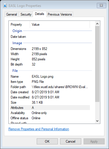
How to Find the Resolution and Size of Your Logo
To see the resolution and size of the logo you are working with:
- Right-click on your logo file.
- Select “Property.”
- Under the “Details” tab, you will find the information for image size.
The EASL logo size is 2199px by 852px.
Save High-Quality Logos for Everyone in One Folder
We find it helpful to save all the high-quality logos in a designated spot and provide the location (e.g., file pathway) in the style guide.
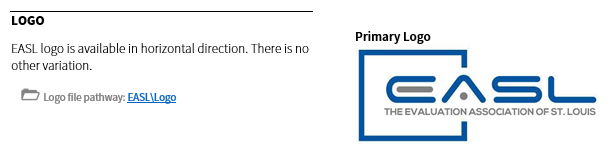
If the organization has logos of different orientations, then we include each variation in the style guide.
If a logo does not exist but a website does, you can use the existing website to help you choose a color palette instead.
Here’s how we describe the variation of the logo and provide the logo file pathway in the style guide:
Step 2: Choose a Color Palette
Next, we figure out what colors are used in the logo or website.
Ask Communications Staff for the Existing Style Guide
If we have access to our partner’s communications staff or the logo designers, we ask for the colors used.
When we don’t have access to these individuals, we use some helpful tools to get this information.
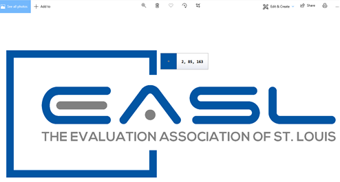
Use an Eyedropper Tool to Detect Color Codes
There are several color picker tools available online for free. The Instant Eyedropper is highly recommended by Ann K. Emery – and we love it too! Check out this tutorial of how to use it.
The Instant Eyedropper decodes the color in the logo:
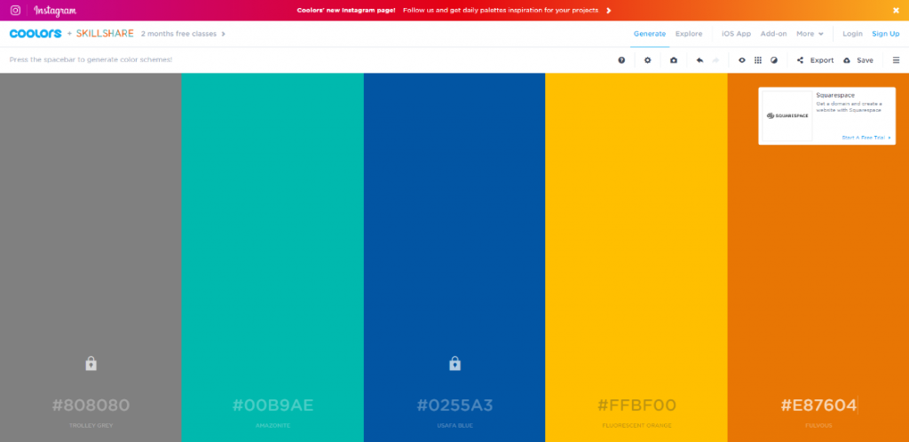
Have a One-Color or Two-Color Logo? Generate a Color Palette Based Off the Logo’s Primary Colors
Using the eyedropper tool, we detected the primary colors that are part of the organization’s logo.
Next, we moved to creating color palette using the primary colors detected.
COOLORS is a great free online tool to help you generate a good-looking color palette. This tool also allows you to test for color blindness test to ensure accessibility of selected colors.
Lock the primary colors in the panel and the tool generates the color schemes for you!
Document the Color Codes in Your Style Guide
Document the CMKY and RGB codes for each color in your style guide.
If your organization typically only uses Microsoft Word, Excel, or PowerPoint, then you will need those RGB codes.
CMYK codes are used in Adobe Creative Cloud and other platforms.
Here’s the color palette for EASL in the style guide:

Step 3: Choose Fonts
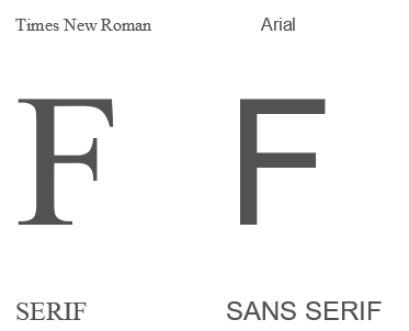
Typography is very serious in the design world but the primary thing you need to know is there are two major font styles: Sans Serif and Serif.
Serif fonts usually have a more book-style, old-fashioned, and traditional look. These fonts have little decorative stroke, or “little feet,” that extends from letters. Serifs are generally easier to read in lengthy or smaller print. Think about using serif fonts for your narrative or body text.
Sans Serif fonts tend to look a bit more modern, crisp and clean. It also lets people know that you’re more “approachable.” These fonts work well for headings, graphics/charts, and titles.
Here’s an example of serif vs. sans serif:
How Many Typefaces Do You Need?
We generally try to choose no more than two to three typefaces for each style guide.
We choose fonts that have the right amount of contrast—including at least one serif and one sans serif font.
The Fonts We Chose for EASL
By eyeballing the EASL logo, we saw that the EASL logo used fonts from the Sans Serif font family.
We chose Source Sans Pro as the primary font and Rockwell (from Serif font family) as secondary font to provide variety for design use.
Source Sans Pro is our favorite – looks modern and clean, and has a great variety of options within its font family. It’s also a free and open-source font!
Fed up with the default fonts in Word and PowerPoint (e.g., Calibri, Arial, Times New Roman)?
Need Font Inspiration?
There are other options for you!
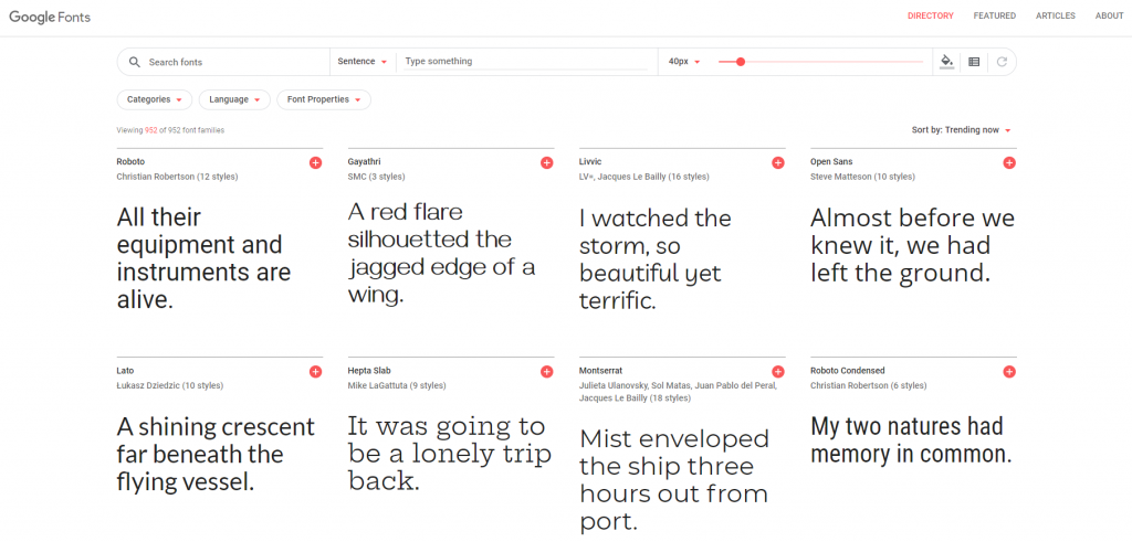
Google Fonts provides a good variety of typefaces and it’s FREE to download.
Google Fonts is one of our favorite source for free fonts.
Not Sure What Your Existing Font is Called?
There are some online tools to help identify what the font is in your logo or any images (The Font Squirrel Matcherator, WhatTheFont!).
If it is not a standard font available in the platforms you are using (e.g., Word, PowerPoint) it may be best to find a font of similar style to ensure others outside your organization have access to the fonts included in the style guide.
Step 4: Provide Image and Charts Guidelines or Examples
Photos are a powerful and compelling visual tool. Even though we may not have all the professional knowledge about photography, we do tend to have a natural instinct for what images represent our organizations, teams, or projects.
What to Consider When Choosing Photographs
In the style guide, we find it helpful to show examples of images that represent the organization, team or project well.
When selecting photos, we gravitate towards photos that are human-focused and personal, and try to keep in mind representing diverse groups or experiences.
We have found it helpful to either select some images to include in the style guide that can be used by team members or minimally link to a collection of potential photos that have been curated by whomever is developing the style guide.
Where to Find Photographs
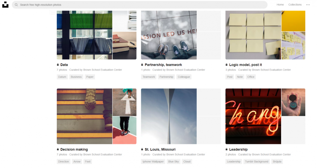
We often use Unsplash and Pexels to curate collections of photos/images – since they have many high quality images and photos for free (for both commercial and noncommercial purposes).
In curating a small collection of images, we identify key words/concepts related to the organization, team, or project.
In developing the EASL style guide we identified a few concepts and then organized these images by these key words using Unsplash.
Here’s our team member curated collection of images using key words search/concepts associated with EASL (from Unsplash):
Including Sample Graphs in Your Style Guide
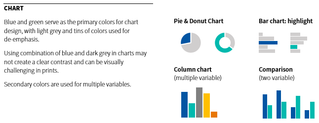
Beyond photos we want our graphics, charts, and data visualization to maintain a consistent look and feel as well (check out Ann’s blog about intentional color schemes).
In the style guide, we find it helpful to provide some examples demonstrating how to apply the color palette in the bar charts and pie charts, and which colors should be used for comparison data.
Here’s how we provide color palette options for charts:
Step 5: Share, Share, Share
The creation of the style guide can be a shared responsibility or done by just one creative team member.
Once the style guide is created you must make your team or organization aware it exists!
How to Share Your Style Guide
Share the style guide(s) at staff meetings and send an email announcement.
Make the location of the style guide and related resources (e.g., logos, stock images) accessible to all team members.
The EASL Style Guide
Below is a snapshot of the EASL style guide.
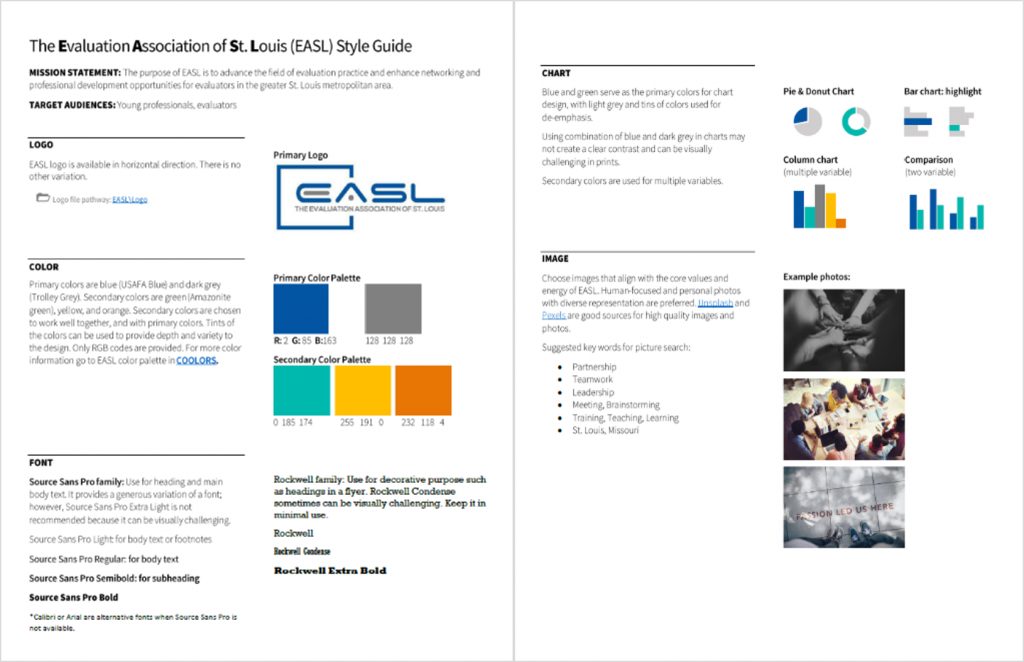
This guide is shared with current and future team members to increase the likelihood that there is consistent branding and look and feel for all EASL products.
How We Used Our Style Guide
Here’s an EASL flyer we created by following the design elements in the style guide:

Additional Resources for Style Guides
Are you ready to develop a style guide?
Check out some additional related resources. Enjoy!
1 Comment
As someone who created my first style guide earlier this year (and my organization’s first ever style guide), this was a helpful post to both confirm helpful contents of a style guide and get a few ideas of what else I might include (like the stuff about using images and including more examples of charts). Thanks so much for sharing!