I have a love-hate relationship with stacked bars charts. They’re a great way to show part-to-whole patterns (like an easier-to-read pie chart). But, like pie charts, they feel overwhelming once we add a bunch of different categories. Are they the worst chart of all time? Perhaps. Here’s how to make stacked bar charts more bearable.
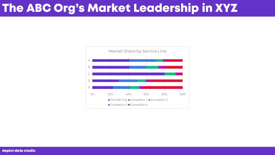
Before
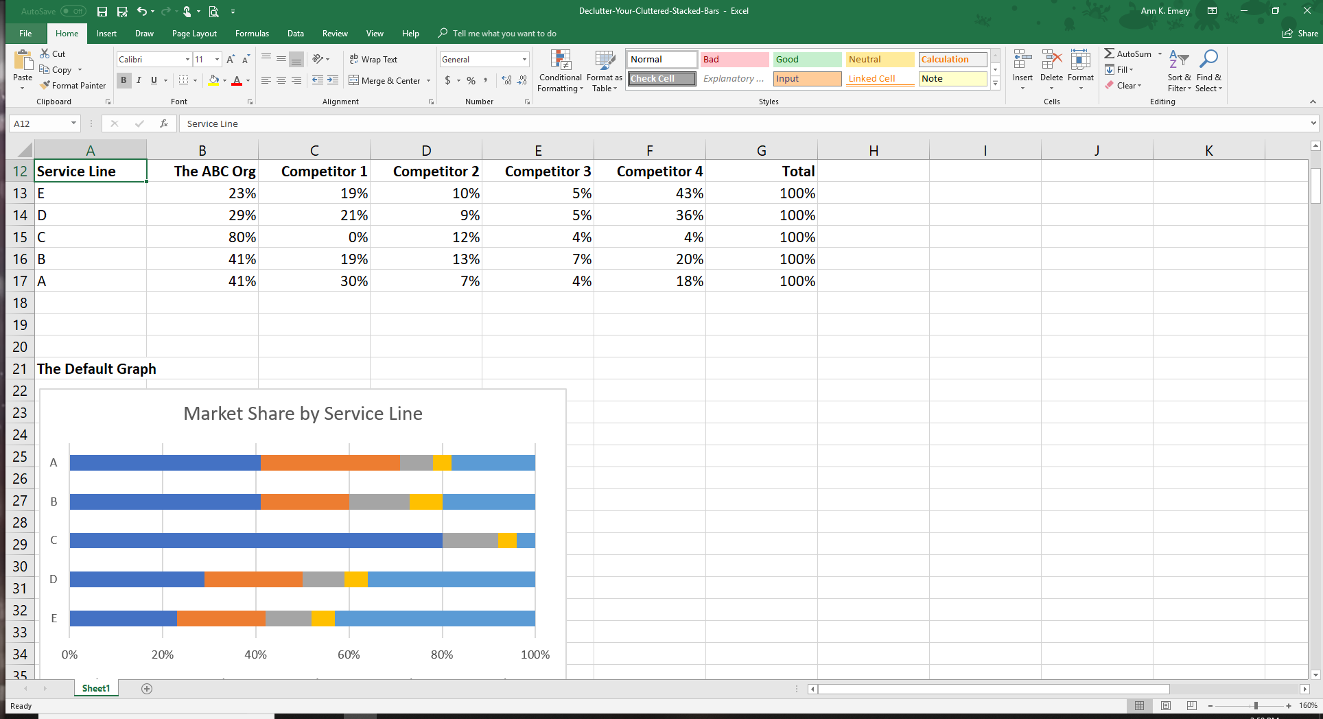
Here’s the “before” graph from a recent project. The categories and numbers are different, but you get the idea. Most stacked bars look like this—there’s too much going on for the graph to be useful.
After
At a bare minimum, we need to declutter the default graph. You need to:
- remove the border;
- remove the vertical grid lines;
- declutter the horizontal axis (0 to 100 percent is plenty of detail—no need to label each of the 10 percent increments);
- move the legend to the top (since the legend is critical for understanding the graph);
- re-color the words in the legend to match the colors in the graph;
- declutter the title (short and sweet for slideshows, please);
- add numeric labels;
- outline the rectangular shapes in white (so the colors don’t bleed together); and
- reduce the gap width.
Check out the click-by-click breakdown:

Storyboard for a Live Presentation
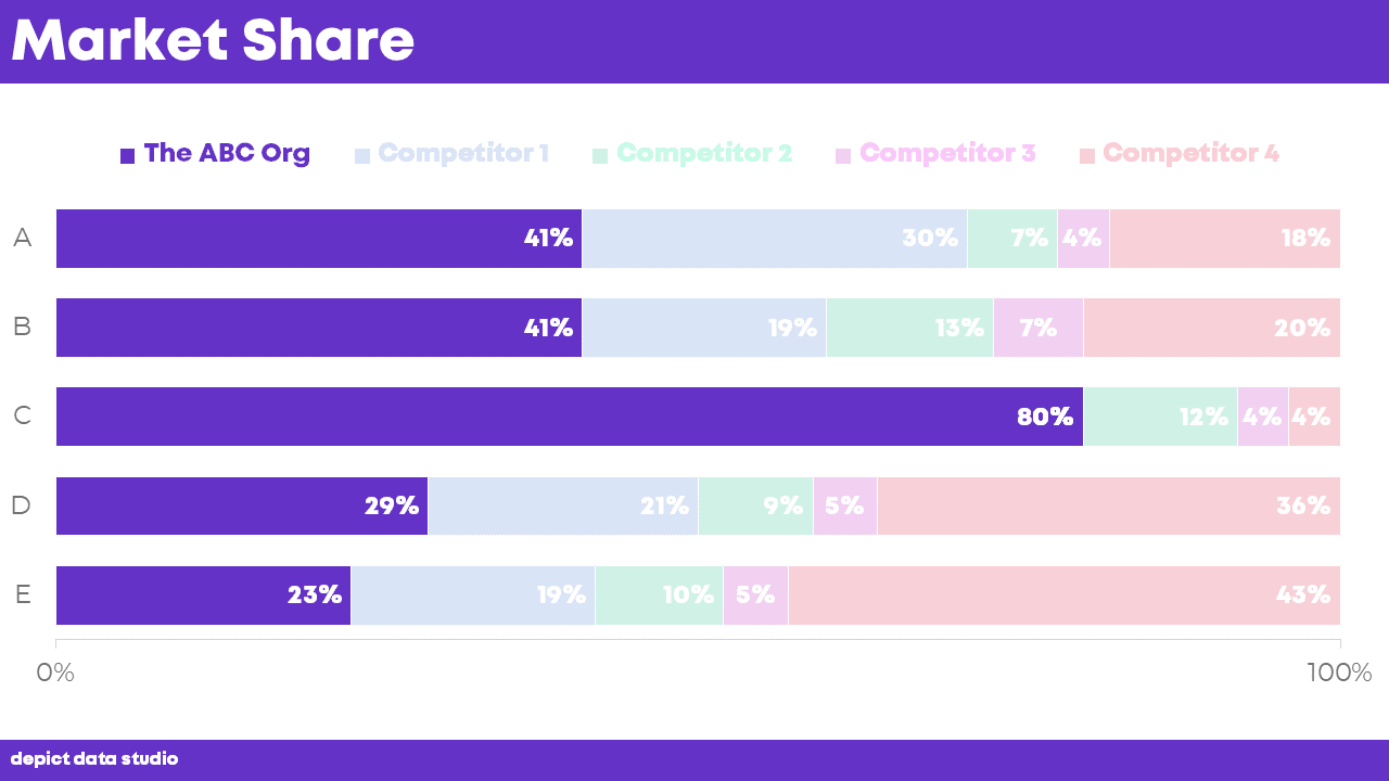
The decluttered version is easier to read… but it’s still too dense for a slideshow. Here’s how we can “declutter” the graph so that our audience can follow along without wanting to bang their heads against a wall.
First, show the “completed” slide and provide a brief overview. I would say, “Let’s talk about our market share compared to our 4 competitors. We’re looking at five different products, A, B, C, D, and E.” You’d only spend a few seconds on this slide.

Second, dive deeper in the details. Focus attention on the ABC Org with dark colors. I simply changed the other segments of the stacked bar chart to an 80% transparency. I also selected lighter colors for the legend. You would say, “Here’s how we’re doing. Check out Product C–that’s where we hold 80% of the market share.”
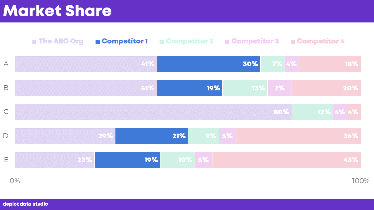
Third, focus attention on Competitor 1 with dark colors. You would say, “Here’s how Competitor 1 is going. They hold 30% of the market share in Product A, but they don’t offer Product C at all.”
Fourth, focus attention on Competitor 2. You know the drill! You would say, “Competitor 2 holds a smaller piece of the market—between 7 and 13 percent for these five products.”
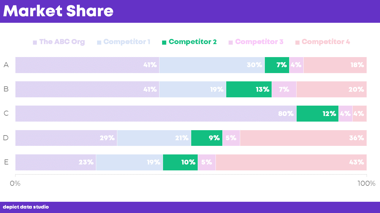
Finally, conclude your storyboarding with the “finished” slide again. Invite your audience to ask questions and open the floor to discussion. You would say, “Here’s that same overview again. I won’t go through Competitor 3 and Competitor 4 in detail, but you can see how they’re doing, too. Next, let’s talk about what these numbers mean for our future work…”
Storyboarding–guiding your viewers through one piece at a time with dark colors–guarantees that your audience will be looking at the data, and not scrolling through their phones. How are people supposed to make decisions based on your data if they’re not even paying attention to you? Break up dense visualizations into multiple slides. Your audience will thank you.
Bonus! Download the Materials
Want to explore how I edited the graph? Download the spreadsheet.
Download the MaterialsBonus! Watch a Sample Class
I’m teaming up with 13 guest experts to bring you Great Graphs, an online course about getting your data out of spreadsheets and into real-world conversations through better data visualization, reports, slideshows, and dashboards.
Want to see what the storyboarded slides would look like and sound like? Watch a sample class:
Great Graphs begins October 1. The course only opens once a year and we’re only able to take 100 students. Reserve your spot today before they’re gone!
1 Comment
How do I declutter the scale and only leave 0 to 100?