Two weeks ago, I challenged readers to re-create the “after” version of a side by side bar chart. You can read the full post here.
Congratulations to the 9 contestants! Click on the contestant’s name to see their chart.
- Regan Grandy
- Sara Vaca
- Alex Kadis
- Katrina Brewsaugh
- @CaptainCane64
- @PD_ssp
- Will Fenn
- Angie Ficek (Check out how she used her own data!)
- James Coyle (Check out how he used his own pre-post data!)
Now it’s time to post the how-to guide.
Step 1: Study the chart that you’re trying to reproduce in Excel.
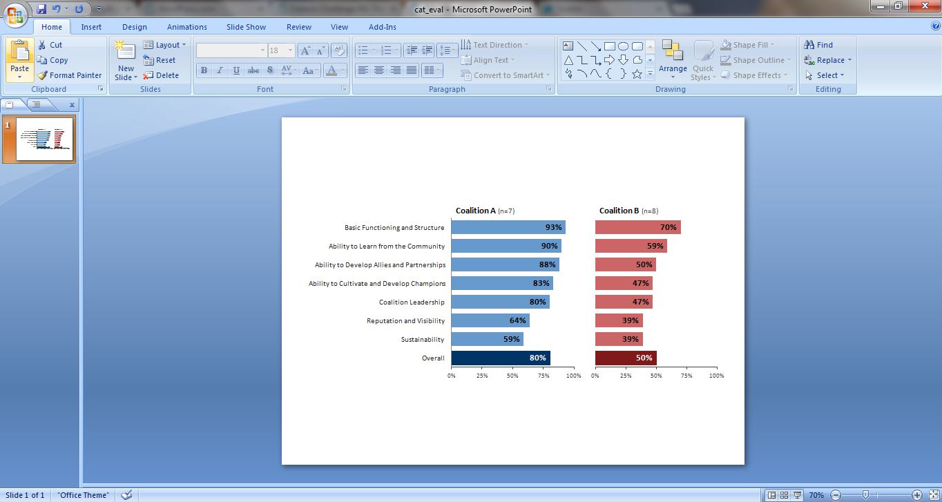
We’re trying to re-create a side by side bar chart like the one shown below. We’re comparing how Coalition A and Coalition B scored on Innovation Network’s Coalition Assessment Tool.
Step 2: And the secret to making side by side bar charts in Excel…
…is that we’re going to make two separate bar charts, one for Coalition A and one for Coalition B. When we copy and paste the charts from Excel into PowerPoint or Word, they’ll look like a single cohesive chart.

Step 3: Type the data into Excel.
Make sure you choose a purposeful order to your data, like the highest percentage on top and the lowest percentage on bottom.
Excel often flips the data table upside down when creating charts, i.e. if you want the overall scores to be at the bottom of the chart, then you need to put the overall scores in the top of your data table. (Or, you can reverse the order of the categories later on.)
Step 4: Create the first bar chart.
You know the drill: Add data labels inside the end of your bars. Choose a color palette that matches your client’s logo or your own logo. Use an action color to draw the reader’s eye where you want it (in my example, the overall score). Delete unnecessary ink like the tick marks, grid lines, and border. Use gray to de-emphasize things like (n=7) and the axis labels. Reduce the gap width.
Beginner Excel users: If you need extra instruction, check out how to make a basic bar chart and my Excel for Evaluation chart tutorials.
Step 5: Copy the first chart.
Rather than re-create the wheel when making the second bar chart, let’s save some time by simply copying the first chart.
Step 6: Populate the second chart with Coalition B’s data.
Use the “select data” feature to put Coalition B’s percentages into the chart.
Step 7: Adjust the second chart’s bar color and title.

Step 8: Delete the second chart’s axis labels.
Yep, you’re right, the second chart’s bars are going to get waaaaaay too long. We’ll fix this in Step 9.
Step 9: Re-size the second chart.
Here’s my super scientific secret for making sure each chart is the same size: I measure the plot area with a business card.

First, adjust the first chart’s plot area so that it’s the width of a business card or post-it note.

Next, I adjust the second chart’s plot area so that it’s the same width as my business card.
Step 10: Paste the charts into PowerPoint or Word.
Select both charts and paste them into PowerPoint or Word at the same time. Here’s what it looks like on a slide. Looks like a single chart!
Bonus
Click below to download my Excel file.
Download the Excel File
9 Comments
I took a different approach. I used one chart with 3 columns. I used the first and last column for actual data. In the middle column I subtracted the first column data (which was in percentage terms) from “1? so that when I added the 1st and 2nd column together it would always sum to “1? – you’ll see why in a moment. Let’s call the 3 columns A, B (the summed column), and C.
Next, I set up a stacked bar chart with the 3 columns. The first part of the bar had the first data set (A), the 2nd had the column of sums (B) and the 3rd had the second data set (C). The middle cells (B) forced the bars for the 2nd data (C) set to line up correctly.
Finally, I made the color for the middle column (B) white and deleted the title for that column, effectively making it invisible.
By now, you’ve figured out why I had the X axis problem (it runs from 0 – 250%). My solution, which I couldn’t implement correctly in the time that I had to work on this, was to have 2 axes. I wanted both to run from 1 to 100%, but this forced an overlap that I couldn’t fix. As I thought about it, the problem is that I would need a 3rd axis for the filler column (B) so I don’t know that I would be able to make this work at all.
I hope this explanation was easy to follow.
Thanks, this was a fun exercise.
Thanks for putting up the “solution” I’ve been pondering how you did it since the last post. (Not what I expected! It’s so simple!)
[…] from Ann: Last week I shared a dataviz how-to guide. Paul Denninger has a great alternative solution to share! He uses hidden bars, also known in the […]
[…] Dataviz Challenge #3: The Answers! (emeryevaluation.com) […]
[…] reduce cluttering, delete the second chart’s axis labels and use the business card trick to make sure each chart’s plot area is the same width and […]
[…] the third dataviz challenge, we started talking about making several comparisons at once. For example, when the Innovation […]
[…] Want to make your own side-by-side bar chart? I’ve got a tutorial. […]
Instead of external sizing, have your charts “snap to grid” and then simply make sure that the grid behind the charts are the same.
[…] from Ann: Last week I shared a dataviz how-to guide. Paul Denninger has a great alternative solution to share! He uses hidden bars, also known in the […]