Viewer considerations are key: What type of information do your viewers need to see? What information do they already have? What information are they expecting? How many points in time should be included? Will you present aggregated or disaggregated findings? How long do you anticipate that they’ll spend looking at your graph?
And here’s another thought-starter question to consider: Do your viewers want to see the data presented as-is, or do they want you to cut to the chase and interpret the data?
Sometimes we need to serve as unbiased collectors and disseminators of information. This is especially true for my workshop participants in research-y roles who publish their data in places like peer-reviewed journal articles or formal research reports with lengthy appendices.
Other times, we need to get a message across in our graphs — and fast! This is especially true for my workshop participants who are consultants or those who work in communications-y roles.
Their viewers are busy, busy, busy. Their viewers are hoping that someone else — you! — will dig through mountains of data and uncover the handful of nuggets worth paying attention to.
It’s not that one visualization style is better or worse than the other. They’re apples and oranges. I want you to figure out when your viewers are expecting to see each style and then learn how to switch back and forth.
Storytelling Strategies I Use in My Graphs
The as-is approach is the easy one. You create a graph. You clean up the default settings a little, especially those cruddy parts like borders or too-thick grid lines. You select colors from the viewers’ color palette. I’ve been doing a lot of design projects with USAID contractors lately; this blog post has USAID’s exact shades of blue and red.
The storytelling approach can seem like the harder one. But! It’s not impossible! This is just a newer style for most of us.
I want to make it easier for you. Here are four design strategies you can use to tell a story in your graph:
- Descriptive titles
- Descriptive subtitles
- Annotations
- Saturation
Use one technique or all four, it’s up to you. Let’s check out a few examples. The graphs on the left present the data as-is while the graphs on the right interpret the data.
Example 1. Tell a Story in Bar Charts
This first bar chart uses a descriptive title and saturation to show how chocolate is the preferred ice cream flavor.

Example 2. Tell a Story in Slope Graphs
The descriptive title and saturation emphasize how Project A is performing particularly well.

Example 3. Tell a Story in Line Graphs
A descriptive title, a descriptive subtitle, and an annotation explain how the agency is funding more studies to measure the effectiveness of their programming, which is due to their new policy. Annotations are call-out boxes that give viewers more background information about a specific data point or two, like why we’re seeing a sudden increase or decrease.

Example 4. Tell a Story in Donut Charts
The as-is version on the left gives equal emphasis to both subgroups of students because the red and blue are both relatively dark colors. This is USAID’s exact shade of red (with data that is obviously not from USAID). The red is tricky because we’re accustomed to stoplight color-coding in which green means “good” and red means “caution!” or “bad!” In addition to the red and blue being equally saturated, we also have to be careful with the cultural connotations of using red here.
The interpreted-version on the right uses saturation to highlight the percentage of students who qualify for free and reduced meals.

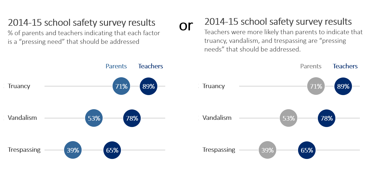
Example 5. Tell a Story in Dot Plots
Finally, this dot plot uses a descriptive subtitle and saturation to draw viewers’ eyes towards the teachers’ survey responses.

Join the Conversation
Which approach do you follow most often? And who are your viewers? Their preferences drive every decision about how you’ll format your graph, after all. Are your viewers expecting you to present the data as-is, or do they prefer that you offer interpretations through titles, subtitles, annotations, or saturation?
11 Comments
I love the way you broke this down into four techniques. I definitely intentionally use all 4 at some point in my data presentations. I am an internal data analyst/evaluator, so my colleagues aren’t data people themselves and want the story told to them. I find that the most helpful technique for me is trying to anticipate their questions so that I can order the presentation for them to follow logically. For example yesterday I developed a presentation on our mortality data– heavy stuff. There has been a lot of interest in our agency in reducing suicide rates, increasing life expectancy for our seriously mentally ill population, and also examining how the opioid epidemic (so talked about in the news) is affecting our community. It’s not always easy to anticipate people’s questions, but the more I get to know the people I work with and our datasets, the easier it gets! From there the order of the presentation more or less falls into place.
Great article that highlights the subtle differences on presenting information #intention
Well done. I’m sharing.
[…] In another charting article, Ann K. Emery asks if you'll present the data as-is, or if you'll tell a story. She shows four examples of how to use a storytelling approach in a chart. […]
Thanks for this thorough breakdown, Ann. I’ve been trying to use all four techniques for the purposes of practicing my skills, particularly donut charts and dot plots. As far as my audience goes, it varies. My audience can run the gamut between researchers, nonprofit staff, or students or parents, but I find myself moving away from presenting data as-in and more towards telling a story.
Excellent way to give story to your graphs. I admit most of the users go with descriptive title & saturation trying to reveal maximum. Personally believe that annotation is better idea but based on what the audience is and what they are looking for. Anyway thanks for such a nice article?.
Awesome examples!
I’m happy to report that I actively use all four of those signals! The other storytelling strategy I leverage often is strategic animation during live data presentations. I like to create a dynamic narrative by animating additional charts in to flesh out the story. Or, use white boxes to obscure parts of the chart that I wish to hide until the right moment, and then fade them out when I speak to that insight. It’s dramatically improvement engagement with my presentations.
Thanks Ann!
[…] Source: annkemery.com Nicole Huggett 4/23/2016Viewer considerations are key: What type of information do your viewers need to see? This is especially true for my workshop participants in research-y roles who publish their data in places like peer-reviewed journal articles or formalresearch reports with lengthy appendices. Their viewersare hoping that someone else you! will dig through mountains of data and uncover the handful of nuggets worth paying attention to. […]
SPOT ON post Ann! I teach Excel at work and often cover Excel Pivot Tables, Slicers and that’s exactly what I convey to the students. “What is the question you’re trying to answer?”
[…] Ann Emery and Stephenie Evergreen have written wonderful posts on this topic. […]
[…] Will You Present the Data As-Is, or Tell a Story? By Ann K. Emery “It’s not that one visualization style is better or worse than the other. They’re apples and oranges. I want you to figure out when your viewers are expecting to see each style and then learn how to switch back and forth.” […]