
Are you looking for ways to display your qualitative data?
The vast majority of data visualization resources focus on quantitative data.
In this article, let’s look at some of your options for qualitative data visualization, like word clouds, photographs, icons, diagrams, and timelines.
What *Not* To Do
I used to conduct qualitative-heavy research projects pretty much all day every day.
Key informant interviews, bellwether interviews, document review, focus groups, you name it…
So I know from personal experience that 99.9 percent of qualitative reports look like this:

Which is fine, unless you want someone to, ya know, actually read your report.
Here are several ideas for presenting qualitative data for your organization’s reports, presentations, handouts, infographics, and more.
Word Clouds
Data visualization novices love to love word clouds, while data visualization experts love to hate word clouds.
Word Clouds Are Okay for Visualizing One-Word Descriptions, But Not for Visualizing Allllllll Your Qualitative Data
Here’s the most obvious strategy for visualizing text-based data: the word cloud, also known as a tag cloud. Frequent words or phrases are shown in larger, bolder font. Less-frequent words or phrases are shown in a smaller font.
I’m not advocating for run-of-the-mill word clouds where you simply dump your interview transcripts into a word cloud and hope for the best. Simply looking at how often a word or phrase appears in your dataset is not a sufficient way to analyze your data!
Instead, I’m talking about intentional word clouds – when you’ve considered other options, and have purposefully chosen a word cloud as your visualization of choice.
Here’s one example. When I conduct interviews as part of a qualitative research project, I often included a question in the interview protocol such as, “What one word you use to describe _____?” For example, “Mr. Policymaker, what one word would you use to describe public opinion towards poverty in the United States?” or “Mrs. Principal, what one word would you use to describe this new initiative’s effect, if any, on your charter school?”
The rest of the interview is obviously focused on loooooooong responses, and fuller descriptions, and plenty of examples. But for one or two moments during the conversation, it’s nice to pause and throw in a semi-qualitative short question.
Then, you’d visualize those one-word responses in a word cloud, like this one from Students First:

Here’s another example from the Pew Research Center, in which they visualized one-word descriptions of Barack Obama with packed bubbles. Packed bubbles are similar to word clouds. In word clouds, word frequency is depicted through font size. In packed bubbles, word frequency is depicted through bubble size.

Word Clouds Are Okay for Visualizing Before/After Comparisons
Word clouds are also great for before/after comparisons, like these tweets describing breakups. Does your study involve pre/post tests with a few open-ended questions? Did you interview participants at multiple intervals during the study? You could adapt this technique for nearly any time series design.
What our breakups look like on Twitter http://t.co/yRZ8fBgRxx Before and after: pic.twitter.com/XQg7JKMar5 — Motherboard (@motherboard) September 23, 2014
The Best Software Tools for Creating Word Clouds
There are tons of free and low-cost websites for generating word clouds. The Poll Everywhere blog summarized nine of their favorite tools. My personal favorites are Wordle and Tagxedo.
Wordle
Wordle is a free website for making word clouds in an oval or rectangular shape. It’s pretty easy to use. You simply copy all of your text (e.g., from your interview transcripts) and paste the text into Wordle. Then, you can customize the word cloud’s fonts, colors, and general shape to your liking. I suggest matching the fonts and colors to your project’s existing branding guidelines so that your word cloud matches the rest of your report or slideshow.

Tagxedo
Tagxedo is a free website for making word clouds in fun shapes, like an apple, heart, or outline of the United States. You can pull in qualitative data directly from a website or Twitter feed (you don’t have to copy and paste, so you save a step). And, with Tagxedo, you could even have your word cloud printed on a t-shirt, tote bag, or coffee mug. I see Tagxedo as more of a decorative option than a researchy option.

Showcase Open-Ended Survey Data Beside Closed-Ended Data
What’s better than quantitative data? Or better than qualitative data? Quantitative and qualitative data combined!
Use this technique when your survey has both closed-ended and open-ended questions. Tie the responses together in one chart to add much-needed context. In this example, a survey asked nonprofits to describe what it was like to work with an outside consultant. Then, the survey asked them why their experiences were good or bad. Who cares if 33 percent of nonprofits had excellent experiences but we don’t have examples that describe why?
Rather than simply listing out the open-ended responses in your appendix, showcase them beside your stacked column chart.
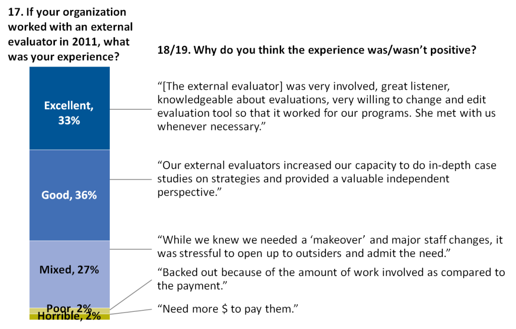
Read more about this technique in this post written by Johanna Morariu and I.
Include Photos Beside Participants’ Responses
For your non-anonymous reporting, how about inserting photos of the interviewees next to their ideas?
Strategies for use of #interpreter services in hospitals http://t.co/EpvPyvNcMZ, from @abtassociates @NHeLP_org &more pic.twitter.com/O8V05h3DoM
— Sabriya Rice (@sabriyarice) September 2, 2014
Here’s an example from the New York Times, where they added photographs beside interviewees’ responses:

Include Icons Beside Descriptions and Responses
Icons are so easy to use that there’s really no excuse for not using them to break up long sections of text.
Islamic State is one of the world’s richest terror groups. Here’s why: http://t.co/C0DsXqHkfD pic.twitter.com/ikNThUwNhb — Wall Street Journal (@WSJ) August 28, 2014
Another great use of icons comes from the Washington Post’s story about how animals are faring after the BP oil spill. Isn’t it remarkable how icons and bold subtitles help to break up a chunk of text?![]()
The Center on Budget and Policy Priorities used icons to visualize how working-family tax credits can help at every stage of life:
And the Center on Budget and Policy Priorities used icons again to help their readers understand how low-wage workers face a cut in tax credits:
Create Diagrams to Explain Complex Concepts and Processes
You can create diagrams for many aspects of your project, like this diagram explaining what type of protective gear is keeping doctors safe from Ebola:
Breaking down the protective gear helping keep doctors safe from Ebola http://t.co/bQUDqFoD1X pic.twitter.com/tDjkiSLFvs
— Washington Post (@washingtonpost) September 15, 2014
Graphic Timelines
Regular text-based timelines + diagrams, photos, and other images = graphic timelines. Timelining is especially valuable in situations in which you need to track how a program, initiative, or campaign unfolds over time.
Interactive Timelines
This timeline from the New York Times includes an assortment of qualitative and quantitative information: dates, milestones, # of rockets, and # of casualties. My screenshot doesn’t do it justice; head over to the New York Times website to explore the interactive version.
Static Timelines
Maybe you’re not the New York Times, I get it. Anyone can design a static timeline from the comfort of their PowerPoint slide.
A Graphic Timeline of the 21st Century Conservation Service Corps http://t.co/GmpTR3qfqv #21CSC #conservation pic.twitter.com/nGydFtkXkC — The Corps Network (@TheCorpsNetwork) August 12, 2014
Color-Coded Phrases
One of my all-time favorite examples of qualitative data visualization comes from the New York Times’ election coverage in 2016.
They compared and contrasted speeches from Donald Trump and Hillary Clinton.
First, the New York Times team presented miniature thumbnail images of each nominee’s convention speech. You can even click on the thumbnail images and they’ll expand so that you can read the transcript. I love how the thumbnails provide a birds-eye-view analysis of the qualitative themes from each speech simply by color-coding certain phrases.

Directly underneath the thumbnails, the New York Times team pulled out a few sample quotes so that readers can get a sense of what was said.

Want to try this technique yourself? Color-coded text is deceptively simple. I suggest highlighting the entire phrase in a light color, as the New York Times has done in this example. Make sure you don’t just color-coded the font itself. It’s challenging for our eyes to read green letters, but it’s pretty easy for our eyes to read black letters against light green background shading.
Comment and Share Your Ideas
How are you visualizing qualitative data interviews, focus groups, surveys, document reviews, and other qualitative data sources?
Please link to your favorite resources below.
Let’s give virtual high fives to the creators and celebrate a job well done.
12 Comments
Barbara Felver, data visualization specialist in the Research and Data Analysis (RDA) Division of Washington State’s Dept. of Social and Health Services does a great job illustrating a variety of quantitative and qualitative data for research and survey reports. For example, see her work in this year’s foster parents’ survey: http://www.dshs.wa.gov/pdf/ms/rda/research/11/207.pdf
[…] 6 Ideas for Displaying Qualitative Data | Ann’s Blog […]
[…] In her new Blog Post, Ann K. Emery puts forward 6 ideas for displaying qualitative data: […]
Thanks for a great overview of options for displaying qualitative data – and terrific examples. We will expand the options on the BetterEvaluation.org catalogue of options.
Thanks for sharing. To combine pictures and written information makes it easy to cpature even complex data.
HOW DISPLAYING QUALITATIVE DATA WITH NEW MINDSIGHT FROM THOUGHT LEADER for the understanding.
Fantastic Ann! Because qualitative research makes my heart beat fast with joy; I love to see more attention being paid to data vis of such rich information. Thank you, thank you for helping to spread the word that qual is beautiful too!
These are great tips that embrace the “visual learner” among the diverse audience of targeted recipents of qualitive research findings.
Incredibly helpful! I manage focus group feedback and started trying to give a visual to the vast breadth and variety of the qualitative input!
[…] from Nielsen Norman. Awesome tips from CRC colleagues for larger community surveys. Achievable qual visualization ideas from Ann Emery. Some tools for qual analysis and visualization from Tech for […]
[…] Achievable qual visualization ideas from Ann Emery. […]
[…] recently shared six ideas for displaying qualitative data. Later this year, I’ll publish a follow-up post with additional […]