
Hi! My name is Nick Visscher, I’m an internal evaluator with Denver Zoo. Our data work spans the gamut from collecting guest satisfaction insights to observing preschool kids in our nature play programming. With everything our team does we aim to help our staff improve their programs and our guest’s experience. It’s important for us to disseminate our findings in ways that make our stakeholders (mainly internal staff) to dig in and explore. Clear, concise, and well visualized reporting is super important and something we are passionate about.
There are so many options when it comes to reporting software, but one familiar face I often find myself turning to is Microsoft PowerPoint. You might not immediately think of PowerPoint when it comes to creating formal reports, but I love using it in lieu of more common applications like Word. Positioning new images and text boxes into a document is just easier in PowerPoint. You don’t need to worry about anchoring items or how inserting new text might change the position of items you’ve already included on a page. It’s a blank canvas without many limitations.
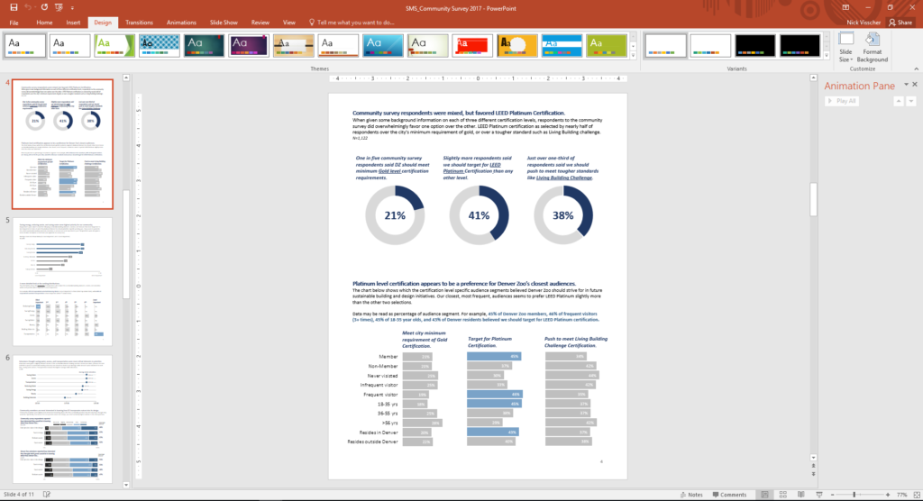
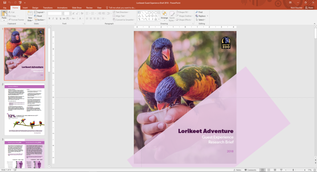
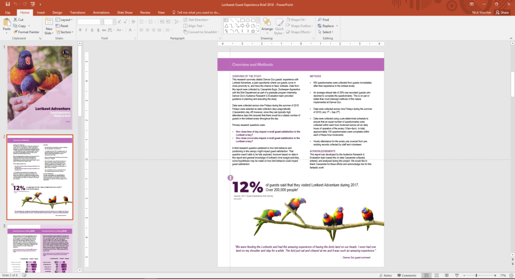
Here are some screenshots from a report that I wrote in PowerPoint. These pages come from our Lorikeet Adventure: Guest Experience Research Brief.
Here are a few tips I keep in mind when using PowerPoint to design my evaluation reports. Note: I’m working in MS Office 2016.
- Changing slide orientation: I like a traditional page layout for a report I know my readers will likely print, not the default slide size (16:9 aspect ratio). To change it, I go to the Design pane and create a custom slide size, change the settings to 8.5” by 11”, and select a Portrait orientation.
- Making use of the page ruler, gridlines, and guides: In the View pane I always select Ruler and Guides (and sometime Gridlines) so I can make sure key text and objects are in the same position on each page. I also know my readers will likely print and use a staple in the upper left corner so I make sure to keep one guide line at a half inch from the left. This lets me position headers and text where I know a staple won’t get in the way.
- Using built in arrangement options for multiple text boxes or images: Don’t spend too much time clicking that left arrow or right arrow to “nudge” objects into just the right place on a page. Select all the objects you wish to align, go to the Home pane, select Arrange, and then select Align. There are built in arrangement options there which perfectly align or evenly distribute everything at once. This is one feature that consistently saves me time and makes everything look better.
- Inserting shapes and lines as design elements: I love using basic shapes and lines in different variations on a page to give the design of a report a sleek and professional feel. I avoid predefined slide design templates at all costs, they don’t often follow the principles of good design.
- Using fill color and transparency: I’m not always confident in knowing which colors compliment each other so to avoid having to pick different colors, but still give some visual variation, I increase the degree of fill color transparency on key shapes or objects. I also like doing this on cover pages when most often the entire slide background is a photograph. Inserting overlapping shapes with 50% transparency creates a sophisticated visual effect and also adds some darker space on the page perfect for a title or text header to stand out.
- Copying page design for the whole report: Most of the time I like my background design and title text to be consistent on each page. Once I’ve created a page layout I like I simply copy and paste that slide for the remainder of the report pages. This is a quick solution to having to re-create the most common design elements in your report over and over again. I’ve used a more elegant solution lately by editing the slide master in the View pane and editing the default fonts and colors in the Design pane.
- Editing dataviz directly in PowerPoint: I used to spend a lot of time editing charts directly in Excel, then copy/pasting them into PowerPoint. This would sometimes cause size and formatting issues so I’d have to do a few edits there too. PowerPoint has the same chart editing and layout features as Excel does so now I create a basic default chart in Excel using my data, copy/paste that right away into PowerPoint, and do all of my editing there.
- Letting your copy editor do their thing: I always need a copy editor when I finish a report. PowerPoint provides similar review and comment features as Word does. It’s not quite as extensive but it does the trick. Under the Review pane you can select text, add comments, and select “start inking” to highlight areas is the report that need further attention.
- Saving your report: Save your report as a PDF or XPS document when you’re ready to send to your readers. They’ll be dazzled by the beauty of your work and be none the wiser that you used trusty ole PowerPoint to design it.
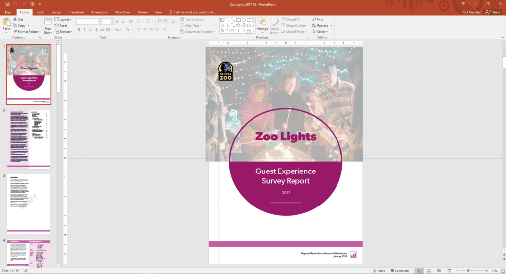
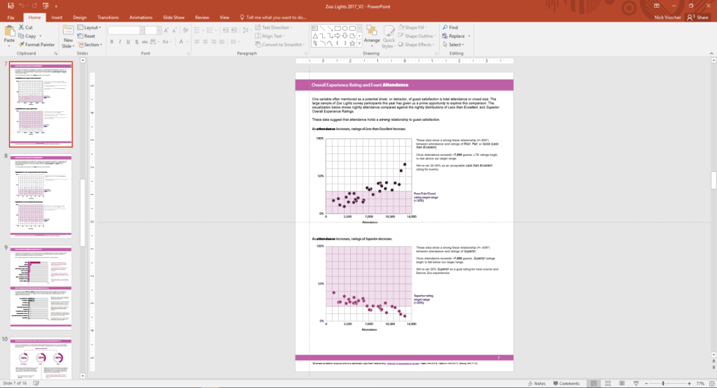
Here’s another report that I designed within PowerPoint. These pages come from our Zoo Lights: Guest Experience Survey Report.
Have you tried writing your reports in PowerPoint instead of in Word? If so, please share your tips in the comments section below.
29 Comments
This was a great tutorial. Thank you for providing! I am designing my next report in PPT right now! Shhhh! ~Jessica, Child Advocates of Fort Bend
Your secret’s safe with us. 🙂
Woohoo! I’m glad this list has inspired you Jessica! Your secret is safe 🙂 Happy PowerPoint-ing!
wow, what a beautiful report in PP!
Can you share it with us please?
Thanks in advance
Hi Hossat, This report’s not available for download, sorry! It’s an internal report that Nick designed specifically for his audience. One of these days, “in all my spare time,” I’ll design some sort of template for these reports. Until then, I hope you find the behind-the-scenes screenshots to be useful.
Great post! I plan to use tip #3 right away. I use Nancy Duarte’s slidedoc format for reports and like this 8.5″ x 11″ option too.
Learning about “Align” a few years ago has already saved hours of my precious time! It’s the little things.
This tip was probably the simplest game changer for me. This works for everything (and in most MS Office applications ) for things like conference posters, handouts, reports, ACTUAL powerpoint slide decks… It’s really nice once you realize you’ll never have to nudge objects click by click anymore!
Nick — I literally used to zoom waaaaaaay to 400% or 500% on my screen, hold up a ruler, and eyeball all my text boxes to “align” them. Oops.
Does anyone know of any templates that already exist with it rotated and filled in content
Hi Jeremy, Check out https://www.duarte.com/slidedocs/. THE trailblazer in “slidedocs” is Nancy Duarte and the dozens of staff at her company. I believe they have free templates to get you started. Like any templates, you’ll want to adjust the colors and fonts, at a bare minimum, so that it doesn’t look so default. Let me know if you encounter any other helpful templates.
Thanks for sharing this, great idea! Formatting on Word has always been a challenge for me
Hello, This is great! Do the reports created in Powerpoint meet accessibility standards for folks who use screen readers, etc.?
Great question. Someone asked this question on Twitter too.
Here’s what I said: “I don’t see why it wouldn’t. Reports can be written in any software program (Word, PowerPoint, InDesign, Publisher, etc etc etc) and then PDF’d. I believe you can tag tables and images in any program.”
And here’s what Nick said: “Using Accessibility Checker in PPT (as in Word) is important when creating… then when publishing to PDF, there a couple more clicks I think to make sure it exports as an accessible doc – found this in my search: http://lpc1.clpccd.cc.ca.us/lpc/blackboard/accessible_ppt/convert_ppt.htm”
Let us know what you learn in your search, too.
Definitely can Marissa, you just need to create the document in a way that’s accessible (as you probably normally would in Word) can use accessibility checker in PowerPoint when creating the report to see whch elements need alt text, etc and then follow these instructions when exporting to PDF: https://t.co/OrMkFSxihM
Hi Ann and Nick:
a) Another way to get matching colors in different objects (point 5 of your post) without too much concern over if its well done, is to play with Saturation:
1- Shape Fill
2 – More Fill Colors
3 – Custom tab
4 – Color Model HSL
5 – And play with different levels of Saturation
b) If we want to print the report directely from the PPT we must take in consideratin that the printer always put a white margin that we can’t see even at the Print Preview.
Thanks for the post
Miguel
This is a great point Miguel. I often click between my edit view and print preview when I’m making reports to see how it will print if I were to do so directly from ppt so I can check what that white border looks like and if it impacts anything I have on the page, especially important when bleeding images or objects over the page edges. This is one reason you want to be sure to custom format your page layout too, manually enter 8.5 width and 11 length instead of relying on the default “letter” size option that ppt gives you, which actually defaults the slide to 7.5 X 10.
Thanks for the color tip too, I’ll try that out!
Brilliant!
This is very interesting post on report creation in PowerPoint.
[…] How to Write Your Reports in PowerPoint Instead of Word: 9 Tips for Getting Started […]
Finally, it becomes easier to use MS powerpoint in terms of writing reports as my MS word was showing errors.
Great post, thank you. As a consultant I write reports for a living. I grew up on Word and was trained to write word-heavy, long form reports. Whilst I (think I) do that very well, I’m conscious that these days many people prefer shorter, more visual reports so I’m exploring how I might transition to that. Two issue I’ve always had with ppt are (1) the way it resizes text when I don’t want it to and (2) the way it works one page at a time, i.e. text doesn’t flow from one page to the next. Is there a way to address either of these? Might Publisher (which I’ve never really used; does it even still exist?) be a good alternative tool for the job?
Hi Patch, Argh yes, I have the same frustrations with PowerPoint.
Rather than using the built-in text boxes, which automatically re-size the text, I delete those and add my own. Then I have full control over the text formatting.
I don’t know how to adjust the page breaks/page flow; don’t think this is possible actually (?). I plan the content carefully in advance (by spending time developing a detailed outline). Then, I make sure that each topic simply fits on its own page.
You’re certainly welcome to continue using Word! Or, Publisher. But PowerPoint does tend to be easiest to use as you add more visuals to your reports.
Good luck!
Ann
Thanks. When do u prefer portrait or landscape orientation?
I’m trying to use landscape as much as possible these days — since so many people are reading the reports from their computers.
Interesting but I fail to see the benefit. Why not just use Word with PowerPoint inserts for powerful reports (or for that matter insert PowerBI).
I just find PowerPoint to be more artistic since it requires so much careful manipulation of content – an issue I simply don’t have in Word.
Word’s great for text-heavy reports. PowerPoint’s great for visual-heavy reports. They each have their own value.
Love the focus on meaningful, visual reporting! It’s great to see how your team’s data work supports both staff growth and guest experience—such an important balance.
How does using the Slide Master improve the efficiency of report design compared to copying and pasting individual slides?