2 Comments

  • Kathleen Lynch says:

    I love your tips. Simple, clear, to the point. You model what you advocate. Thanks, Ann!

  • max says:

    how to delete all of them simultaneously

  • Leave a Reply to max Cancel reply

    Your email address will not be published. Required fields are marked *

    Removing Graph Clutter: Don’t Forget the Leader Lines

    Updated on: Aug 11th, 2015
    Data Visualization
    , , , ,
    Removing leader lines from pie charts

    Software typically gets better with time. New graph types are added, more color palettes are available, and editing tools are easier to locate and faster to use.

    Excel 2013’s leader lines are an exception. Leader lines are those gray or black lines that connect the labels with their corresponding pie slices or bars. They add unwanted clutter to graphs.

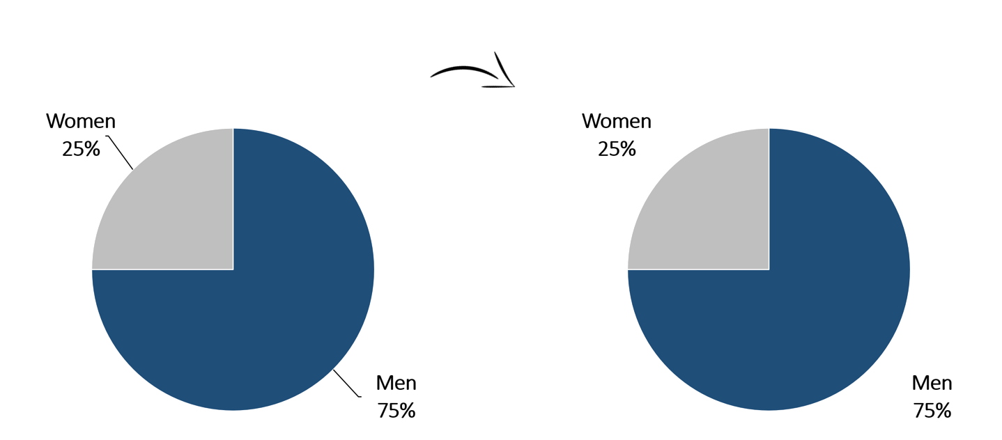
    Please, remove those leader lines from pie charts:
    Removing leader lines from pie charts

    And remove leader lines from bar charts:
    Removing leader lines from pie charts

    And don’t forget to take them off your scatter plots:
    Removing leader lines from scatter plots
    Removing leader lines is simple. Click on the lines themselves and hit the Delete key on your keyboard.

    Or, right-click on the leader lines, select Format Leader Lines, and click No Line.

    Voila! One less mess in your graph.

    More about Ann K. Emery
    Ann K. Emery is a sought-after speaker who is determined to get your data out of spreadsheets and into stakeholders’ hands. Each year, she leads more than 100 workshops, webinars, and keynotes for thousands of people around the globe. Her design consultancy also overhauls graphs, publications, and slideshows with the goal of making technical information easier to understand for non-technical audiences.

    2 Comments

  • Kathleen Lynch says:

    I love your tips. Simple, clear, to the point. You model what you advocate. Thanks, Ann!

  • max says:

    how to delete all of them simultaneously

  • Leave a Reply to max Cancel reply

    Your email address will not be published. Required fields are marked *

    You Might Like

    Our complimentary mini course for beginners to dataviz. Takes 45 minutes to complete.

    Enroll

    How to Bring Your Technical Tables to Life

    Just because I’m pro-graph, I’m not anti-table. Technical tables have so much value, especially as visual appendices for reports. In this blog post, you’ll get ideas for bringing your technical tables to life.

    More »

    Inside our flagship dataviz course, you’ll learn software-agnostic skills that can (and should!) be applied to every software program. You’ll customize graphs for your audience, go beyond bar charts, and use accessible colors and text.

    Enroll

    Subscribe

    Not another fluffy newsletter. Get actionable tips, videos and strategies from Ann in your inbox.