Are you trying to tell a story with your data? Data visualization doesn’t have to be complicated. In fact, some of my favorite visualizations are actually quite simple. In this post, let’s transform an inaccurate, story-less visualization into an accurate, engaging visualization that gets straight to the point.
I recently partnered with a school system to visualize data about the percentage of their students who quality for free or reduced-price meals. In the United States, Free and Reduced Meals (a.k.a. FARMs) is basically how we measure poverty in schools. The more students who are eligible for free lunch (based on their family’s income), the more students who are low-income.
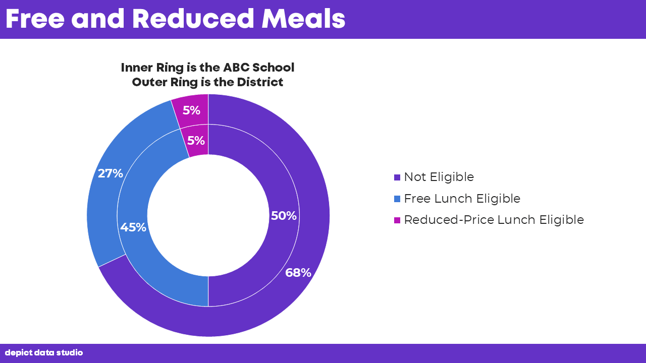
Before
Here’s the before version.
They wanted to compare one of the schools to the district as a whole.
The nested design almost made sense because it almost easily allows us to compare the school and district.
But the concentric circles throw off the proportions. Do you see the magenta segments? The outer ring is larger than the inner ring, so the outer five percent is incorrectly larger than the inner five percent. Oops!
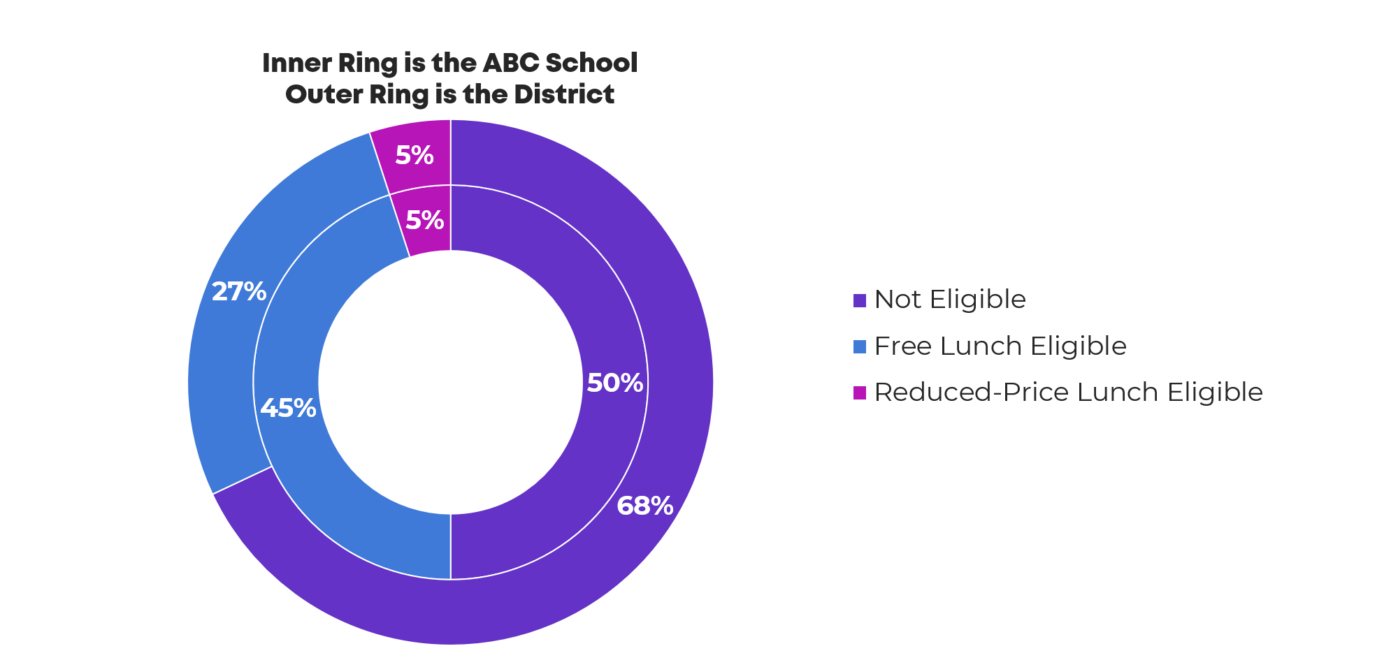
After
Let’s look at three possible ways to better tell our story.
Stacked Columns
Here’s my first attempt. At the very least, we need to transform our circles into rectangles.
For all of these makeovers, I selected two colors: one color for the district and another color for the school. I also made the District and School text stand out in a large font size. You would use your own branded colors and fonts, not mine.
My Former Researcher Brain loves stacked charts. Researchy types like me tend to default to this layout. I’m not sure why… just because we’re used to stacked charts?
There’s nothing inherently wrong with stacked charts. They just tend to be overused. Even though I design data visualizations for a living, I still can’t shake my Former Researcher tendencies, and I tend to draft reports with way too many bar charts. As I’m editing my own work, I look for places where I can swap out my overused bar chart for another chart type. I don’t include variety just for variety’s sake. I look for places where the chart’s messaging might be clearer through another chart type.
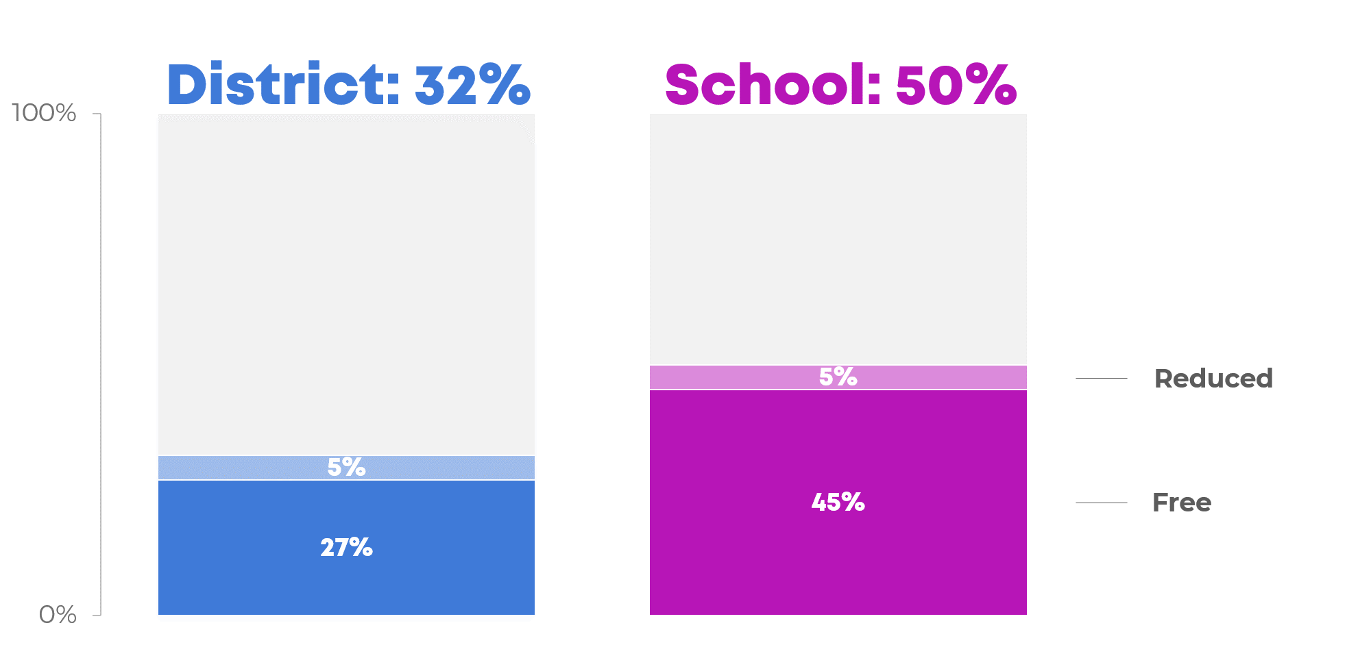
Waffle Charts
Another option is a waffle chart, like these two waffles. Waffles contain 100 little squares. They’re like square pie charts.
This approach almost works. I like it, but I don’t love it. I’m not in love with the labels. I tried creating text boxes for each of the segments—e.g., 27% free meals or 5% reduced meals—but it was impossible to arrange the text boxes on top of the waffle without looking cluttered or busy. Then, I moved the text boxes to the top of the graph, where they are now… but the viewers have to zig-zag their eyes back and forth between the words and the squares. Good. But not great.
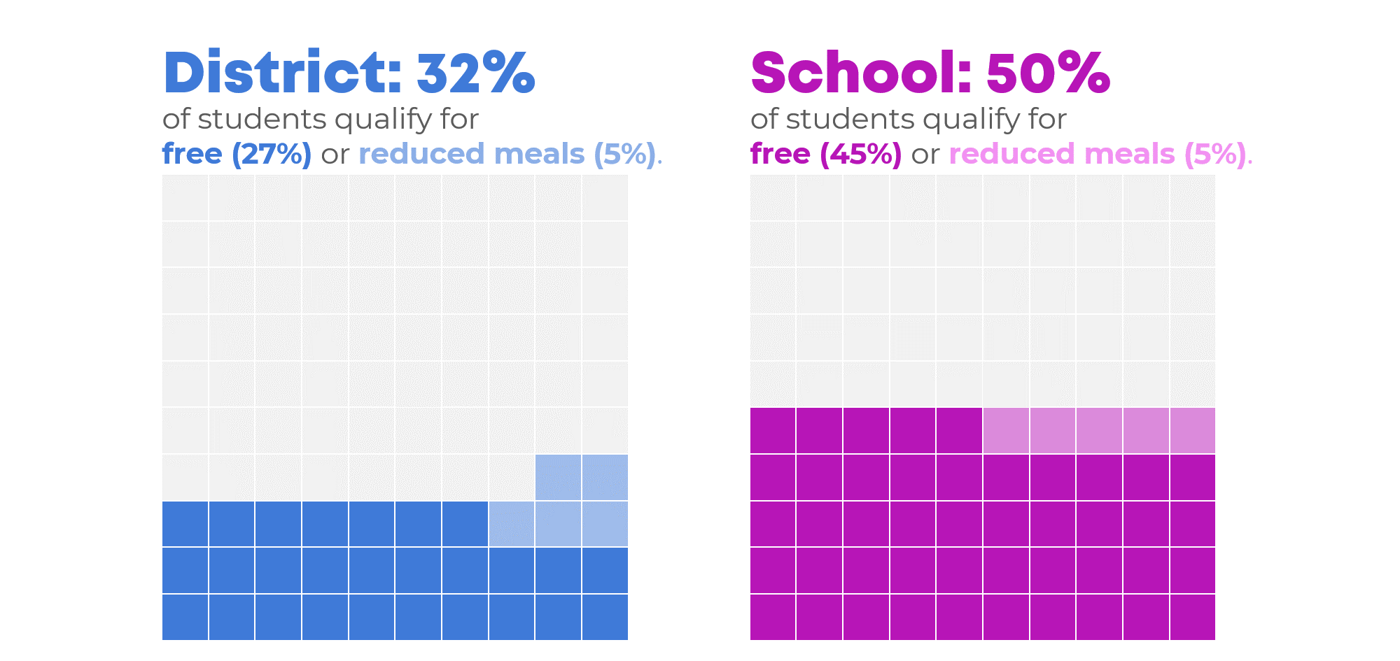
Icon Arrays
Or, go big-picture with icon arrays. I love this approach, and the school district did, too.
In this icon array, we intentionally collapsed the categories—we combined free and reduced into a single category—to focus on big patterns so that our audience wouldn’t get lost in the weeds.
We also intentionally transformed the percentages into whole numbers, which is a better approach for non-data people (i.e., regular people who don’t stare at spreadsheets all day). Whole numbers are a lower numeracy level than percentages, so more people will understand the information.
And we intentionally focused on small numbers—3 in 10 students instead of 30 in 100 students—so that the numbers feel more tangible.
Want to try icon arrays yourself? A heads up: You must be comfortable with rounding. Thirty-two percent of students in the district qualified for free or reduced meals, but I rounded that 32 down to 30. I don’t suggest coloring-in part of an icon. Partially-colored icons can get confusing, especially if you’re using those little people icons.
Icon arrays shine when you need an at-a-glance overview. For example, you might use icon arrays for slideshows or executive summaries. You can save the nuanced stacked columns or waffles for the body of the report.
Your Turn
This isn’t an exhaustive list of options.
What additional designs can you come up with?
Bonus: Download the Materials
Want to explore how I made these visuals? Download the slides and use them however you’d like.
Download the Slides
1 Comment
The biggest problem with concentric donut charts is determining which ring corresponds to which series.
Waffle charts are distracting (I have to stop myself from counting the squares), and when a small item is spread between two rows, it makes comparisons easier.
The stacked bars might be the best approach, though for some audiences, the simplified icon arrays might be most effective.