
I recently partnered with a group of public health researchers.
We were brainstorming different ways to display the number of new HIV infections in each subgroup. The organization wanted to compare HIV infections among men who have sex with men (MSM), African Americans, Hispanics/Latinos, and injection drug users (IDUs) between 2006 and 2010.
As always, there are several correct ways to display these infection numbers.
Option A: A Traditional Line Graph
This is the traditional way to display the data, a classic line chart.
We’ve got all the years displayed: 2006 through 2010, and all four subgroups of people are displayed within the same chart.
But this isn’t the only way to display that dataset.

Option B: A Slope Graph
Another option is a slope chart. A slope chart is basically a line chart that only shows two points in time.
You might only have two points to display, like pre and post data. Maybe that’s the only time you collected data.
Or, you might meet with your teammates and do some brainstorming and decide that your viewers don’t need to be distracted by all the peaks and valleys in the dataset. You might decide that your viewers really need to focus on the big picture. In general, did things go up, or did things go down?
I’m usually a big fan of slope charts, but I don’t think a slope chart works best for this particular dataset. The lines almost look flat – like barely anything happened during that timespan. And maybe that’s the story you’re trying to tell – that HIV infection rates were relatively stable during this time period. But if you’re trying to emphasize that there were huge increases or decreases, then this chart isn’t for you in this particular circumstance.

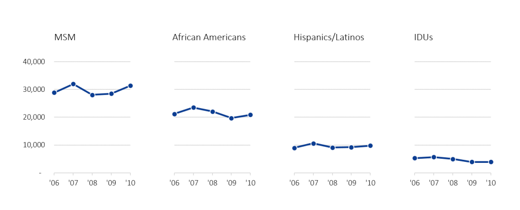
Option C: A Small Multiples Line Graph
A small multiples line chart helps us disaggregate the four different subgroups.
This style would be useful if you wanted to add subtitles or annotations above each graph. For example, you might type “MSM” and then below, “HIV infections rose slightly in 2007, decreased in 2008 and 2009, and then increased again in 2010.”
Here’s a twist on the small multiples line chart. It combines a technique called color highlighting with the small multiples design.
I use this approach when I want my viewers to see the contextual information, like the number of new HIV infections for men who have sex with men (the blue line on the first chart) compared to HIV infection rates for the other groups.

Option D: A Small Multiples Area Graph
When you’ve only got one line per graph, another option is to transform your line chart into an area chart. An area chart shades in the area underneath each graph.
This is a really popular design because people say it’s easier for our brains to see that big, filled-in, dark shape than to spot the skinny line all by itself. The skinny line on the line chart is competing with the axes and the grid lines for our brain’s attention. But there’s no way you can look at this graph and not spot those big blue chunks right off the bat.

Option E: A Small Multiples Slope Graph
A fifth option for this dataset is a small multiples slope graph.
Remember, slope graphs have two points in time. So we’ve just got 2006 and 2010 HIV infections here.

The takeaway message is that there are at least a dozen correct ways to visualize each of your datasets. It’s your job to sit down and sketch all the options on paper, and to weigh the pros and cons of each layout, and then to choose which layout corresponds to the message that you’re going for.
Which style do you prefer for this particular dataset?
6 Comments
I like option C2(?), the small multiples with color highlighting. The line graph makes it hard for any one line to stand out. Slope graphs are best for dramatic change (although I’ve had success with simply coding increase/decrease by color). All the other small multiples graphs, IMO, convey the idea that the variable of interest is declining dramatically over time, which it is not. By providing gray lines for context, the highlighted line appears as one category of many (which is true) as opposed to a chronological continuance (which is untrue).
Very useful. Thanks!
It would be nice to write an article about the Incorrect ways to visualize the same dataset.
I really like the color highlighting technique used with small multiples!
definitely option C1: A Small Multiples Line Graph. Vgood datatoink ratio, elegance, clarity. Honestly, I liked small multiples since I’ve seen it at @evergreendata site (“Declutter Dataviz with Small Multiples”). Combining with color highlighting would be better in case one show graphs in sequence – in four separate slides, or vertically instead horizontally. There would me more place for commentary, written or oral. Anyway, “to sit down and sketch all the options on paper” is essential – checking one’s idea dressed up in specific data often directs to another, better idea.
I really like the second small multiples color highlighting option. In this case, it’s color used with purpose to do those direct group comparisons vertically in the same figure rather than having to compare across 4 figures from left to right.
Always a pleasure to read 🙂 As someone dabbling in graphic design, I opt for the area charts D for the same reason you suggest. Visual imprinting is useful.. especially when dealing with totals for a relatively small number of sets/categories. I would have deleted the 40,000 axis label though to slim it down even more. Option C (ii) is the next best option however choosing becomes a bit more of a challenge when the decision-maker decides to inform the graphic designer to go with lines rather than these options that would speak more intuitively to the majority. You need to check out these talented visualization experts. amazing work, golden graphic tips that any M&E person would find useful –> https://darkhorseanalytics.com/blog/category/visualization/