4 Comments

  • Ben Collins says:

    Amazing how much more readable the new version is! Thanks for sharing the transformation. I’d be tempted to go one step further and remove the y-axis altogether…interested to hear your thoughts on that? It would maybe leave the lines floating though, and the chart would perhaps lose some impact.

  • Jared Hansen says:

    Great transformation! One question I have is when I look at this is why did you start the y-axis 30%?

  • Evan H says:

    Really love this post. Helped me with cutting down numbers and lines in my own graphs.

  • […] Here’s a screenshot from one group’s (public-facing) research report. The authors of the report talked about wheelchairs that were given to people in other countries. This was the demographic section of the report so there were a few graphs showing who those wheelchairs went to — men, women, kids, adults, and so on. There are 3D pie charts but I don’t fault anyone for their before graphs. We’ve all been there. […]

  • Leave a Reply to Ben Collins Cancel reply

    Your email address will not be published. Required fields are marked *

    This morning I keynoted a conference in Tallahassee. Data visualizers who critique others before critiquing themselves make me gag, so I opened my talk with a trip down memory lane.

    Check out this beauty from one of my earliest jobs. I’ve anonymized it but 99.9% of my work from this period had this look and feel, i.e., an overly-labeled graph that I made in Excel and pasted directly into Word without any editing at all.
    Example of my older work that is an overly-labeled graph that I made in Excel and pasted directly into Word without any editing at all.
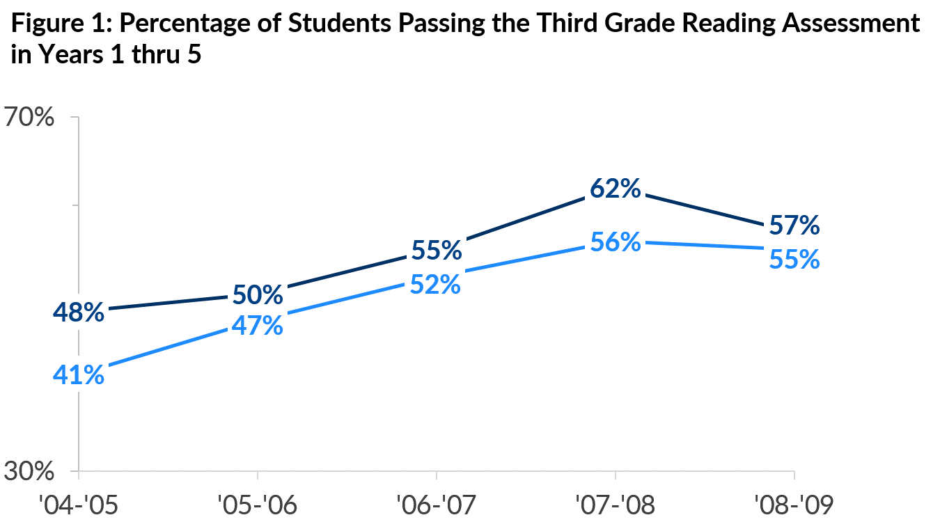
    Redundancies made my graph look more complicated than it really was.

    • The title and the y-axis label were redundant.
    • The numeric labels on each data point and percentages listed down the y-axis scale were redundant.
    • If we’re going to label individual values on the graph, then we no longer need grid lines.
    • The full time period is unnecessary. This graph’s viewers–decisionmakers in a state education agency–would know that ’08-’09 means the 2008-2009 school year.
    • The markers (tiny squares) along with the numeric labels are redundant.
    • The control group’s dotted line and gray color are redundant. I often use dotted lines to represent projections so I removed the dotted lines here.
    • The legend leads to unnecessary zig-zags around the page. Direct labels are faster to read and hold up better in black/white printing scenarios.
    • And so on…

    At the time, I adored these graphs because each graph represented hours of data cleaning and good ol’ fashioned hard work. I knew so much about number-crunching but so little about graph-making, and I was probably too tired after all the analysis to even think about the visualization. Plus, this was 2008. Let’s be honest. Everyone’s graphs looked like this in 2008.

    Recently, I’ve been showing you one tip at a time, like deciding how far you’ll stretch your scale, whether you’ll use a regular or stacked chart, and whether your chart will be oriented vertically or horizontally. Today, let’s check out how lots of small edits–small deletions, in this case–add up to completely makeover your graph.

    Continue scrolling for the play-by-play edits:
    Step by step showing how to strip down a chart of unnecessary labels, data, etc.
    Step by step showing how to strip down a chart of unnecessary labels, data, etc.
    Step by step showing how to strip down a chart of unnecessary labels, data, etc.
    Step by step showing how to strip down a chart of unnecessary labels, data, etc.
    Step by step showing how to strip down a chart of unnecessary labels, data, etc.
    Step by step showing how to strip down a chart of unnecessary labels, data, etc.
    Step by step showing how to strip down a chart of unnecessary labels, data, etc.
    Step by step showing how to strip down a chart of unnecessary labels, data, etc.
    Step by step showing how to strip down a chart of unnecessary labels, data, etc.
    Step by step showing how to strip down a chart of unnecessary labels, data, etc.
    Step by step showing how to strip down a chart of unnecessary labels, data, etc.
    Step by step showing how to strip down a chart of unnecessary labels, data, etc.
    Intentional subtraction still blows my mind every time.

    Purchase the template ($5)
     

    More about Ann K. Emery
    Ann K. Emery is a sought-after speaker who is determined to get your data out of spreadsheets and into stakeholders’ hands. Each year, she leads more than 100 workshops, webinars, and keynotes for thousands of people around the globe. Her design consultancy also overhauls graphs, publications, and slideshows with the goal of making technical information easier to understand for non-technical audiences.

    4 Comments

  • Ben Collins says:

    Amazing how much more readable the new version is! Thanks for sharing the transformation. I’d be tempted to go one step further and remove the y-axis altogether…interested to hear your thoughts on that? It would maybe leave the lines floating though, and the chart would perhaps lose some impact.

  • Jared Hansen says:

    Great transformation! One question I have is when I look at this is why did you start the y-axis 30%?

  • Evan H says:

    Really love this post. Helped me with cutting down numbers and lines in my own graphs.

  • […] Here’s a screenshot from one group’s (public-facing) research report. The authors of the report talked about wheelchairs that were given to people in other countries. This was the demographic section of the report so there were a few graphs showing who those wheelchairs went to — men, women, kids, adults, and so on. There are 3D pie charts but I don’t fault anyone for their before graphs. We’ve all been there. […]

  • Leave a Reply to Ben Collins Cancel reply

    Your email address will not be published. Required fields are marked *

    You Might Like

    Our complimentary mini course for beginners to dataviz. Takes 45 minutes to complete.

    Enroll

    Inside our flagship dataviz course, you’ll learn software-agnostic skills that can (and should!) be applied to every software program. You’ll customize graphs for your audience, go beyond bar charts, and use accessible colors and text.

    Enroll

    Subscribe

    Not another fluffy newsletter. Get actionable tips, videos and strategies from Ann in your inbox.