
Last fall I had the honor of keynoting the Southeastern Library Assessment’s Conference in Atlanta. We talked about a few data visualization principles, like showcasing your takeaway message with dark colors and clear text. Then, we worked together to transform the graphs, dashboards, and reports that the conference attendees had submitted ahead of time.
Before
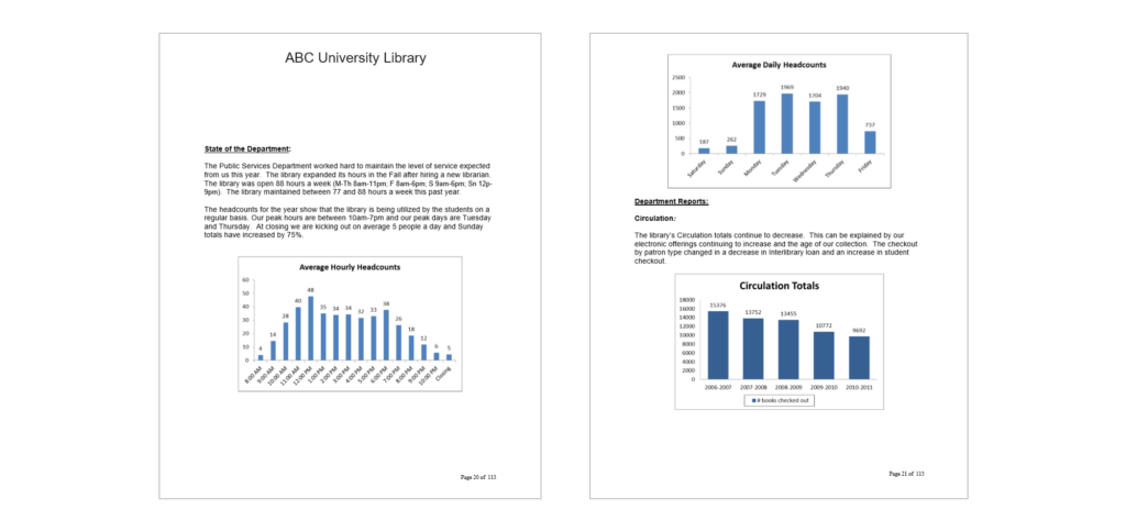
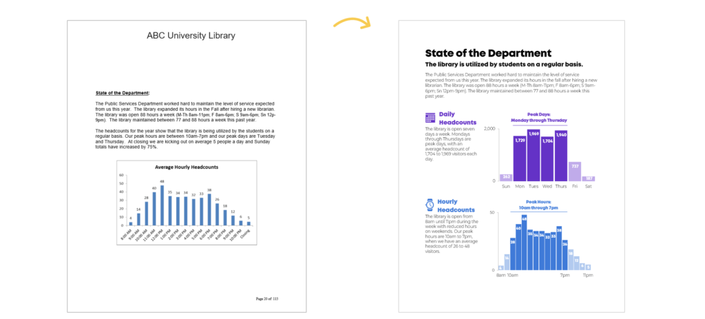
This attendee worked at a large university library and was responsible for writing an annual report about the library’s operations and accomplishments. The report was full of tables, graphs, and photographs.
This is a screenshot from the beginning of the report that offered background information about the library, like how many visitors came to the library each hour and each day. Library headcounts inform decisions about staffing and about future library hours. For example, if they find that library attendance peaks in the morning, then the university might decide to open the library earlier to accommodate their visitors’ preferences.
After: Reenvisioning the Individual Graphs
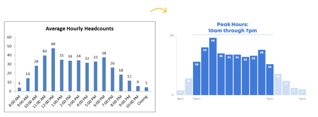
The first graph was about average hourly headcounts—how many students, staff, and other visitors were present in the library at any given hour in the day.
In this makeover, we:
- Decluttered the graph by removing the border, tick marks, and horizontal x-axis line;
- Decluttered the vertical y-axis by removing all of the labels except for the smallest value (0 visitors) and largest value (50 visitors);
- Decluttered the horizontal x-axis by only labeling a handful of key hours;
- Nudged the columns closer together (here’s a tutorial on shrinking the gap width) so that viewers could see the smoothed-out shape of the graph rather than the individual columns;
- Applied a mix of darker and lighter colors; and
- Wrote an annotation above the graph to highlight the key finding. This takeaway—that the library’s peak hours are between 10am and 7pm—was hiding in the paragraph above the graph. I wanted to make the report skimmable.
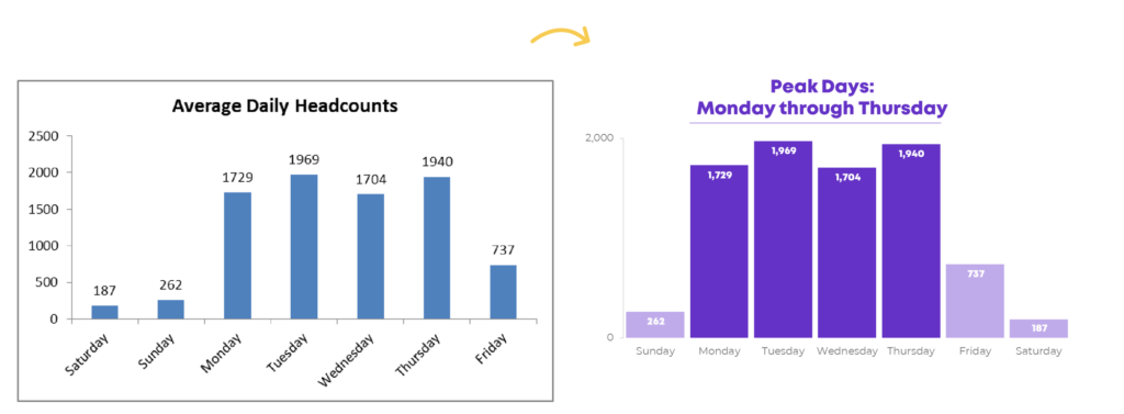
Here’s the second graph, which is about average daily headcounts. I decluttered the graph and then brought their key message into center stage with dark colors and an annotation.
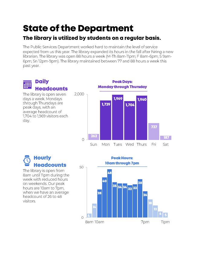
After: Re-envisioning the Page as a Whole
Next, we had to think creatively about the page as a whole. How would we arrange the graphs on the page? How big or small should we make each graph? How would we re-write the existing paragraphs?
While editing the page as a whole, we:
- Adjusted the report’s text hierarchy by making the Heading 1 and Heading 2 text large, bold, and dark.
- Re-wrote the introductory paragraph and moved some of those sentences closer to their respective graphs. The sentences about daily headcounts belong next to the graph about daily headcounts.
- Wrote graph titles. I usually advocate for storytelling titles that explicitly state the graph’s desired takeaway message. But in this makeover, I decided that annotations—Peak Days; Monday through Thursday—would be just as powerful. I didn’t want the graph’s storytelling title to be redundant with the graph’s annotation, so I combined a generic title with a storytelling annotation.
- Added icons because icons can make our graphs more memorable; and
- Paid careful attention to alignment. The words are left-aligned. The graphs are aligned with each other, too. You could draw a single vertical line from the top graph’s y-axis down to the bottom graph’s y-axis. It took a few minutes to get the spacing just right, but alignment is always worth the extra time because it makes the finished product look more professional and purposeful.
Here’s the full before/after data visualization makeover:
Bonus
Would you like to explore the Excel file, Word document, and PowerPoint slides that I used to create this makeover? Purchase the materials and use them as inspiration for your own projects.
Purchase the Templates ($5)
Leave a Reply