
As we were wrapping TechnoServe’s 2016 Impact Report, I also began consulting on TechnoServe’s Results Portal. The Results Portal is an interactive, web-based dashboard that’s embedded within TechnoServe’s website at http://www.technoserve.org/our-work/impact#portal.
For the first time, TechnoServe’s beneficiaries, partners, donors, and prospective donors can view key stats about TechnoServe’s projects. TechnoServe is offering their data to the public, not because they have to, but because they want to. What’s not to admire about an organization that’s committed to transparency and information-sharing?
The portal includes a map of the countries and regions where TechnoServe works…

…and results by country and by project.

There are three features that make TechnoServe’s Results Portal easy to navigate:
- Consistent color-coding and icons by category;
- Consistent navigation; and a
- Consistent text hierarchy.
Consistent Color-Coding and Icons by Category
I like color-coding by category within a single document. I love color-coding across multiple documents and projects.
Remember TechnoServe’s 2016 Impact Report, which I showed you last time? They reported on three key variables: financial benefits, beneficiaries, and finance mobilized. Throughout the entire 16-page report, information about financial benefits was always displayed in green with the icon of the hand holding paper currency. Information about beneficiaries was always displayed in purple with an icon of several farmers standing together. And information about finance mobilized was always displayed in turquoise with the line graph icon.
We repeated the same colors and icons throughout the Results Portal, too. Can you spot the icons, terms, and definitions in the opening screen of the Results Portal? We added a fourth variable to this project, too. TechnoServe wanted to emphasize how many beneficiaries were female, so information about percent women was displayed in orange.
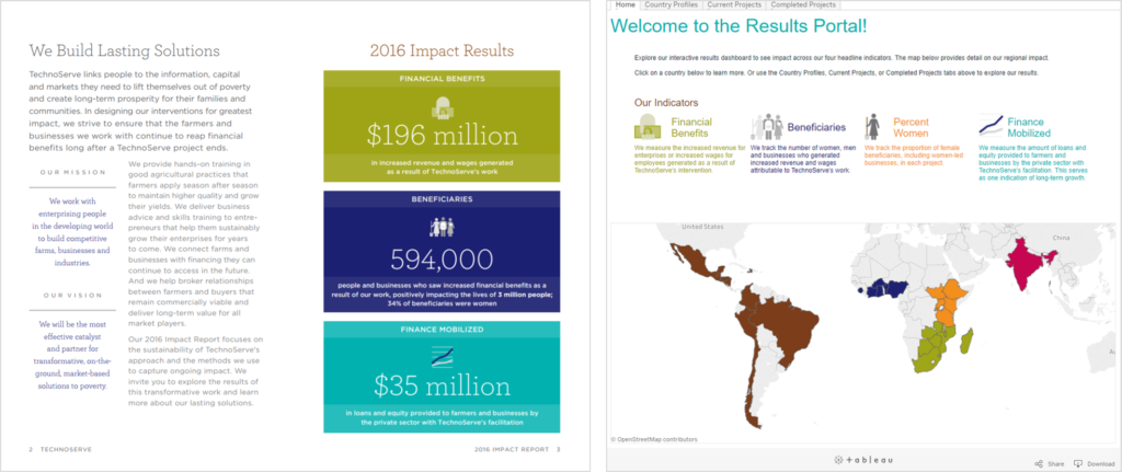
2016 Impact Report (left) and Results Portal (right)
We also worked on a third product, a series of Google Sheets dashboards that were designed for TechnoServe’s internal audiences. Those dashboards aren’t public. But yes, you guessed it, the internal dashboards follow the same color-coding. Financial benefits are green, beneficiaries are purple, percent women is orange, and finance mobilized is turquoise.
Consistent Navigation
Tableau allows you to insert drill-down menus just about anywhere: in the upper left, upper right, lower left, lower right, or middle of the page.
In earlier drafts, our lists of countries and projects that viewers could explore were in different places on different screens. We placed the lists wherever we found blank space and could squeeze them in.
In the final version, we intentionally placed the lists in the upper left corners. In Western cultures, we read beginning in the upper left corner and then read across and down in a z-shaped pattern. That’s why we placed the country and project lists in the upper left corner—because it’s the most valuable real estate on the page.
Our goal was to make navigation seamless. We wanted viewers to focus on interpreting the data, not on interpreting the dashboard.
Consistent Text Hierarchy
Do you really need font in size 8, 9, 10, 11, 12, 13, 14, 15, 16, 17, and 18?
Sometimes, software programs give you too many different font sizes. You insert a chart and there are different sizes for the title, subtitle, axis labels, numeric labels, and category labels.
Other times, dashboard designers create too many different font sizes. We’re not sure what our final product will look like. We experiment. We try a graph title in size 12 on one screen and a graph title in size 13 on another screen. We try a body font in black on one screen and dark gray on another screen. We try a page title in bold on one screen and italic on another screen.
In the final version of the Results Portal, we paid careful attention to fonts, sizes, colors, and styles. We built a consistent text hierarchy. A text hierarchy tells your viewers which information is at the top of the food chain. The most important information is largest, the information that’s of medium importance is a medium size, and the regular ol’ body font is the smallest size.
Consistent text hierarchies across screens make you look polished and professional. More importantly, text hierarchies make your viewers’ job of interpreting the information faster and easier.
Has your organization built a public-facing dashboard like TechnoServe yet? Link to your websites here!
Leave a Reply