In February 2023, I participated in Stefanie Posavec’s Dataviz Drawing Class.
I LOVED the class!
Wondering whether the class is right for you?
What’s inside this review:
- Class logistics
- Why I signed up
- About the instructor
- What we learned
- Who this class is best for
- My favorite part
- Learn more
Class Logistics
A dozen of us met for two half-day classes held over Zoom. This was the perfect length: a half-day of dataviz principles and quick drawing exercises, followed by a half-day focused on a bigger project.
Participants were mostly based in the U.S. and Europe, with most people using data for part/all of their job.
We used an online whiteboard tool, Miro, to introduce ourselves and share our drawings. There was a small learning curve, but then it was easy to snap photos of my hand-drawn images and upload them to the site.
Stefanie also sent us a supply list a couple weeks in advance. She said we needed a spreadsheet tool (Excel, Sheets, etc.) and some basic art supplies (e.g., plain paper, black crayon, colored pencils, etc.). There weren’t any specialty art supplies needed; these were all supplies that you’d have laying around your home somewhere.
Why I Signed Up
My own dataviz consulting and training is spreadsheety and linear—almost to a fault.
I don’t think it’s helpful for any of us to work within silos.
I wanted to think about dataviz from a different lens—drawing!
Sure, I could read one of Stefanie’s books.
Sure, she probably has public-facing talks on YouTube.
But nothing compares to quality online training where your brain is fully immersed in the topic alongside the instructor and peers.
About the Instructor: Stefanie Posavec
According to Stefanie’s website, she is “a designer, artist, and author exploring experimental approaches to communicating data and information to all ages and audiences.”
Her projects “might be wearable, danceable, or hoppable, be found in hospitals, museums, or on television, and will often use a human-scaled, hand-crafted design process.”
I first heard of Stefanie Posavec after she wrote Dear Data with Giorgia Lupi.
Then, I fell in love with I am a Book, I am a Portal to the Universe.
Day 1: Dataviz Basics + Data Drawing Challenges
Here’s what we learned and practiced each day.
Data Visualization Basics
The first hour was an intro to dataviz, including:
- seven data visualization variables,
- Gestalt principles, and
- preattentive processing.
I took detailed notes, but won’t be sharing them here for obvious reasons. You’ll have to take her class to learn more. 😊
Stefanie had examples from a variety of artists (e.g., Sol LeWitt) and historical figures (e.g., William Playfair). Every dataviz person is familiar with Playfair, but the rest were new, and I loved learning about more artists.
9 Dataviz Drawing Exercises
For the next few hours, Stefanie gave us drawing exercises.
Again, I won’t be describing the exercises in detail.
Here’s what I made:
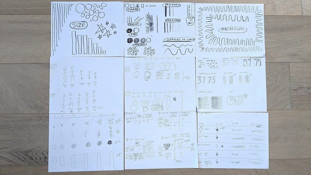
After each exercise, we shared our drawings on our webcams so we could learn from each other.
I was pleasantly surprised that everyone kept their webcams on!
Usually, I’m the only one with my webcam on. In Stefanie’s class, I was the only one with my webcam off (because I was walking on the treadmill while sketching). Then, I’d turn my webcam back on to share my drawings.

Day 2: Musician Challenge
On the second day, Stefanie gave us a public dataset to work with.
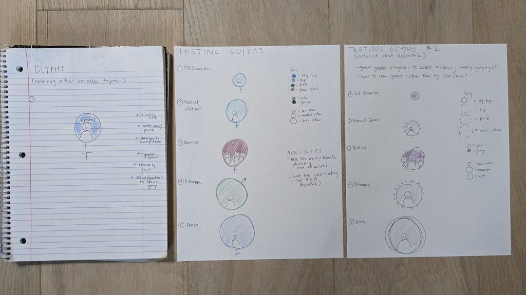
She guided us through how to approach data as a designer, like understanding which type(s) of variables we’re working with (categories, rating scales, binary data, etc.).
Here are my glyphs (new terminology and new approach to dataviz design for me):
Then, we had ~50 minutes to arrange the glyphs with an underlying architecture (e.g., a circle, spiral, clusters, etc.).
The underlying architecture was a massive a-ha for me! The structure really differentiates linear, predictable dashboards from exploratory, artistic visualizations.
We posted in-progress drafts to the Miro board as we worked, and Stefanie provided helpful feedback.
Since I’d been working with paper and pencil for a while, I was ready to switch to computer-drawn graphics. I was probably supposed to continue drawing, but… realistically, all of my client projects have to be done in everyday software like Excel, since that’s the common denominator for all my clients. I had to make sure I could actually implement my sketched ideas in Microsoft tools.
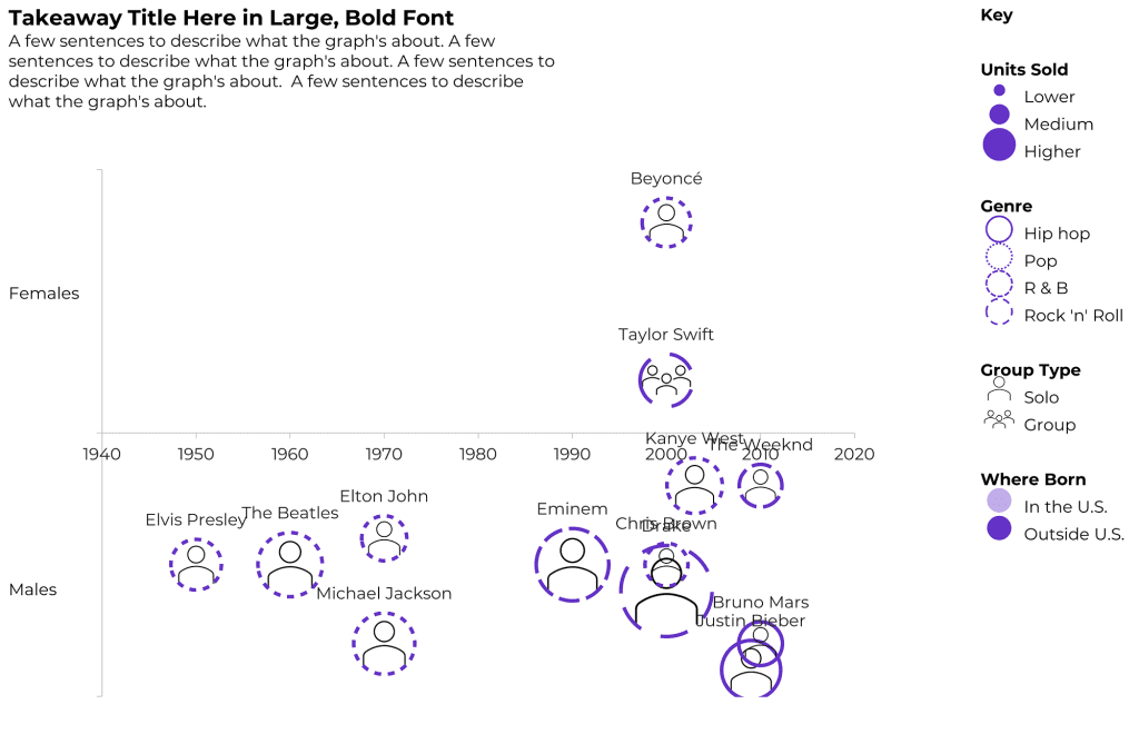
Here are some of my drafts, which were made in good ol’ Excel. (These are just bubble charts with icon fills, outline colors, and outline patterns.)
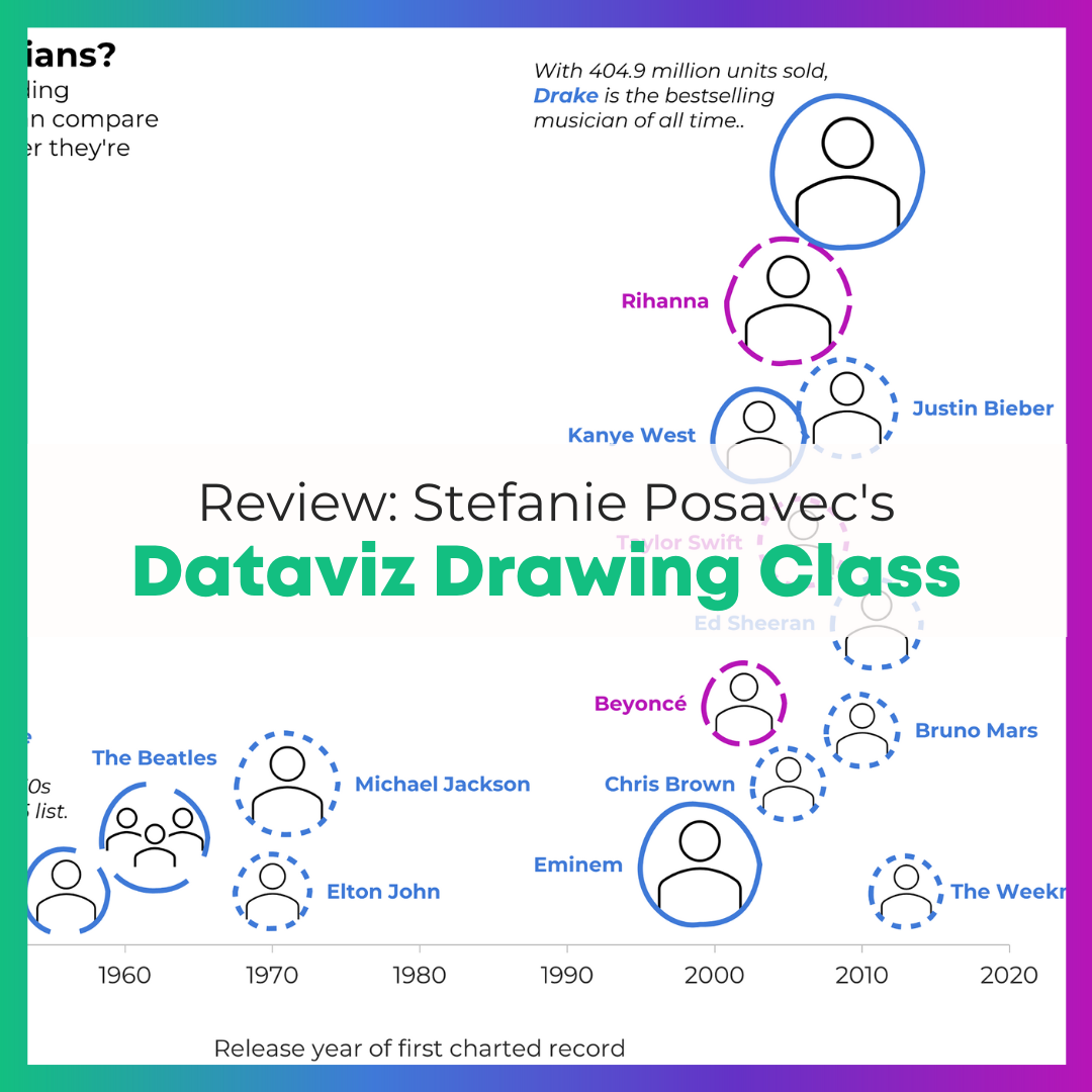
First, I tried arranging musicians by time and gender, and I started drawing the key. Don’t look too close – I had genre typos in this one, which I fixed later.
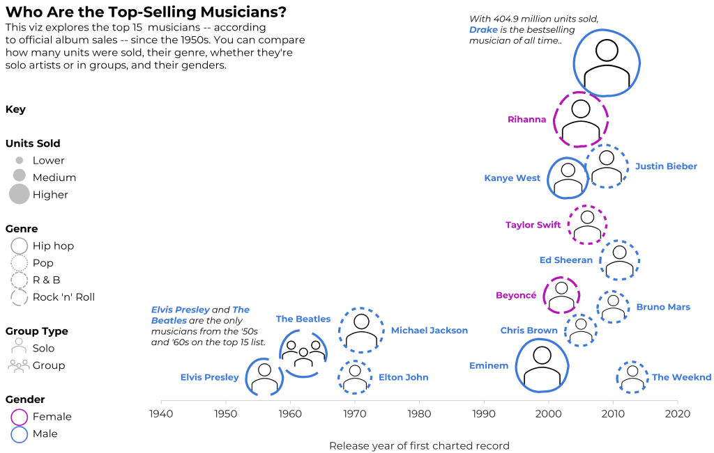
Then, I dropped the gender variable, and focused on the timeline (a.k.a. a column chart).
The timeline effectively showed how most of the top-selling artists are from the 2000s.
But, this one felt empty; I could’ve placed another variable on the y-axis.
That’s a lot within 50 minutes!
I was pleasantly surprised how much I could figure out, both design-wise and software-wise, in less than an hour. I can’t remember the last time I nearly-finished an entire non-traditional viz like this so quickly! I was on my treadmill, walking 10 miles during each of the classes, so my brain was definitely on Beast Mode.
After class, I spent another hour arranging the glyphs by the musicians’ birth country. I wanted to show how most of the top-selling artists are from the U.S. and Canada.
I didn’t spend time to make sure the glyphs didn’t overlap.
(Remember, this is an Excel bubble chart, so I’m manually assigning each artist an x and y value behind the scenes.)
At some point, you have to call it quits on just-for-fun dataviz.
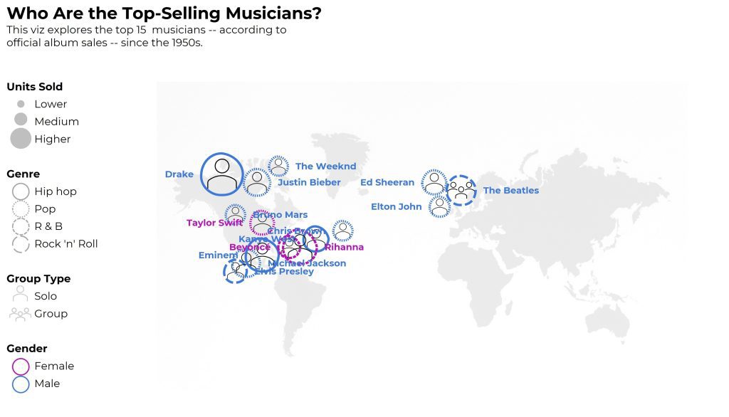
Time permitting, I would’ve:
- represented gender with shapes (circles vs. squares) instead of colors (to make it colorblind-friendly);
- continued fiddling with the artists’ placements on the map so they didn’t overlap so much;
- added a second outline/ring to the artists coming after 2000, and kept the single ring for the artists pre-2000;
- added the artists’ photos (the icons are placeholders); and
- shaded the background of each photo according to… something? (Imagine a light-dark shading as the background color behind their headshots.)
Who This Class is Best For
Stefanie described the focus as:
- People who are creating or inventing data visualizations (me!)
- People who want to move beyond the standard chart types (me!)
Well, it was for me, but not really.
I knew I’d be the only full-time dataviz instructor.
I think I was the only one who made datavizzes as the major focus of my job (?). Other students seemed to make graphs, dashboards, and infographics as a piece of their job, but not as the focus. One participant had just finished undergrad.
After listening to others’ questions—Which chart should I use? How exactly do I get started??—I think this class is best suited for people who already have prior data visualization training.
This isn’t the class to learn about data analysis, like how to merge datasets, clean data, recode variables, or calculate frequencies or descriptive statistics. The participants I chatted with in breakout rooms already had those skills from their data-focused jobs.
This isn’t the class to learn the difference between chart types, like a scatter plot vs. bubble chart, or a histogram vs. a population pyramid. Stefanie provided an overview of chart types, but chart types are so nuanced that they deserve an entire class of their own.
This isn’t the time to learn color nuances, like the difference between sequential, diverging, and categorical color palettes. Again, Stefanie provided an overview, but colors deserve an hour or two on their own.
This isn’t a class to learn about Big A Accessibility (like 508 compliance, colorblindness, etc.) or to learn about Small A Accessibility (making sure graphs are easy to understand). This was tricky for me—accessibility is woven into every aspect of my work, and I kicked myself as I drew non-colorblind-friendly graphics and made my own vizzes harder to decipher just for creativity’s sake.
This isn’t the class to learn any software how-to’s. You’ll be working with paper, crayons, colored pencils, and markers. I opted to work in Excel the last hour. Another student pulled up Illustrator.
Instead, this is a class to help you think past the common chart types that are available in our everyday software programs. (“I’m having trouble thinking outside PowerPoint’s charts!” mentioned a few fellow students.)
This is a class to help you think about individual data points (glyphs) within the underlying architecture. I don’t think I’ve ever approached a project from the lens! I’ll likely use this approach from now on.
This is a class to help you approach a brand new dataset and start graphing. These skills are essential for everyone working in data.
This is a class to practice conceptualizing your ideas on paper first, which is a critical planning step that’ll make all your visualizations stronger. There’s nothing worse than sitting down to your computer without hand-sketching first. Computer-first vizzes are never as good as sketched-first vizzes.
My Favorite Part
So much hands-on learning time!
About half the first day, and nearly the entire second day, were spent drawing and drafting visualizations.
For a busy consultant like me, it’s tough to devote time to learning and sketching for my own skill-building. I loved loved loved having dedicated time with others to practice my craft.
I like to lie to myself and pretend that I can set aside time for learning, but I can’t. That’s what dedicated classes like this are for.
Learn More
I asked Stefanie when she’s offering the class next. Possibly in June 2023! Follow Stefanie Posavec on LinkedIn to hear about the next class.

Leave a Reply