I met Patricia Mullaney-Loss this spring and was excited to hear how Patricia and her colleagues are thinking carefully about the dashboards they design for their end users. Today, Patricia is sharing her top seven tips for designing visualizations in Tableau. Enjoy! –Ann
Tableau dashboard ideas often originate from new and interesting data or conversations with those using your data. At the National Association of State Arts Agencies (NASAA), we talk with our members often to understand their needs and what is most important to highlight in a visualization. Ideas are plentiful and roadblocks to implementing your ideas can be just as frequent. Here are some tips from our organization’s experience using Tableau to generate interactive visualizations for state agencies.
Tip #1: Select the Appropriate Level of Detail
Before making visually appealing charts, you need to decide how to showcase your data for maximum benefit to your end users.
Familiarity with the data can be a disadvantage. How you use raw data on the backend may not necessarily translate to how people want to view data on a Tableau dashboard. Parameters, calculated fields, or groups will help deliver the type of analysis your users need.
Consider the level of detail to showcase. Will you display data for individual grants, organizations, cities, regions, or states? Some users may prefer a very detailed unit level. Others might just want to see aggregated figures. For instance, our users might not want to see each grant administered from every agency across the country. It might be more meaningful to show medians, means, or percent of total by state or region.
Note: When you are getting started and using data from an Excel sheet, your dataset may not be optimally shaped for Tableau use. Luckily, there is an Excel plugin that will shape data for Tableau–it’s faster than making a pivot table or using the Tableau Data Interpreter!
Tip #2: Don’t Be Tempted by Flashy Chart Types
Tableau’s “Show Me” function will display a plethora of assorted, flashy charts to choose from.
When in doubt, go with bar and line graphs. These simple chart types are still how many people can relate to visualized data, and chances are your end users are not mathematical physicists expecting four-dimensional graphs. You can use exciting bubble and tree charts ONLY if they really are the most effective at conveying the information.
Additionally, be prepared to make a lot of bad graphs to get a great one. If it’s part of your creative process, make a few charts that look like rainbow spaghetti and then edit them down to palatable visuals. Our process usually starts out with outside-the-box visualizations before selecting a few good formats.
Tip #3: Minimize Distractions by Building Symmetrical, Aligned Visualizations
Your dashboard may end up with some odd spacing between titles and subtitles, or between charts. Taking a step away from the dashboard will help you see where formatting oddities draw the user’s eye and try to minimize the distractions from the data.
Hack your layout. Adding 8-point spaces between titles and tiny spacing boxes next to charts can be onerous, but it will make the visualization look more streamlined and well put together.

Left: Note how the spacing is asymmetrical and how the subheading gets a lost. Right: More symmetry and space between the heading and subheading makes it easier for the eye to read.
Tip #4: Add Context with Tooltips
Give the data context by writing a sentence with tooltips.
When users hover over your visualization with their mouse, then they’ll see your sentences in little pop-up boxes, like this one:
Are you displaying a calculated field, like percent change over time, but also want users to have access to the actual figures? Tooltip.
Want to associate more data with dots on a map? Tooltip.
Need to define a term? Tooltip.
Sometimes Tableau automatically generates tooltips, so practice good tooltip hygiene on all your charts.
You can get some quick ideas for how to incorporate tooltips by visiting one of NASAA’s suite of visualizations.
Tip #5: Design for Both Web and Print
We know a lot of our members like working with visualizations online. But many users also like to print dashboards out for meetings.
We try to make the size of the dashboards amenable to a standard sheet of paper. We also ask ourselves if all the data people need to see are visible from a printout. In other words, is there information inside Tableau’s tooltips that needs to be shown in the dashboard itself?
If your users are viewing dashboards on mobile devices, then make sure to use the mobile design function.
Tip #6: Use Minimal Formatting
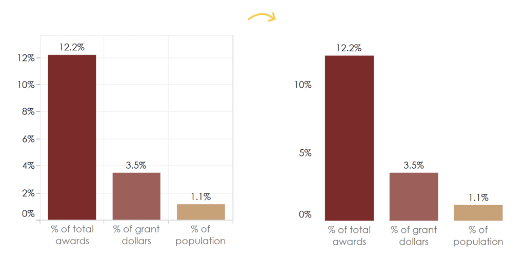
When in doubt, get rid of extraneous lines, tick marks, and boxes in and around charts. The extra stuff crowds the data you want people to focus on. Plus, minimal formatting just looks clean and polished.

Left: Data can get lost with extraneous lines. Right: Without extra tick marks and grids you can see data more clearly.
Tip #7: Choose Your Colors Wisely
Highlight important data points with something bright, but try not to physically hurt people’s eyes with a neon green.
Have in mind the larger context/visual environment in which the dashboard will be viewed. If it will be embedded on a website, it should not clash with the web design.
If people external to your organization will be seeing it, consider how to incorporate your branding.
If you know people will print a dashboard, remember that most print in black and white, so make sure the hue values are differentiated enough to be distinguishable in grayscale.

Make sure that colors of different hue values will still show clearly when printed in black and white.
We hope these tips serve as a starting point to help evolve your visualization practices!


Leave a Reply