8 Comments

  • Excellent ideas for improving charts!

  • […] don't need a dinosaur chase in every chart. Ann K. Emery explains how to simplify your charts, and emphasize the key information, by using text and […]

  • rfway says:

    new to the site…very impressive and a great resource to a newbie like me..

  • MpPierce says:

    Great way to think about things. I really like the approach of “get naked, then get meaningful.” (Realizing that, out of context, that could be a very dangerous phrase.)

  • […] the mostly edited version: reduced clutter; custom color; labels directly beside the data; reduced gap […]

  • Henry Wang says:

    Hi Ann,
    Thank you for the excellent write up. In my chart, the line that I would like to highlight ends up being overlapped by other lines. Is there a way to make the line of interest the one that overlaps?
    Thanks,
    HW

    • Ann K. Emery says:

      Good question. It’s very easy. Right-click on the middle/center of the chart. Go to Select Data. In this window, you’ll see a list of categories included in the chart. (For this fictional dataset, the list would read Organization A, Organization B, and so on.) Use the up and down arrows to rearrange the list of categories. *The important line that should be on top, a.k.a. the one that should overlapp all the others, goes on the bottom of this category list.*

  • Henry Wang says:

    Perfect, thank you Ann!

  • Leave a Reply

    Your email address will not be published. Required fields are marked *

    The Simplification & Emphasis Approach to Editing Graphs

    Updated on: Jan 26th, 2016
    Data Visualization
    , , , , , , , , ,
    Before and after of a graph where it has been simplified and then emphasis has been placed on certain parts.

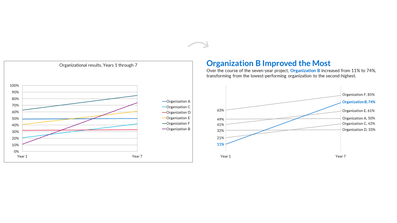
    I teach about data visualization a lot. And it basically comes down to two techniques: simplification and emphasis.

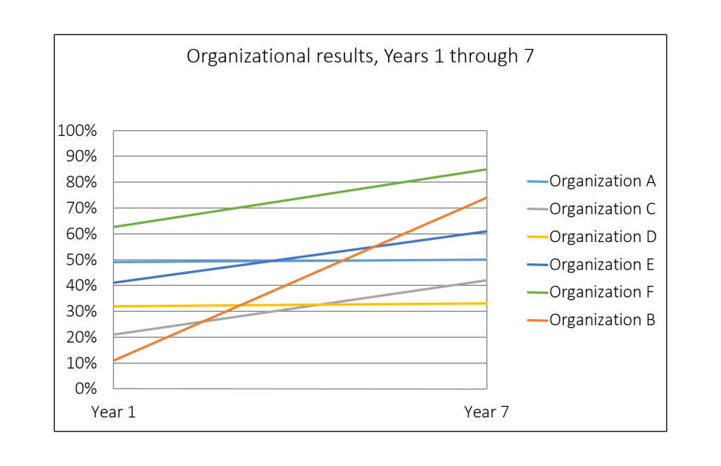
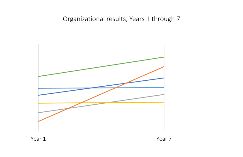
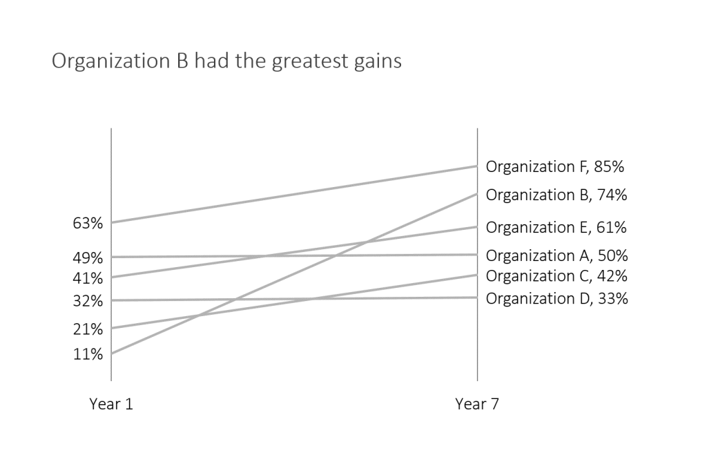
    Here’s a default graph with fictional data:
    Default graph with fictional data.
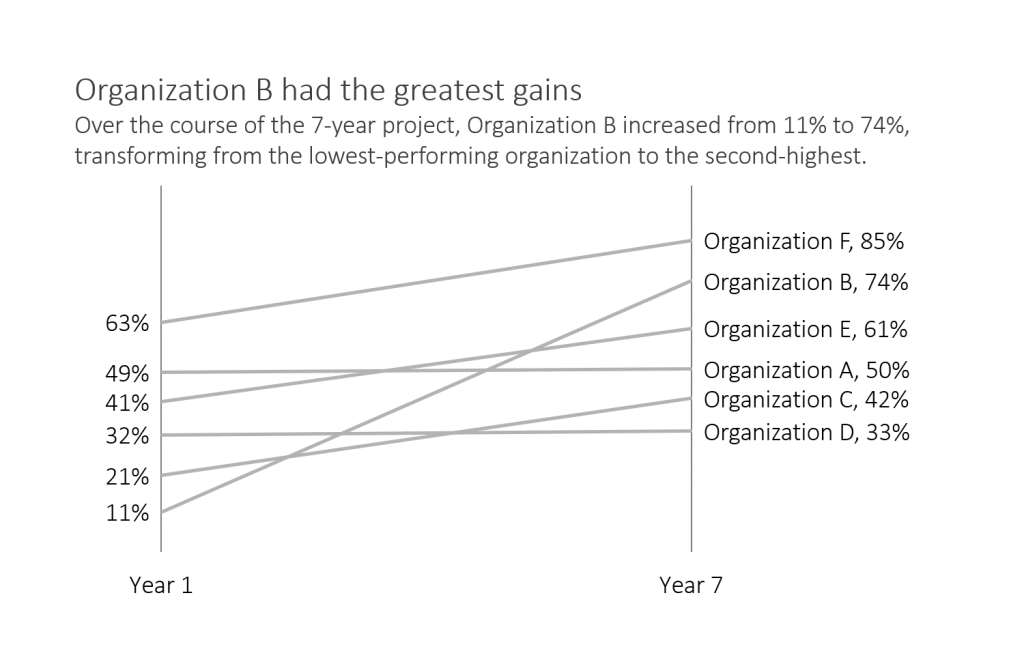
    First, simplify the graph. Remove the border. Remove the horizontal grid lines. Remove the vertical axis. Remove the legend. Remove the title. Remove the color!
    Default graph with fictional data where border is removed.
    Default graph with fictional data where horizontal gridlines are removed.
    Default graph with fictional data where vertical axix is removed.
    Default graph with fictional data where legend is removed.
    Default graph with fictional data where the title is removed.
    Default graph with fictional data where all color is removed.
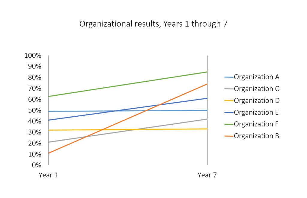
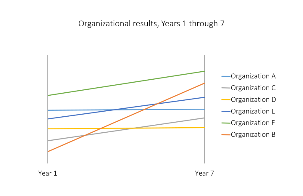
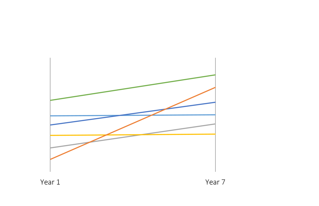
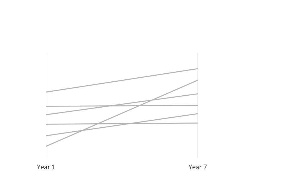
    Once your graph is naked, you’re done simplifying.

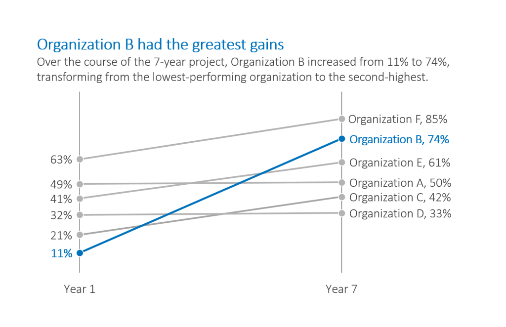
    Second, emphasize your message with text. Add direct labels. Add a descriptive title. Add a descriptive subtitle. Make sure the text is hierarchical; the title is largest and the subtitle and labels are smaller.
    Default graph with fictional data where labels are added.
    Default graph with fictional data where a title has been added.
    Default graph with fictional data where a descriptive subtitle has been added.
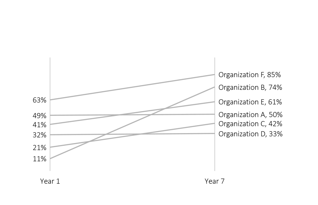
    Third, emphasize your message with color. Leave the software program’s default color scheme at the door. Instead, enhance branding by matching your graph’s color palette to your organization’s logo. I’m facilitating a workshop for The Evaluation Group this week, so here’s their exact shade of blue.
    Default graph with fictional data where certain text and a line in the graph are now in the color blue.

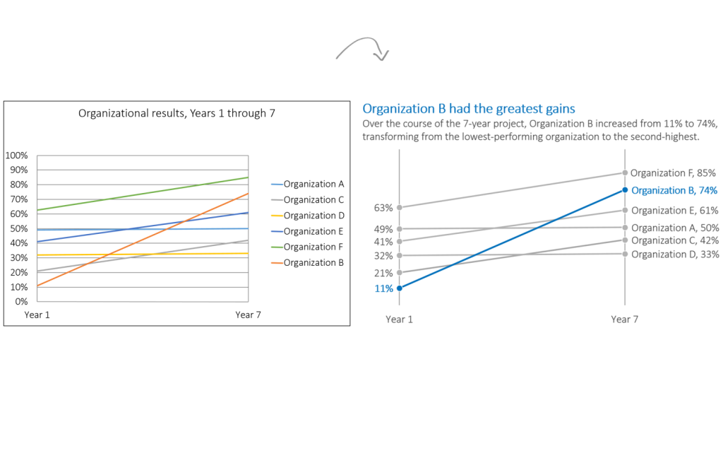
    Simplify by removing unnecessary ink. Then, emphasize your message with text and color. That’s all, folks!
    Before and after of a graph where it has been simplified and then emphasis has been placed on certain parts.
    Want your company to practice the simplification and emphasis approach with your own datasets? Contact me to schedule your in-person workshop or virtual webinar. 

    More about Ann K. Emery
    Ann K. Emery is a sought-after speaker who is determined to get your data out of spreadsheets and into stakeholders’ hands. Each year, she leads more than 100 workshops, webinars, and keynotes for thousands of people around the globe. Her design consultancy also overhauls graphs, publications, and slideshows with the goal of making technical information easier to understand for non-technical audiences.

    8 Comments

  • Excellent ideas for improving charts!

  • […] don't need a dinosaur chase in every chart. Ann K. Emery explains how to simplify your charts, and emphasize the key information, by using text and […]

  • rfway says:

    new to the site…very impressive and a great resource to a newbie like me..

  • MpPierce says:

    Great way to think about things. I really like the approach of “get naked, then get meaningful.” (Realizing that, out of context, that could be a very dangerous phrase.)

  • […] the mostly edited version: reduced clutter; custom color; labels directly beside the data; reduced gap […]

  • Henry Wang says:

    Hi Ann,
    Thank you for the excellent write up. In my chart, the line that I would like to highlight ends up being overlapped by other lines. Is there a way to make the line of interest the one that overlaps?
    Thanks,
    HW

    • Ann K. Emery says:

      Good question. It’s very easy. Right-click on the middle/center of the chart. Go to Select Data. In this window, you’ll see a list of categories included in the chart. (For this fictional dataset, the list would read Organization A, Organization B, and so on.) Use the up and down arrows to rearrange the list of categories. *The important line that should be on top, a.k.a. the one that should overlapp all the others, goes on the bottom of this category list.*

  • Henry Wang says:

    Perfect, thank you Ann!

  • Leave a Reply

    Your email address will not be published. Required fields are marked *

    You Might Like

    Our complimentary mini course for beginners to dataviz. Takes 45 minutes to complete.

    Enroll

    Inside our flagship dataviz course, you’ll learn software-agnostic skills that can (and should!) be applied to every software program. You’ll customize graphs for your audience, go beyond bar charts, and use accessible colors and text.

    Enroll

    Subscribe

    Not another fluffy newsletter. Get actionable tips, videos and strategies from Ann in your inbox.