33 Comments

  • Chris Ganowski says:

    Thanks for posting about this. I too have never understood while Excel reverses the sort order when transposing data from a table to chart. I generally use option B that you outlined above. However, I’ve noticed that if the chart includes a y axis, and you choose this option, Excel moves the axis from the bottom of the plot area to the top. Sometimes this isn’t an issue, like when you don’t use a y axis at all, as in your example. Or sometimes having a y axis at the top of the plot area makes logical and aesthetic sense. But there are cases where keeping the y axis at the bottom of the plot area is preferred, but by reversing the category order, this isn’t possible. I wonder if this whole thing is a strange little blip, or if there some kind of method to Microsoft’s madness…

  • Ian Watkins says:

    Chris – in the Format Axis pane, as shown above, under horizontal axis crosses, change it to ‘at maximum category’. This will move the y-axis back to the bottom.

    • Pamela says:

      This is the best solution I’ve come across online Ann K. Emery , thank you also to Ian Watkins for the solution to invert the x-Axis ..

  • Dave Bruns says:

    Hi Ann – with categories in reverse order – Jon Peltier has a nice article on the source of this problem in Excel. The gist: Excel plots low values closest to the origin, and higher values further away. This works well for column charts, but causes bar charts to look upside down.

  • Dawn Reinhardt-Wood says:

    Thank you! Life saver! Or, at least, hair saver! Been pulling mine out for a half hour.

  • Kalpana says:

    Thank you so much. Saved my life and time. you are a genius

  • Tina says:

    Thank you for this. Short and simple explanation to annoying problem. You are the best!

  • Antonio ValleNeto says:

    None of the options solved my problem:

    My list is ordered in alpha order (label) and I want to see chart sorted by bar size.

    • Ann K. Emery says:

      Hi Antonio, You’ll simply need to re-order the table from greatest to least or from least to greatest.

    • Megan Wagner says:

      Is there a way to sort the bar chart without having to sort the table? I have a comparison chart of categories per year and I want to chart to sort the data, but not the table because it mixes some of the values when this is completed.

      Do you happen to know of an Option C?

      • Ann K. Emery says:

        Hmm, good question Megan. When you say that it “mixes some of the values,” what do you mean exactly? Give me some more details on your situation and I’ll help you troubleshoot!

  • Joseph Musaazi says:

    Hi Ann, thanks a lot for the post. But when you reverse the categories, the x-axis shifts on top. How do I bring it to the bottom?

    Thanks
    Joseph

    • Ann K. Emery says:

      Hi Joseph, I don’t think there’s a way to *both* reverse the categories *and* keep the x-axis on the bottom. This might’ve been possible 5-10 years ago in earlier versions of Excel… but I just tried again, and it doesn’t seem possible.

      Your alternative approach would be: Adjust the table that’s linked to your chart. In other words, go into your table and re-sort the values, anticipating that your table is going to do a somersault once the values go into the chart. Put the values you want on the *top* of your chart at the *bottom* of your table, and so on.

      • Paul Holland says:

        You can format the horizontal axis. In the Format Axis dialog box, under “Labels” set that to “High”. That should drop the x-axis labels to the bottom of the chart.

  • Jennifer says:

    Genius! I have been struggling with this for years! Such an easy to follow process, thank you!

  • Andrea says:

    Thank you so much!

  • Heath Wilder says:

    I need to sort categories independant of alphabet or size. eg: I have a survey with categories Strongly Agree, Agree, Neutral, Disagree, Strongly Disagree. I’m going to assume that I have to put an Rank on those answers in order to sort

  • Taimoor says:

    Thank you so much!!

  • Tundrahound says:

    High five Ann. Option 2 was golden.

  • Brittany says:

    When using a combo bar chart, checking the “values in reverse order” box flips the bars horizontally rather than reordering them. I’m trying to graph a subset of my data, so resorting the table isn’t working either. There has to be a simpler way to tell Excel you want the bars in a chart in descending order from the top!

  • Marina says:

    I love you right now, thank you so much!

  • Tim Golisch says:

    Thank you!

  • Guillermo Torrez says:

    Good Solution, in your example has two varariables . favourite food and number of votes. How about when we have 4 diferents variables like that?

    Month Bears Dolphins Whales
    Jan 8 150 80
    Feb 54 77 54
    Mar 93 32 100
    Apr 116 11 76
    May 137 6 93
    Jun 184 1 72

    Please could you share your suggestion or any idea how to do that?

    Thank in advance.

    • Ann K. Emery says:

      Maybe a “small multiples bar chart?” You might need a separate chart for each of your 4 variables. You could make them the same size and align them next to each other to make comparisons across the variables/charts easy.

  • Dale Nixon says:

    You are a life saver!! Thank you for this very simple and helpful explanation.

  • Niraj Thapa says:

    Hi I have a small question, What is the way out to reorder the bar chart in ascending or descending order, if the data table is not arranged in either way.

    Example:
    Data:
    A B C D E F G H I
    100 700 200 900 350 210 460 990 85

    I need the bar chart in ascending /descending order.

  • Mansoor says:

    Awesome! Couldn’t find it in Youtube.

  • No help says:

    This didn’t help sort, it just reversed the order…

  • I’ve found that you can customize the order of your data legend.
    Here’s how:

    Click on the Chart > Chart Design > Select Data

    Under Legend Entries (Series), select your legend, and click on the small blue up “^” or down button to move them around.

  • Liz says:

    Thank you !! This was really bothering me, I was doing option A and my chart was the other way round. Option B for me !!

  • Leave a Reply to No help Cancel reply

    Your email address will not be published. Required fields are marked *

    “Ann, my bar chart is upside down! Help!”

    You read my prior post about using horizontal bar charts for nominal variables like favorite fruits.

    My toddler is eating two! bananas a day so bananas are the winner in this fictional fruit contest.

    Our original table is ordered alphabetically and that just won’t do.

    Our viewers will either want to know about the favorite fruit (a greatest to least ordering) or they’ll want to know about the least favorite fruit (a least to greatest ordering).

    Excel spreadsheet showing data and corresponding chart.

    How to Re-Sort Your Bar Charts in Microsoft Excel

    You’ve got two options for re-sorting your bar chart.

    Option A: Re-Sort the Table

    Option A is to re-sort your table.

    If you’re not working in spreadsheets all the time, you may not have discovered sorting and filtering features before.

    Here’s how you can sort data tables in Microsoft Excel:

    1. Highlight your table. You can see which rows I highlighted in the screenshot below.
    2. Head to the Data tab.
    3. Click the Sort icon.
    4. You can sort either column. To arrange your bar chart from greatest to least, you sort the # of votes column from largest to smallest.

    Well, that would be the logical approach. A largest to smallest sorting should produce a largest to smallest chart, right? Right? Right? But the chart does a somersault!

    Excel spreadsheet showing data and corresponding chart where the data is upside down.

    Here’s where Option A comes in. You anticipate that your chart is going to do a somersault and sort your table the opposite of what you want to appear in your chart.

    You anticipate that your chart is going to do a somersault and sort your table the opposite of what you want to appear in your chart.

    Option B: Re-Sort the Bars within the Chart

    Option B, my preferred method, is to leave your table alone.

    I like my tables to match my charts–largest to smallest tables with largest to smallest graphs. It keeps me organized so that I don’t have to do mental somersaults every time I look at my screen.

    Here’s how you can re-sort the bars within your Microsoft Excel charts:

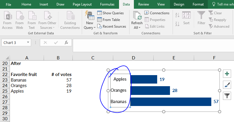
    1. Click on the category labels on the left. You’ll see a rectangular border appear around the outside of the categories.
      To re-sort your chart, click on the category labels on the left. You'll see a rectangular border appear around the outside of the categories.
    2. Hold your mouse over the lettering, like the word apples.
    3. Right-click and select the option on very bottom of the pop-up menu called Format Axis.
      Select the option on the very bottom of the pop-up menu, which is called Format Axis.
    4. Then, on the Format Axis window, check the box for Categories in Reverse Order. That’s a jargony name with a straightforward purpose. It just re-sorts your bar chart in the opposite order of your table.Check the box that says Categories in Reverse Order to, you know, reverse the order of your chart's categories.

    Your Turn

    Comment and let me know: Which method do you prefer, and why? Do you prefer Option A, in which you anticipate that the table will do a somersault, and you sort the table upside down? Or do you prefer Option B, in which you use the Categories in Reverse Order button to sort the bar chart itself?

    Bonus: Download the Spreadsheet

    Want to practice sorting your table and/or sorting the bar chart? Download the spreadsheet I used in this blog post.


    Download the template

    More about Ann K. Emery
    Ann K. Emery is a sought-after speaker who is determined to get your data out of spreadsheets and into stakeholders’ hands. Each year, she leads more than 100 workshops, webinars, and keynotes for thousands of people around the globe. Her design consultancy also overhauls graphs, publications, and slideshows with the goal of making technical information easier to understand for non-technical audiences.

    33 Comments

  • Chris Ganowski says:

    Thanks for posting about this. I too have never understood while Excel reverses the sort order when transposing data from a table to chart. I generally use option B that you outlined above. However, I’ve noticed that if the chart includes a y axis, and you choose this option, Excel moves the axis from the bottom of the plot area to the top. Sometimes this isn’t an issue, like when you don’t use a y axis at all, as in your example. Or sometimes having a y axis at the top of the plot area makes logical and aesthetic sense. But there are cases where keeping the y axis at the bottom of the plot area is preferred, but by reversing the category order, this isn’t possible. I wonder if this whole thing is a strange little blip, or if there some kind of method to Microsoft’s madness…

  • Ian Watkins says:

    Chris – in the Format Axis pane, as shown above, under horizontal axis crosses, change it to ‘at maximum category’. This will move the y-axis back to the bottom.

    • Pamela says:

      This is the best solution I’ve come across online Ann K. Emery , thank you also to Ian Watkins for the solution to invert the x-Axis ..

  • Dave Bruns says:

    Hi Ann – with categories in reverse order – Jon Peltier has a nice article on the source of this problem in Excel. The gist: Excel plots low values closest to the origin, and higher values further away. This works well for column charts, but causes bar charts to look upside down.

  • Dawn Reinhardt-Wood says:

    Thank you! Life saver! Or, at least, hair saver! Been pulling mine out for a half hour.

  • Kalpana says:

    Thank you so much. Saved my life and time. you are a genius

  • Tina says:

    Thank you for this. Short and simple explanation to annoying problem. You are the best!

  • Antonio ValleNeto says:

    None of the options solved my problem:

    My list is ordered in alpha order (label) and I want to see chart sorted by bar size.

    • Ann K. Emery says:

      Hi Antonio, You’ll simply need to re-order the table from greatest to least or from least to greatest.

    • Megan Wagner says:

      Is there a way to sort the bar chart without having to sort the table? I have a comparison chart of categories per year and I want to chart to sort the data, but not the table because it mixes some of the values when this is completed.

      Do you happen to know of an Option C?

      • Ann K. Emery says:

        Hmm, good question Megan. When you say that it “mixes some of the values,” what do you mean exactly? Give me some more details on your situation and I’ll help you troubleshoot!

  • Joseph Musaazi says:

    Hi Ann, thanks a lot for the post. But when you reverse the categories, the x-axis shifts on top. How do I bring it to the bottom?

    Thanks
    Joseph

    • Ann K. Emery says:

      Hi Joseph, I don’t think there’s a way to *both* reverse the categories *and* keep the x-axis on the bottom. This might’ve been possible 5-10 years ago in earlier versions of Excel… but I just tried again, and it doesn’t seem possible.

      Your alternative approach would be: Adjust the table that’s linked to your chart. In other words, go into your table and re-sort the values, anticipating that your table is going to do a somersault once the values go into the chart. Put the values you want on the *top* of your chart at the *bottom* of your table, and so on.

      • Paul Holland says:

        You can format the horizontal axis. In the Format Axis dialog box, under “Labels” set that to “High”. That should drop the x-axis labels to the bottom of the chart.

  • Jennifer says:

    Genius! I have been struggling with this for years! Such an easy to follow process, thank you!

  • Andrea says:

    Thank you so much!

  • Heath Wilder says:

    I need to sort categories independant of alphabet or size. eg: I have a survey with categories Strongly Agree, Agree, Neutral, Disagree, Strongly Disagree. I’m going to assume that I have to put an Rank on those answers in order to sort

  • Taimoor says:

    Thank you so much!!

  • Tundrahound says:

    High five Ann. Option 2 was golden.

  • Brittany says:

    When using a combo bar chart, checking the “values in reverse order” box flips the bars horizontally rather than reordering them. I’m trying to graph a subset of my data, so resorting the table isn’t working either. There has to be a simpler way to tell Excel you want the bars in a chart in descending order from the top!

  • Marina says:

    I love you right now, thank you so much!

  • Tim Golisch says:

    Thank you!

  • Guillermo Torrez says:

    Good Solution, in your example has two varariables . favourite food and number of votes. How about when we have 4 diferents variables like that?

    Month Bears Dolphins Whales
    Jan 8 150 80
    Feb 54 77 54
    Mar 93 32 100
    Apr 116 11 76
    May 137 6 93
    Jun 184 1 72

    Please could you share your suggestion or any idea how to do that?

    Thank in advance.

    • Ann K. Emery says:

      Maybe a “small multiples bar chart?” You might need a separate chart for each of your 4 variables. You could make them the same size and align them next to each other to make comparisons across the variables/charts easy.

  • Dale Nixon says:

    You are a life saver!! Thank you for this very simple and helpful explanation.

  • Niraj Thapa says:

    Hi I have a small question, What is the way out to reorder the bar chart in ascending or descending order, if the data table is not arranged in either way.

    Example:
    Data:
    A B C D E F G H I
    100 700 200 900 350 210 460 990 85

    I need the bar chart in ascending /descending order.

  • Mansoor says:

    Awesome! Couldn’t find it in Youtube.

  • No help says:

    This didn’t help sort, it just reversed the order…

  • I’ve found that you can customize the order of your data legend.
    Here’s how:

    Click on the Chart > Chart Design > Select Data

    Under Legend Entries (Series), select your legend, and click on the small blue up “^” or down button to move them around.

  • Liz says:

    Thank you !! This was really bothering me, I was doing option A and my chart was the other way round. Option B for me !!

  • Leave a Reply to No help Cancel reply

    Your email address will not be published. Required fields are marked *

    You Might Like

    Our complimentary mini course for beginners to dataviz. Takes 45 minutes to complete.

    Enroll

    How to Make Interactive Dashboards in Excel

    Interactive (a.k.a. dynamic) dashboards are a great option for technical audiences that have the time and interest to explore the data for themselves. In this blog post, you’ll learn about the four pieces needed: Datasets, linked to pivot tables, linked to pivot charts, linked to slicers.

    More »

    Need practical how-to tips? In this course, you’ll learn how to make great graphs inside software you already have. Includes beginner, intermediate, and advanced tutorials for making charts from start to finish.

    Enroll

    Subscribe

    Not another fluffy newsletter. Get actionable tips, videos and strategies from Ann in your inbox.