4 Comments

  • […] to explore:  diverging stacked bar charts (also see here), dumbbell dot plots, slopegraphs, span charts, and Sankey diagrams. Don’t forget good dataviz principles, though. Add these to your […]

  • […] Only have access to the minimum and maximum values in a dataset? Try a span chart. […]

  • […] to explore:  diverging stacked bar charts (also see here), dumbbell dot plots, slopegraphs, span charts, and Sankey diagrams. Don’t forget good dataviz principles, though. Add these to your […]

  • Leave a Reply to Ann's Blog | Visualization in 2015: New Year’s Resolutions to Further Your Data Development Cancel reply

    Your email address will not be published. Required fields are marked *

    Span Charts: When You’ve Only Got the Min and Max

    Updated on: Oct 29th, 2014
    Data Visualization
    , ,
    Chart created through Microsoft Excel that shows that as nonprofit budgets grow, so do CEO salaries.

    A few months ago I received a copy of the Chronicle of Philanthropy. An article about nonprofit CEO salaries caught my attention.

    Picture of a cutout newspaper article.
    Let’s zoom in and check out that data table:

    Zoomed in view of a cutout newspaper article.

    Nevermind that the data (salary ranges) has nothing to do with the article (turnover).

    Rather than displaying a mean or median, the article displayed a range. A range! What a challenge. I had to figure out how to best visualize that range.

    During all my workshops, I encourage attendees to sit down and sketch on blank paper before turning to their computer and getting frustrated by Excel’s limited menu of chart options. Sketch first and free your mind, figure out the software second.

    Draft #1

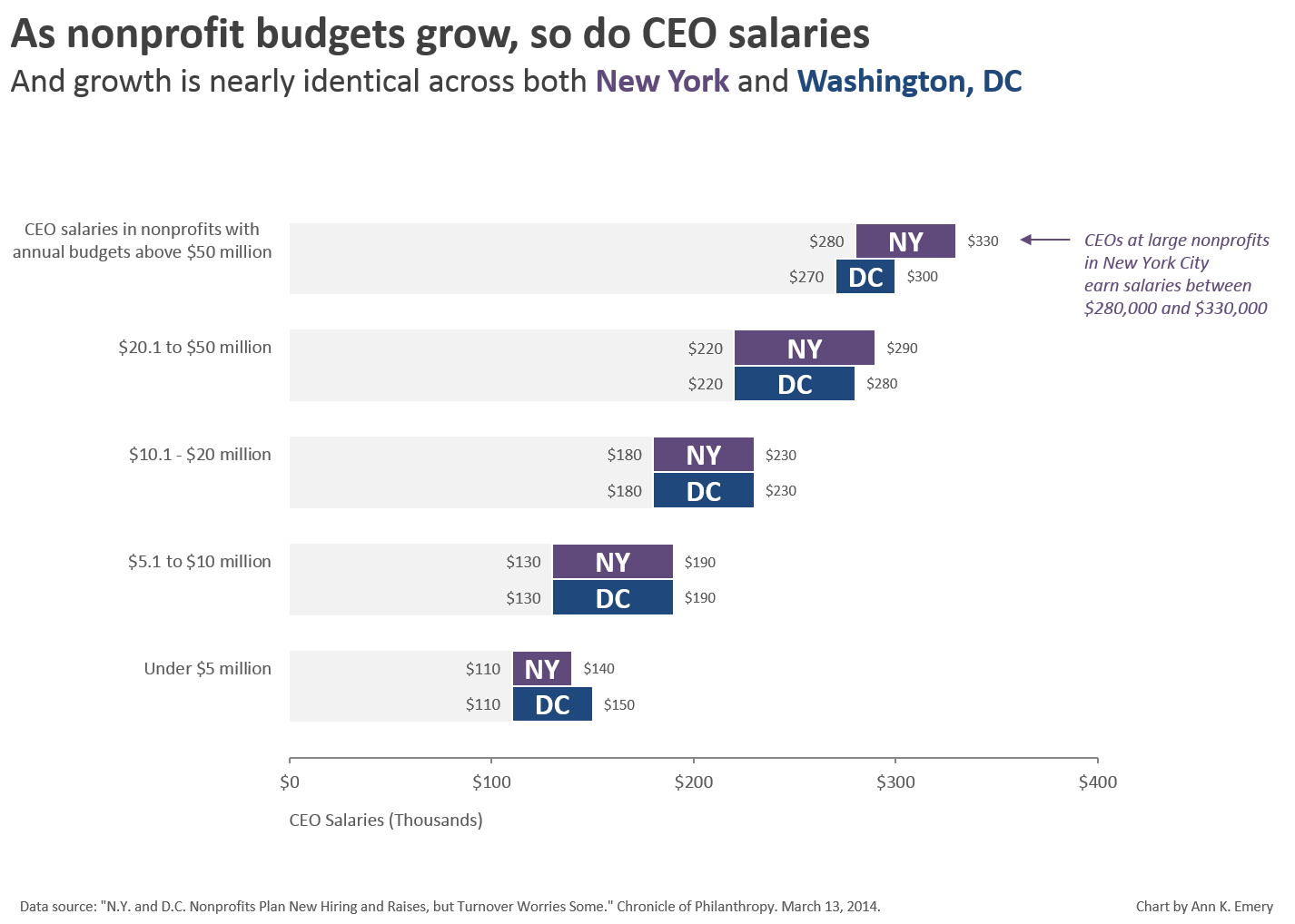
    First I drew an exact replica of the data table from the article – CEO salaries, CDO salaries, Washington, and New York.

    I actually hadn’t realized that Washington and New York salaries were nearly identical until I sat down to sketch.

    Sketch of an exact replica of the data table from the article containing CEO salaries, CDO salaries, Washington, and New York.

    Draft #2

    Since New York and DC salaries are nearly identical, why display them a few inches away from each other? This draft places New York and DC’s salaries directly beside each other.

    Draft sketch that places New York and DC’s salaries directly beside each other.

    Draft #3

    I decided that I wasn’t really interested in CDO salaries, only CEO salaries.

    Draft sketch that shows only CEO salaries.

    Draft #4

    The data table gives us aggregate/summarized numbers.

    If I had the raw data (I don’t), I could visualize each CEO’s unique salary in some sort of dot plot/pictograph/scatter plot-esque chart.

    Draft sketch that visualizes each CEO salary in a dot plot/pictograph/scatter plot-esque chart.

    Draft #5

    If I had the raw data, I could create an actual scatter plot that mapped out the connection between nonprofit size and CEO salary, maybe annotating one cluster of salaries.

    Sketch draft that shows the CEO salaries in a scatter plot.

    On the Computer

    There are probably a million more options, but I’d sketched a few ideas, and was ready to sit down at my computer and try to design the real thing.
    I decided to create a twist on Draft #2.

    Yes, this is good ol’ Excel.

    Chart created through Microsoft Excel that shows that as nonprofit budgets grow, so do CEO salaries.

    Another Option: Displaying Ranges in Line Charts

    You’ve seen how I might visualize a minimum and maximum value in a bar chart.

    But what about line charts?

    Here’s a great example from the New York Times.

    Rather than displaying exact numbers, the New York Times displayed a range in this line chart. These are estimates, after all. Displaying an exact mean, median, or frequency count wouldn’t make sense.

    As usual, the screenshot doesn’t do it justice. Head over to http://www.nytimes.com/interactive/2014/07/31/world/africa/ebola-virus-outbreak-qa.html#model to explore the charts.

    NY Times line chart that shows a range.
    How have you graphed your data when you only have a min and max? Share your ideas below.

    More about Ann K. Emery
    Ann K. Emery is a sought-after speaker who is determined to get your data out of spreadsheets and into stakeholders’ hands. Each year, she leads more than 100 workshops, webinars, and keynotes for thousands of people around the globe. Her design consultancy also overhauls graphs, publications, and slideshows with the goal of making technical information easier to understand for non-technical audiences.

    4 Comments

  • […] to explore:  diverging stacked bar charts (also see here), dumbbell dot plots, slopegraphs, span charts, and Sankey diagrams. Don’t forget good dataviz principles, though. Add these to your […]

  • […] Only have access to the minimum and maximum values in a dataset? Try a span chart. […]

  • […] to explore:  diverging stacked bar charts (also see here), dumbbell dot plots, slopegraphs, span charts, and Sankey diagrams. Don’t forget good dataviz principles, though. Add these to your […]

  • Leave a Reply to Ann's Blog | Visualization in 2015: New Year’s Resolutions to Further Your Data Development Cancel reply

    Your email address will not be published. Required fields are marked *

    You Might Like

    Our complimentary mini course for beginners to dataviz. Takes 45 minutes to complete.

    Enroll

    The Data Visualization Design Process: A Step-by-Step Guide for Beginners

    Visualizing numbers in charts, graphs, dashboards, and infographics is one of the most powerful strategies for getting your numbers out of your spreadsheets and into real-world conversations. But it can be overwhelming to get started with data visualization. In this step-by-step data visualization guide for beginners, I’ll walk you through the data visualization design process so that you can transform your spreadsheets into stories.

    More »

    Inside our flagship dataviz course, you’ll learn software-agnostic skills that can (and should!) be applied to every software program. You’ll customize graphs for your audience, go beyond bar charts, and use accessible colors and text.

    Enroll

    Subscribe

    Not another fluffy newsletter. Get actionable tips, videos and strategies from Ann in your inbox.