What’s in store for the future of data visualization? A decade ago, I celebrated making my very first 3d exploding pie chart for a report that I was writing. Nowadays, I can’t open my laptop without my jaw dropping on the floor as I scroll through site after site of data visualization masterpieces that magically incorporate animation and interactivity and scrollytelling and multimedia and the perfect blend of art and science. How times have changed! In this article, let’s take a look back at some of the best data visualization accomplishments from the past 12 months. We’ll also look forward and make predictions for the future of data visualization in the coming 12 months (and beyond).
Rather than just share little ol’ Ann’s reflections, I turned to YOU, the data visualization community. I created a quick poll on Google Sheets and I also asked you to reflect on both Twitter and LinkedIn. I also collected social media posts that touched on these themes of predictions for the future or resolutions for the upcoming year. This is by no means a serious research study. I just wanted to gather some of your ideas into one central place.
Here’s what you said about the best data visualizations of 2018 as well as your predictions for the future of data visualization in 2019 and beyond.
The Best Data Visualizations of 2018
First, I asked the community to name the coolest data visualization they saw in 2018.

Here’s what you said:
- “I love Ann Emery’s before and after gifs. Seeing the changes happen before my eyes is really useful!” –Anonymous (Editor’s note: MOM! STOP COMMENTING ON MY BLOG!)
- “Our NISER evaluation team is doing some really cool things! Shout out to our director Pam Bishop, PhD for being so supportive!” —Sondra LoRe, National Institute for STEM Evaluation & Research (NISER)
- “Nothing stands out apart from the data displays you shared at the FL Grant Developers Network conference in December.” —Jennifer A. Chevalier, Director At-Large, Learning Forward Florida and Grant Developer for St. Lucie Public Schools, Port St. Lucie, FL
- Why Kevin Durant’s Shoes Keep Falling Off by FiveThirtyEight –John H.
- “Storyline.” —Jenny McCullough Cosgrove, Noesis Consulting
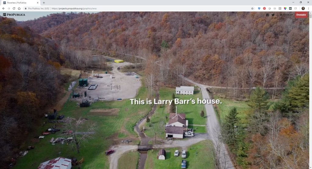
Michel Guillet of Capire Solutions mentioned Powerless: What it looks and sounds like when a gas driller overruns your land by Ken Ward Jr., The Charleston Gazette-Mail, and Al Shaw and Mayeta Clark, ProPublica. Michel writes, “The map projections in the story are stunning and really bring this story to life. Also, really easy for the reader to engage and appreciate it.”
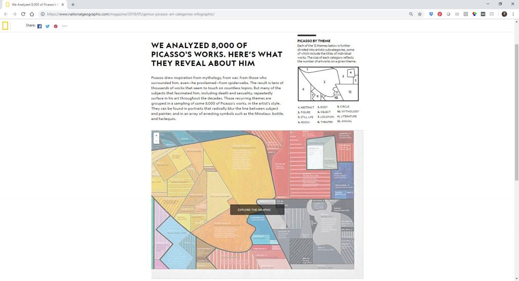
Lance Salyers of 5×5 Advisory mentioned Frames of Mind by Alberto Lucas López of National Geographic which is a treemap that depicts 8,000 of Picasso’s works within 12 major themes. Lance wrote that Frames of Mind is “literally a work of art that is also deeply information dense.” The visualization was even painted on a 36 x 60 inch canvas!
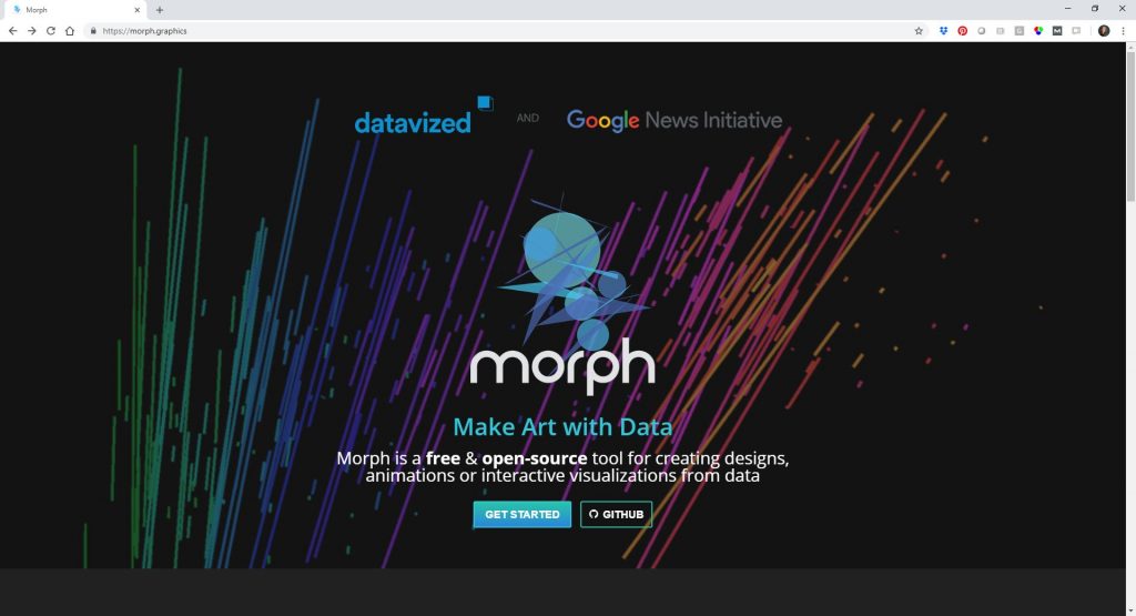
RoBlitz mentioned Morph, which is “a free & open-source tool for creating designs, animations or interactive visualizations from data.”
Mike Pell, Envisioneer at The Microsoft Garage, gave a trophy to the “Weather Channel’s use of mixed reality in TV broadcast to show the dangers of rising floodwaters with Hurricane Florence in Sept 2018.” Want to peek behind the scenes of the design process? You can read all about How the Weather Channel Made That Insane Storm Surge Animation.
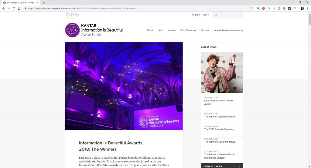
The Kantar Information is Beautiful Awards “celebrate excellence and beauty in data visualizations, infographics, interactives and information art.” You might recognize Here’s How America Uses Its Land by Bloomberg LP, “a series of unique 8,000-pixel maps in a distinctive, scrolling web experience.”
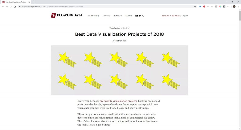
Nathan Yau of FlowingData described his picks for the Best Data Visualization Projects of 2018. I was glad to see that the Women’s Pockets Are Inferior” project Jan Diehm and Amber Thomas made the list. Their diagrams comparing men’s and women’s pocket sizing was a personal favorite.
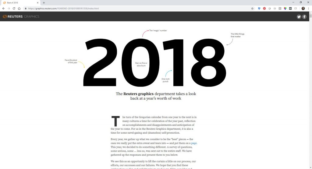
The Reuters’ graphics department reviewed their Best of 2018 visualizations. Their 14-member graphics team, which spans New York, London, and Singapore, described the favorite pieces they designed over the past year. I loved reading their personal reflections on why each piece was their favorite; for example, because the project “was a great showcase of pictures, video, graphics and text, and how all those things can work seamlessly together in one package.”
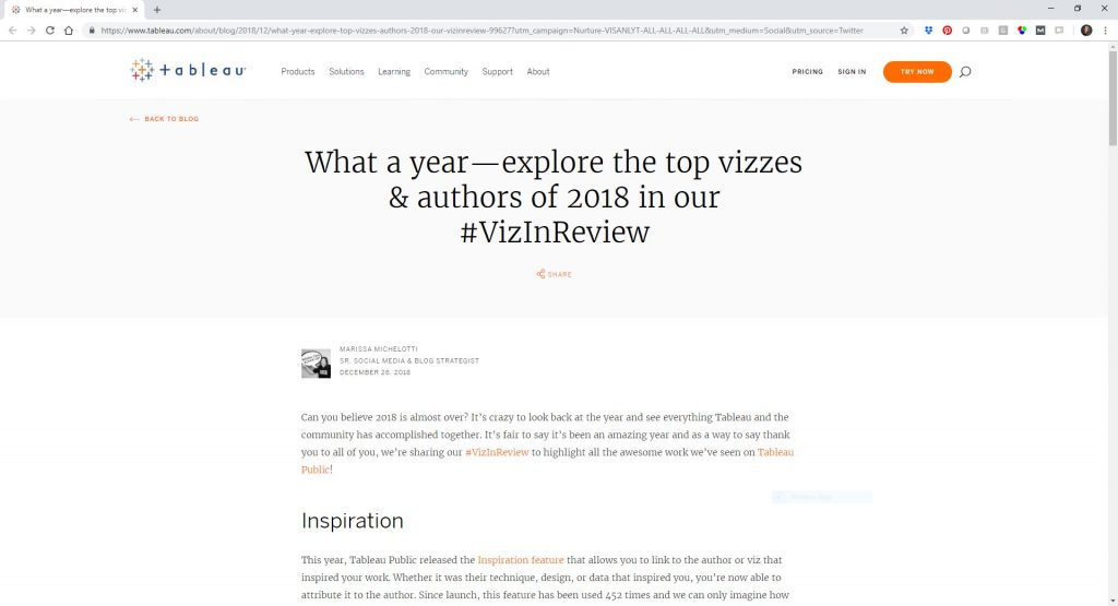
Marissa Michelotti wrote What a year–Explore the top vizzes & authors of 2018 in our #VizInReview to celebrate the Tableau Public community’s accomplishments. Marissa begins by highlighting some of Tableau’s new features that were released in 2018, like the Inspiration feature, which allows you to credit the authors or visualizations that inspired your work. In theory, Tableau’s Inspiration feature should cut down on visualization plagiarism, in addition to making it easier to give virtual high fives to each other. My favorite visualization from Marissa’s article is Andy Kriebel’s Visual Vocabulary, which is basically the Financial Times’ Visual Vocabulary resource brought to life inside of Tableau. You can see more visualizations on social media by searching for the #VizInReview hashtag.
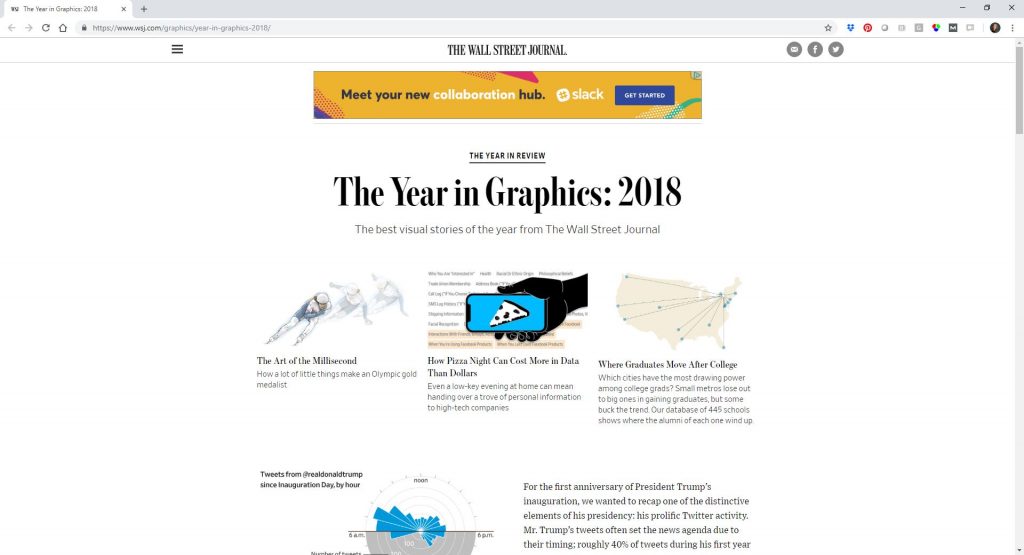
The Wall Street Journal highlighted their best visual stories from 2018 in The Year in Graphics: 2018. My personal favorite was Trump Takes to Twitter Like Clockwork not because of the subject matter but because it depicts time series data (tweets by time of day) going around in a cycle. My brain is one big spreadsheet. I tend to only think about time as being linear from left to right. When I see time depicted as going around in a circle, it forces me to go outside my visual comfort zone a bit.
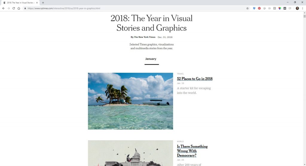
The New York Times collected some of their favorite multimedia stories in one place. The New York Times is my all-time favorite graphics team, so it’s hard to choose just one personal favorite from their article… but I’d like to give a special trophy to The Age That Women Have Babies: How a Gap Divides America by Quoctrung Bui and Claire Cain Miller. Recently, a Facebook “friend” was claiming that all Millenials are having babies in their early 20s. My acquaintance included a screenshot from the New York Times’ article in her Facebook rant–clipped ever so perfectly to include only the data to support her point and leave out all the rest of the context. Being the font and color nerd that I am, I recognized the New York Times’ green/pink maps immediately. I went straight to the article and (politely) pointed out how she had clipped the screenshot to support her point and that the data don’t suggest that Millenial women are having babies earlier and earlier–in fact, the opposite is true in many cases. She didn’t respond but I like to hope that she’s still stewing over being called out for trying to lie with data. Any article that arms you for internet arguments is a winner, amirite??
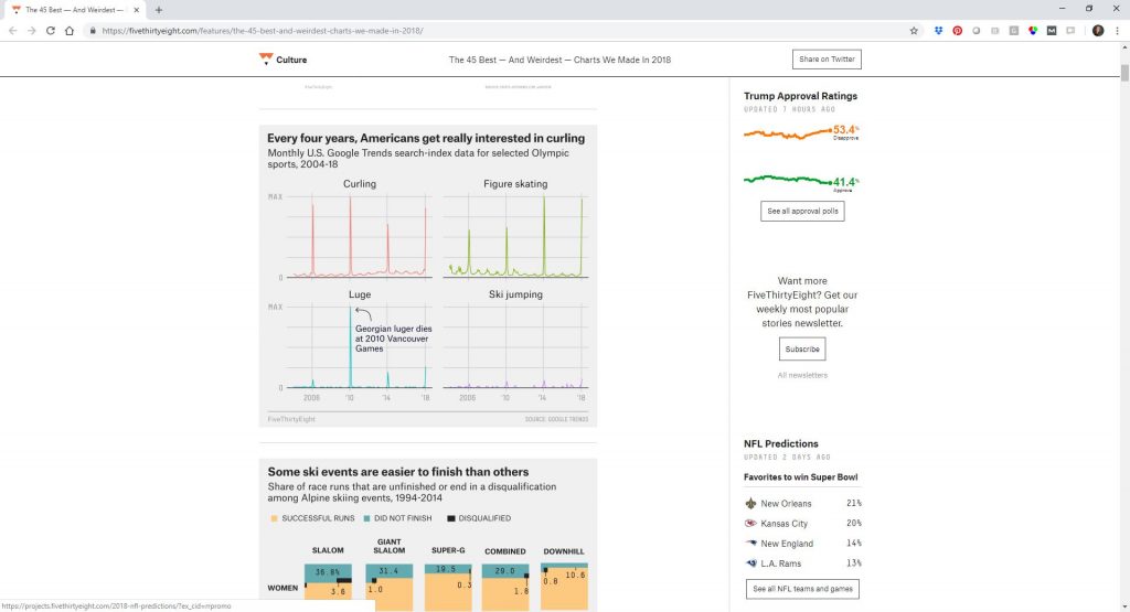
FiveThirtyEight shared 45 of their best and weirdest visualizations from 2018:
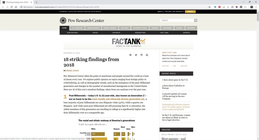
Pew Research Center shared their 18 most striking findings from 2018. While not a review of their best or favorite visualizations, the 18 findings are all depicted visually. The article contains a variety of small multiples bar charts, and line graphs with shading to show confidence intervals, and slope charts, and dot plots.
Finally, the Guardian highlighted their top 18 visualizations from 2018 in a Twitter thread:
18 for 2018: a thread of our biggest projects of the year 📷 🌍 📈
— Guardian Visuals (@GuardianVisuals) December 21, 2018
Predictions for the Future of Data Visualization in 2019 and Beyond
Next, I asked the community to share their predictions for data visualization in 2019 and beyond.
This is my aspirational wish: That we think about accessibility at the beginning of every data visualization project, not just as an obligatory check-the-box requirement at the end. There are plenty of practical ways to make visuals more accessible:
- Test drafts to ensure that colors are legible for people with color vision deficiencies. Avoid red/green color combos and use direct labels as much as possible.
- Test drafts to ensure that colors are legible if/when printed in grayscale. Direct labels help with the inevitable grayscale printing, too.
- Ensure that colored text is legible against both white or colored backgrounds. You can test drafts with WebAIM’s Color Contrast Checker.
- Write alt-text for every image. One of my 2019 Dataviz Resolutions is to write alt-text for every image on my blog, even past articles. Seeing as there are 200+ articles, 20+ pages, and thousands of images… it’s a major undertaking, but one that I’m majorly committed to.
- Match your text’s reading grade level to your audience. Please, no more writing in grade level 1,000,000. I aim for grade 12 or lower in just about all settings, from technical reports to blog posts.
- Use larger font sizes. Most of us wear glasses nowadays. Larger font sizes benefit everyone. I consulted on a project recently and the draft used size 6 font. 6!!!!!!!!! My wish is that every document would use size 11 font or larger and that every slide would use size 18 or larger.
Amy Cesal shared a few more strategies for improving accessibility in data visualization in Accessible Data Viz is Better Data Viz.
What You Predicted for the Future of Data Visualization
Here’s what you predicted for 2019 and onwards:
- “People will continually try to make things more complicated than it needs to be.” –John H.
- “I predict the data visualizations in 2019 will need to demonstrate the interdependence of both qualitative and quantitative data. As the availability and access to all types of data increases, the interdependence needs to be highlighted because it reinforces evidence to make data informed decisions.” —Sondra LoRe, National Institute for STEM Evaluation & Research (NISER)
- “This will be the year “Smart Information” takes off – the combination of AI + XR to make visualizations more conversational and immersive.” —Mike Pell, Envisioneer, The Microsoft Garage
- “1. Many Career Jumpers bringing knowledge and perspectives from different science directions. 2. Dataviz more and more established in universities, trainings, education. 3. Coming back to the basics, focusing on how to gather and/or recognize clear and reliable data in contrast to the fake news trend.” —RoBlitz
- “Counterintuitively, as the dataviz gets more impressive visually, the effort we put into critically thinking about and analyzing what the data *means* will wane. Sadly… :(.” —Lance Salyers, 5×5 Advisory
- “More discussions feeding off of the Literate Visualization presentation at openviz.org.” —Michel Guillet, Capire Solutions
- “More interactive data displays with live links to videos, research reports, etc. to allow for the opportunity to increase understanding and support the validity of the data.” —Jennifer A. Chevalier, Director At-Large, Learning Forward Florida and Grant Developer for St. Lucie Public Schools, Port St. Lucie, FL
- “More interactivity – more electronic data viz.” —Jenny McCullough Cosgrove, Noesis Consulting
I predict that 2019 is the year we see a backlash against formulaic, pattern-based, research driven web design and a move back towards art direction, communication of ideas, and creativity.
— Andy Clarke (@Malarkey) December 28, 2018
I don’t know what wizardry it takes to do this, but if this is the future of data visualization, count me in. https://t.co/uPX6GiuFjD
— Eric Weissmann (@eweissmann) September 28, 2018
What Others Have Predicted about the Future of Data Visualization
Devon Hopkins at CARTO made eight predictions about The Top Trends in Data Visualization. His first prediction is that “Data visualization is not just for data scientists anymore.” I’ve certainly seen this trend in my own work. In fact, the vast majority of my own training courses and consulting projects are with and for the non-data scientists. “We can expect the continued growth of tools and resources geared towards making the data visualization field and its benefits more accessible to everyone,” Devon wrote.
Jacob Koshy wrote about Interesting Trends Shaping the Future of Data Visualization in 2017. He writes, “The humongous amounts of data available today is almost causing an information overload for anyone venturing into its analyses.” You’ve gotta love any article that begins with humongous, am I right?? Jacob predicts a bigger emphasis on social-first data visualizations and mobile-first visualizations, and that storytelling and narrative will be hot skills. Jacob also mentions the Pantone Color Institute’s Greenery as a color trend for 2017, although I’m not sure I’ve ever seen Pantone’s Color of the Year actually used widely in data visualization.
Will Towler wrote Data Visualization: The Future of Data Visualization for Analytics Magazine in 2015. My favorite quote from his article is that “Embellishment can’t make up for lack of substance.” Looking forward, Will predicted that “Nextgen technologies and evolving cognitive frameworks will boost the role that data visualization can play in organizations and society.”
Amolie Sharma from the Geetanjali Institute of Technical Studies in Udaipur wrote a thread on Quora asking, “What is the Future of Data Visualization?” She writes, “We’re seeing cheaper and more reliable ways to store data than ever before, which means we’re all seeing far more of it than ever before. This is why professions like data scientist are booming… Data visualization is the obvious answer to turning all of that data into actual usable information that will drive a business forward.” Amolie predicts that we’ll see better tools; data visualization for all; more common chart types; an increase in interactivity/animation; and more portable (mobile) data.
Jeffrey Heer from the University of Washington gave a 10-minute keynote talk on Charting a Path Forward: The Future of Data Visualization at the Strata Data Conference in 2015… although this talk feels more like a Data Visualization 101 talk than a Future of Data Visualization talk.
Alan Mendelevich has a 42-minute presentation at the NDC Conferences in Oslo in 2018 on The Future of Data Visualization on the Web. “Gone are the days when we used creative HTML table tricks to show a bar chart or resorted to saving static images from Excel,” he wrote.
Annoying Things about Data Visualization
Next, I prompted you, “If I had a magic wand, I would fix [this annoying dataviz thing] in 2019 and beyond.”
I wanted to hear about your pet peeves. I wasn’t sure if you’d mention software challenges, or difficulties convincing coworkers to get on board with better data visualization, or trouble choosing the right chart to match your desired takeaway message, or something else altogether.
These are the annoying pet peeves that dataviz nerds like me are working to overcome. I can’t promise that I/we can solve all of them in 2019 (or even in our lifetimes), but it’s a try to tackle as many as possible. Data visualization is supposed to make it easier to find meaning in your numbers, not harder.
![Next, I prompted you, "If I had a magic wand, I would fix [this annoying dataviz thing] in 2019 and beyond."](http://cdn.kicksdigital.com/depictdatastudio.com/2018/12/Slide4-1024x576.jpg)
Here’s what you said:
- “Trying to use overly complex visual representations to make key points instead of ‘just telling me.’” —Mike Pell, Envisioneer, The Microsoft Garage
- “Default Excel settings.” –Anonymous
- “Over-simplifying!!!” —RoBlitz
- “Too much attention spent on designing the ‘viz’ and not enough on thinking through importance (or lack thereof!) of the underlying ‘data’ itself.” —Lance Salyers, 5×5 Advisory
- “Error messages that appear when the database connection is lost are friendly and intuitive. In addition, notifications are automatically sent to admin with recommended fix. Getting understandable R error messages would be an extra bonus.” —Michel Guillet, Capire Solutions
- “Let’s give some kudos to qualitative data and how it can enrich and enhance the evidence we are trying to show with quantitative data.” —Sondra LoRe, National Institute for STEM Evaluation & Research (NISER)
- “Inaccurate scaling which distorts the appearance of data being represented.” —Jennifer A. Chevalier, Director At-Large, Learning Forward Florida and Grant Developer for St. Lucie Public Schools, Port St. Lucie, FL
- “I would love to see more tips for churning out multiples of a similar report across sites (e.g. the same survey results for multiple schools) quickly and efficiently.” —Ashlee Lewis, Research, Evaluation, and Measurement Center at the University of South Carolina
- “I have themes and styles set up for different clients, but the charts and graphs in Word default to Calibri every time, requiring lots of manual font and font size selection.” –Anonymous
- “Super fun to look at but incomprehensible dataviz.” —Jenny McCullough Cosgrove, Noesis Consulting
My 2019 data journalism wish is for some news org to start analyzing photos of football/baseball/basketball stadium/arena photos to compare insanely inflated official attendance numbers to what real photographic data shows
— Joshua Benton (@jbenton) December 30, 2018
Data Visualization Skills to Develop in 2019 and Beyond
Finally, I prompted you, “I can’t wait to develop [this dataviz skill] in 2019 and beyond…” What are your New Year’s Resolutions related to data visualization? Do you want to learn a new software program? Do you want to get better at slide design, report design, or infographic design?
![Finally, I prompted you, "I can't wait to develop [this dataviz skill] in 2019 and beyond..."](http://cdn.kicksdigital.com/depictdatastudio.com/2018/12/Slide5-1024x576.jpg)
I’m personally stuck between wanting to master coding (and therefore learning a software program like R) and wanting to master graphic design (and therefore learning a program like Adobe InDesign). I’ve been stuck at this coding/design crossroads for a few years now. Sure, I could master both sides… with unlimited time and mental attention. But time and attention are my most limited resources, and after the client deliverables are taken care of, and the workshops are finished, and the blog posts are written, and the courses are taught… there aren’t very many hours left in the day.
Here’s what you said:
- “The art part of my data visualisations. Using the chemistry of colours, fonts etc. to get to the point.” —RoBlitz
- “Ways to use imagery to help tell the data story beyond just using icons.” —Lance Salyers, 5×5 Advisory
- “Shiny proficiency.” —Michel Guillet, Capire Solutions
- “I work in education evaluation and often conduct focus groups with students each semester. I would like to creatively visualize this data as it directly relates to pre-post survey data. In other words, how can we visualize the growth words from focus groups as the are related to the quant. data obtained through pre-post surveys?” —Sondra LoRe, National Institute for STEM Evaluation & Research (NISER)
- “I have been reflecting recently on bias in data reporting. More specifically, I want to consider what I am choosing NOT to measure and/or NOT to represent in my data visualizations and how my decisions impact the story I tell through data. If you haven’t read the Tyranny of Metrics by J. Muller, I would highly recommend it!” —Jennifer A. Chevalier, Director At-Large, Learning Forward Florida and Grant Developer for St. Lucie Public Schools, Port St. Lucie, FL
- “Using Excel to produce reports on a large scale. Tableau is too cost prohibitive.” –Anonymous
- “Making easy to understand visuals!” –John H.
- “I want to get better at taking a second or third look at my data viz and distilling the message down to the essential take-away. I continue to have trouble getting out of the details!” –Anonymous
- “Interactive dataviz!” —Jenny McCullough Cosgrove, Noesis Consulting
2️⃣0️⃣1️⃣9️⃣(easy) resolution: sharing more exploratory data patterns 📈✏️🧡
I love drawing abstract compositions that in my mind can represent data points in multiple way. It’s one of my ways to stay inspired, soothe my mind, and collect ideas for future projects.More soon! pic.twitter.com/NmyHLhd3nR
— Giorgia Lupi (@giorgialupi) January 1, 2019
My ambition for 2019 is to up my frequency of publishing projects, and do more personal projects and small experiments, such as this snapshot of one I’m working on right now. #WIP pic.twitter.com/PiUzw4XGDv
— Jan Willem Tulp (@JanWillemTulp) December 31, 2018
Join the Conversation: What’s in Store for the Future of Data Visualization?
Where do you think data visualization is headed in coming years? Where do you want data visualization to be headed in coming years? Comment and let me know. I’d love to hear from as many different industries, educational backgrounds, career paths, and experience levels as possible.
5 Comments
[…] Depict Data Studio | ‘The Future of Data Visualization: Predictions for 2019 and Beyond’ […]
[…] Depict Recordsdata Studio | ‘The Future of Recordsdata Visualization: Predictions for 2019 and Beyond’ […]
[…] The Future of Data Visualization: Predictions for 2019 and Beyond […]
[…] https://depictdatastudio.com/the-future-of-data-visualization-predictions-for-2019-and-beyond/ […]
The future of data visualization with Big Data maximizes the potential and increases productivity by providing infographics that can be transformed into critical insights.