Kathy Dowell has been a program evaluator for more than 25 years and is currently an evaluator at The Evaluation Group (www.evaluationgroup.com). She has long been passionate about creating data visualizations that are easy to understand, tell a story, and help stakeholders make informed decisions. I’ve been so glad to have Kathy in my online training program for the past year. Check out her awesome work! –Ann
—–
I have been an enthusiastic consumer of data visualization workshops, blogs, books, and tips over the years, and I am always trying to take my data viz skills to the next level. I have been following Ann’s blog for several years now, and I love the way she presents material in a user-friendly way that makes you realize that good data viz is achievable.
Last year I enrolled in Ann’s Great Graphs course to further my skill set and I’m really glad I did. I love not only her way of showing how to create great visuals in software we already have (Excel and PowerPoint), but she also has a great eye for design and presentation that sets her approach to visualization apart from other data viz gurus.
What I learned in Ann’s course has been invaluable in so many ways. Not only have my skills improved, but I now approach every data viz project with the goal of telling a story by intentionally using data visualization design concepts to make the story clear. By taking the time and putting in the effort, my skills have improved and so has my work.
Here are three ways my work has improved since taking Ann’s course.
Improvement #1: Presenting Qualitative Data
One of my biggest struggles as an evaluator is how to present qualitative data in an engaging and interesting way.
I want my clients to take away key points from the qualitative data I collect and report.
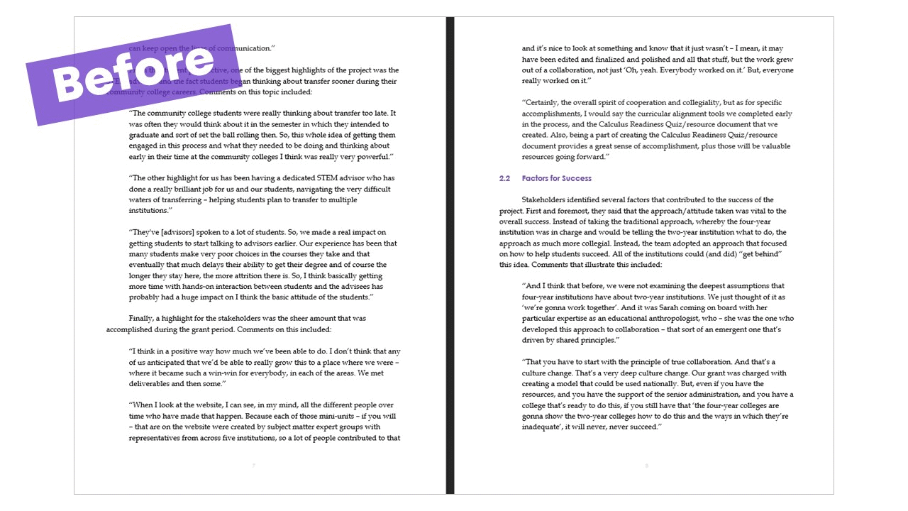
What My Qualitative Data Visualization Used to Look Like
Unfortunately, I don’t think I used to achieve this goal.
Here is an example of how I used to present qualitative data:

A ‘before’ picture of an old report shows long paragraphs without any color or visuals.
Yes, that’s right…page after page of text and quotes.
Nothing there to make readers remember what they are reading or highlight the important points.
I can only imagine my clients’ eyes glazing over as they waded through all this text to try and figure out the point I was trying to make.
Even worse, I could imagine them skipping these pages altogether.
What My Qualitative Data Visualization Looks Like Now
Ann’s course gave me inspiration to change my approach in her lesson about presenting qualitative data, specifically, using color-coding to highlight key phrases and help readers home in on the most important pieces of information.
My first attempt looked better and was more user-friendly, but my boss helped me step it up even more by inserting icons to help readers remember the key take-aways (by the way, Ann also encourages the use of icons).
Below are the two newer versions, and I now use the icon format in many of my reports.
This approach is so much better for my clients, as the icons represent and help them remember the main themes, and color-coding portions of the quotes draws attention to the phrases that illustrate each theme. Now my clients don’t have to struggle to pull out the main ideas.
And, speaking of icons, see that icon at the top right corner of the page? Every chapter in this (very long) report had its own icon that was first used on the “Contents” page, and then repeated on every page of the chapter as a quick reference for my readers. Each chapter was a different color as well, which also aided in helping readers orient themselves in the report.

Improvement #2: Presenting Pre/Post Data Using Dot Plots
I do a LOT of pre/post data collection in my work.
By far, one of my favorite ways to present pre/post data is with a dot plot.
I’ve been making them for years, but I’ve always been a little disappointed in the results.
For example, when some variable increase and others decrease, I never felt like there was a clean way to set them apart from each other.
Yes, I tried used arrows and different colors, but I never quite liked the final result.
Great Graphs changed that! Ann showed me how to create dot plots that are modern and that beautifully highlight when some variables increase, some decrease, and some don’t change at all.
By color-coding the different groups, using arrows, adding some white space, and adding icons and descriptors, the graph is much clearer.
What My Dot Plots Used to Look Like
Here is one of my old plots. It’s good. But it could be better.

What My Dot Plots Look Like Now
Here is how I make dot plots now…so much more informative and easier to interpret!

Improvement #3: Making Report Covers
I put a lot of work into my reports, so I want my clients to read them.
One way to get them interested is by making report covers that are interesting and engaging.
My old report covers failed miserably.
Did they provide the necessary information? Yes…title, name of program, date, author, etc.
But they were BORING.
In Ann’s course I learned how to make better report covers by using full-bleed photos.
Here’s what my old report covers looked like:

What My Report Covers Look Like Now
And here are some examples of what my report covers look like now – colorful, interesting, and engaging:

The Results
These are just three examples of how my work has been elevated by applying Ann’s tips, tricks, and ideas.
Having these new skills in my arsenal makes me look forward to each new data viz project.
I love creating visually appealing reports, and thanks to Ann’s course, I have the skills and inspiration I need!
2 Comments
tutorials on your dot plots now would be great!
Hi Joyce, Yes, dot plots are great! We’ve got an 18-part video tutorial on dot plots in our online courses that you might like. Hope to see you in a course.