
Last week’s blog post about contiguous vs. non-contiguous datasets was immensely unpopular.
I had the most unsubscribes to my blog and newsletter of all time — in more than a decade of blogging, YouTubing, and newsletter-ing.
One person said something like this:
“I think the issue is you’re a visualization expert and visually the mini sets are easier. From a data prep perspective, one really long table is the correct way to store the underlying data. Dealing with dozens of tables that should just be a single set is a typical rookie mistake.”
Let’s chat more about that distinction: storing underlying data vs. tables that look nice visually.
Two Types of Tables
The term “table” is tricky.
At its core, a table is just a collection of rows and columns.
But you’ll need different types of tables at different phases in the data analysis and visualization process.
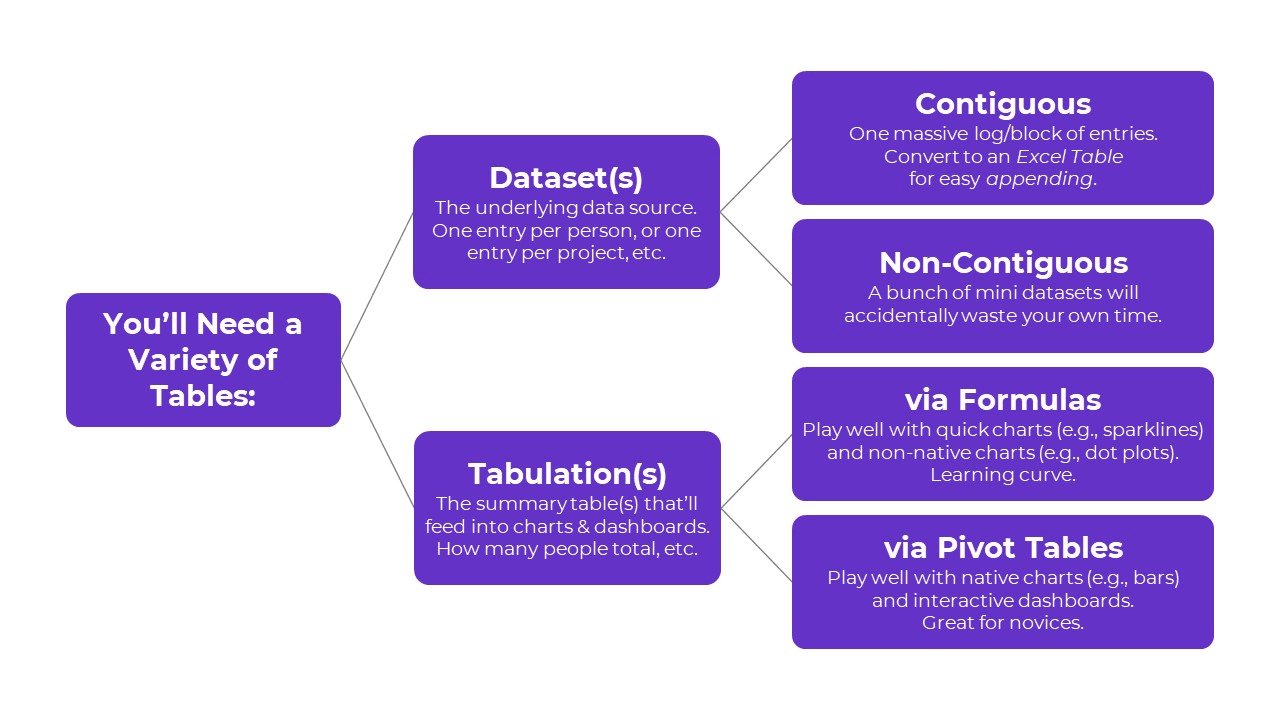
Here’s the major distinction you need to understand:
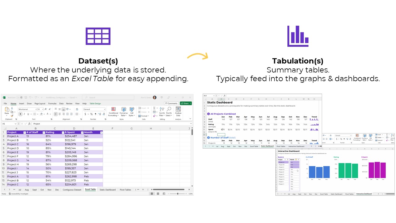
- Datasets are tables where your data is stored.
- Tabulations are tables where those datasets are summarized.
Let’s look at each type in more detail.
Type 1: Datasets
The first type of table is a dataset, which is where your data is stored.
Sort-of synonyms:
- Raw data: This is a sort-of synonym. The term raw means the data hasn’t changed since you received it (i.e., a coworker emailed it to you); since you downloaded or exported it (i.e., from a public-facing website, or from your agency’s database); or since you or someone else manually-entered it.
- Clean data: This is a sort-of synonym. The term clean means the data has changed since you received it. You checked for duplicates and missing data; you checked for and dealt with outliers; and/or you cleaned and recoded variables (e.g., by transforming a MM-DD-YYYY into Q1, Q2, Q3, or Q4, among hundreds of other recodings that are often necessary).
- Master dataset: This is a direct synonym — and this is the term I learned in undergraduate and graduate statistics courses — but we don’t use slavery terms anymore. I’ve been hunting for a better term for a couple years. If you’re in Simple Spreadsheets then you’ve heard me talk about this a lot. I’ve experimented with the terms central headquarters or hub to replace master dataset, but none of them felt right. The term that currently feels most accurate is contiguous dataset.
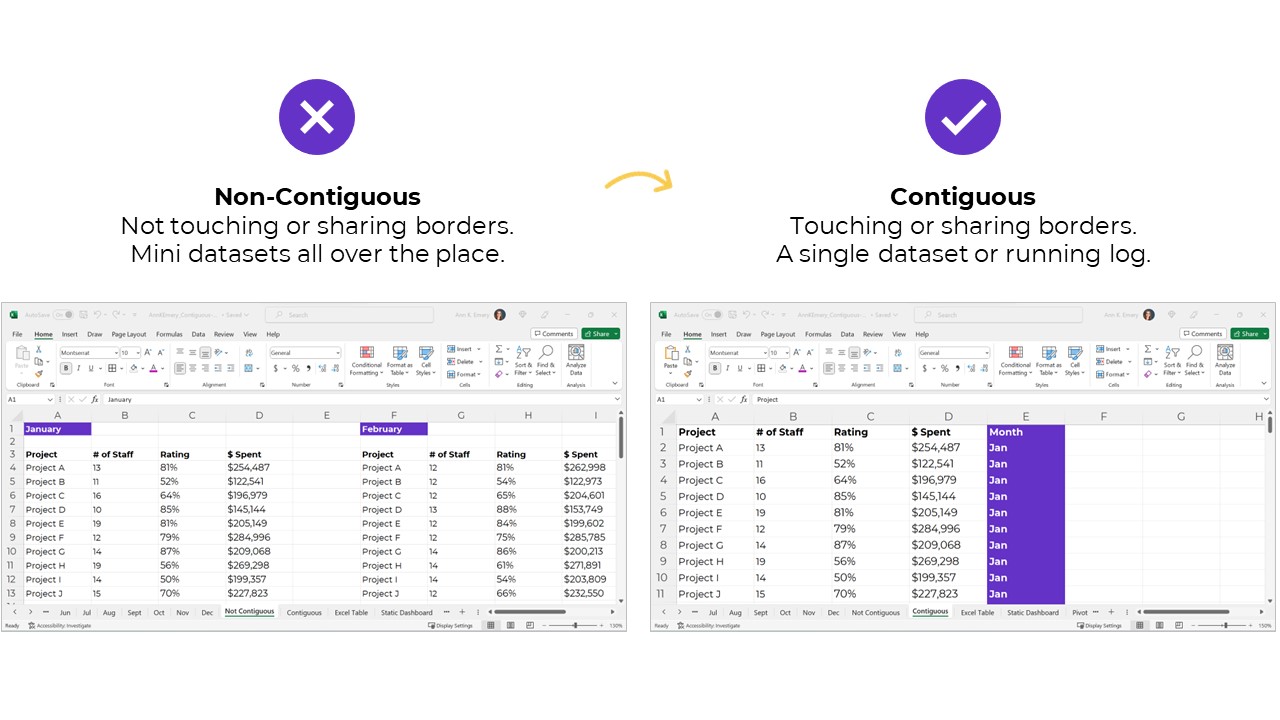
Datasets: Contiguous vs. Non-Contiguous
Datasets should be contiguous, i.e., touching or sharing a border.
If you want to be efficient, that is.
Non-contiguous datasets — dozens of mini datasets located across different sheets or Excel files — lead to wasted time, wasted money, and wasted brainpower.
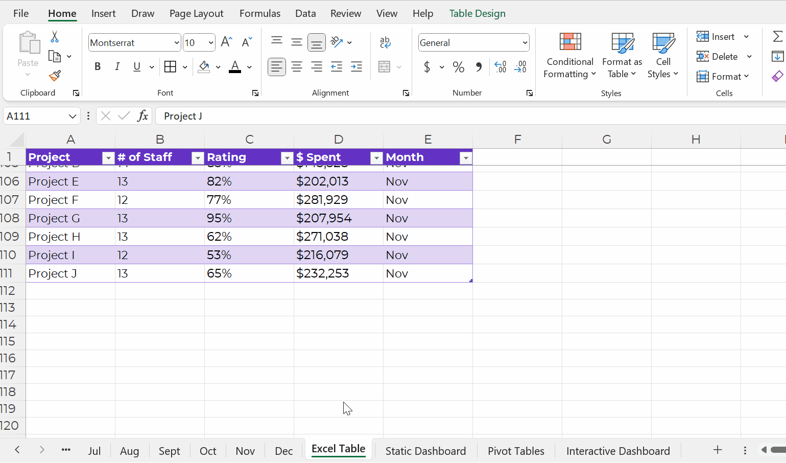
Datasets: Stored as Excel Tables for Easy Appending
Datasets should be stored as Excel Tables when you need to append them later, i.e., if you’ll be adding to them.
You can learn more about contiguous vs. non-contiguous datasets and tables vs. Excel Tables in this blog post. The Simple Spreadsheets course is all about data management and analysis, too.
Type 2: Tabulations
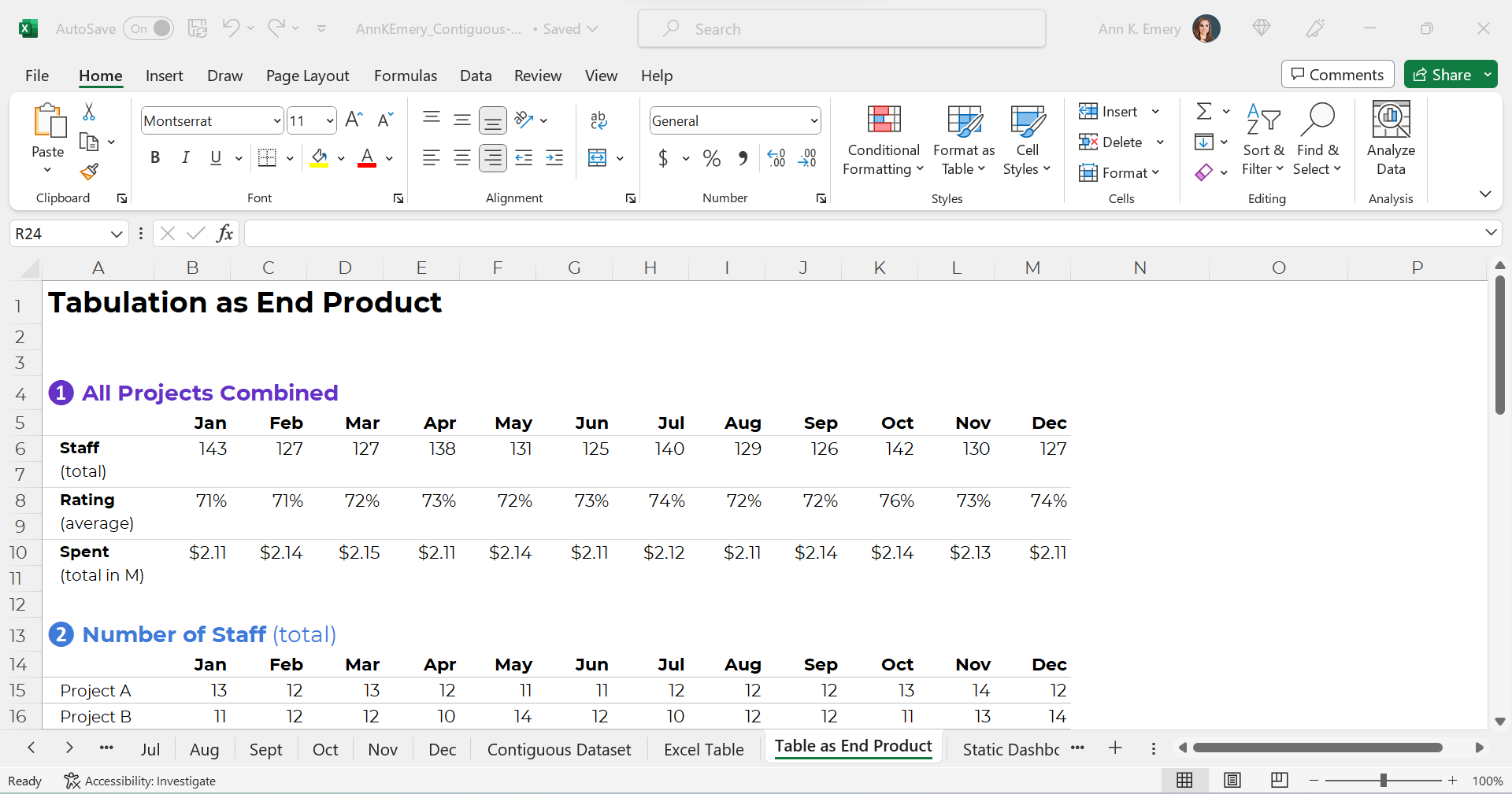
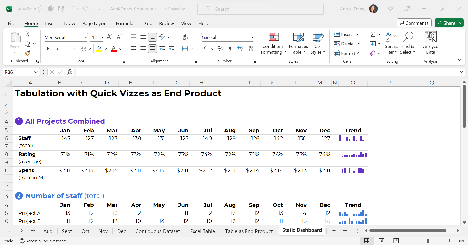
The second type of table is a tabulation. Tabulations are tables where the datasets are summarized.
For example, the dataset might have one entry per project. The tabulation might show the totals and/or averages across all the projects.
Datasets and tabulations have different purposes. They’re used at different points in the analytical process. They look different. They are different.
Synonyms:
- Summary table
- Summary statistics
- Report
- Key metrics
How to Tabulate the Dataset
You’ve got two options in Excel:
- Formulas (sumifs, countifs, averageifs, lookups, etc.) will play nicely with the quick vizzes (below). They require more skill and practice, though.
- Pivot tables will play nicely with the interactive dashboard (below). Anyone can learn pivot tables within minutes, so I often recommend them for the beginner/intermediate crowd.
This distinction deserves its own blog post, too. In all my “spare” time, ha! We also talk about the distinctions between formulas and pivot tables in detail inside Simple Spreadsheets.
Tabulations: Can Be the End Product (meh)
The tabulation might be the end product that you share with others.
I suppose you could email the summary table to colleagues. You could post it on a website, or share it on a slide.
Except… meh.
Why not bring those visuals to life?!
Tabulations: Can Feed into Mini-Graphs
Why not add quick vizzes to bring tabulations to life?!
Sparklines, data bars, heat tables, and symbol fonts are my go-to’s.
Visuals make it easier for our brains to spot patterns. It’s obviously faster to look at a viz than to read all the numbers.
Your quick vizzes might look like this:
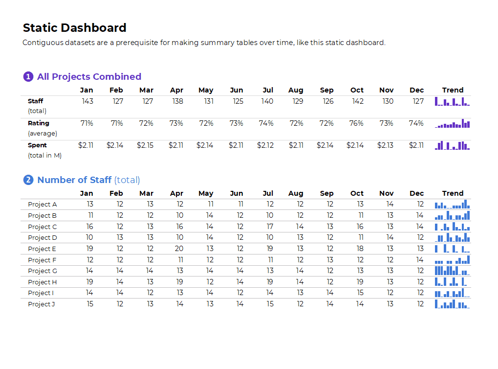
If you format the sheet for easy printing and PDF’ing, then voila!, you’ve got a static dashboard.
Static dashboards like these are great for internal audiences that (1) need a quick turnaround time and (2) want lots of details from the actual tabulations.
Tabulations: Can Feed into Big Graphs and Dashboards
Tabulations can also feed into larger graphs (for documents and slides).
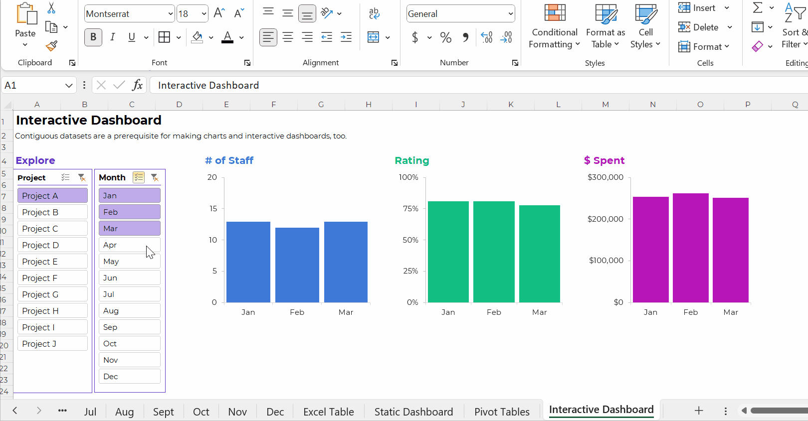
Or, tabulations can feed into larger graphs for interactive dashboards.
Your interactive dashboard in Excel might look something like this:
The Bottom Line
“Table” is a tricky term. It’s broad and generic. It means different things to different people.
There are two main types of tables:
- Datasets are the underlying data source. You might have one entry (one row) per person, or per organization, or per project. Datasets should be contiguous because.
- Tabulations are the summary tables. You might tally-up how many people, or how many organizations, or how many projects. Tabulations might be your end product (yawn!). Or, they might feed into graphs and dashboards (yay!).
We need both datasets and tabulations. But these are different types of tables.
2 Comments
Super helpful!
i really appreciate how clearly and simply you lay things out Ann.